How to Create an Area Chart in Excel
An area chart mimics the idea of a line chart.
The only difference between a line and an area chart is the shading between the lines of an area chart. An area chart shades the area covered by a dataset to show its volume.
That’s just the idea of an area chart – more details on how you can make one in Excel come in the guide below 👇
So download our free sample workbook now and dive right in.
Table of Contents
What is an area chart?
Area charts are used to show trends over time where trends are represented by lines.
However, in an area chart, the area between the line and the x-axis is shaded. This makes a comparison between different datasets easy 🚀
Here’s what an Area chart in Excel looks like.

The above chart has multiple datasets plotted to it and each of them is shown as a shaded region.
You can readily see which region covers the largest area to determine the volume of the underlying dataset 🧐
Interesting, right? So let’s see how to make an area chart in Excel.
How to create an area chart in Excel
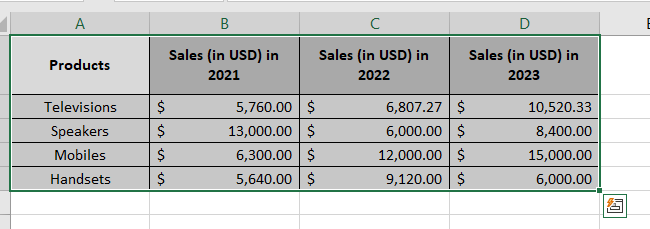
To make a simple area chart in Excel, you must have your data arranged in a tabular form. As in the image below, we have the sales of 4 different products arranged over three years 💸

Nice, now let’s make a simple area chart out of it:
- Select the data set to be plotted (headers included).

- Go to the Insert tab > Line Chart Icon.

- Choose a simple area chart under the header 2D-Area.
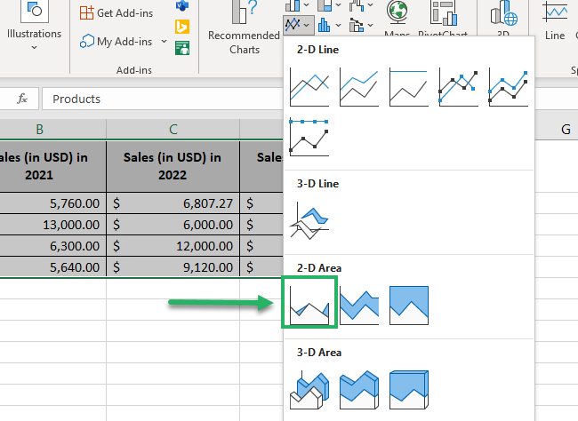
And there you have an area chart plotted out of your dataset.
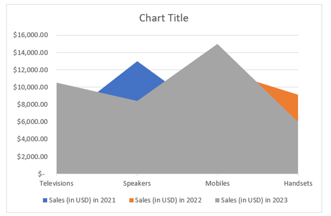
Super easy, no?
Let me help you decipher this chart before we move on to other Area chart types.
The grey portion represents the sales for 2023. No, there’s no science behind it –the legends on the bottom tell that 👇
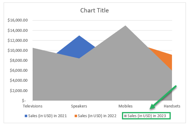
The Blue and orange peeking areas represent the sales for the years 2021 and 2022, respectively.
Note that all the products are listed along with the X-Axis. Each apex of the chart represents a product.
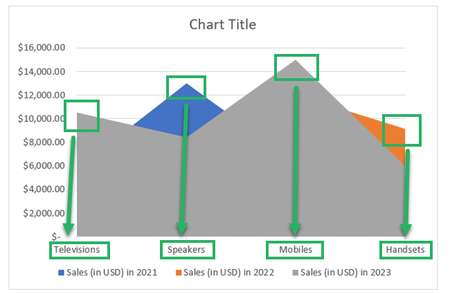
For example, the third peak highlighted above shows the sales for Mobiles at $15,000. As this is the peak of the Grey Area, we know these sales are for the year 2023 📅
Pro Tip!
Want to change what your area chart looks like? Here’s how you can do that:
- Select the chart.
- Go to the Chart Design Tab > Chart Styles.
- Choose any chart style as desired from the in-built chart style drawer of Excel.
Stacked and 100% stacked area charts
A simple area chart comes with a big drawback. You cannot study different data plots using an Area chart.
For example, in the area chart above, we cannot see the sales for televisions, speakers, and mobiles in 2022 (represented by orange color) 🍊
That’s because the sales in 2021 (blue colored) and 2023 (grey colored) were higher for all these products, so we only get to see the grey and blue areas for these products.
However, you can help this problem by creating a stacked area chart instead of a simple one. Check this out:
- Select the dataset to be plotted.

- Go to the Insert tab > Line Chart Icon
- Choose a stacked area chart under the header 2D-Area.
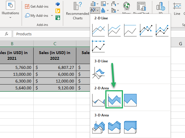
This time Excel plots a stacked area chart out of your dataset.
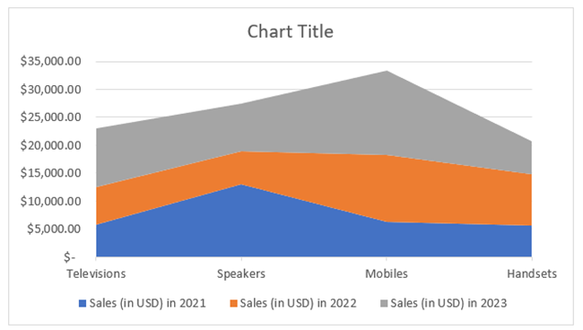
The areas for the smaller datasets (sales of certain products for 2021 and 2022) are now no more overshadowed 😍
You can clearly see them on top of the chart.
A stacked area chart shows cumulative sales for each product. A simple area chart plots the chart on the actual sales value for each product in each year.
Just like the stacked area chart, you can also create a 100% stacked area chart.
A 100% stacked area chart plots data in the form of percentages 🎭
All the numbers on the Y-axis (in a normal stacked chart) turn into percentages under a 100% stacked chart.
Let me show you how to create one in Excel.
- Select the dataset to be plotted.
- Go to the Insert tab > Line Chart Icon.
- Choose a 100% stacked area chart under the header 2D-Area.
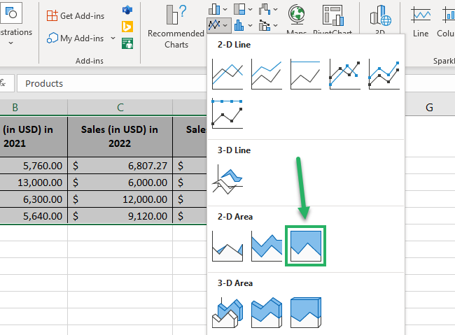
And you get a 100% stacked area chart for your dataset.
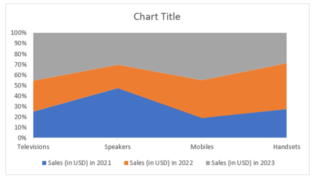
Note that this time the chart touches 100% and all sales are shown as a part of it. For example, let’s discuss a product to understand how a 100% stacked area chart works.
In our example, the total sales of Speakers are $27,400 ($13,000 + $6000 + $8400) 💁♀️
In 2021, the sales of Speakers of $13,000 contributed around 47% ($13,000 / 27,400) to the total sales of $27,400.
In 2022, the total contribution towards the total sales became 69%. Here’s the math:
= $13,000 + $6000 /27,400 * 100
And in the year 2023, the sales touched 100%.
= $13,000 + $6000 + 8400 /27,400 * 100
Pro Tip!
A 100% stacked chart will help you decipher the data in the following manner:
- You can see the proportionate contribution of each product in each year towards the total sales of that product. For example, we can see that in 2021, Speakers contributed around 47% of the total sales of Speakers.
- 2. You can also see the trend in sales of each product. However, all of these trends can be deduced in terms of percentage and not in absolute values 💰
That’s it – Now What?
That’s all about area charts in Exel. how they look, how many types they have, and how you can create them in Excel – the guide above covers it all.
But hold on! That’s just one chart. Excel has a huge variety of hearts to offer. And not only charts but so many more tools, features, and functions too.
Some of the top-notch functions from Excel include the VLOOKUP, SUMIF, and IF functions. Want to learn them already?
Other Resources
Interested in learning more about other chart types of Excel?
