List of All Excel Charts & How to Use Them (2024 Tutorial)

One of the big reasons that make Microsoft Excel a great spreadsheet software is the charts that it has to offer 📊

Yes, people, you heard that right! Charts.

Microsoft Excel has a huge variety of charts to offer. You cannot only use Excel to store data but also to represent your data – in many shapes and forms.

What are the charts offered by Excel? And how and when can you use them? I will walk you through that in the guide below. Stay tuned.

To practice making a chart along with the guide download our free sample workbook here 📩

How to create a chart in Excel

Excel has simplified creating charts like something. To create a chart in Excel, you must have your data organized in rows or columns, and that’s it.

For example, here we have a dataset that tells the preferences for different brands among people 🛒

Chart data in Excel

To turn this dataset into a chart:

  1. Select the data (don’t mind including the headers.)
Selection of data
  1. Go to the Insert tab > Recommended charts.
The Insert tab
  1. Go to All Charts.
  2. Select any desired chart (from the list on the left side). We are making a pie chart out of it 🥧
Selecting the pie chart type

Hover your cursor on any chart to see a preview of how your data would look when presented in that chart type.

Kasper Langmann, Microsoft Office Specialist
  1. Click Okay and there comes your chart.
Creating a pie chart

Alt-text:

It is only that easy to create a chart in Excel. Try creating different charts similarly in Excel.

But! Must know that different chart types suit different data types. The right chart for your data will depend upon your needs and your dataset 🤔

Change chart layout and design

When you create a chart in Excel, you’ll see it coming in the default chart style.

But you don’t have to go with those colors, styles, and layouts. You can instantly change them using the (so many) editing options offered by Excel 🎨

However, changing the colors, elements (and so much more) individually across the entire chart might cost you hours.

To your good, Excel has many layouts and styles for you to instantly change how your chart looks. And honestly speaking, it is only about a click🖱

Changing the Chart Layout

As the name suggests, chart layout changes the overall layout of your chart. It will reposition the elements, change how they look, add some, or even delete some of them under different layouts 😍

To change the layout of your chart:

  1. Select your chart (taking the same one from our example above).

Once you have selected the chart, you’d see two new tabs appearing on the Ribbon. The Chart Design tab and the Format tab.

  1. Go to the Chart Design tab > Quick Layouts button.
Designs for pie charts
  1. Hover your cursor over the Quick Layouts button. And you’d see a menu of layouts 👁
Context menu of layouts
  1. Hover the cursor over any layout to preview how it looks.
  2. Choose the layout you like by clicking on it.
layout 7

Like we have chosen layout 7 here 7️⃣

Choosing a different layout for your chart

Changing the Chart Design

Now that we have seen how to change the layout of any chart in Excel, let me tell you – changing chart designs in Excel is equally easy 🎭

You can try applying a wide variety of designs to your charts in Excel by following the steps below:

  1. Select the Chart.
  2. Go to the Chart Design Tab > Chart Styles Group.
Chart styles

You see that large drawer of designs. Those are not all.

  1. Click on the drop-down menu icon to the right of these styles to see more of them 🙈
Launching more chart styles
  1. Hover your cursor over different chart styles to have a quick preview of each of them.
  2. Click on the one you like to have applied to your chart.

Like we tried Style 8 here 💡

Applying Chart Style 8

List of all Excel chart types

We are off on a rollercoaster ride that won’t be ending anytime soon. Coming next is a long (very long) list of charts offered by Excel 💁‍♀️

So fasten your seat belts and here we go.

Bar Chart

A bar chart represents data in the form of bars (can be horizontal or vertical) 📊

To make a bar chart out of your dataset, it must be organized in the form of rows or columns.

Here is what a bar chart looks like.

Bar chart in Excel

A bar chart illustrates the comparisons between different data points in the form of bars. The length of the bars defines the size of the underlying data.

  1. Some common kinds of bar charts include the following:
  2. Clustered Bar chart
  3. Stacked Bar chart

Learn how to make bar graphs in Excel by reading our blog here.

All of these charts can be made in both, 2-D and 3-D styles 🕶

Kasper Langmann, Microsoft Office Specialist

Column Chart

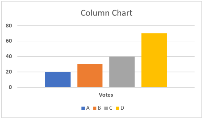
If you have your data plotted in columns (or even rows), you can plot a column chart out of it.

Like a bar chart representing each category of data in the form of horizontal bars, a column chart does the same in the form of vertical bars. Here is what it looks like 🧐

Column Chart in Excel

A column chart can take different shapes like stacked column charts where columns are stacked over one another.

Or a 100% stacked column chart where data is plotted in percentages. For all these charts, you can choose a simple 2D or 3D chart type 😍

Learn more about making Column Charts in Excel here.

XY Scatter Charts

If you have two-dimensional data in Excel, there’s a high chance a scatter plot will visualize it the best. Simply arrange your data into rows or columns with the data for any one axis in one row (or column) and the data for the other axis in the corresponding row (or column).

Excel will mark dots on each intersecting point of the X and Y axis values and return a scatter plot that looks like below 🕊

A Scatter Plot.

With large datasets, scatter plots make comparisons a lot easier. To learn how to make a scatter plot in Excel, hop on here.

Line Chart

If your data talks about time – a line chart is the best to visualize it like a trend over time.

In a line chart, categories are distributed across the y-axis. And time is spread across the y-axis. A line chart will show the distribution of data over time in the form of a continuous line.

This way line charts are ideal for showing trends over time 🏹

Here is what a line chart looks like:

A line chart

You can make a line chart with markers where each data point is highlighted with markers (prominent dots).

Pro Tip!

A line chart works best with multiple datasets. If you have only a single dataset (trend) to show, a scatter plot may also work 👩‍🏭

However, for multiple datasets, a line chart is better. This is because it helps make a comparison between different trends displayed together.

Line charts are of the following types:

  1. Stacked Line charts
  2. 3-D Line charts
  3. 100% Stacked Line charts

Doughnut/Pie Chart

A doughnut chart is called such because it looks like a doughnut. No jokes – it does. 🍩

Check it out here.

A doughnut chart

And a Pie chart looks just like a round pie with slices 🍕

A Pie chart

Both these charts represent data in the form of slices. And so, they are used to show the proportion of different categories in the whole dataset.

Bigger the category, the bigger the slice, and vice versa.

This helps data visualization as you can take a look into the chart to readily tell which item makes the biggest (or the smallest) part of the dataset 🔎

How to make a pie chart/doughnut chart in Excel? Learn here.

A pie chart only suits a dataset with 7 categories (at most). If your data has too many categories to present, the doughnut/pie chart may become a mess with too many slices to it.

Such a tightly packed pie chart makes it hard to visualize the data ❌

Kasper Langmann, Microsoft Office Specialist

Bubble Chart

A bubble is a chart with bubbles – yes, here’s what it looks like.

A bubble chart

A bubble chart is an enhanced version of a scatter plot. Just like a scatter plot, all data points are presented as scatter points on the graph.

However, here’s the difference: a bubble chart has bubbles that are of variable sizes. The size of each bubble is proportionate to the size of the value it represents. So if your data has three columns (three sets to compare), a bubble chart is your best choice💭

You can make various types of bubble charts in Excel like simple and 3D bubble charts.

Adding chart elements (like data labels) to the bubbles can enhance the readability of your Bubble Chart.

Kasper Langmann, Microsoft Office Specialist

Stock Charts

Just like the name suggests, a stock chart shows fluctuations in data. The idea of a stock chart originates from the idea of a chart showing fluctuations in stock prices 🏪

However, by no means is a stock chart only limited to showing stock prices. You can use it to show any fluctuating data – could be annual performance scores, GDP, temperatures, or anything.

Here is what a stock chart looks like:

A stock chart

To make the perfect stock chart, arrange your data in the right order. There are different types of stock charts, like the ones listed below:

  1. High-Low-Close
  2. Open-High-Low-Close
  3. Volume-High-Low-Close
  4. Volume-Open-High-Low-Close

Histogram Charts

A Histogram makes a unique chart when it comes to data presentation. It displays data frequencies. Each column of the chart shows a bin (bin is a range, like 5 to 50) 🌂

A histogram in Excel

You can change the size of the bins as desired. The length of each column shows the proportion of data relating to that bin (or range).

A Pareto chart is also a histogram, but with a line that shows the cumulative total percentage. See here:

A pareto chart

Learn more about histogram charts in Excel here.

Sun Burst Chart

The sunburst chart is a hierarchal chart based on the idea of the sun with a broad radius of its rays 🌞

To make a sunburst chart, replace these rays with different hierarchies of the data that you want to be plotted.

If your data has different hierarchies, for example, if you want to show the sale of cars > ABC Brand & XYZ Brand > Sedan, hatchback, and SUV.

A sunburst chart

A sunburst chart will make one ring outside the chart for each of these hierarchies. The first hierarchy will make the innermost ring, and every next hierarchy will come next as another outer ring 💍

Treemap Chart

If you call this chart more of a set of hieratically arranged boxes – you are right.

A Treemap chart looks no different than that 💁‍♀️

A Treemap chart

It offers a helicopter view of a dataset with multiple categories. Each category has a different color that makes it easy to comprehend data.

Box & Whisker Charts

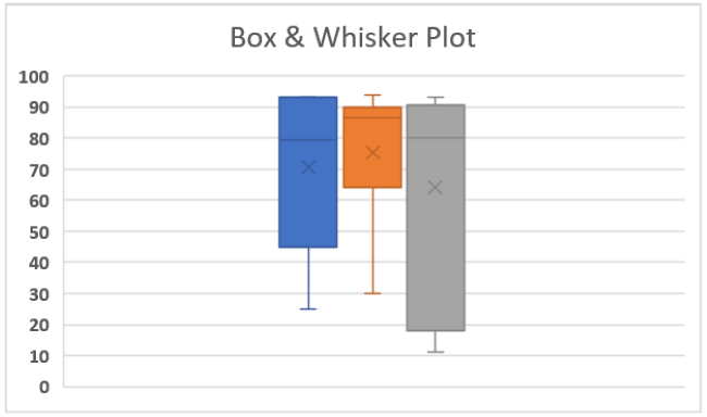
A box and a whisker chart in Excel looks like the one below:

A box and a whisker plot

It distributes data into different quartiles and shows together their mean and outliers. You’d see lines extending out of each box. What are those?

These lines are used to show the potential variability in data across their upper and lower quartiles 🚁

Learn more about Box & Whisker Plots in our blog here.

Area Chart

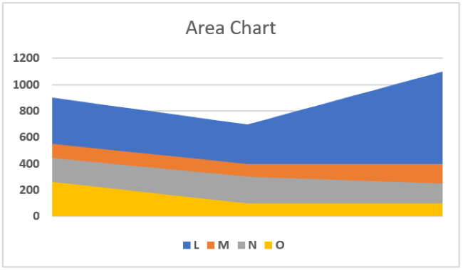
An area chart plots data by showing the area covered by it on the chart. See here.

An area chart

Area charts are the best when it comes to comparing different streams of data together. Or when you want to show changes in data over a given period.

You can also plot the sum of your data on an Area chart to show much each category of the data contributes towards the whole 💪

Area charts can take different forms like the ones listed here:

  1. Stacked Area Chart
  2. 100% Stacked Area Chart
  3. 3-D Area Chart

Funnel Charts

Funnel charts are one of my top favorite charts in Excel. They are simple, easy to make, and represent the data in a fine, readable way 📖

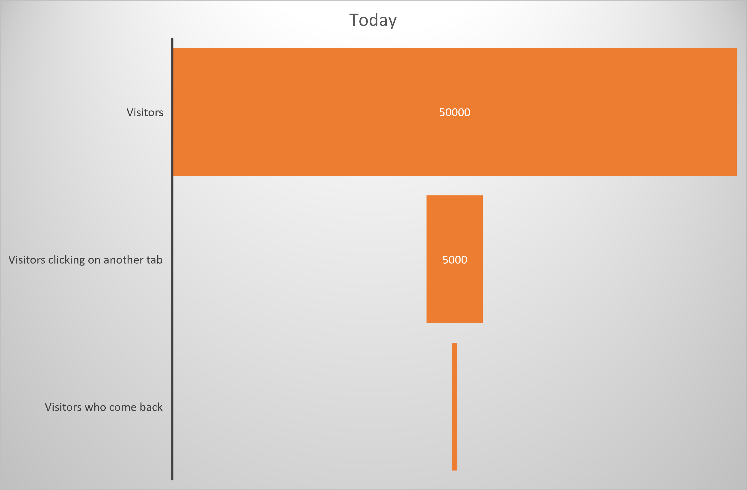
You can use it to show values across multiple stages. For example, if you want to map the movement of a company’s revenue to its net profit, a funnel chart can help you with that.

It will show how much the revenue shrinks down after each expense. As the revenue keeps thinning down, the chart takes the shape of an inverted triangle (a funnel) 🔻

Here is what a funnel chart looks like:

A funnel chart in Excel with chart title

Map Chart

When it comes to visuals, nothing beats the map chart. Needless to mention, a map chart looks like a map 🌐

A Map chart

It represents different categories of data and their sizes in the form of geographical regions on a map. It is best to use a map chart when you are showing geographical data that involves different regions, states, etc.

Each category in a map chart is shown using a different color that is defined through legends.

Frequently asked questions

More than 50. To mention a few, the bar chart, line chart, pie chart, column chart, and many more.

This number includes several varieties of each chart type. Like the clustered column chart, stacked column chart, etc. under the Column Chart type.