How to Make a Bell Curve in Excel (Step-by-Step Guide)
A bell curve is also known as a normal distribution curve that looks like a bell.
It represents the normal distribution phenomenon of data. To create it, you need to have the mean and standard deviation of a dataset together with the normal distribution of data 🔔
In the guide below, I will walk you through the whole process of creating a bell curve in Excel. Download your free practice workbook for this guide here and tag along with me till the end.
What is a Bell Curve
A bell curve represents the distribution (or spread) of a dataset.
Here’s how it looks:
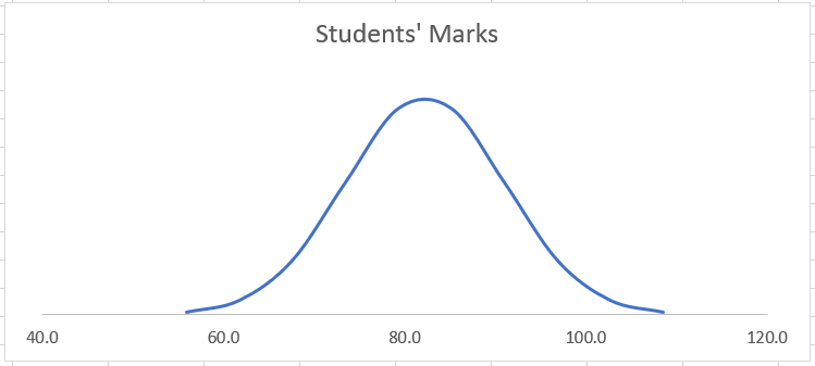
It is a statistical graph that’s bell-shaped and symmetrical. The peak of this curve represents the mean of the data, and the spread indicates the standard deviation.
Standard Deviation is the dispersion within a dataset. It measures the spread or variability of a dataset 🏃♀️
A bell curve stands on the concept that:
- around 68% of the data falls within 1 standard deviation of the mean,
- 95% falls within 2 standard deviations of the mean; and
- 99.7% falls within 3 standard deviations of the mean.
In a bell curve, also known as a normal distribution curve, most of the data points will cluster around the mean (average of the dataset) and taper off equally on both ends of the curve.
This means that the bell curve is symmetrical around the mean and the two ends of the curve are a mirror reflection of each other.
Uses of the Bell Curve:
Normal distribution is a key statistical concept that you’ll see applied across various fields. Some common examples of bell curves being used around a variety of fields are as follows 👇
- In manufacturing and quality control, normal distribution helps in monitoring process variations and maintaining product quality.
- Many educational institutions use bell curves to standardize test scores and assign grades.
- Analyzing employees’ performance often involves assumptions of normal distribution.
- Financial analysts use normal distribution to assess risks and returns in investment portfolios.
- In market analysis, stock prices and returns are often modeled using normal distributions.
- Many biological traits’ measurements, such as height and weight, follow a normal distribution.
And many more. Understanding the bell curve helps professionals from many fields.
To learn how you can also make a bell curve out of your data, see the next section 🤩
Making a Bell Curve in Excel
To make a bell curve in Excel, I will take the example of the test grades of students from a class.
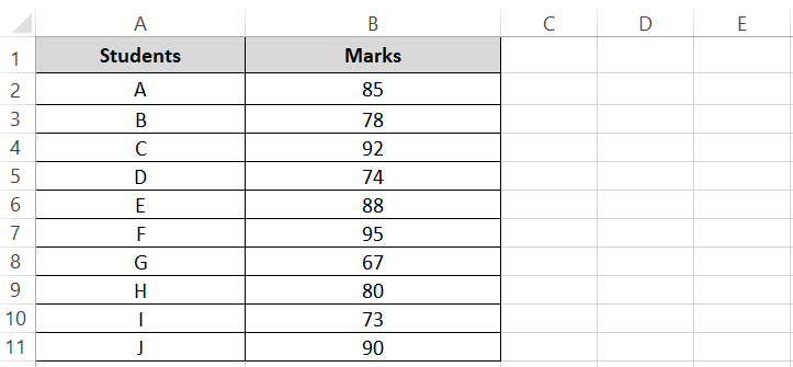
To see a clear picture of how the class has performed, we will create a bell curve for these grades 📚
Step 1) Begin with calculating the mean of these grades by using the AVERAGE function.
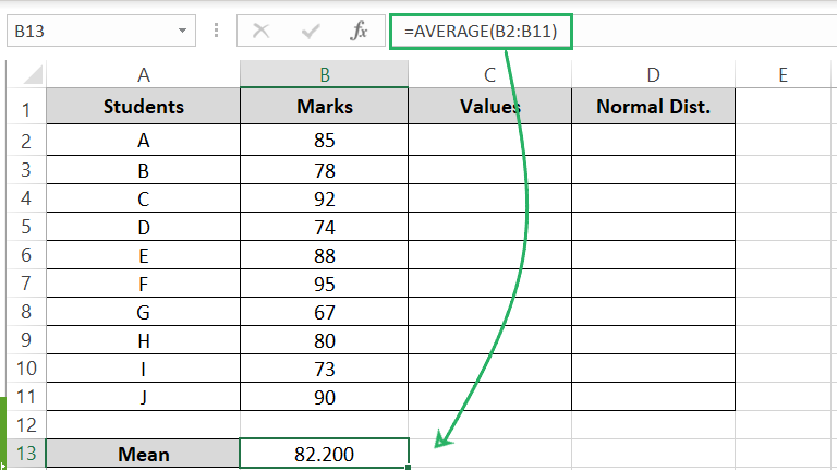
Step 2) Next, calculate the STDEV.P function to calculate the standard deviation for these grades.
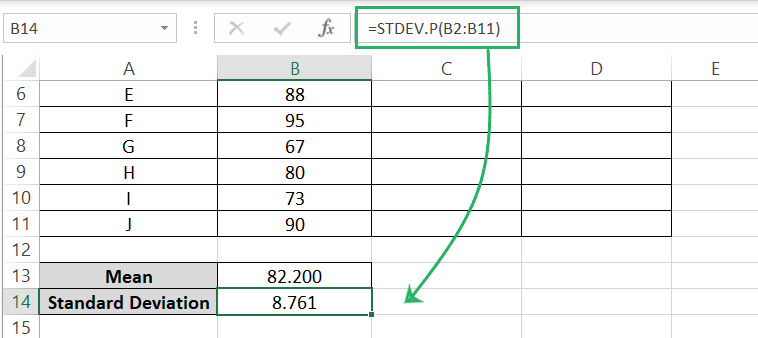
I am using the STDEV.P function to calculate the standard deviation for this dataset as this dataset consists of the population (all students from the class). If you are working with a sample, use the STDEV.S function.
Once we have the standard deviation for this dataset, we need to calculate the highs and lows for this dataset.
Step 3) Calculate the high end of the data by calculating 3 standard deviations away from the mean using the following formula:
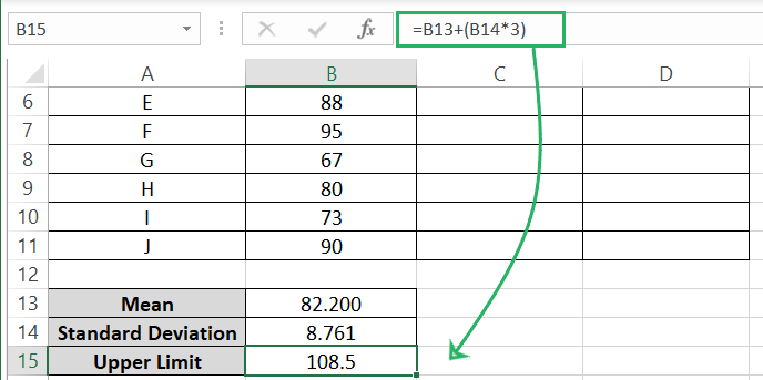
We added 3 standard deviations (Standard deviation multiplied by 3) to the mean of the data.
Step 4) Calculate the low end of the data by calculating 3 standard deviations away from the mean using the following formula:
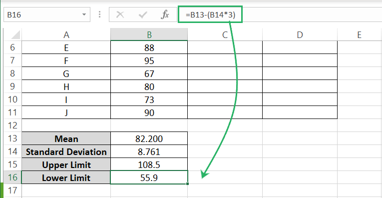
We subtracted 3 standard deviations (Standard deviation multiplied by 3) from the mean of the data.
This gives us the range (55.92 to 108.5) within which 99.7% of data should lie. The data that remains outside this range will make outliers 🚀
We have 10 students which means we need 8 values between the lower and upper end of the data extremes of 55.92 and 108.5, respectively.
Step 5) Calculate the difference between the low and high ends of the data.
Step 6) Divide this difference by the number of data points you want to create less than 1. We need 10 data points so, it would be 10 less 1 = 9.
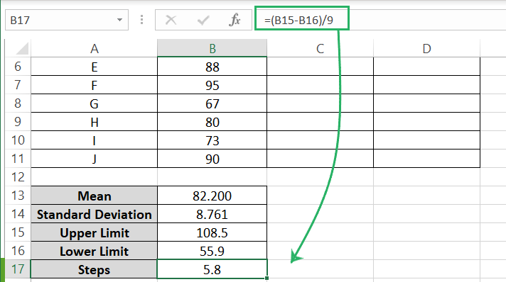
This calculates the gap between all data points which comes out as 5.84.
Step 7) Write the lower end of the data as the first data point.
Step 8) Add the gap (5.84) to it.
Turn the reference for the cell containing the data gap into an absolute reference so that we can drag the formula down.
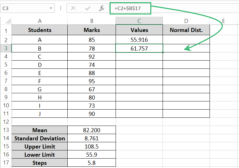
Step 9) Drag this formula down.
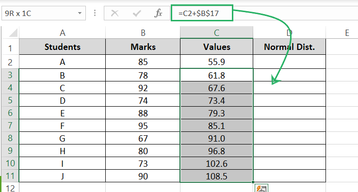
The data points should end on the upper end of the data as calculated above i.e., 108.5.
With this, we have the values to be used readily 🙏
Step 10) Now calculate the Normal distribution values for each of these by using the NORM.DIST function is shown below.
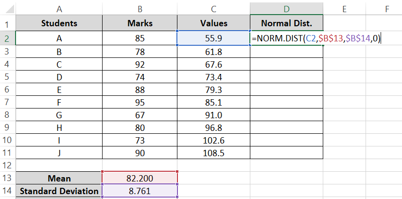
- The first argument is the value for (which will be the data points we just calculated).
- The second argument refers to the average of the dataset (make it an absolute reference).
- The third argument refers to the standard deviation of the dataset (make it an absolute reference).
- The last argument defines if you’re calculating the cumulative distribution function (TRUE or 1) or the probability mass distribution (FALSE or 0). Set it to 0.
Step 11) Drag this formula down the list to calculate the Normal distribution for all values.
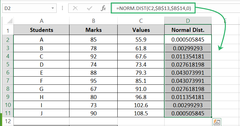
That’s it. The data’s ready.
To make a bell curve graph (normal distribution graph) out of this data 📊
Step 12) Select the Values and the Normal Distribution numbers.
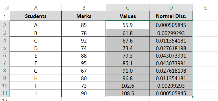
Step 13) Go to the Insert tab > Scatter Charts > Scatter will smooth lines.

A bell curve (a scatter plot basically) is created for your data that looks like below.
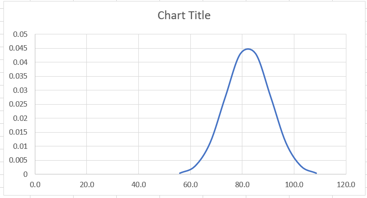
This is how it’ll look essentially. Let’s quickly format it a little to make it look better.
Your bell curve must have squeezed to one end of the chart, killing the central attention it deserves.
Don’t worry, that’s only because the axes range taken by Excel is too widespread 👀
Step 14) Double-click on the horizontal or x-axis to launch the Format Axis pane towards the right.
Step 15) Go to Axis Options.
Step 16) Set the minimum and maximum bounds based on the data points closer to where the Bell Curve starts and ends. I will set it to 40 and 120.
Step 17) Set the Major Units to 20 for the gap between the axes points to be 20 (this makes the chart look cleaner).
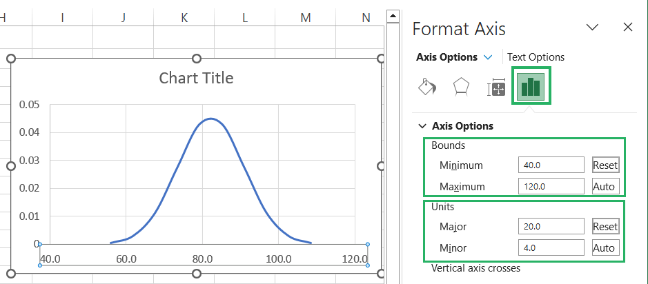
For the Bell Curve, only the horizontal Axis that plots the standard deviated marks is important. The vertical axis (showing the normal distribution) might be confusing.
Step 18) Select the chart > click on the Chart Elements icon (plus sign) towards the right.
Step 19) Click on the small arrow next to the Axes option and uncheck the Primary Vertical Axis.

Step 20) Also, uncheck the option for Gridlines.
The vertical axis and the gridlines will go away from the chart’s face making the bell curve prominent and easy to understand.

And that’s it. A Bell curve in Excel is all done 🙋♀️
You can play around with the colors and other minor details as you like.
Conclusion
A bell curve is not only a curve that represents data. It pictures the variability and standardization in the underlying data and is pivotal for statistical analysis.
This guide explains how you can make a bell curve in Microsoft Excel step-by-step. After you’ve learned to make bell curves in Excel, hop on to other statistical Excel tutorials by Spreadsheeto.
