How to Use the Excel FORECAST function Step-by-Step
Forecasting makes a crucial element of every business. Accurate business forecasting can help your business progress much faster than ever.
But forecasting is usually not that simple. You’d need to have specialists (statisticians mostly) on board. Or you’d need to buy specialized forecasting software. Both of which can cost you thousands of dollars. 💰
Good News! Microsoft Excel offers many tools and functions that will make forecasting easier and cheaper for you.
Let’s jump into the guide below and learn them all. Download our free sample workbook here to tag along with the guide.
Table of Contents
What is forecasting?
Forecasting is the technique to estimate future trends based on historical data.
For example, Company A made sales worth $5000 in 2020 and $5500 in 2021. How many sales will it achieve in 2022?
The historical data of sales shows a 10% increase ($5000 to $5500) in sales over the year.
Given the historical trend of increase, we can forecast sales of $6050 in 2022. (Sales of $5500 increased by 10%).
That’s the simplest version of forecasting, and it only gets more complex.
Forecasting is only based on probabilities and estimates – which can change anytime. And the actual results may vary from the forecasted stats.
Forecasting in Excel
Microsoft Excel offers many tools, graphs, trendlines, and built-in functions for forecasting.
You can use these tools to build cash flow forecasts, profit forecasts, budgets, KPIs, and whatnot.
The three main (and relatively simpler) forecasting tools of Excel include the following.
- Moving Averages
- Exponential smoothing
- Linear Regression
Let’s not wait anymore and dive right into each of these smart techniques.
Moving Averages
Moving Averages are used to see a wider picture of how the numbers have been changing over periods. See here.
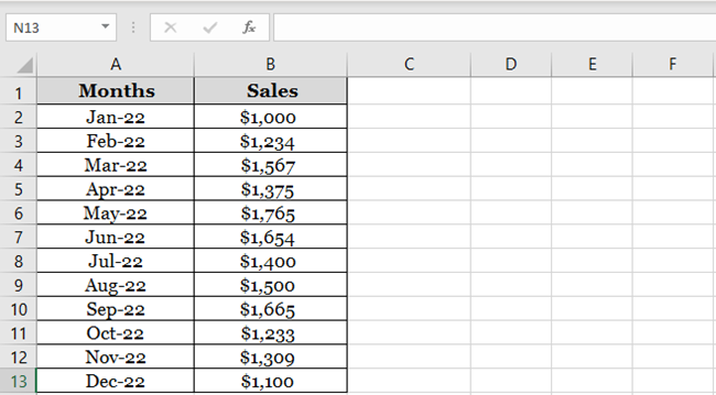
The image above shows the sales made over the past 12 months.
Create a simple line chart out of it to see the trend of sales over the last year.
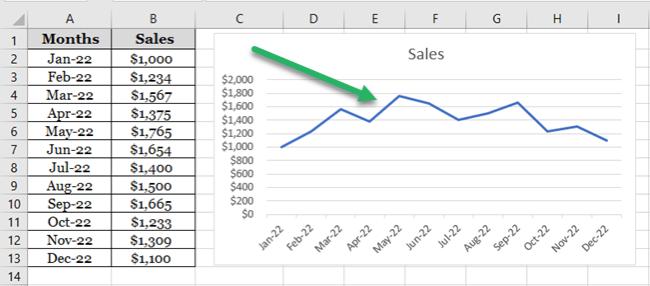
Seems like a series of mountains 😉
The graph of sales shows steep rises and falls in sales throughout the year. It’s hard to study the trend of sales over the year, let alone forecast it for future years.
Let’s make the moving average of these sales to analyze the trend of sales better. The moving average for every two months’ sales.
There are three ways how you can apply the moving average method to forecast numbers.
1. Manually using the AVERAGE function
We are making a two-months moving average so the first average would be calculated at the end of month 2.
1. So, activate a cell in a new column parallel to February (2nd month of our data):
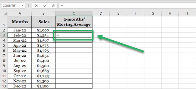
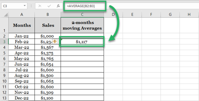
2. Write the AVERAGE function as below:
= AVERAGE (B2:B3)
3. Excel calculates the average for the first months.
4. Drag and Drop this formula to the whole list.
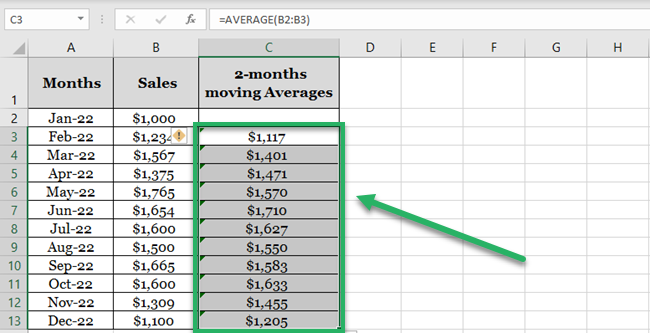
What has Excel done? As the cell references were not absolute but only relative, the cell references change for each next average.
And so, we get the moving average for the next two months (like February and March) in the example above.
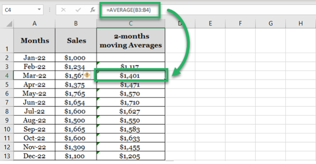
5. Turn both these series (sales and moving average of sales) into a line graph to study the trend.
6. Select the whole data set.
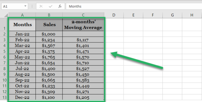
7. Go to Insert tab > Charts > 2D Line Chart Icon.

8. Choose any 2D line chart, as desired.

Excel plots both series on the line chart (each with a different color).
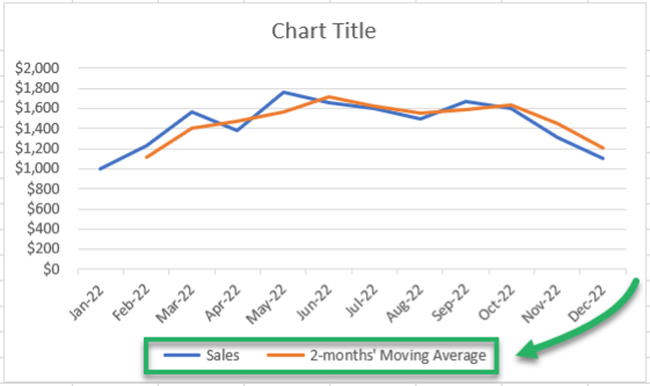
Note how the blue line has sharp highs and lows. Whereas the orange line is smoothed out. This makes it easier to study the trends over a given period.
Based on this orange trend line, you can study the historical trend of sales over the year. Assuming sales would seek the same trend in the future, you can forecast future sales.
2. Using Data Analysis
Excel offers an in-built tool to calculate moving averages in Excel.
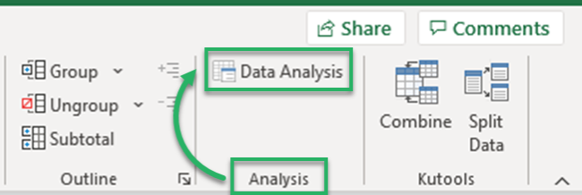
1. Go to Data Tab > Analysis > Data Analysis.
Pro Tip!
Can’t find the Data Analysis tool? Load it into Excel by going to:
File > Options > Add-ins > Analysis ToolPak > Okay
2. The Data Analysis dialog box opens up.
3. Select Moving averages.
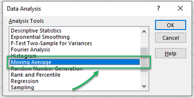
4. In the moving averages dialog box:
- Refer to the cell range containing sales as input values.
- We are calculating the 2-month moving average, so set the interval to “2”.
- Specify any range where you want the moving averages to appear as the output range.

5. Click Okay, and there you have the moving averages calculated.
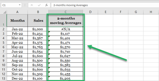
Why do we have N/A against January 2022? Because we need at least two months of data to calculate 2-months moving average.
6. Select the data and convert it into a chart by going to the Insert tab > Charts > 2D Line Chart Icon.
7. Here’s what the chart looks like.

3. Moving Average Trendline
Not only calculate moving averages, but Excel can also automatically plot them in a chart. How? See here.
1. Select the dataset (including months and sales).
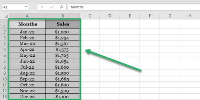
2. Go to Insert tab > Charts > 2D Line Chart Icon.

3. Choose any 2D line chart, as desired.
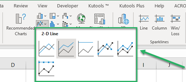
The chart to be plotted will still have a single trend line only (though it’s a 2D chart). This is because the data only consists of sales to be plotted.
4. Once the chart is plotted in Excel, select the chart.
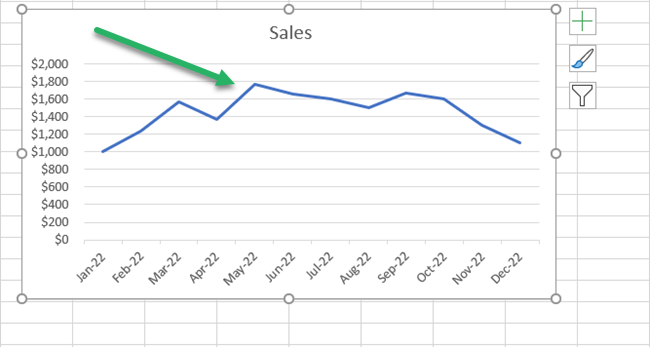
5. Go to the plus (+) icon that appears to the right of the chart.
6. Hover your cursor over ‘Trendline‘ to enable the drop-down menu.
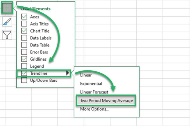
7. Choose a Two-period Moving Average (because we are calculating a 2-months moving average).
8. A smoother, orange line follows the blue line in the chart. This line represents the trend of the 2-month moving averages for sales.
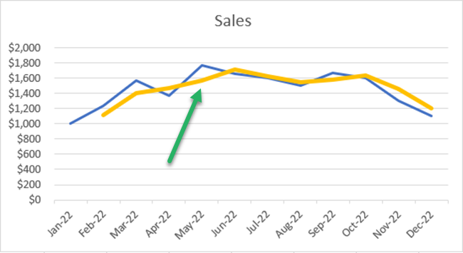
This method is faster than other methods of plotting moving averages in Excel. However, this only gives you a trend line for moving averages and not the numbers for moving averages.
Exponential Smoothing
There’s another technique how you can forecast data for the future – through the Exponential smoothing tool of Excel.
Let’s continue with the same sample data as above.
1. Select the data (or any cell from your data, and Excel would recognize the range itself).

Pro Tip!
To predict future values using the Exponential Smoothing forecasting model, make sure your data:
- Has two series (like time series and the numeric value for each).
- Time series has equal intervals (like monthly, quarterly, and annual values).
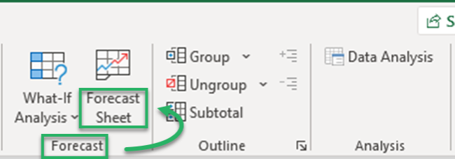
2. Go to Data Tab > Forecast > Forecast Sheet.
3. This takes you to the ‘Create Forecast Window’.
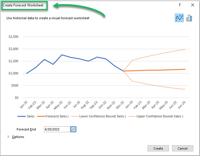
It gives a chart preview and many options to set the variables as desired.
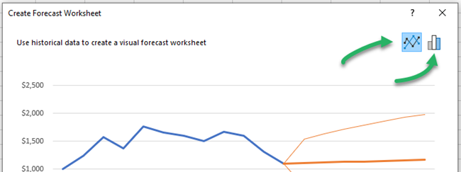
To the top right of this window, there are two kinds of charts that you can make (a line chart or a bar chart).
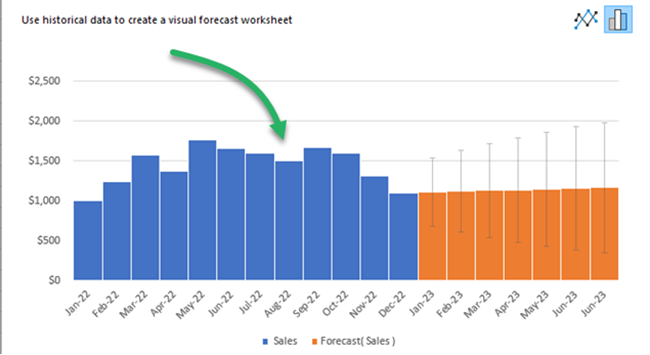
You can also choose to create the forecast in the shape of a bar chart as follows.
4. To the bottom, there is an option to set the forecast end date. For how long do you want to forecast the sales?
5. We have set it for 6 upcoming months (until July 2023).

6. You can also change the date from when the forecast begins.
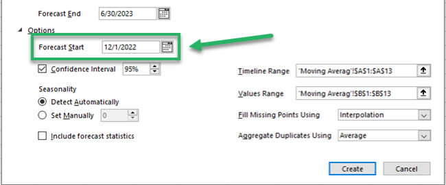
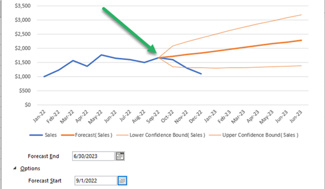
For example, let’s set it to 01 September 2022. As we change the date from 01 January 2023 to 1 September 2022, the orange line takes September as the starting point.
Pro Tip!
But we don’t need the forecasted values for the months from September 2022 to December 2022 – we have the actual sales figures for these months.
You can still set the forecast start date to a few months earlier to enable comparison. We can compare the forecasted and actual sales figures for these months.
This helps you to gauge the accuracy level of the forecasted sales.
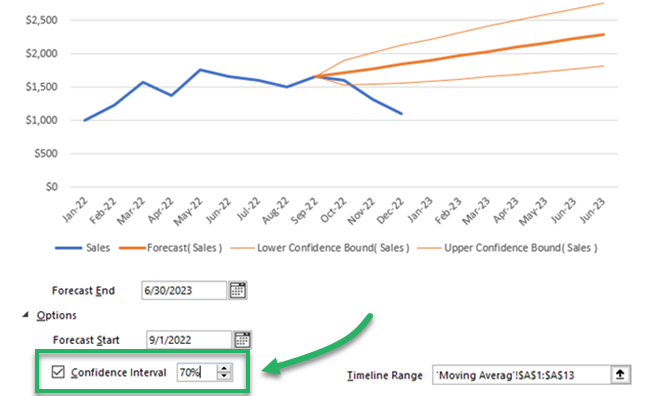
7. Confidence Interval depicts the accuracy of the forecasts. You can set it to any number. A smaller confidence interval means more confidence in your predicted value.
We have set it to 70%.
8. Set other options as needed, and once done, click ‘Create’.
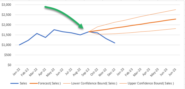
9. The Forecast Sheet also provides a data range (Sales forecasts) for the specified months (Sept 2022 to June 2023).
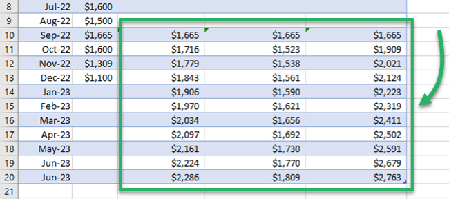
This includes the future values for sales, and lower and upper confidence intervals.
That is how you can forecast statistics (for any period) using the exponential smoothing tool of Excel.
Linear Regression
Here comes the last forecasting model of this guide – linear regression.
Remember the liner line equation from our early childhood academics:
Y = a + bx
This equation extrapolates the historical trends to the future. It takes the assumption that the future trend would follow a straight line.
For data without seasonality, linear regression is the best and simplest forecasting technique.
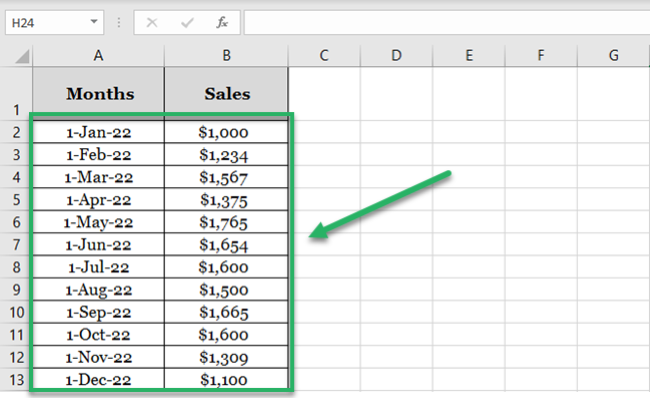
1. Here is the sales data for one year. And we want to forecast the sales for the year to come.
2. To do so, we need to apply FORECAST.LINEAR function as shown below.
= FORECAST.LINEAR (
3. The first argument of the Forecast Linear function specifies the target date. (The first future date from where the forecast must begin).
= FORECAST.LINEAR (D2,
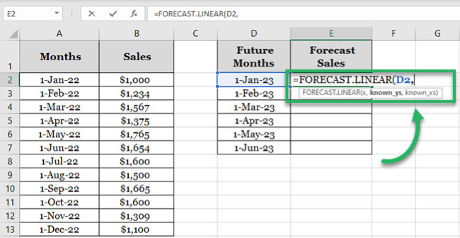
We have set it to D2 (that contains the first date i.e. 01 Jan 2023 for which we need the forecast sales).
4. The second and third arguments are known x value and known y values.
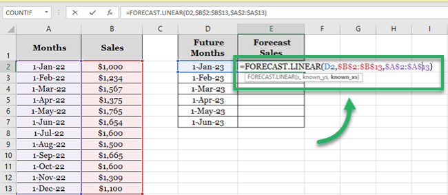
In our example:
- “Variable x” is the sales range. As the second argument, we have referred to the cell range $B$2:$B$13.
- “Variable y” is the time series. We have referred to the cell range $A$2:$A$13 as the third argument.
Did you notice we have turned the range reference to absolute? This is because we need to drag and drop this formula to the remaining cells. But we want to keep the range reference the same as we drag and drop it.
5. Hit Enter and we the forecasted sales for 01 Jan 2023.
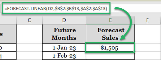
6. Drag and drop the same to all the forecast months.
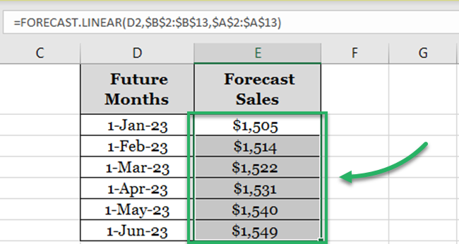
That’s how you can forecast numbers using the linear regression tool.
If you want to see these numbers plotted on a graph:
7. Merge the months (actual and forecast months) as below.
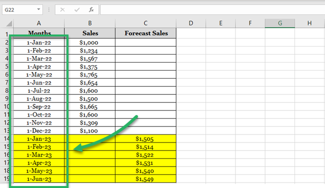
8. Copy / Paste the actual sales of the last month (December) to the column for forecast sales.

Doing so would create an uninterrupted trend line.
9. Select the dataset (time series, sales data, and forecast sales).
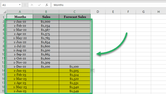
10. Go to Insert > Charts > Recommended Charts.

11. Click on Line Charts.
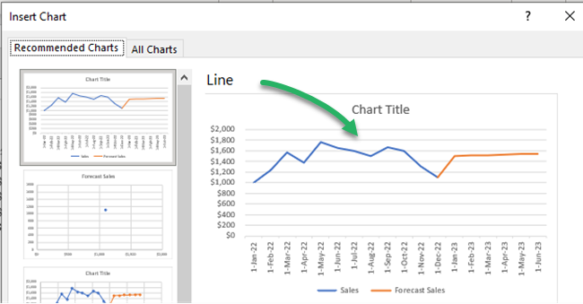
12. Excel creates a line chart to plot the data points for actual and forecast sales.
Excel draws an orange linear trendline for the forecast sales.
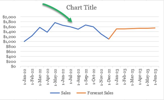
Excel forecasting using the linear regression method is always fun, isn’t it?
That’s it – Now what?
We have seen a bunch of techniques to perform forecasting in Excel. Starting from moving averages to exponential smoothing to linear regression. You must be feeling like a statistician by now.
Surprisingly, all of these smart tools/functions are only a small part of the very versatile function library of Excel.🤷♂️
Some other mind-blowing functions of Excel include the VLOOKUP, SUMIF, and IF functions.
To learn more about these functions, sign up for my 30-minute free email course now.
Conclusion
Enjoyed the guide above? This is not all. There’s so much more to Excel that you’d love to explore.
So don’t stop here and check out our blog post on the 15 most common functions of Excel.
