How to Create a Box and Whisker Plot in Excel
If you’re a stats person, a box and whisker plot must be your go-to chart 📈
That’s because this one chart accommodates most of the key statistical values for any dataset. Starting from quartiles to the median to the outliers of that dataset.
And it not only calculates these figures for your dataset but plots them too. Making a box and a whisker chart is easy – but it might be a little hard to understand the calculations that run on the back. But that’s what I am here for 👋
Let me walk you through a comprehensive guide that’ll teach you all about Box and Whisker plots of Excel.
So continue reading and download our free sample workbook here to tag along with the guide below.
Table of Contents
Create a box and whisker plot
Creating a box and a whisker plot in Excel is a matter of a few clicks. See for yourself.
The data below has a list of temperatures recorded for a region 🌡
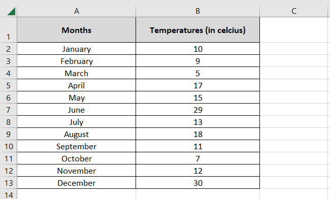
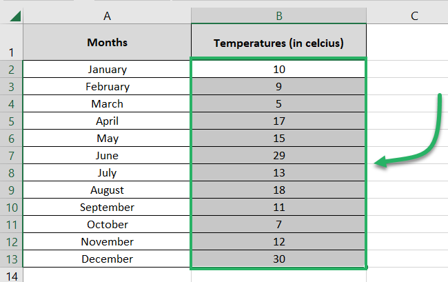
Let’s create a box and a whisker plot out of it. To do that:
- Select the data to be plotted (the numbers only) 🔢
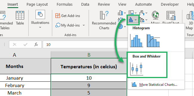
- Go to the Insert tab > Charts.

- Click on the Statistical Chart Icon > Box & Whisker Plot.
And there you have a box and whisker chart created! Yes, creating it in Excel is only that simple 👩🏭
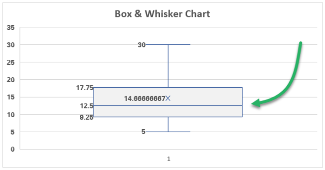
To tell you a little bit about it:
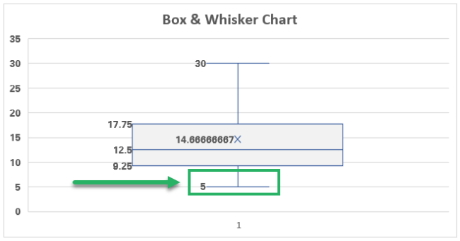
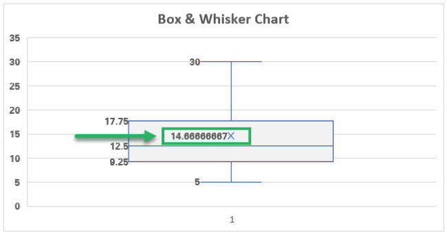
The whisker at the bottom shows the minimum value of our dataset (5).
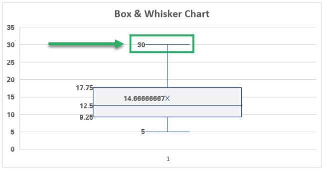
Similarly, the whisker at the top shows the maximum value of our dataset (30).
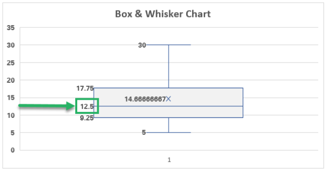
The line in the center of the grey box shows the point where the Median for this dataset lies (at 12.5).
The Median makes the middle value of any dataset 🔎
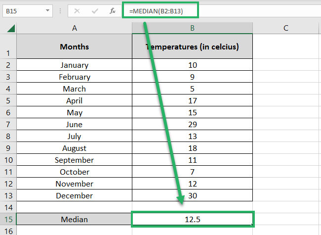
You can quickly double-check the Median for your dataset by using the MEDIAN function as follows:
= MEDIAN (B2:B13)
Pro Tip!
How is the Median calculated?
- Arrange your data in ascending order.
- Divide it into two halves.
- If the number of values in your dataset is odd, the center point of your data will be the Median.
For example, if your dataset has five numbers , break it into and . The number in the center is your median 🌗
- If the number of values in your dataset is even, take the two central numbers and average them out to find the median.
For example, if your dataset has four numbers , take the two numbers in the center 3 and 5. Average them out as ((3+5) / 2 = 4). The median for this dataset is 4.
And the X that you see in the center of the box represents the mean of the data (14.67).
You can calculate the mean for any dataset by using the AVERAGE function in Excel 💪
Add outliers to the box and whisker plot
Adding outliers to a box and whisker plot is the easiest.
But for this, we’ll make a slight change to our dataset, which will cause the Box and the Whisker Plot to change too.
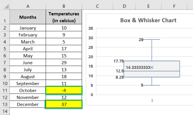
Nothing much, we only changed one value from this dataset from 30 to 37 and another from 7 to -4.
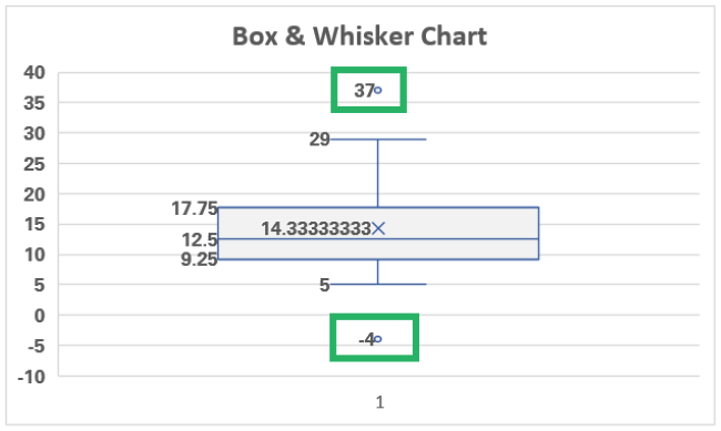
As a result, the top whisker of the chart extends up to 29 and not 37 (the maximum value of the dataset). And the minimum value of this dataset now becomes -4 but, the bottom whisker still only extends to 5 🤔
Why is that? We will learn that after we know how to insert an outlier. To add outliers to your box and whisker plot:
- Select any element of the chart (the box or the whiskers).
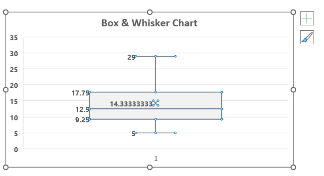
The Format data series pane will launch as shown below.
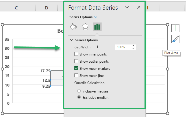
- Under Series Options, check the box for “Show Outlier Points”.
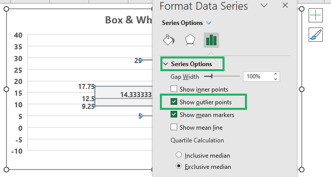
There comes a blue dot on your chart that marks the highest (37) and the lowest value (-4) of our revised dataset. That’s what we call an outlier 🔵
Pro Tip!
What is an outlier? An outlier is a value that lies in data extremes (both smaller and larger sides of the data).
This is the value that can disturb the overall distribution pattern of the data 🧐
How is it calculated? The formula for outlier reads as :
- Lower Outlier = Quartile 1 – (IQR * 1.5)
- Upper Outlier = Quartile 3 + (IQR * 1.5)
What is an IQR? It stands for the inter-quartile range (the distance between the third and the first quartile), and you calculate it as follows:
= Quartile 3 – Quartile 1
The IQR rule says that if any number of your dataset exceeds 1.5 times your interquartile range, that number is an outlier🚴♂️
It is too large or too small to disturb the whole dataset.
Let’s calculate it for our dataset:
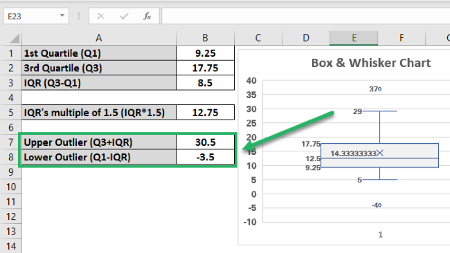
Our outliers range from -3.5 to 30.5.
We have taken the numbers for the 1st and 3rd Quartile from the chart i.e. 17.75 and 9.25 👀
This tells that any figure of this dataset that exceeds 30.5 or is below -3.5 will be considered an outlier.
Such numbers will not be included in the whisker range (so the whisker will extend up to the minimum and maximum numbers of the dataset excluding outliers).
That is why our whisker only touches 29 and 5. Both, 37 and 4.5 are beyond the outlier limits so, they are represented as blue outlier dots only 🧠
Calculate quartiles
Yeah, I know, everything now makes sense except for the Quartiles themselves.
Pro Tip!
Stats has a total of 3 quartiles and their formulas are as below:
- Lower Quartile (Q1) = (N+1) * 1 / 4.
- Middle Quartile (Q2) = (N+1) * 2 / 4.
- Upper Quartile (Q3 ) = (N+1) * 3 / 4.
Where N is the number of values in your dataset.
Like our dataset has 12 numbers so, our lower quartile (Q1) must be
= (12 + 1) * 1 / 4
= 13 * 0.25
= 3.25th Number of our dataset
Do not forget to arrange the data in ascending order before you pick it out 🚀
To calculate quartiles in Excel, we have two functions.
- QUARTILE.INC
- QUARTILE.EXC
INC and EXC stand for Include and Exclude. The only difference between these functions is about including and excluding the median while calculating the quartile ✍
Excel uses the QUARTILE.EXC formula for calculating the quartiles of Box and Whisker plots.
Let us do the same too.
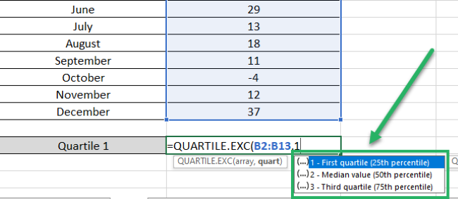
- Write the QUARTILE.EXC function as follows:
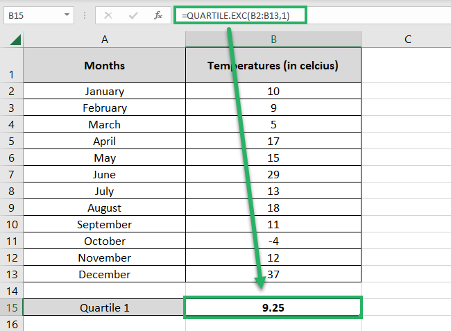
= QUARTILE.EXC (B2:B13, 1)
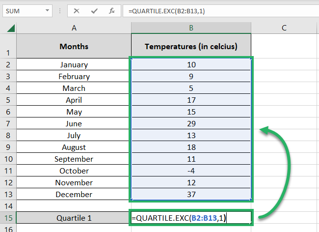
Specify the range of numbers whose Quartile is to be found.
The quart argument specifies the quartile to be found. Like 1 represents the first quartile and here are others 👇
- Hit Enter and there you have it.
That’s it – Now what?
That’s all about creating Box and Whisker charts in Excel. Once you know what runs at the backend of this chart, it begins to make much more sense than before.
Just like the Box and Whisker chart, Excel offers a wide variety of charts, tools, and functions. If you are on the journey to master Excel, you must not miss out on Excel functions 🎯
And as there is a whole library of them (a very huge library), we suggest you begin learning the core functions first. Like the VLOOKUP, SUMIF, and IF functions.
Other resources
If you enjoyed learning about the Box and Whisker Plot in Excel – we bet you’d love to know about other chart types offered by Excel too. There are many of them.
Learn about all the charts offered by Excel in our blog here.
