How to Create a Bubble Chart in Excel: Insert & Edit
A bubble chart displays three variables on a two-dimensional graph3️⃣
Just like the name sounds, a bubble chart is a chart where the data is plotted in the form of bubbles.
In this tutorial, we will walk you through the process of creating a bubble chart in Excel, from selecting the data to formatting the chart.
So download our free sample workbook here and jump in straight🚀
Table of Contents
What to use a bubble chart for
A bubble chart is to be used when you have three-dimensional data to plot on a graph. Most of the graphs can tackle two datasets graphically. Where one is plotted on the x-axis and the other is plotted on the y-axis.
However, what differentiates a bubble graph is its ability to graph three datasets together, where💭
- Two datasets are plotted on the X and Y coordinates
- And the third set is plotted as the size of the bubble.
For example, if you have a dataset that shows the relationship between three variables:
- The number of products sold
- The sales
- And the size of each product line (in percentage).
A bubble chart can help you plot it as follows:
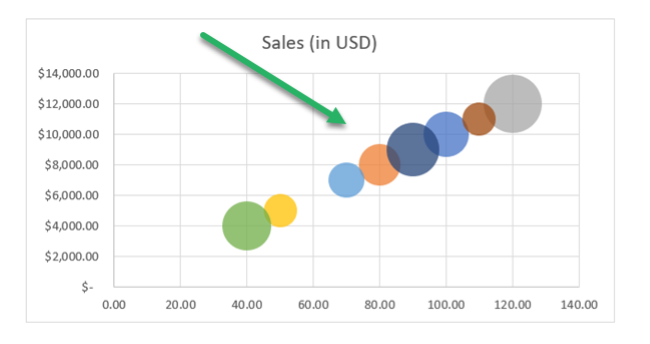
Note how two data sets (units sold and sales) are plotted against the two axes. Whereas, the size of each product line is reflected in the size of the bubbles (note how the bubbles’ sizes vary) 👀
How did we create this? All these details follow in the section below.
How to create a bubble chart
Creating a bubble chart in Excel is easier than you think it’d be. Let me take you through the steps to be followed to create one, below.
So here’s the dataset that we want to plot graphically into a bubble chart👇
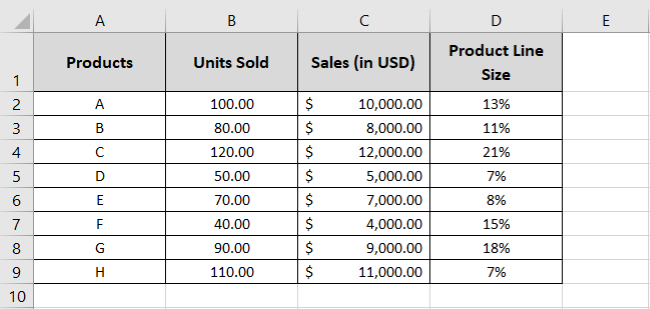
It has a list of products, and for each product, we have three sets of data to be plotted on a chart:
- Number of Units sold
- Sales (in USD)
- Product Line Size
To plot these on a bubble chart:
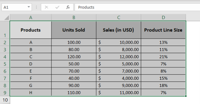
- Select the dataset (including the row or column headers).
- Go to the Insert tab > Recommended Charts.

- In the Recommended Charts window, go to the All Charts tab.
- From the pane on the left, select Scatter Plot.
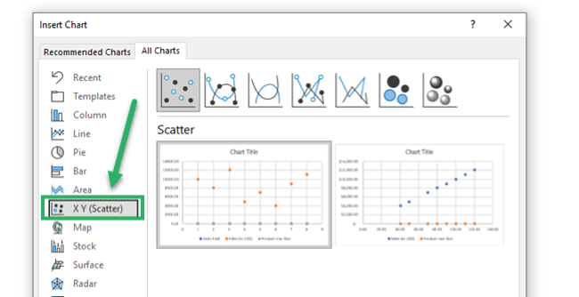
- From the different chart types under scatter plot, select a Bubble chart as shown below.
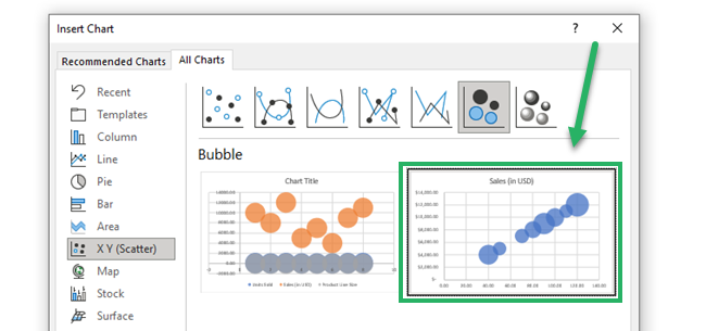
- Click okay to have it inserted in your sheet🎯
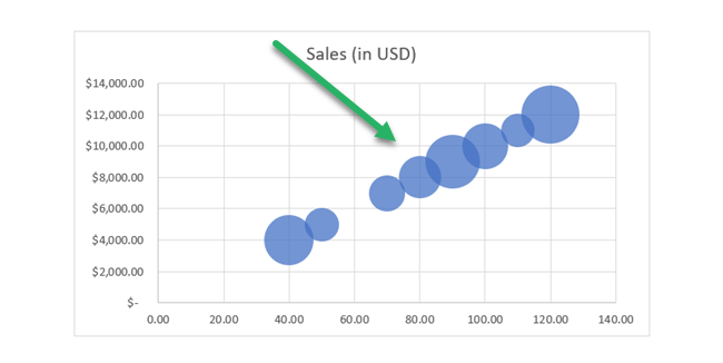
That’s how easily you can create a bubble chart in Excel.
Modify the bubble chart
We have already created a bubble chart in the section above – but that’s not it. That’s how a default bubble chart in Excel should look like.
There are plenty of ways how you can modify this chart in Excel. Let’s explore some of these ways now😎
Changing the colors of the Bubbles
Right now, we have all the bubbles on our chart in blue. And that’s not very appealing.
Let’s try changing the colors of all of these bubbles to distinguish each bubble. For that:
- Select (or click) on the bubbles on the bubble chart.
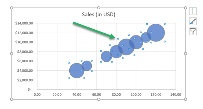
- From the Format Pane that launches to the right of the sheet, click on the Fill icon.
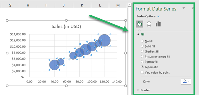
- Under the header Fill, check the option Vary colors by paint.
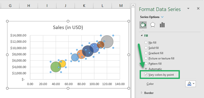
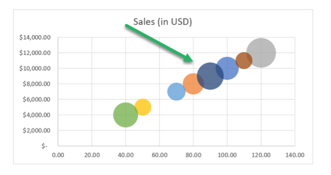
This will give a different color to each bubble as shown here🎨
Don’t want different colors but a uniform color that’s not blue?
- Select (or click) on the bubbles on the bubble chart.
- From the Format Pane that launches to the right of the sheet, click on the Fill icon.
- Under the header Fill, go to the option Color.
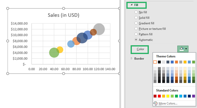
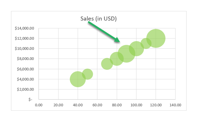
Select the color that you want to be applied to the bubbles. And all the bubbles would be colored similarly. For example, we are setting it to Green🌎
Format axes
Next on the list, formatting axes to change the shape of the chart.
- Double-click on the axis that you want to format. We are starting with the vertical axis.
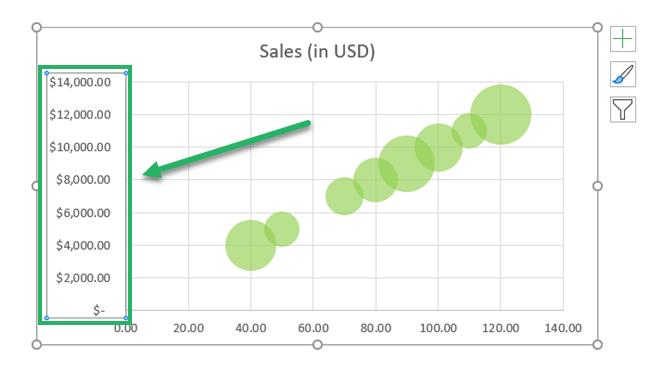
This will take you to the Format pane on the right.
The minimum bounds right now are set to zero. Whereas the maximum bounds are set to 14,000.
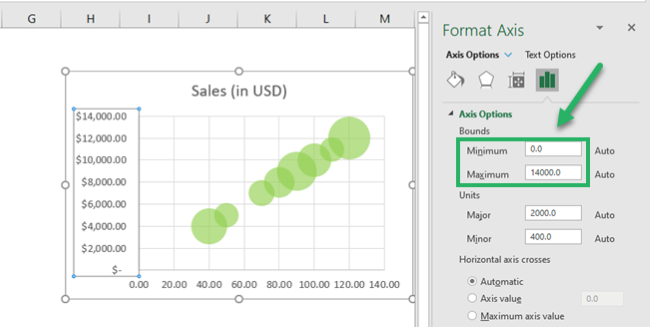
- Set the major units (the interval between the axis) to 3000.
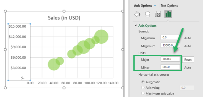
And here are the results. This makes the graph look cleaner and wider😍
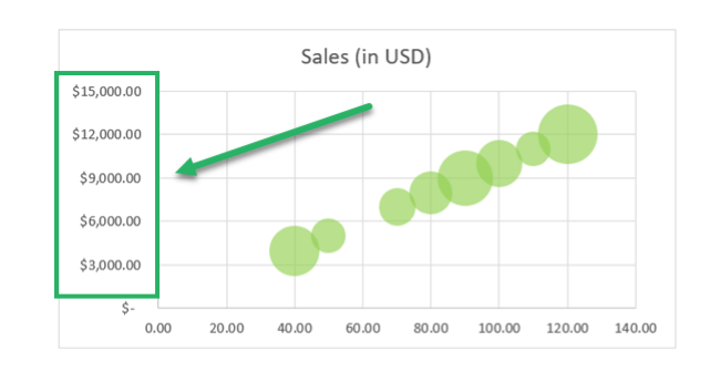
You can similarly make edits to the X-axis.
Adding Data Labels
Everything’s good, but it’s hard to understand which bubble represents which product. Isn’t it?
It’d get a lot easier to read the graph if it had Data Labels to it. So let’s add them right now🔖
- Select (or click) on the bubbles on the bubble chart.
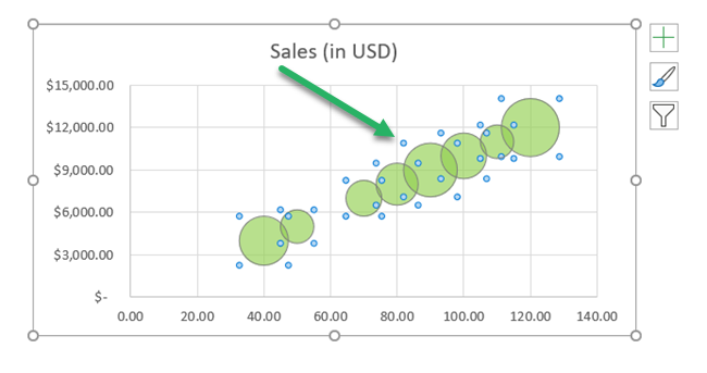
You’d see three icons appear to the right of the chart.
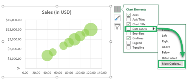
- Click on the Plus Icon (chart elements).
- From the context menu that launches, hover your cursor around Data Labels.
You’d see a small arrow appear next to it.
- Click on this arrow > Go to More options🔎
- Go to the Series Icon > Label options as shown below.
- From the header Label Options, check the option Value from Cells.
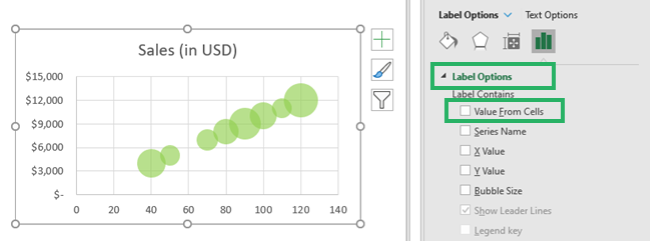
Make sure all other options from the Label options are unchecked. We only want the Value from Cells to appear as data labels inside the bubbles. And nothing else❌
- As the Data Label Range, select the cells that contain values to be displayed as labels. We are referring to A2:A9 – the product names.
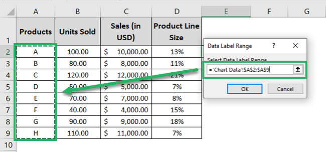
- Hit Okay. And the chart changes as follows.
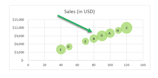
Note the labels (A, B, C) in the Bubbles. The bubbles on the bubble chart now show the name of the product they represent.
This way you can easily tell which Bubble is representative of which Product. This makes it easier to read the chart📝
For example, I can now look at the chart and tell that Product C represents the biggest product line. Then comes product G, product F and so on.
Pro Tip!
Adding data labels helps analyze the data better and visualize all three datasets together📊
For example, after the data labels have been added, a quick glance at the graph tells the following details about Product C:
- the greatest number of units sold (i.e. 120);
- the highest sales (i.e. USD 12,000);
- and the biggest product line size of 21%.
And that’s not it – there are so many more ways how you can edit your Bubble chart to your liking. Add colors, resize it, format the axes, and labels, and do so much more✨
The opportunities with Excel chats are endless.
That’s it – Now what?
That’s all about creating a bubble chart in Excel.
Once you know what runs at the backend of this chart (and how it deals with three datasets together), it begins to make much more sense than before.
Just like the Bubble chart, Excel offers a wide variety of other charts, tools, and functions. If you are on the journey to master Excel, you must not miss out on Excel functions.
And as there is a whole library of them (a very huge library), we suggest you begin learning the core functions first. Like the VLOOKUP, SUMIF, and IF functions.
Other resources
If you enjoyed learning about making bubble charts in Excel – we bet you’d love to know about other chart types offered by Excel too. There are many of them.
Learn about all the charts offered by Excel in our blog here.
