How to Make & Use a Pie Chart in Excel
(Step-by-Step)
A pie chart is based on the idea of a pie – where each slice represents an individual item’s contribution to the total (the whole pie).
Unlike bar charts and line graphs, you cannot really make a pie chart manually. This is because it is hard to draw slices that accurately represent the weight of each item of a data set.
However, Excel allows you to create a wide variety of pie charts (simple, 2D, and 3D) easily and speedily.
To learn how to create and modify pie charts in Excel, jump right into the guide below. Download our free sample workbook here to tag along with the guide😎
Table of Contents
How to create a pie chart
Creating a pie chart in Excel is super easy. For instance, take a look at the data below.
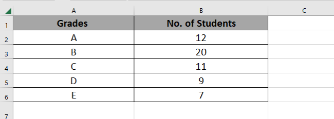
The data shows different grades achieved by students on a test.
Right now, we can see 12 students scored an A, 20 students scored a B, and so on.
But can we readily tell which grade was scored by most of the students? A pie chart will help us do that. See here how.
- Select the data.
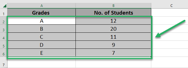
- Go to the Insert Tab > Charts.

- Select the pie chart icon.
What is that doughnut-like shape next to the pie chart icons? That’s a doughnut chart.
A pie or doughnut chart is just the same. The only difference is that a pie chart looks like a pie🥧 and a doughnut chart looks like a doughnut🍩
- From the drop-down menu, select the type of pie chart. For now, let’s go with a 2D pie chart.
- And here comes a 2D pie chart.
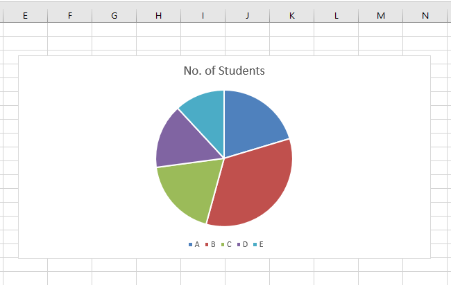
Seeing the pie chart, we can clearly tell that most of the students scored a B grade.
That’s because Grade B is represented by red color and the biggest slice of the above pie is the red slice.
The next biggest is the blue slice (which means Grade A). Then comes the green slice (Grade C), the purple one (Grade D), and so on🔍
A Pie chart plots the data graphically and makes it so much easier to decipher it, doesn’t it?
Pro Tip!
Select the chart > Click on the Plus Icon on the top right of the chart > Add Legends.
This adds a quick color key to the pie chart that tells which color represents what. Like the small grade icons at the bottom of the chart above.
Each box tells which color represents which grade. You can add these to enhance the readability of your pie chart 🎉
How to modify a pie chart
Don’t like how the above chart looks like? No worries – there are plenty of ways how you may edit it to fit your needs.
Chart Style
The easiest way to change the looks of your pie chart in Excel is to apply a different chart style to it. To do so:
- Select the chart (you will see white circles on its corners and sides when selected).
After the chart is selected, two new tabs will appear on the ribbon. The ‘Chart Design’ and the ‘Format’ tab.

- Go to the Chart Design Tab > Charts Styles.
- Scroll through the chart styles that appear in the Chart Styles group to find the one for your chart.

- Once chosen, click on that chart style to have it applied to your chart.
Just like we did here.
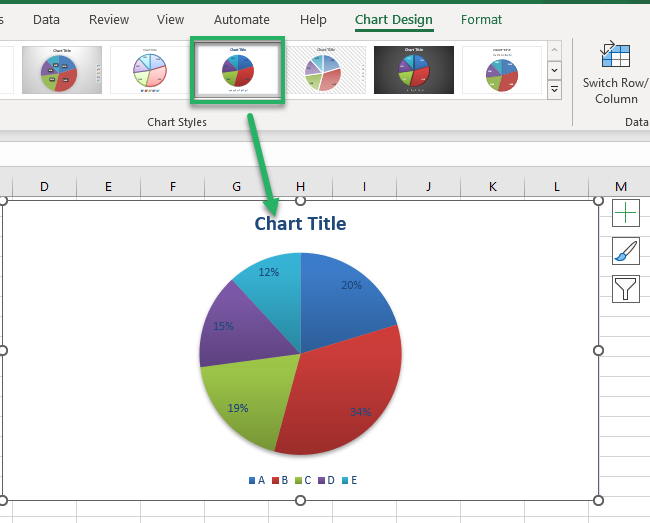
Note how each slice displays its percentage value under the chosen chart style.
Different styles offer different looks to your chart; you can apply any of them by simply clicking on them👆
Chart Colors
The charts’ colors are just too boring? We heard you and here’s how you can fix the colors of your pie chart in Excel.
- Select the chart.
- Go to the Chart Design Tab > Chart Styles > Change Colors.

Click on it and you will see a menu of color palettes before you.
- Hover your cursor on any color palette to preview how it looks when applied to the chart.
Here’s how our pie chart looks in tones of blue and green.
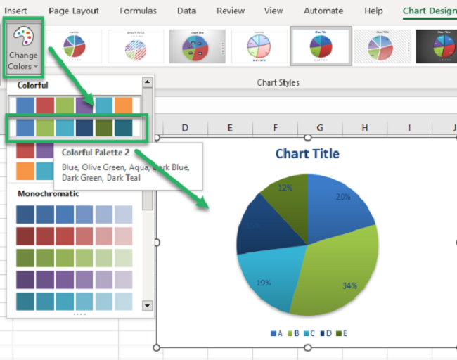
- Once you’ve chosen the right color palette for your pie chart, click on it and your chart would be recolored.
Data Labels
A chart without labels can not only be boring but hard to understand too.
To add data labels to your chart:
- Select the chart by clicking on it.
- Click on the plus sign appearing at the top-right corner of your chart.
- From the Chart Elements drop-down menu, check the box for Data labels.
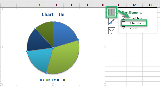
This adds data labels to each slice of the Pie Chart, as shown below.
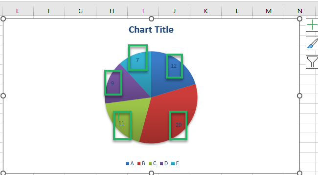
Each slice now contains a number. This is the number of students who scored any particular grade. For example, the red slice tells that 20 students scored a B grade🅱
This is not it – to further format the data labels of your pie chart:
- Right-click on the pie chart.
- From the context menu, choose Format Data Labels.
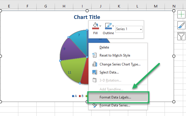
This takes you to the Format Data Labels pane.
- Choose from the variety of options for Data Labels from the “Label Options” as shown below.
Like do you want each slice to show the Grade along with the percentage proportion of students who scored that grade?
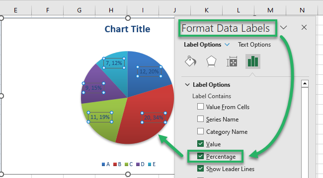
Chart Title
Every chart needs a title to tell the readers what’s coming their way. To add a title to your pie chart in Excel:
- Select the Chart.
- Click on the Plus sign that appears at the top right of the chart.
- Check the box for “Chart Title”.
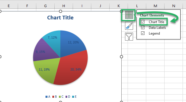
- Give any name to your chart by typing it in the title box as shown below.
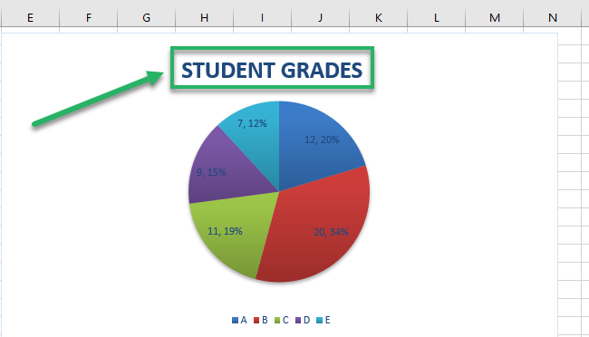
Chart Layout
Excel offers many in-built layouts for pie charts✌ To change the layout of your chart:
- Select the pie chart.
- Head to the Chart Design Tab > Chart Styles Group > Quick layout.
This launches a drop-down menu of options for the layout of your chart.
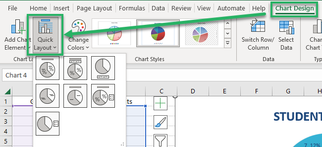
- Hover your cursor around different layouts to have a quick preview of each.
- Click on any layout to have it applied to your pie chart.
For example, here’s how the layout of our pie chart changes under the first layout style.
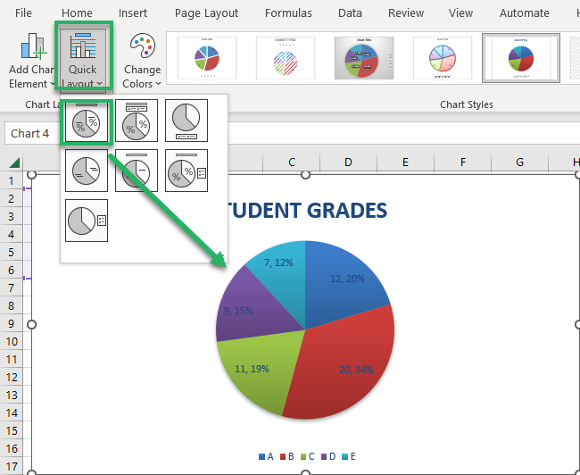
We now have each grade written inside the slice along with the percentage proportion of students who scored that grade.
Change Slice Angle
Changing the slice angle rotates the slices in the pie chart🍕 To do so:
- Right-click on the pie (the pie itself and not the space around it).
- From the context menu of options, click on Format Data Point.
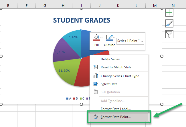
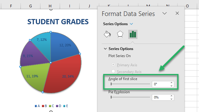
This takes you to the Format Data Series pane.
- Look out for the Series option > Angle of First Slice.
- Increase the value of the “Angle of the first slice” by using the arrows. Or you can manually add a value to it.
As you increase the value, the slices of the pie chart start moving in an anti-clockwise direction.
For example, we have increased the angle value from 0 to 88, and the slices have accordingly rotated anti-clockwise.
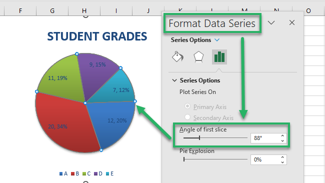
Chart Area
Don’t want a simple and dull white background to your pie chart? Here’s how you can change it.
- Right-click anywhere on the chart.
- From the context menu that opens up, click on the “Format chart area” option.
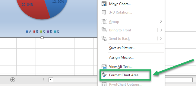
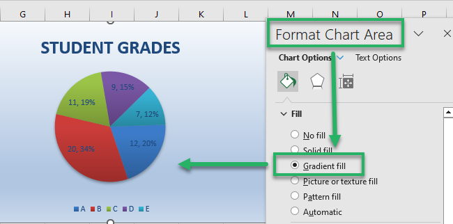
This takes you to the ‘Format chart Area” pane.
- Look out for several color-filling options under the Fill header. And choose the one that suits your needs.
For example, how do you like the icy-blue gradient fill look that we just tried below🥶
When to use a pie chart
Okay, it is really simple to make and edit a pie chart. But why would anyone even use a pie chart🤔
A pie chart is your go-to chart when you want to:
- Provide the readers with an easy-to-understand graph (like the breakup of financial figures).
- Show both value and proportion of different items in a dataset (pictorial representation of categories).
- Offer less explanation and a better graphical representation.
And most importantly, when your data set has a single variable to be plotted. Pie charts are meant to plot a single data series only.
Pro Tip!
A pie chart has slices that show the proportion of each item to the total. But what if the slices get too many and too thin? Such a pie chart will only be a mess with little value to offer.
A pie chart is ideal for data sets where you have at most seven categories to display7️⃣
That’s it – Now what?
Until now, we’ve learned to create a pie chart in Excel alongside several ways to modify it.
A Pie chart for sure is an easy and helpful graphic tool. But that’s only one chart type from the vast library of charts in Excel.
And to your good, in addition to charts, Excel has tons of other functions to offer too. Some of these functions include the VLOOKUP, IF, and SUMIF functions.
Those 3 functions are on my personal top 10 list of the most important functions in Excel. And IF is actually my favorite function of all time.
Want to learn them already? Enroll in my 30-minute free email course to learn these and many more functions of Excel😉
Other resources
But don’t just stop here!
There’s so much more that you can do to your charts in Excel. Like adding axis labels to charts and saving charts as images.
