Best Practices for Using Power BI (Design, Reports, etc.)
Power BI is one of the most powerful and commonly known data business intelligence tools.
It has a user-friendly interface and robust functionality – both of which, empower businesses to leverage it to make data-driven decisions easily 🚴♀️
But, to create effective and efficient Power BI reports, you must know some key tips to make the best out of Power BI. And many of them can help you to maximize your performance.
Let me walk you through these best practices through the tutorial below.
1. Sort the Data
This is something you’ll find very basic but, many BI users stumble upon this point.
Each report is ultimately prepared out of data. To create a reliable report, you must have your data sorted 🙏
Power BI offers multiple tools to clean data (removing duplicates, filling in missing values, standardizing formats, etc.). Cleaning data prevents error, and with only the relevant data at hand, you get better processing speed.
However, Power BI is not meant for authoring data, so it is not even the best choice for sorting data. It is advisable to load sorted data to Power BI (for example, sort it in Excel and then import it to Power BI).
Structuring your visuals on cleaned data ensures the visuals you create are depictive of accurate information 🧹
2. Import Only Relevant Data Fields
The story doesn’t end with cleaning your data before importing it to Power BI.
Sometimes, your data might be sorted and in perfect shape, but you might not need the whole of it in Power BI.
In Power BI, importing unnecessarily large amount of data is not a safe option, frankly speaking. Irrelevant fields can slow down the responsiveness of Power BI and clutter your reports 🏃♀️
Here’s how you help it.
When you import data in Power BI, only select the essential columns and tables, that you’ll need for your visuals and uncheck the rest.
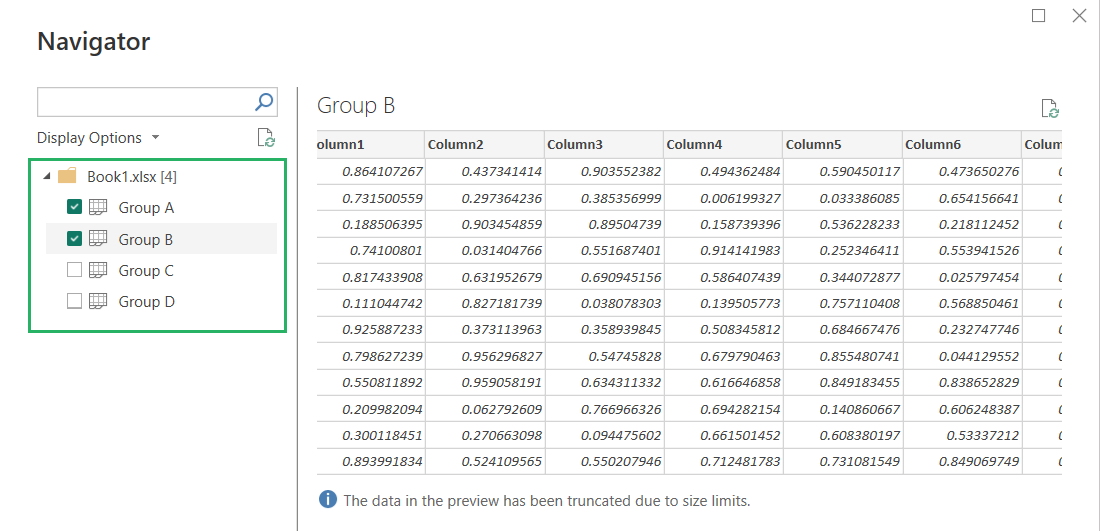
Use Power Query Editor to filter out irrelevant data while you’re importing. A targeted approach is important to keep Power BI going fast without hiccups, especially for large datasets and complex dashboards.
3. Optimize DAX Calculations
DAX stands for Data Analysis Expressions.
It is the calculation language of Power BI. Many would think it’s programmed to be a little too advanced but, believe me, it’s not 🔢
Efficient usage of DAX calculations can help you improve your report performance significantly.
Note that this also works the other way around. Poorly written or overly complex DAX formulas slow down Power BI functioning.
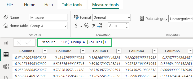
While you write up a DAX function, go as simple as possible. Be wise to use variables and aggregations to reduce the processing time. DAX formulas are like the powerhouse of Power BI – they enhance speed and allow accurate calculations but, only if written correctly.
4. The Right Visuals
The Power BI visuals are stunning if anything.
But let that not be enough justification for them being added to your report. Looking good is not equivalent to being effective 🖼
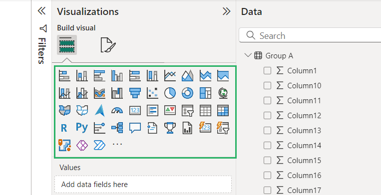
Choosing the right visual that won’t clutter your report but would effectively represent data is a task, and here’s how you can ace it.
- Understand your data type. Is it categorical, geographical, time-series hierarchical? Choose the visual that pictures it effortlessly.
- Define the purpose of your visual before you drag it to the canvas. Do you want to show a comparison of data, distribution of data, or composition of data?
- Use color to draw attention to specific data points, trends, or comparisons.
- Use tooltips and drill-through features to allow users access to supplementary data as they need it. This keeps the visual clean and data a cursor hover away.
- Use gauges or KPI cards to draw attention to metrics at a glance.
Being creative is cool but, don’t go off-roading with visuals by over-adding elements or colors to them. Simpler visuals are often more effective.
Coming down to the right visual in Power BI is not only about aesthetics. Make sure the visuals you create are readable and understandable from your target audience’s POV 🕶
5. Standardize Colors and Themes
This is something that I’ve seen in hundreds of reports. A poorly selected color theme can crush the core purpose of a Power BI report.
Your color theme is your game. Play it strong 🎨
Consistency in colors and themes across your visuals builds a professional and cohesive report that will now buzz users off.
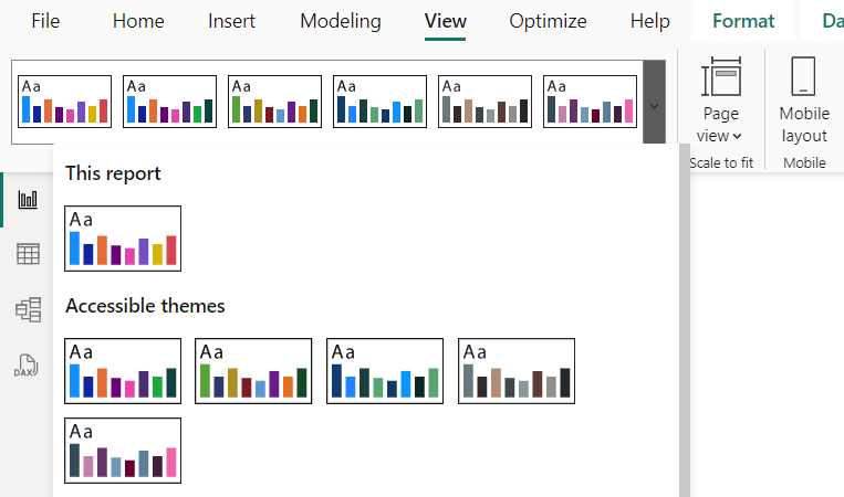
Power BI offers a variety of custom themes (including pre-designed ones) for you to choose from. This helps reinforce branding. However, if you choose to go with a color palette of your own, make sure it is consistent across all the visuals and pages of your report.
Consistent color-coding across visuals, such as using red for declines, yellows for averages, green for growth, and so on makes it easier for viewers to interpret data intuitively 🖌
A standardized theme also ensures that each report follows a uniform style and coherent data flow, which is crucial for business reporting.
6. The 8-10 rule of reports and dashboards
Power BI Visuals are a cool way to present data insights but, make sure they don’t overwhelm the data beneath.
You heard that right. Adding too many visuals to your Power BI report can slow down its performance. And it might also draw attention away from what’s important 8️⃣
To help this problem, remember and follow the 8-10 Rule of Power BI Reports and Dashboards.
What’s that?
- When creating reports in Power BI, use no more than 8 visuals per report page.
- When creating dashboards in Power BI, use a maximum of 10 tiles.
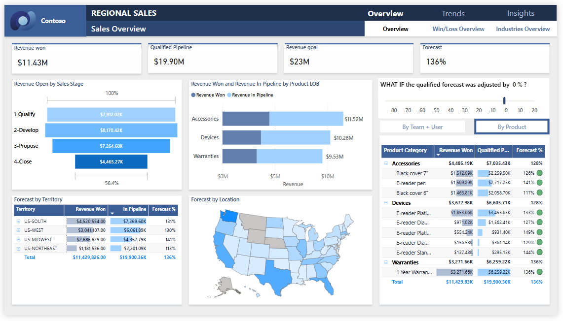
Simple enough?
The above count ensures your reports/dashboards are not overdone.
Readability and Understandability checked ✅ This also enhances user experience.
Ever wondered why Microsoft’s Power BI free templates seem perfectly balanced? Pay close attention to see if they follow the same rule. There are no more than 5-7 visuals per report page in their templates.
7. Use Tooltips and Drill-Throughs
Tooltips in Power BI are small pop-up boxes that appear when users hover over data points on a visual.
Looks like below:
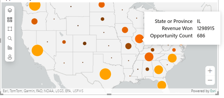
Whether you want to add them and what information should they supply is what you decide.
If you want to provide users with additional contextual information without cluttering the main report – use tooltips instead of adding more and more to the visual. Users can explore deeper insights or specific details for individual data points by hovering over the visual, and the relevant tooltip will pop up ⛳
Tooltips are super useful for offering interactivity and some supplementary information unobtrusively.
Similarly, Drill-throughs in Power BI allows users to “drill” from one report page to another to explore more detailed information about a specific data point or category.
It is a category of Power BI filters. A visual presents consolidated information for many data points.
If you want to allow users to go deeper into a single data point from a visual, using a drill-through filter will bring them all the information for that data point on a separate report page 🍾
This allows users to navigate deeper into the data without cluttering the main report page, making them an essential tool for data exploration.
Tooltips and drill-throughs are excellent ways to allow users more information (as and when needed) without decluttering the main report page.
8. Enable RLS (Row-Level Security)
Row-Level Security (RLS) in Power BI is a feature that restricts data access for specific users (based on their roles) by applying filters to the dataset at the row level.
It controls the data rows that users can view based on their roles/attributes. Very valuable for organizations that seek data confidentiality while they create and share the same report with a variety of users 🔐
One of the benefits of RLS is that it makes the design and coding of your application’s security simpler and easier.
When it comes to RLS, it’s recommended that you:
- Create a separate schema for the objects, predicate functions, and security policy
- Avoid type conversions
- Avoid recursion in predicate functions when possible
- Avoid using excessive table joins in predicate functions
- To do this, all you need to do is define the roles and rules of your users.
In Power BI Desktop, you can define roles like that of a “Manager” or a “Regional Salesperson” and apply DAX filters to restrict data based on criteria relevant to each role.
For example, you can set up an RLS filter to allow a regional sales manager to see only sales data for their assigned region from a report.
When RLS is enabled, Power BI would only take and import the data the user is authorized to view.
RLS sheds the load off an organization to create multiple reports for multiple users or compromise data confidentiality.
9. Only use Certified Custom Visuals.
Power BI has a great library of visuals.
But with all due regret, it doesn’t have all the visuals. And for some visuals, you’ll still have to see the marketplace 📷
For example, the histogram chart. A very common one but, unfortunately, Power BI doesn’t have it built-in yet.
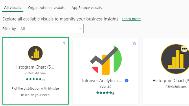
But here’s the good news. The built-in Power BI visual library isn’t the end of it.
You can get additional visuals from the marketplace that has custom visuals made by third-party individuals and companies.
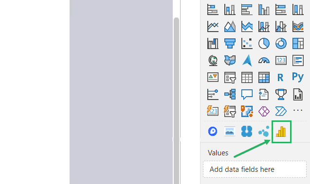
However, hold your guard high 🛡
Visuals that you get from the internet bear the risk of data leakage, viruses, malicious data injection, and more. They might not even perform very well.
The solution:
Even when you seek visuals from the marketplace, only use Microsoft-certified custom visuals. Microsoft performs lots of tests on visuals and makes sure they don’t do anything malicious.
10. Avoid bi-directional and many-to-many relationships against high cardinality columns.
Bi-directional relationships in Power BI form between two tables that are related in both directions. This means that the record in one table bears references to multiple records in another table.
Whereas, many-to-many relationships are where multiple records in one table relate to multiple records in another table.
In Power BI, avoid creating bi-directional and many-to-many relationships unless necessary. Especially for high-cardinality columns, this might create complex relationships requiring significant resources to process and store 📖
High cardinality columns are those that have many unique values, like reference numbers, ID card details, etc.
Instead of creating bi-directional and many-to-many relationships, it is advisable to break such relationships into one-to-many tables or create intermediate tables. This reduces joins and helps you manage data in a more scalable way.
Conclusion
We have put forth the 10 best Power BI best practices that you can adopt to enhance your Power BI experience.
These practices will not only help you improve your performance but also add more clarity to the insights Power BI brings you 💪
Focus on clean data, optimized calculations, and only the very relevant visuals, and focus the right amount of attention on the deserving visuals. This helps you deliver impactful reports and support data-driven decision-making.
Sticking to these practices ensures you leverage the full potential of this business intelligence platform. If you found this article interesting, make sure you check out the following related blogs by Spreadsheeto, too.
