Add Secondary Axis in Excel: Two Y Axis Chart
A chart with an x-axis and a y-axis is fine. But how cool would a chart with three axes 3️⃣
The third axis here will be the secondary y-axis (that comes to the right side of the chart). It helps analyze the data plotted on the chart.
Good news! It is super easy to add a whole new y-axis to your chart in Excel 🚀
Stick to the guide below to learn how to do that. Here’s the free sample workbook for this guide for you to download and practice with us.
Table of Contents
Why add a secondary axis?
A secondary axis will make that ‘bizarre-to-understand” chart all the more understandable 😵
Why should you add one to your chart?
It will make more sense if I show you how this works. So, here we have the demand and sales of different products.
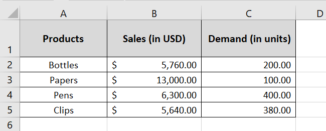
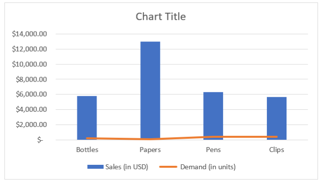
If we make a simple chart out of it, here’s how it will look.
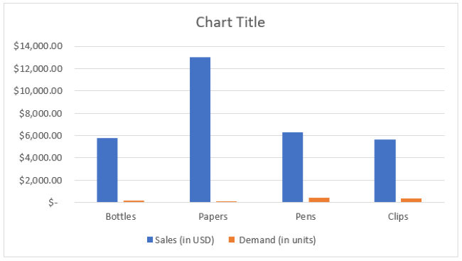
Sales are represented by blue bars. Whereas, the demand is shown by that orange line that touches the x-axis.
It’s hard to plot demand and sales together on the same axis. That’s because sales go in thousands of dollars, and the demand is merely in units 💲
However, what if we change the chart to look like below?
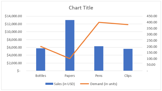
What’s different about it? We have added a secondary vertical axis to the right side of the chart. It represents the demand separately.
You can now readily see the values for demand plotted on the graph. And you can see how the figures have moved. Guess that tells why to add a secondary axis ✌
Add a secondary axis with Recommended Charts option
The first and easiest way to add a secondary axis to an Excel chart is by inserting a chart that by default offers a secondary axis.
What does that mean? See here 👀
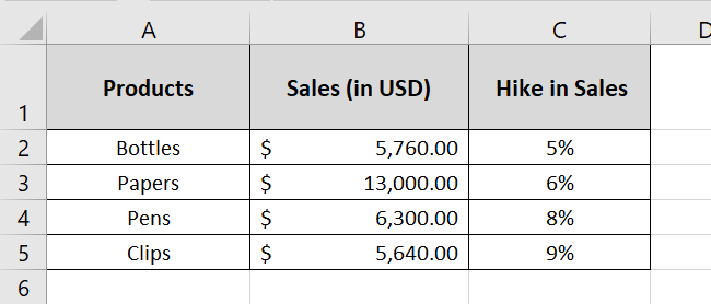
The image here has a data set with three columns: product, sales, and hike in sales.
- Select this dataset.
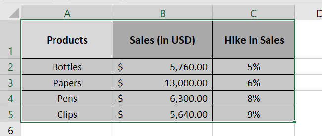
- Go to the Insert tab > Recommended Charts.

- Scroll the charts recommended by Excel from the pane on the left 📜
- Choose the chart where you see a secondary axis in the preview window.
In our example, this is the clustered column chart 📊
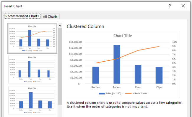
So we are selecting it. And here we have a chart with a secondary axis added to it automatically 😍
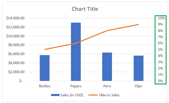
Add secondary axis manually
If not automatically, you can always add a secondary axis to your chart manually🏃♀️
This will usually be the case when none of the charts recommended by Excel show a secondary axis.
Yes, that’s very much possible. For example, here is the data with three columns again: the products, sales, and demand.

But both the numeric data columns (sales and demand) are simple integers so Excel plots them both on the same axis.
And so, we don’t have a secondary axis in any of the recommended charts this time 🤷♀️
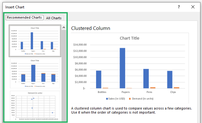
Excel only represents the second dataset with another color. And very clearly, we cannot read the figures it represents.
If that’s the case you’re facing, don’t worry. You can insert a secondary axis in your chart manually. How? See here.
- Insert the basic chart from the recommended charts (without a secondary axis).
Here’s how it looks.
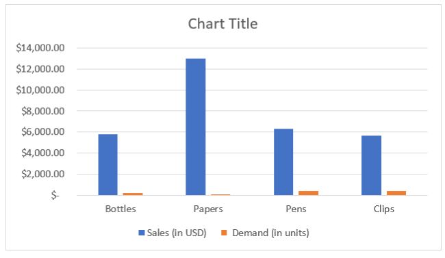
Looks weird, I know. We will just put it back in place 💪
- Double-click on the small orange bars at the bottom.
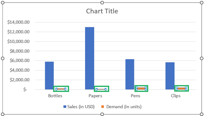
You’d be taken to the Format Data Point > Series Options as shown here.
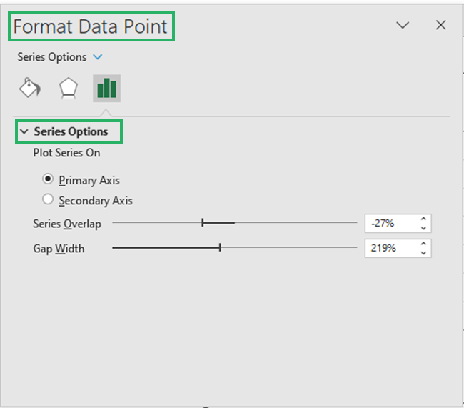
- Check the option Secondary Axis.
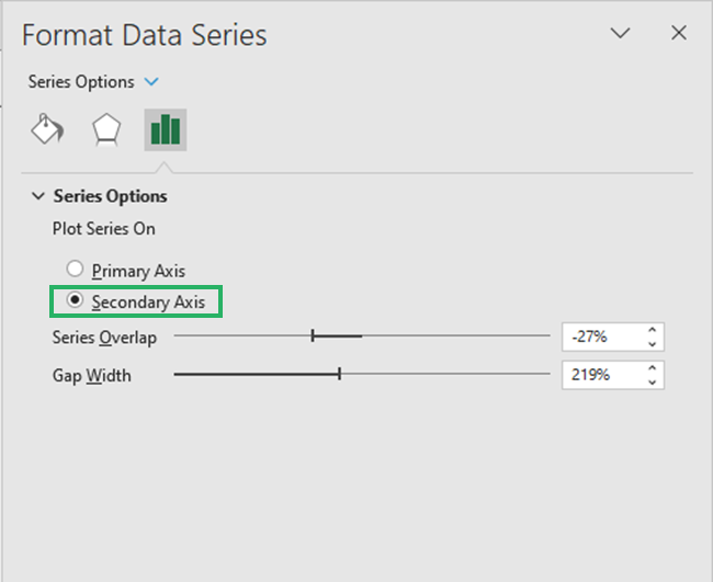
And here comes a new axis to the right of the chart.
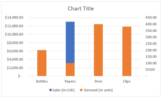
But the chart is now stacked. The orange bars resonate to the secondary y-axis.
Whereas, the blue bars resonate to the primary y-axis.
If you don’t want it to be a clustered chart but a different one, you can change it through the following steps ✍
- Select the chart.
- Go to the Insert tab > Recommended Charts.

- Under the Change Chart Type dialog box, select the tab All Charts
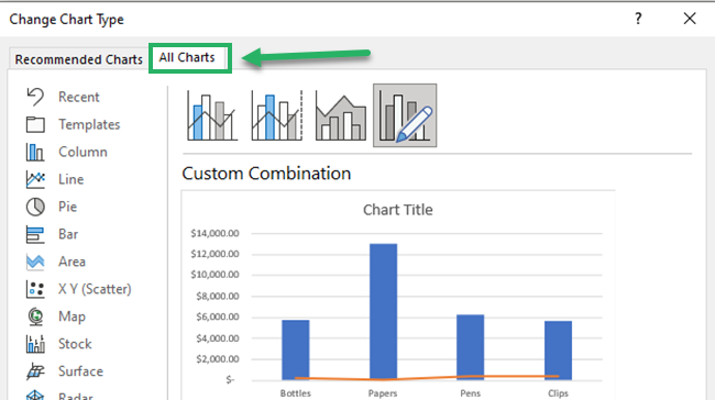
- From the list of charts on the left, select Combo Charts.

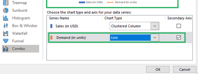
This window allows you to select the chart type for each axis.
We are setting Demand (in units) as the secondary axis by checking the arrow next to it.
- For the chart type, click the drop-down arrow next to Demand (in units) and select the desired chart type from this list of charts.
We are selecting a line graph. This can be any chart (your call totally).
- All done. Click Okay.
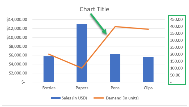
Here comes the chart with a secondary axis on the right. A line chart is made on the chart that graphs the demand (in units).
Pro Tip!
Read out the stats for the product ‘papers’ from the chart. The column chart (represented by blue bars) touches $13,000 on the primary y-axis, so we know the sales of papers are $13,000.
And the line chart for Papers goes down to 100 on the secondary axis (on the right). This tells us the demand for papers is only 100 units.
That’s how easy it is to read data points with a secondary axis 🧐
Remove the second axis
Removing the secondary axis is twice as easy as adding it to a chart in Excel.
Let me walk you through the steps for removing the secondary axis from a chart in Excel 🎯
So here’s our chart with a secondary axis.

To delete it:
- Select the secondary axis.
- Right-click on it to launch the context menu as follows.
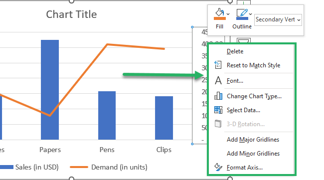
- Click on Delete.
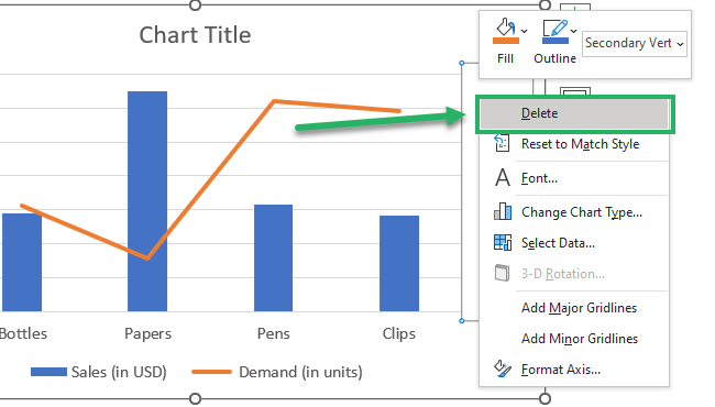
And whoosh! The secondary axis is gone ❌

Note that as the secondary axis is deleted, the orange line is also plotted on the primary y-axis 📈
Another way how you can do this is here:
- Double-click the chart plotted on the secondary axis. The orange line on our chart is plotted on the secondary axis.
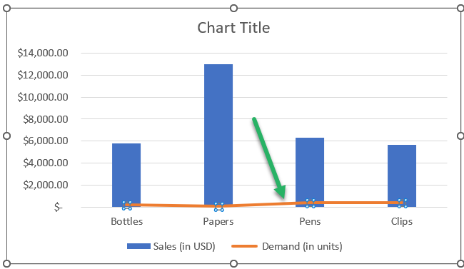
You’d be taken to the Format Data Point > Series Options. The option for Secondary Axis would already be checked.
- Check the option Primary Axis.
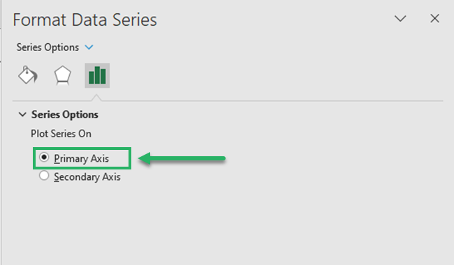
The results are again the same 🔔
That’s it – Now what?
This is all about adding a secondary axis in Excel ( by default and manually) and removing it. Hope you found that easy and very useful.
Excel takes the edge as one of the most versatile spreadsheet programs because of the various chart types offered by it. And not only charts, but Excel offers many more tools, features, and mind-boggling functions, too 📝
Some of my favorite functions from Excel include the VLOOKUP, SUMIF, and IF functions. These key functions will take your spreadsheeting game to the next level.
Want to begin learning them? Click here to register for my 30-minute free email course that will teach you these (and many more) Excel functions now.
Other resources
Charts are one of the most used tools of Excel.
And to your good, Excel offers a huge variety of basic 2-D and 3-D chart types. Want to explore them all? Hop on here to read about all chart types offered by Excel.
