How to Switch X and Y Axis in Excel
(Flip Chart Axes)
Knowing how to switch the x-axis and y-axis in Excel will save you a lot of trouble.
![]()
Microsoft Excel is powerful spreadsheet software that will let you store data and make calculations on it. You can then visualize the data using built-in charts and graphs.
However, there are times when you have to switch the value series of the chart’s axes.
And if you don’t know how, your only choice is to exchange the columns or values manually.
Download the sample workbook here to tag along as you read this guide.
In this article, we’ll show you how to switch x and y axes in Excel.
Table of Content
The X-Axis and Y-Axis
Most graphs and charts in Excel, except for pie charts, has an x and y axes where data in a column or row are plotted.
By definition, these axes (plural of axis) are the two perpendicular lines on a graph where the labels are put.
Here’s an example of an Excel line chart that shows the X and Y axes:
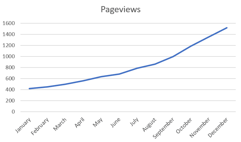
The x-axis is the horizontal line where the months are named. The y-axis is the vertical line with the numbers.
Why switch the axes
There are times when you have to arrange the variables in the spreadsheet before making a chart out of them.
Like in the case of making a scatter chart. It’s recommended that the independent variable should be on the left while the dependent variable should be on the right.
But of course, that’s not general knowledge. So chances are, some people would have swapped them.
This is just one example of a scenario where knowing how to switch axes would come in handy.
In this tutorial, we’ll borrow this data set from the scatter plot tutorial where the values in the left (B) and right column (C) isn’t the recommended arrangement.
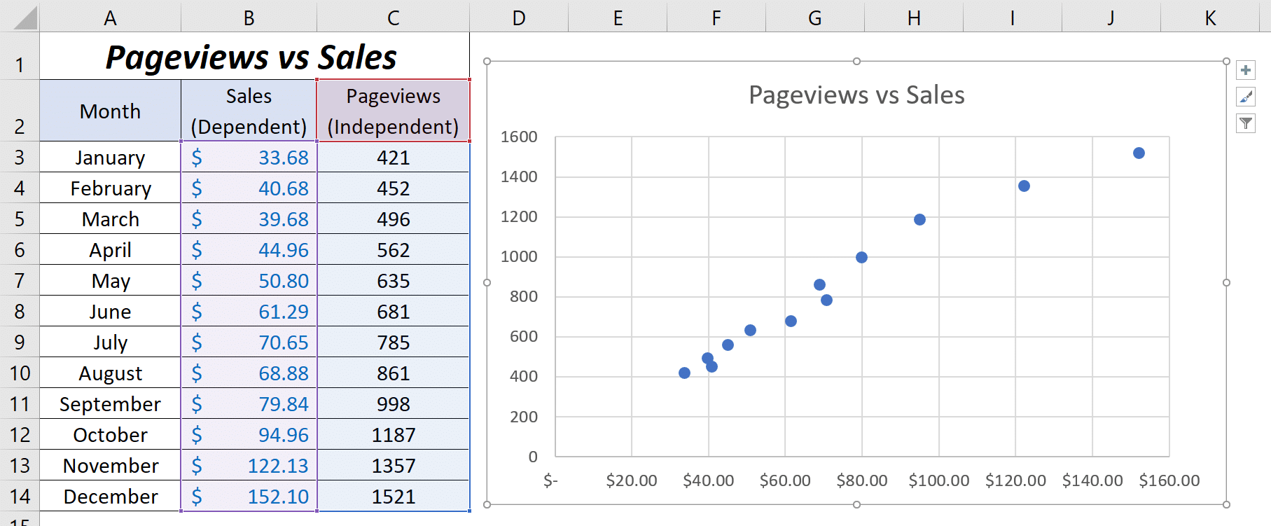
The chart still works. However, the “Pageviews” value series should be on the y-axis (horizontal line) while the “Sales” value series should be on the x-axis (vertical line).
How to switch the x and y axis
If you don’t know how to switch the axes, you would’ve deleted the chart and copy-pasted the contents of columns B and C to exchange the values.
There’s a better way than that where you don’t need to change any values.
First, right-click on either of the axes in the chart and click ‘Select Data’ from the options.
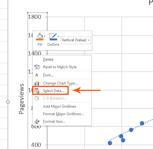
A new window will open.
Click ‘Edit’.
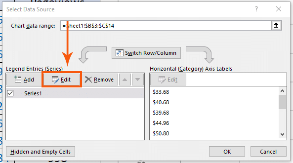
Another window will open where you can exchange the values on both axes.
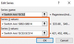
What you have to do is exchange the content of the ‘Series X values’ and ‘Series Y values’.
You can use notepad and copy the values. Then, simply paste them on each form.
Your goal is to change the values from this:
To this:
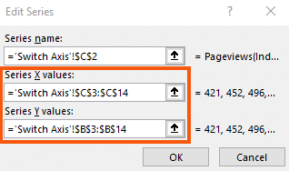
Once you do that, the value series on the axes would be swapped.
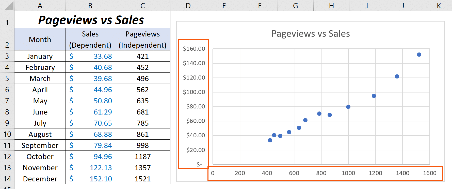
Notice that we didn’t change any values on the spreadsheet data at all. All we did was customized the chart.
That’s it – Now what?
You just learned how to switch x and y axis in Excel in a few minutes.
Microsoft Excel’s charts are so advanced that you can swap the horizontal axis values with the vertical axis values without touching the original data on the spreadsheet.
Pretty cool, right?😎
Now, charts are only useful if you have numbers to show. And those numbers are typically derived from some sort of calculation.
The best functions for calculations or helping with calculations are SUMIF, IF, and VLOOKUP.
If you want to learn those, please enroll in my free 30-minute online Excel course here. We’ll send it directly to your inbox📩
Other resources
While you’re learning about charts you might want to check out my huuuuge guide to all Excel charts (and how to use them).

