How to Change Axis Range in Excel
(Step-by-Step)
Charts are one of the most powerful features of Excel that help to visualize data and recognise trends and patterns.
The axis ranges of a chart are fixed by default and sometimes, they don’t align with our presentation needs. Luckily, you can easily change axis ranges in Excel.
By changing the axis range, you can better focus on specific points and improve readability. In this guide, we will see how you can change axis ranges from doing it manually to using VBA.
Download our sample workbook here to practice changing axis ranges in Excel.
What is axis range?
In Excel charts, the axis ranges refer to the minimum and maximum values displayed on the right and left axes of your chart.
The y-axis values represent the data values or difference between them whereas the x axis values represent the time intervals or categories of your data set.
Y axis values are displayed vertically on the chart and are numerical – these values are often the sales numbers, price or related data points from your data set.
X axis values are represented on the horizontal scale and tell about the type of data being represented. This would often include department, product names, etc.
You can change the axis range as you want – you can increase or decrease the difference between the y axis values.
Similarly, you can change the category’s position or which ones you want to show or hide – Excel charts give you complete control.
Let’s see how you can change the axis range in Excel below.
Change axis range
We use the chart’s format options to change its axis range.
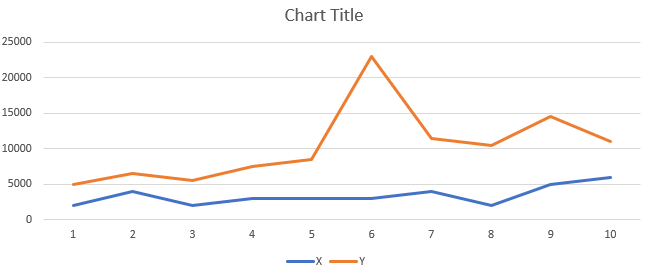
We will use the following Excel graph. We want to change the minimum and maximum values to 0 and 26000 with the major about 4000.
To do that,
Step 1) Select the chart to activate it.
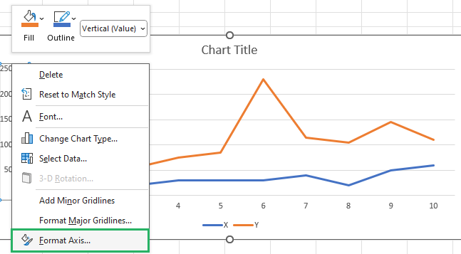
Step 2) Select the axis you want to edit.
Step 3) Right-click it and select Format Axis from the dropdown list that appears.
Step 4) The Format Axis pane will appear on the right side of the chart.
Step 5) In the pane, go to the Axis Options section.
Step 6) In the Minimum box, enter the minimum value you want in the y axis – in our case – 0.
Step 7) In the Maximum box, enter the maximum value – 26000
Step 8) Set the major unit to 4000.
Step 9) The minor unit value will be set automatically.
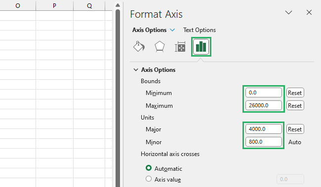
The minimum and maximum values refer to the first and last value of the y-axis. The major and minus axes refer to the difference between each value.
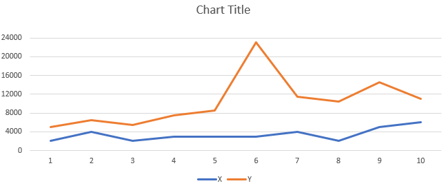
And it’s done! The Y Axis values of your chart will update as:
How cool is that?
Change vertical or Y axis values
If you mistakenly entered the wrong data range for y axis and want to change it, we’ve got a way to help you out there.
The first method you must have thought of would have been clicking the chart and selecting the data range again.
Sure, that is a way but changing the ranges after you’ve entered them can get a little confusing and complicated to handle.
Let’s explore a more effective method below.
We will use the same data set as earlier. We want to change the vertical axis values.
To do that,
Step 1) Click on the chart to activate it.
Step 2) Right-click the chart and a dropdown menu will appear.
Step 3) Choose Select Data from the options.
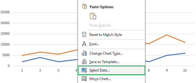
Step 4) The Select Data Source dialog box will appear.
Step 5) Under Legend Entries (Series), select Series1 button and click Edit.
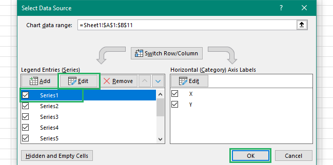
Step 6) A small Edit Series dialog box will appear on the screen.
Step 7) Under the Series name box, select the range you want to insert in y axis.
Step 8) Repeat the same for others.
Step 9) Press OK for the Series box and the Data Source box.

And it’s done! The y axis values will be replaced with the new range:

Smooth, right? You need to try it now!
Change horizontal or X axis values
You can change the horizontal axis values the same way we change vertical axis values with only a slight difference. Let’s see how to do that below.
We will use the same data set as earlier. We want to change the x axis values.
To do that,
Step 1) Click on the chart to activate it.
Step 2) Right-click the chart and a dropdown menu will appear.
Step 3) Choose Select Data from the options.

Step 4) The Select Data Source dialog box will appear.
Step 5) Under the Horizontal (Category) Axis Labels, select Edit.
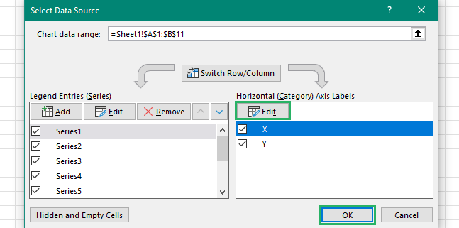
Step 6) The Axis Labels dialog box will appear on the screen.
Step 7) Under the Axis label range, select the new range.
Step 8) Press OK for Axis Labels and Data source box.

Voila! The previous horizontal range will be replaced with the newly selected x axis.
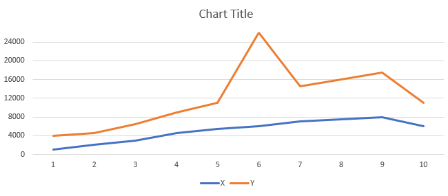
How easy does that look?
Switch X and Y axis
You can switch chart axes to customize the chart or increase clarity. Let’s see how you can switch the x and y axis of a chart in Excel.
We will use the same sample data as earlier.
To switch axes,
Step 1) Click on the chart to activate it.
Step 2) Right-click on the chart to open the dropdown menu.
Step 3) Choose the Select data option from the menu.

Step 4) The Select Data Source dialog box will appear on the screen.
Step 5) Click on the Switch Row/Column button to swap the axes.
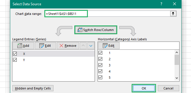
And it’s done! The x and y axis will be switched as:
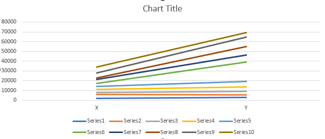
Make sure that your data looks readable and clear. If not, you can change the way values are displayed in whatever way you want.
Change axis range using VBA
Another way of changing axis ranges is to use VBA. It lets you automate different tasks – you can use it to automate adding new ranges in your axes. You can create a macro via VBA to do that.
We have the same sample data as earlier. Let’s see how to work with VBA below.
Step 1) Press Alt + F11 on your keyboard in the Excel file.
Step 2) The Visual Basic editor will appear.
Step 3) Select Module from the Insert tab.
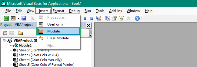
Step 4) Paste the following code into the window.
Step 5) Close the window.
Step 6) Press Alt + F8 to open the Macros window.
Step 7) Select the ChangeAxisRangeBasedOnDataset macro and press Run 🏃♀️
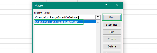
The macro will look for the axis range on the chart in the sheet. Once it locates it, the macro will change the axis ranges to the specified values in the code.
You can customize the code to fit your own values of the maximum and minimum and major and minor units.
This will be what the chart will look like after the axis ranges have been updated.

How fantastic is that? 😀
Conclusion
In this guide, we saw what axis range is and how you can change it. We also saw how you can individually change the x and y axis values of your chart.
Excel charts also allow you to switch the x and y axis values – this makes depicting the dataset on the chart easier and improves clarity.
We also saw how you can change axis ranges using VBA in Excel. Even though VBA is quicker, if you’re a beginner, it would be easier to use the other methods.
To learn more about Excel charts and how axis ranges work, read our articles below.
Add Secondary Axis in Excel: Two Y Axis Chart (2024)
List of All Excel Charts & How to Use Them (2024 Tutorial)
How to Create a Stacked Bar Chart in Excel (Easily)
We hope you enjoy reading this article as much as we did creating it!
