How to Make a Bar Graph in Excel – and Customize it
A bar graph is one of the most commonly used graphs in Excel.
Why?
Because they’re simple to create and super easy to understand.
Bar graphs help you make comparisons between numeric values. These can be simple numbers, percentages, temperatures, frequencies, or literally any numeric data.
Continue reading the guide below to learn all about making a bar graph in Excel.
Download our free sample workbook here to tag along with the guide 💡
Table of Contents
Create a Bar graph
A bar graph is used to display data in the shape of rectangular bars. It helps comparisons as you can readily compare the data by comparing the length of each bar.
Creating a bar chart in Excel has to be one of the easiest of all chart types. It only takes a few simple steps to create one. So let’s do it.
The data below represents the viewership of some top TV news channels 📺
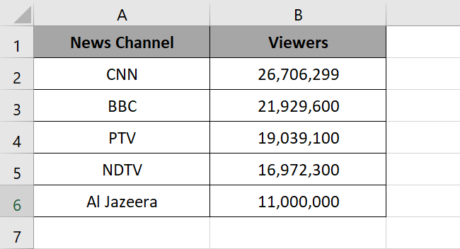
Nice numbers. But which channel has won the highest viewership?
Let’s see this in the shape of a bar graph. To make a bar graph in Excel:
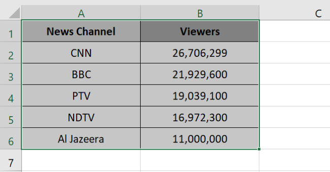
- Select the data to be plotted in the bar graph.
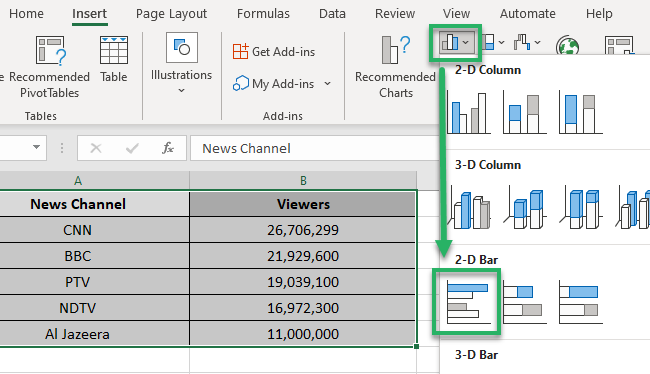
- Go to the Insert tab in the ribbon > Charts group.

You will see different chart types in this window.
- Click on the bar chart icon as shown below.

This will launch a dropdown menu of different types of bar charts.
- Choose the one you like.
For now, we will select a 2D chart.
Tada! Here comes your bar graph 📊
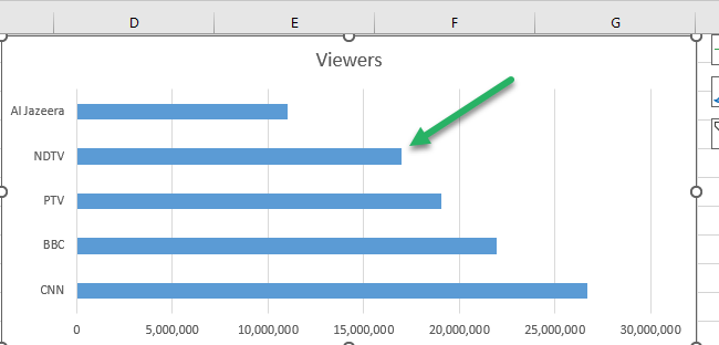
Note that the news channels are plotted on the y-axis. And the viewership is plotted on the x-axis of the bar graph above.
CNN seems like the winning channel with the longest bar of all 🏆
Customize your Bar graph
Bar graphs come with a variety of customization options.
Let’s look into each of them below.
Chart styles
Who said a bar chart necessarily has to be about standard blue bars? You can try out different chart styles to give your chart the desired look.
To change the style of your bar chart, go to the Design Tab > Chart Styles.
And choose any chart style from the different chart styles offered by Excel.

For example, let’s try out chart style 4.
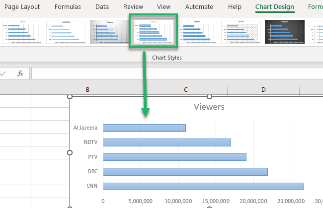
Chart colors
Adding new colors to the chart can change the way it looks.
To do this, go to the Design Tab > Chart Styles > Change colors 🌈

And select from the whacking variety of color palettes offered by Excel.
How about a bar chart with pink bars?
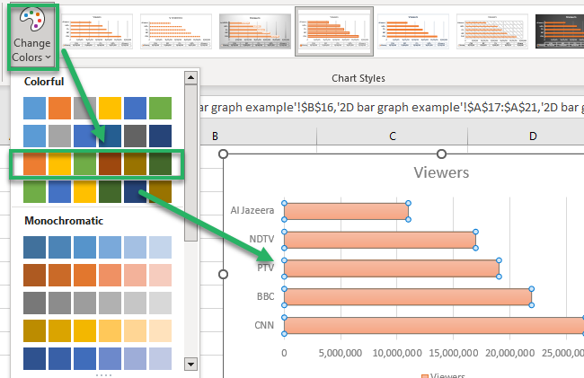
Chart layouts
To change the layout of your chart, go to the Quick layout option under the Chart Design tab.

This launches a drop-down menu of layout options as shown below.
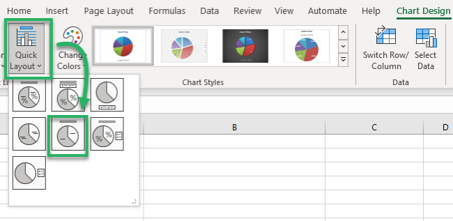
Choose any chart layout from these layouts. For example, this is what layout 5 looks like.
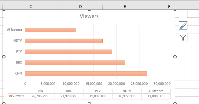
Chart elements
Excel allows users to remove or add different chart elements from a bar chart.
To do so:
- Head to the Chart Design tab.
- Go to Chart Elements.
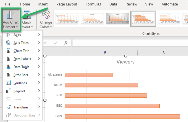
This will launch a menu of different chart elements that you can add to your chart.
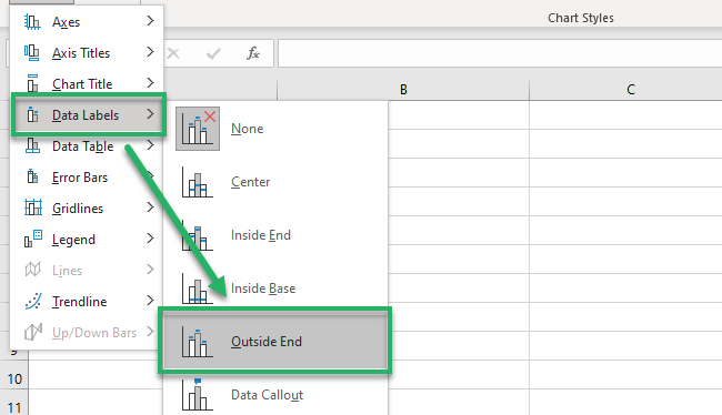
For example, to add data labels:
- Select the data labels option from the dropdown menu of “Add chart elements”.
- Choose how you want them placed on your graph. We are choosing them to be at the “Outside End”.
This is how the data labels are shown on the graph.
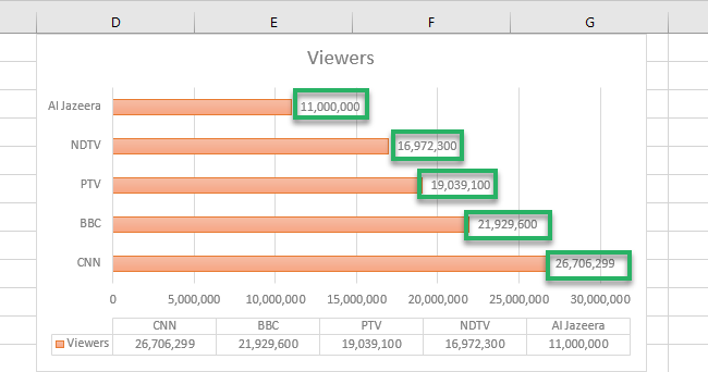
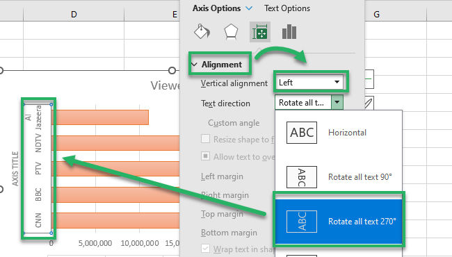
Let us now try changing the alignment of the vertical axis labels. For this:
- Select the vertical Axis labels.
- Go to Chart Elements > Axis > More Axis options.
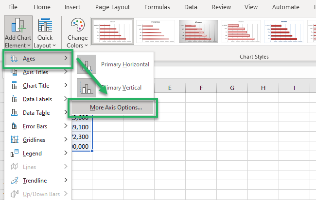
This will launch the Format Axis Title pane to the right side of your worksheet.
Here, you can choose between different alignments and text directions. Like we changed the alignment of our Y-Axis titles to Vertical and this is how it looks like.
Editing bars
The bars on your bar graph can be edited in different ways.
For example, you can change the bar width by following the steps below:
- Right-click on any of the bars.
- Go to Format Data Series from the resulting context menu.
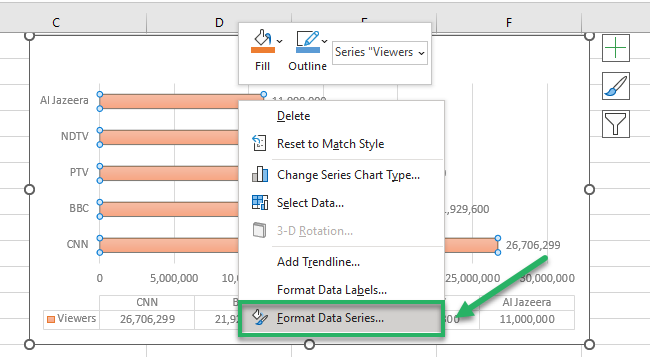
This launches the Format Data Series pane.
- Under the Series Options from the Format Data Series pane, adjust the gap width percentage as shown here.
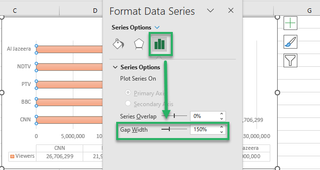
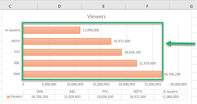
This is the gap width (the gap between two bars) and not the bar width. As you increase the gap width, the bars get thinner, and the gap between bars increases.
And as you shrink down the gap width, the bar width increases.
We have set the gap width to 69% (down from 150%) and here is what the bars now look like.
Bar graph colors
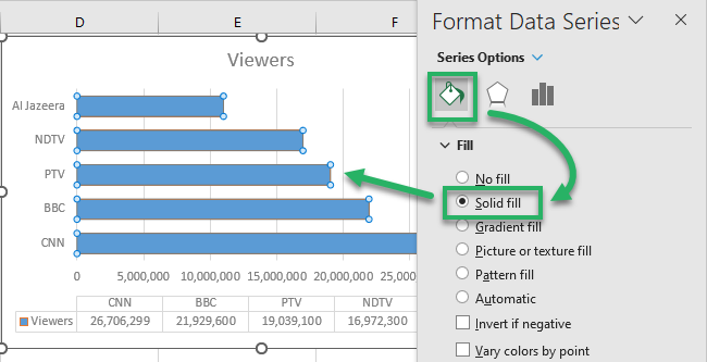
If you want to change the filling type of the bars in your bar graph:
- Right-click on the bars.
- Go to the “Format Data Series” pane from the resulting context menu.
- Head to the Fill option under the Format Data Series pane.
- Choose from the different filling options available.
For example, we have chosen “Solid Fill” and here’s how the bars look like:
Pro Tip!
By default, all the bars of a bar graph are of the same blue color. However, you can change the color of any single bar or all the bars, if desired.
To do so, go to the Format Data Series Pane > Fill > Solid Fill > Color 🎨
Order of graph
Did you note? In the example above, the graph is plotted in ascending order.
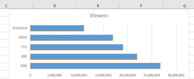
The first bar is the smallest (Al-Jazeera with a viewership of 11,000,000) with every next bar longer than the previous one.
And the longest bar (for CNN with a viewership of 26,706,209) comes last.
You can change this to descending order by following the steps below:
- Right-click on the vertical axis labels.
- Select the Format axis > Axis Options.
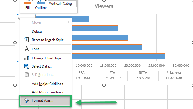
- Under the Axis Options, select the three options highlighted below.
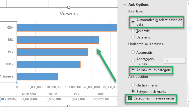
As we check the option for “Categories in Reverse Order“, Excel changes the order of bars to descending order.
Now CNN tops the list and Al-Jazeera takes the last position. This makes the interpretation of data way easier.
Versions of Bar graphs
There are different categories of bar graphs that you can choose from.
And guess what? Each one of them has different uses which are discussed below.
Clustered bar chart
Clustered bar charts (also called grouped bar charts) are ideal for comparing different sets of data.
To create a clustered bar chart:
- Select the subject data.
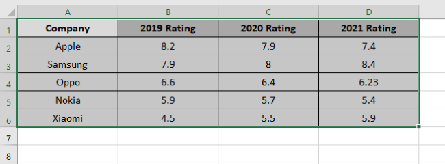
The data above represents the rating for different mobile phone brands for the years 2019, 2020, and 2021.
Can you quickly tell which brand won the highest rating in which year? Hard to tell now but once we pull off a grouped bar chart out of this data – it will take you a nanosecond to tell that.
- Go to the Insert tab > Charts Group > Bar Chart Icon.
- Select clustered bar chart under 2D Bars.
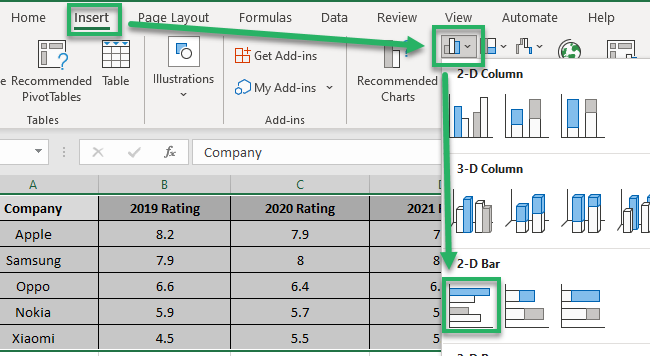
Excel will insert a clustered bar chart to your worksheet as shown below:
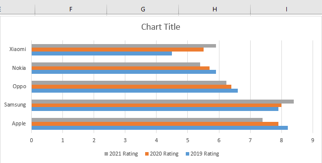
Pay attention to the legends at the bottom. Grey color stands for 2021, orange for 2020, and blue for 2019.
Take a quick test! In which year did Samsung win the best rating?
We see the grey bar for Samsung as the longest. So, Samsung won the best rating in 2021 ✌
Clustered charts work best when you want to compare multiple datasets. They allow you to make comparisons between different categories in a compact space.
Stacked bar graph
The next version on the list is a stacked bar chart.
To make a stacked bar chart, let’s take the data in the example below.
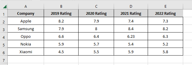
Very similar to the data in the above example, this data series only has an additional column for the year 2022.
To create a stacked bar chart out of it:
- Select the data.
- Go to the Insert tab > Recommended Charts.
- From the chart window, click on the bar chart icon.
- Select a stacked bar chart.
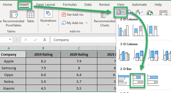
This is how stacked bar charts present data.
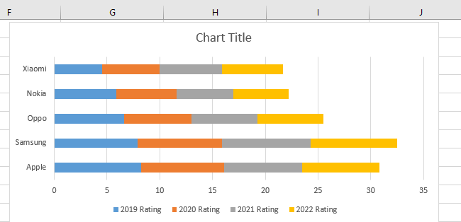
In the graph, stacked bars present each company’s yearly rating with a different color.
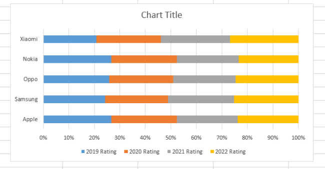
This makes it easy to read the chart. If you use a 100% stacked bar chart, Excel will compare each category’s proportions like below:
Double bar graph
A double bar graph is used to present a comparison between two datasets.
It comes under the clustered chart type. Let’s make one to see what it looks like.
Here is the sales data for different beverages over two months as an example.
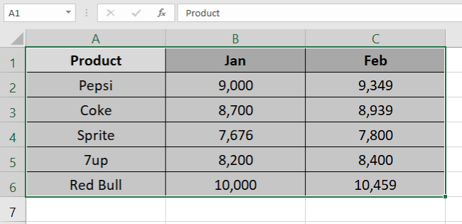
To make a double bar graph out of the data series above:
- Go to the Insert tab > Charts Group.
- Click on the bar chart icon.
- Select clustered bar chart from the resulting menu.
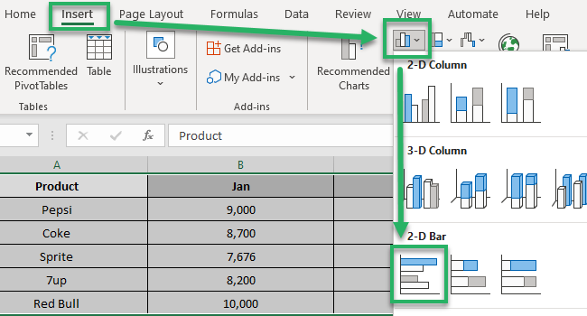
And here comes a double bar graph.
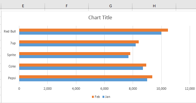
The graph above offers an easy comparison of the sales of beverages for January and February.
Clearly, February (shown by orange-colored bars) has higher sales for each beverage.
That’s it – Now what?
Long journey, no? Until now we have seen how to make and modify bar graphs in Excel.
The article explains different versions of bar graphs. The best thing is that, unlike other charts, bar graphs have versions that can accommodate different data sets.
Don’t just stop here. There’s much more to Excel for you to learn. Some important functions of Excel include the VLOOKUP, IF, and SUMIF functions.
Don’t know where to learn them? Click here to register for my 30-minute free email course that helps you master these and much more 😎
Other resources
There are many more charts/graphs in Excel that can be of help to you. Want to learn about them?
Read about line graphs and 6 other Excel charts that look fantastic. Don’t know how to save a chart as an image? No problem, here’s the guide for it.
