How to Create a Clustered Column Chart in Excel (+Stacked)
Column charts are one of the simplest and most commonly used chart types in Excel. That’s because they are easy to create and are easily understood.
You can use column charts to make an efficient comparison between any kind of numeric data 🔢
For example, between sales over different years, the temperature in different regions, etc.
There are many variations to simple column charts. The most common two types are clustered and stacked column charts.
Let me take you through the guide below that will teach you all about creating a stacked clustered column chart in Excel 🚀
And as you scroll down, do not forget to download our free sample workbook here to practice along with the guide.
Table of Contents
What is a column chart, and why use it?
A column chart represents different categories of your dataset through columns.
The length of these columns represents the size of each category. This aids an easy comparison between the categories 📊
Users can simply look at the column chart. And tell which dataset is the biggest or the smallest by looking at the length of the columns that represent it.
Here’s what a simple column chart in Excel looks like.
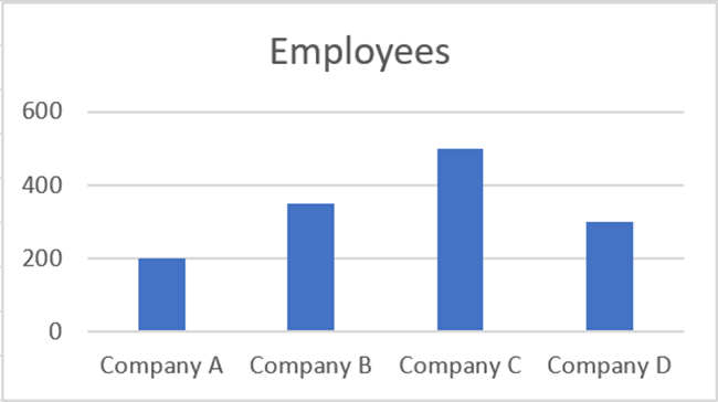
We have four companies here. And we have the number of employees for each of these companies.
The column chart plots these numbers in the shape of columns. And it only takes a glance to tell that Company C has the highest number of employees.
That is why column charts are commonly used to picture data and make comparisons.
A column chart contains vertical columns. A chart with horizontal columns is called a bar chart.
How to create a clustered column chart
After we’ve seen what a simple column chart looks like, it’s time we move forward.
There are many variations to the column chart. And each of them helps with different types of comparisons.
The first variation that we are going to see here is a clustered column chart. As the name suggests, a clustered column chart is where multiple columns are clustered together 🎀
A clustered column chart is used when we have multiple categories and sub-categories of data.
Let’s see this through an example below.
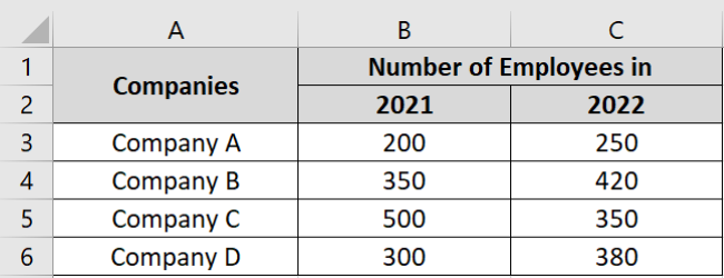
Here, we have the numbers of employees of four different companies over two years (2021 & 2022).
This means we want to compare the number of employees:
- in all four companies (Category)
- in the years 2019 and 2020 (Sub-category)
So, let’s make a clustered chart out of it. Here’s how to do it:
- Select the data to be plotted as a chart.
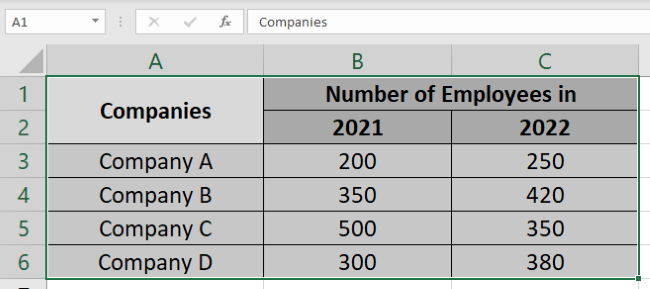
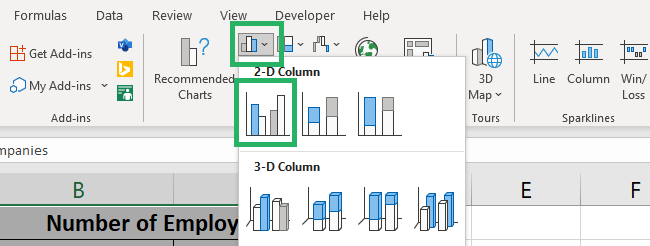
- Go to the Insert Tab > Column Chart Icon.
- Choose a clustered column chart. You may choose a 2D or a 3D chart.
We are going with a 2D chart for now.
There it is! Excel makes a clustered column chart out of our dataset 🎯
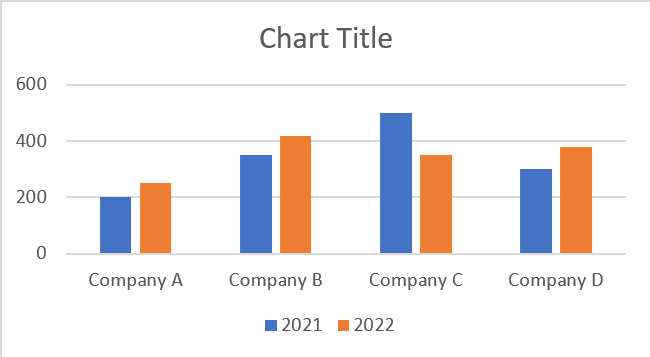
Note that for each company, we have two columns clustered together.
The blue column represents the year 2021. Whereas the orange column represents the year 2022.
How do we know that? Look at the legends at the bottom of the chart 👀

Looking at the chart we can tell that the biggest change in employees over the two years was seen by Company C.
The orange column (for 2022) in the case of Company C is significantly shorter than the blue column (for 2021).
A similar analysis can be made for the change in employees of each company over the two years. And also for all the companies with each other.
Easy and understandable? Clustered charts are a savior when it comes to complex datasets 🤍
How to make a stacked column chart
In literal terms, stacking means arranging in a pile (one over another).
That’s exactly what a stacked column chart looks like 📚
Clustered column charts are where columns representing sub-categories are clustered together. Unlike them, in stacked column charts, columns representing different sub-categories are stacked together.
Let’s visualize stacked column charts using the same data as above to better understand them.
To make a stacked column chart:
- Select the data to be plotted on the chart.
- Go To Insert > Column Chart Icon.
- Choose a 2-D stacked column chart.
You’d see two options here. Let’s go with the first one now and explore the second one later.
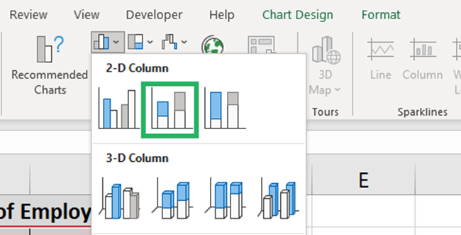
Excel makes a stacked column chart out of our dataset 🤩
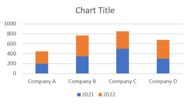
What has Excel done? Instead of clustering the blue and orange charts together, it has stacked them one over another.
Looking at each column, you can readily tell if the blue part (2021) or the orange part (2022) is taller. This aids data visualization.
A stacked chart squeezes down the number of columns to 1 for each category. This makes the chart compact 🔍
And the second stacked column chart type. Let’s try it out here.
- Select the data.
- Go To Insert > Column Chart Icon.
- Choose a 2-D 100% stacked column chart (the last icon under the 2D header).
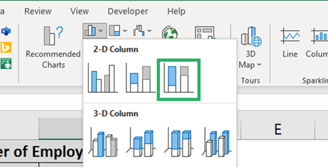
Here’s how a 100% stacked column chart.
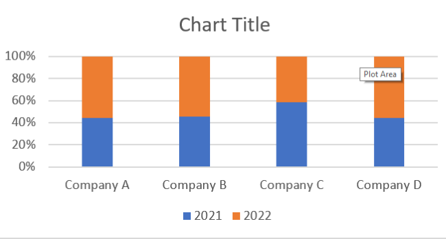
See the difference? In a simple stacked column chart, Excel plots the columns against actual figures.
Whereas, in a 100% stacked column chart, Excel plots the data in terms of percentages.
And so, in total, each column is the same length. But the proportion of orange and blue sub-parts is different for each column.
Editing your chart
Huff! Done with the making of charts. But what if you don’t like the default Excel chart type?
Maybe you are not a very orange and blue lover? That’s fine, you can edit your charts in several ways in Excel 🎭
Let’s see some of them below.
Change the color of the columns
Here’s a quick way how you can change the color of the columns in your column chart.
- Select the chart.
- Look out for three icons on the right side of your chart.
- Click on the second icon (the paintbrush), next to the chart elements.
- Go to the Color tab.
This will launch a drop-down menu of color palettes before you 🎨
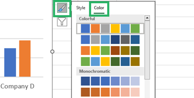
- Hover your cursor around each of the palettes to have a quick preview of how it looks when applied.
- Once you’ve chosen the right palette for your chart, click on it.
How about this monochromatic green palette?
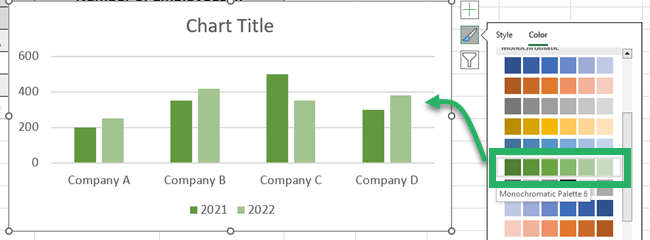
Looks earthily 🌎, no?
Adjust the gap between columns
Right now, there’s much gap between the columns in our clustered chart.
Can we squeeze this gap down? Obviously, yes✂
Here’s how you can do it.
- Select any column and double-click it.
This will take you to the Format Data Series pane > Series Options.
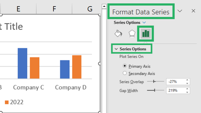
- Adjust the Series Overlap percentage here.
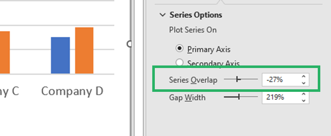
Increasing it would reduce the gap between both the clustered columns and vice versa.
We have increased from -27% to + 24%, and here are the results.
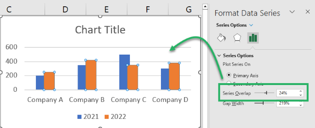
The columns now slightly overlap each other.
Pro Tip!
If you want the columns to stick together but not overlap each other, set this % to 0.
Switch rows and columns in your column chart
When you create a chart in Excel, the placement of data on axes is done by Excel itself.
This depends on the number of rows and columns in the data. Excel plots the larger number on the x-axis.
For example, our data has more rows (four companies) and lesser columns (only two years). And so, Excel plotted rows (companies) on the x-axis and columns (employees) on the y-axis.

However, if you don’t like how the data is plotted in your chart, you can instantly switch the rows and columns in your column chart 😵
To do so:
- Click anywhere on your chart to select it.
- Once selected, look out for the Chart Design tab to appear on the Ribbon.
- Go to Chart Design tab > Switch Row / Column button.

And here comes a whole new-looking chart.
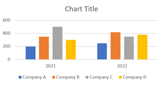
The data plotted is still the same. The only difference is that the years have now taken the x-axis. Whereas the employees are plotted on the y-axis.
That’s it – Now what?
In the guide above, we learned how to make the two most commonly used column chart types. The clustered and the stacked column chart. And also the 100% stacked column chart.
➕ In addition to creating column charts in Excel, we also learned different ways to edit them.
It was a fun guide, wasn’t it? There are so many more chart types that Excel offers.
But Excel is more famous for its functions than for the charts. My personal favorite functions from the Excel function library include the VLOOKUP, SUMIF, and IF functions.
To learn them (and much more), enroll in my 30-minute free email course today!
Other resources
If you liked reading about column charts, we bet you’d love to learn about other chart types offered by Excel too.
Learn how to make a pie chart, a bar graph, a Pareto chart, and a Gantt chart in Excel by reading our other blogs.
