How to Add Line of Best Fit in Excel (Easy Method)
If you want to identify trends and patterns in your data set and make predictions based on them, adding a line of best fit in Excel is your way to go.
It plays a pivotal role in data analysis and visualization and smooth things over such that you can grasp the essence of the data set in one look.
Luckily, Excel offers an easy way to create a line of best fit or trendline on your scatter plot. You can enhance and customize it as you like 🎨
In this tutorial, we will see how you can visualize the relationship between your data set using trendlines. Download our sample workbook here to practice along our guide.
What is the Line of Best Fit
Don’t know what is the Line of Best Fit?
The line of best fit is just another name for a trendline. It connects the data points on a scatter plot to draw a straight line and represent the relationship between two factors.
You plot data on a plot and then draw a straight-ended line out of it that minimizes the distance between these points 📈
Just like the trendline, it identifies and shows the general trend of how data moves or how two variables are linked. For example, here is one.
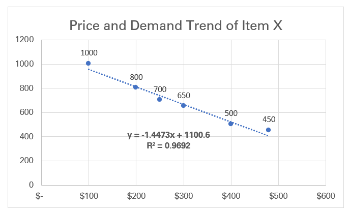
The following line shows the relationship between the demand and price of an item. As we know from the basic principle of economics, price and demand are inversely linked. As the price for a product increases, its quantity demanded decreases.
So, we have plotted data points that analyze the relation between the price and demand of a product (or the data trend). To picture it as a trend, we have drawn a trendline out of it that shows a rising trend 📉
You can similarly draw the line of best fit for any two variables to understand the relationship between them. How?
Let me show you that in the next section.
How to Add a Line of Best Fit in Microsoft Excel
If you’re wondering how the line of best fit is drawn in Microsoft Excel, let me show you how it is done.
Let’s go 🚀
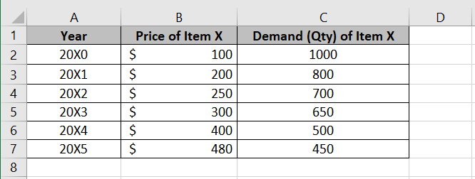
Here I have some data from Item X from different years. How the price moved and, accordingly how the demand for the product in the market moved.
Let’s see it plotted on a scatter plot.
P.S: Step 1 is to make sure the data is populated in two columns like in the image above.
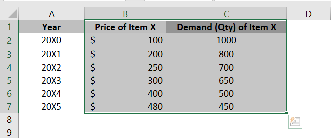
Step 1) Select the data range (only the columns for the data to be plotted on the chart).
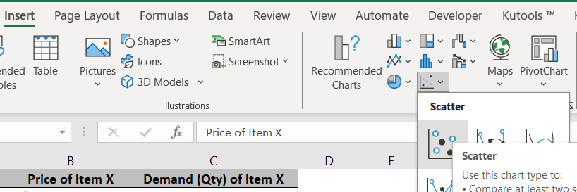
Step 2) Go to the Insert tab on the Ribbon > Charts group > Scatter Plot icon > Scatter Chart option.
This will insert the chart in your worksheet as follows.
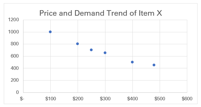
You’ll see Excel has plotted a dot at each data intersection point on the chart 🥽
From a simple scatter plot, you can probably not understand the trend analytics.
To make sense out of it, we need to draw the line of best fit out of it. Here’s how we do it.
Step 3) Click anywhere in the scatter plot to select the chart.
Three icons will appear towards the right of the chart (the Chart Elements).
Step 4) Click on the Chart Elements button (a plus sign) next to the chart.
Step 5) From the drop-down menu of the Chart Elements, check the Trendline box.

Excel will add a basic line of best fit to your chart.
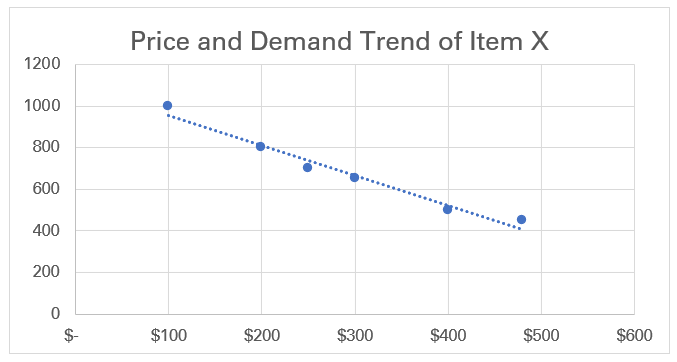
Adding a trendline in Excel is only this easy 💪
However, if you think the trendline should be more expressive, here’s what you can do to customize it.
Step 6) Double-click on the trendline to launch the Format Trendline pane towards the right.
Step 7) Choose from different trendline options (Exponential, linear, logarithmic, etc.) as you’d like its appearance to be.
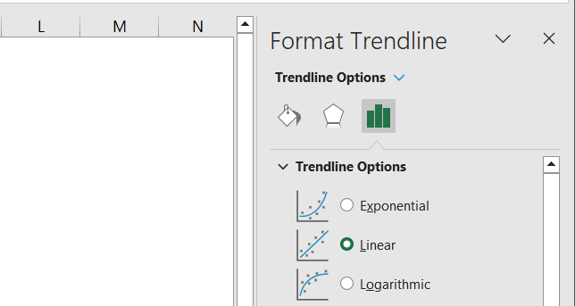
Step 8) Explore other options from the Fill & Line options. For example, do you want a dotted line or a solid line (adjust the dash type)?

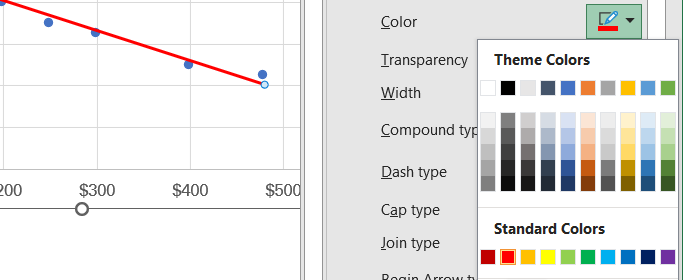
Step 9) Similarly, you can change the color of the line 🖌
Step 10) Click anywhere in the chart and from the Chart Elements group, check the option for data labels if you want the data points labeled on the trendline.

To display the equation of the line and the R-squared value:
Step 11) In the Format Trendline pane > Trendline Options, check the Display Equation on chart and Display R-squared value on chart boxes.
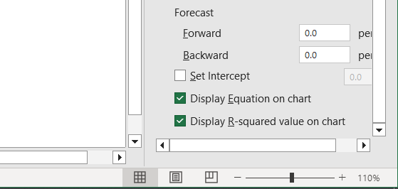
By checking the R-squared and Equation options, Excel will calculate and show the linear equation and R-squared value for the trendline on the chart.
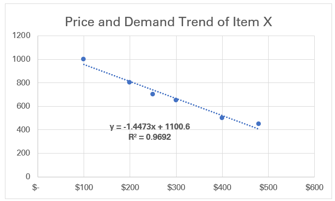
The R-squared value for our chart comes out to be 0.9692 which is super close to 1 saying that the trendline closely fits the data points.
If you do not like the markers (small blue dots representing the data points) around the trendline, you can remove them by following these steps 👇
Step 12) Click on the markers (blue data points around the trendline) to select them.
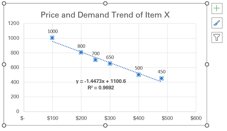
Step 13) From the Format Data Series pane on the right, go to the Fill & Line tab (the paint bucket icon).
Step 14) Select the options for Marker from it.
Step 15) From the Marker Options, select None.
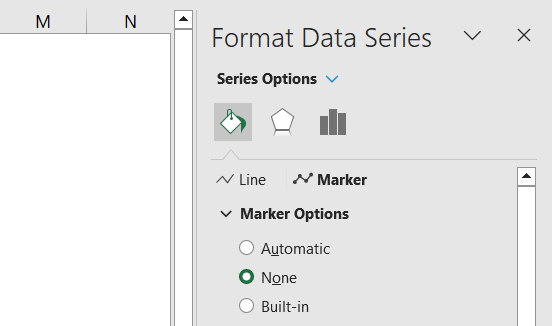
The markers will go away, and you will have a simple line of best fit before you.
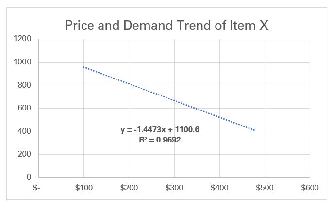
This explains how you can make the line of best fit in Excel. And not only create it, but you can also customize it as you like to add more definition and meaning to it.
Hope you found this easy 🏃♀️
Conclusion
A line of best fit helps you to analyze and visualize the relation between two variables. Put together a scatter plot and make a trendline out of it to see if the data is inversely or directly linked.
Trendlines help you to draw insights out of your data and make predictable patterns out of it. In this tutorial, what is the line of best fit, and how you can draw it in Excel from a Scatter plot?
In Excel, you can customize the trendline as you want it and add the linear equation and R-squared value to it. Enjoyed learning how to create trendlines in Excel to better analyze and project your data? Don’t stop here, check out the following statistical Excel tutorials by Spreadsheeto to continue your learning journey with us.
