How to Use Sparklines in Excel to Show Trends (Fast & Easy)
 In Excel, there are lots of graphs that you can add to your report (and Excel keeps on adding new charts).
But what if you want to put a mini chart into a cell? Actually, you might have already seen a few of them in action. 🤔
Those mini-charts are called sparklines.
In this article, you’ll learn what sparklines are and how you could use one on your spreadsheet.
Let’s get started!
Table of Content
What are sparklines in Excel?
Sparklines are small charts in Excel that fit in a cell.
Unlike there large counterparts, sparklines are used to show variations or trends in the data over a period of time.
If you love reports, you may have seen some of them already.
Here’s an example of sparklines that show income per quarter on US states.

Although sparklines don’t have the same functionalities as regular charts, they are great in adding a level of visual analysis into your report by showing trends.
In addition, sparklines make your report look better and more reader-friendly. 😉
How to add a sparkline?
In Excel, there are three types of sparklines you can add — line, column, and win/loss.

Line and column sparklines are easy to understand since they are just tiny line and column charts.
On the other hand, a win/loss sparkline resembles a column chart and a box and whisker plot. This type of sparkline is good where the data is binary — win/loss, yes/no, true/false, 1/-1, etc…
The good news is, adding and formatting each one follows a similar process.
For this tutorial, let’s use the following dataset:
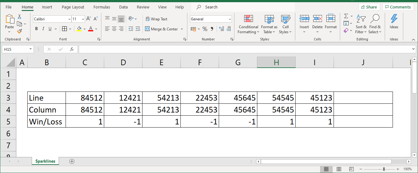
To insert a sparkline in Excel, select the cell in which you want the sparkline to reside in.
Then, on the ‘Insert’ tab…
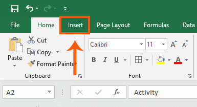
Click the type of sparkline (on the ‘Sparklines section) you want to add.
Let’s try adding a line sparkline in our example.
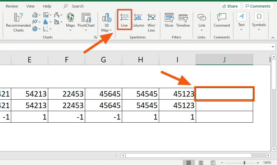
After that, you will be asked for the data range.
Note that if you have selected beforehand the cell where you want the sparkline to reside in, you don’t have to change the ‘Location Range’ setting.
To choose the range, either type into the field the range or click the up arrow button and select the cells that contain the data.
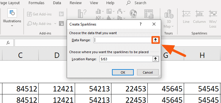
After selecting the data range, press ‘Enter’ on your keyboard or click the arrow down button on the window and click ‘OK’.

Nice and easy! 😊
Hidden and Empty Cells
It’s normal for some reports to contain hidden and empty cells.
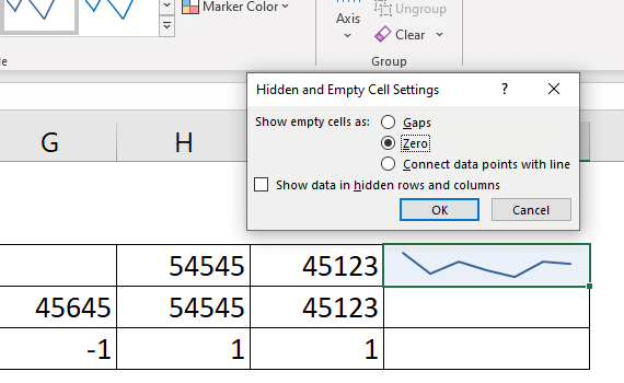
If there’s such a cell in the data range used in creating a sparkline, you will see a noticeable gap on the sparkline by default.

If you would like to show the empty cells as zeroes or connect the data points with a line, all you have to do is:
- Go to the ‘Design’ tab
- Click the ‘Edit Data’ icon
- Select ‘Hidden & Empty Cells…’ from the dropdown
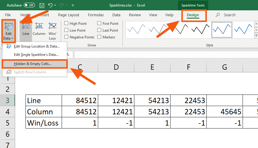
Then, select whether you want to treat a hidden or an empty cell as zero or else, connect the data points with a line.
How to format a sparkline?
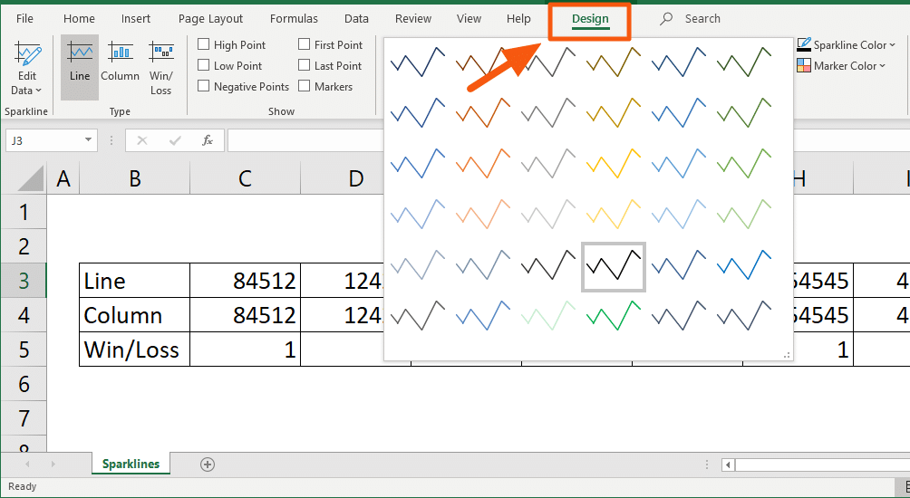
You can also format a sparkline’s style, color, and even the points to show.
All of these are in the ‘Design’ tab.
Markers correspond to the different points that can be shown on a sparkline such as:
- High Point
- Low Point
- Negative Points
- First Point
- Last Point
- Markers
To show any of them, just check their appropriate boxes on the ‘Show’ section.
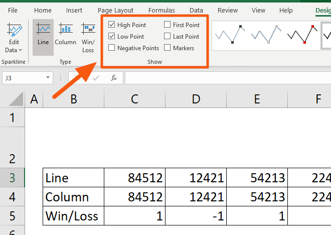
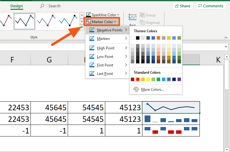
You can change their color from the ‘Marker Color’.
How to delete a sparkline?
If you have noticed, you can’t delete a sparkline by pressing the ‘Delete’ or the ‘Backspace’ key on your keyboard.
That’s because sparklines aren’t objects. They are elements server as the background of that cell.
To delete a sparkline, all you have to do is select the cell where that sparkline resides.
Then, click the ‘Clear’ button found on either the ‘Home’ tab or on the ‘Design’ tab.

That’s it! The sparkline has been deleted. 😊

Wrapping things up…
Sparklines are like mini charts found on an Excel cell. Technically, they are serving as the background of those cells (which is the reason why you can’t delete them).
These elements are great in showing the trends and variations in the data all inside a single cell. Not only are they good for the eyes, but they also add some level of visual analysis to your reports. 😊


