How to Make a Flow Chart in Excel (Step-by-Step)
Flow charts are an excellent way to visually represent workflows, processes, and complex walkthroughs to reach a decision.
You can design flow charts in Excel using its wide array of tools and shapes. It allows detailing and customizing options to create professional-looking flow charts.
If you have a business process or a project timeline that you want to map out as a flow chart in Microsoft Excel, this tutorial is for you. In the sections that follow, I am going to show you how to create a flowchart in Excel, ensuring you can effectively communicate your ideas.
What is a Flow Chart?
A flow chart is flowy (haha, just kidding).
It is a visual representation of a process, a decision tree, or a workflow. In the easiest words, a flow chart is a set of shapes (rectangle, oval, diamond or you name it) connected with arrows.
Each shape depicts a different activity, flow of control, or an activity. And believe me, we all know flow charts since secondary school. Let me quickly remind you what one looks like.

Flow charts are a great go-to tool for academics. Not only there, but you’ll also see it being used in fields like engineering, software development, and business (and where not) to simplify and clarify complex processes, enhance communication, and facilitate problem-solving and decision-making.
Components of Flow Chart
A flow chart primarily has the following components:
- Start/End (Terminator):
Represented by an oval shape, it indicates the beginning and the end of the process.
- Process:
A rectangle that shows a step in the flow chart process where an action is performed.
- Decision:
A diamond shape that depicts a point in the process where a decision must be made (mostly Yes or No) before moving to different paths within the flowchart based on the decision.
- Input/Output:
A parallelogram that shows where data is inputted into or outputted from the process.
- Flow Lines/Arrows:
Arrows or flow lines are the joining lines within a flow chart that direct the flow from one step to another, showing the sequence of actions.
- Connector:
Connectors are the small circles or sometimes labeled arrows that connect different parts of long and complex flow charts.
That’s all about the basic flow chart introduction. It’s now time that we try creating one by ourselves to see how it comes out.
Creating a flow chart in Excel using shapes
The basic and more appropriate (the manual way) of creating flow charts in Excel is by using the shapes library of Excel.
Excel has a huge library of shapes from which you can choose any shape you like (starting from basic circles to a little complex ones like a wave or a scroll etc.
You can draw these shapes and then connect them using arrows to create a flow chart of your own. Don’t know how to make a flowchart? Let me walk you through the end-to-end process of creating flow charts in Excel using shapes in this section.
We are making a flow chart for a product assembly workflow in a factory. Starting from receiving the raw material to shipping the product.
The most important step for me in creating a flow chart in Excel is to remove the gridlines from the Excel sheet.
This gives you a clean canvas to create just as you like.
Step 1) Go to the View tab > Show group > Uncheck the option for Gridlines.

Step 2) Go to the Insert tab > Shapes.
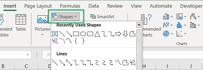
Step 3) Scroll down to the Flowchart shapes section.

Step 4) Choose the shape that you want to use in your flow chart.
I am beginning with inserting an oval.
Step 5) Click and drag on the worksheet to draw an oval as the start shape.
Step 6) Double-click on the oval to write within it. Label it as “Start”.
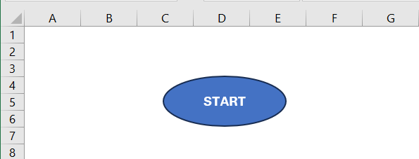
Step 7) Go to Inserting shapes again > select a Rectangle shape.
Step 8) Draw it towards the right of the Start shape. Label it “Receive Raw Materials”.
We are making the flow chart horizontally (progressing towards the right). You can also make it from top to bottom.
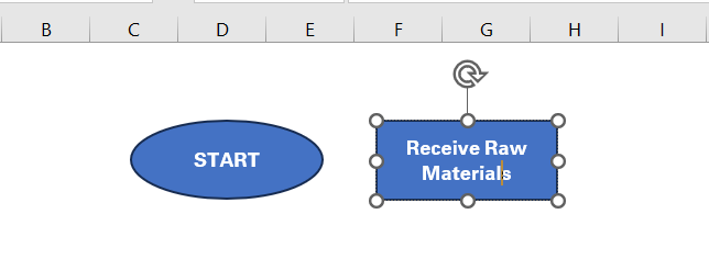
Step 9) Draw another rectangle next to the previous one and label it “Inspect Quality”.
Until here we are covering steps within the process hence we are using rectangles. Make sure to keep the size of shapes similar.
Step 10) Draw a diamond next and label it as “Quality Acceptable?”.
Using a diamond since this is a decision point.
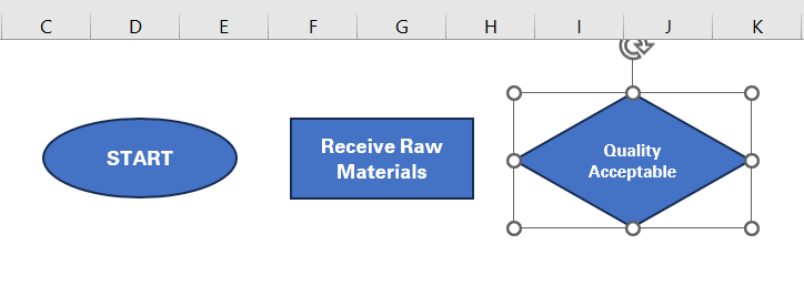
Step 11) Add two more rectangles slightly above and below the diamond to label as “Reject and Return” and “Assemble Product”.

Step 12) Draw another rectangle next to “Assemble Product” and label it as “Test Product”.

Step 13) Add more steps to the process by adding rectangles and label them as “Package Product” and “Ship Product”.
The structure of the flow chart is now ready. All we need to do is add arrows to connect together all the shapes.

Step 14) Go to the Insert tab > Shapes > select the Arrow shape.
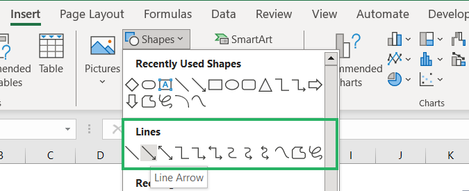
Step 15) Draw arrows connecting one shape to another indicating the flow of the process.
Here’s how it looks with all the arrows added.

Step 16) At each decision point, add text boxes near the connecting arrows by going to the Insert tab > Text box.

Step 17) Write “Yes” and “No” in each textbox to make sense out of the flow chart
And you have the flow chart ready.

You can change the colors of the boxes by selecting each shape and exploring options from the Format Shape tab.
Similarly, you can play around the fonts and styles of the text inside each shape.

In short, with Excel, there are no limits to how you can design your flow chart. Bring out the artist inside you.
Creating a flow chart in Excel using Smart Art
Creating the same chart as above can be simpler and quicker if you use Smart Art.
Let me show you how.
Step 1) Go to the Insert tab > Illustrations group > Smart Art.

Step 2) Choose the smart art graphic that suits your needs by exploring the different types in the left pane.
We are going with a style from the hierarchy as we have decision points and multiple options in our chart.
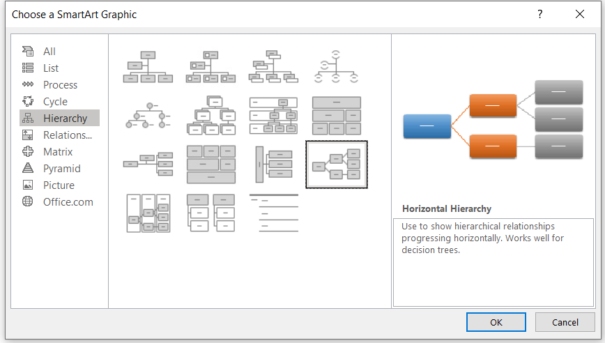
This is how it will initially look.
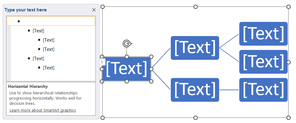
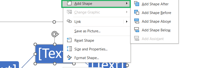
Step 3) Once inserted, you can add more shapes to it by right-clicking on any shape, choosing to add the shape before or after, below or above.
Step 4) Similarly, right-click on any shape > click on Change Shape to change the shapes within the flow chart.
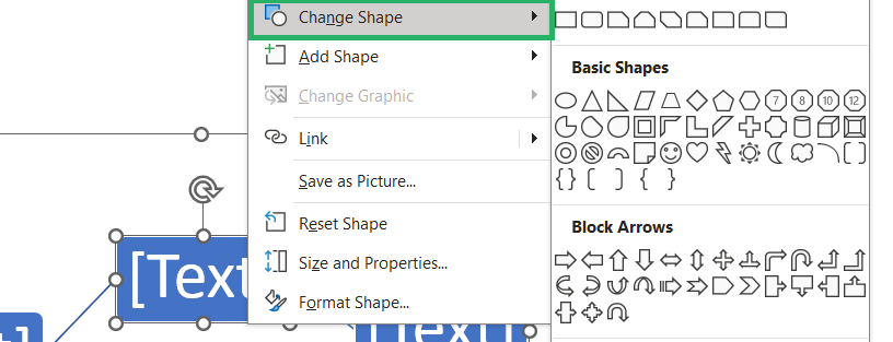
Step 5) Keep adding shapes and changing them as and where you like.
SmartArt automatically connects shapes with arrows, but you can adjust connections by selecting a shape and using the tools provided in the SmartArt Tools tabs.
Step 6) Add text in each shape as desired.

Step 7) You can use the small circles on the borders of the flow chart to drag and resize the whole chart. Or you can resize individual shapes as you want.
Step 8) Once made, you can then go to the Smart Art Design tab and choose different designs and color palettes for the chart as you like.

Here’s how my final chart looks.

And, if you do not want the shapes to be connected as a flow chart after it is made, select the chart, and go to the SmartArt Design tab > Reset > Convert to Shapes button.

The chart will be converted into individual shapes (like in the above section). So, moving one shape will not affect the rest.
Using SmartArt, you can create detailed and visually appealing flow charts in Excel in no time.
Conclusion
Excel is an excellent tool when it comes to creating flow charts to visualize processes and workflows.
Just as we’ve seen in the above tutorial, there are many shapes and connecting tools in Excel that you can use to design clear and professional flow charts.
The best part about flow charts is that they enhance understanding and decision-making. Especially with all the flexibility that Excel offers for easy customization of flowcharts, you have the whole sky to create charts just how you like.
- If learning about creating flow charts in Excel is something you enjoy, must read the following Excel tutorials by Spreadsheeto.
- How to Make a Pivot Chart in Excel (Step-by-Step)
- How to Create a Waterfall Chart in Excel (Step-by-Step)
- List of All Excel Charts & How to Use Them (2024 Tutorial)
