How to Make a Pivot Chart in Excel
Creating a pivot chart in Excel is an excellent way to summarize and visualize large sets of data. Pivot charts make data analysis so much easier as they quickly identify patterns and insights.
Pivot charts are preferred to other charts as they are dynamic – any changes made in the pivot table will automatically be reflected on the chart. This makes the pivot chart more powerful.
In this tutorial, we will see how to create pivot graphs in Excel. To practice making pivot charts in real-time, download our sample workbook here.
What is a pivot chart?
A pivot chart is a dynamic way to represent the data in your Excel sheet. As pivot tables analyze and categorize large datasets of data, a pivot chart displays that table graphically.
In essence, it is a type of chart but what makes a pivot chart useful is its interactivity and its dynamic nature. You can easily manipulate data in a pivot chart to represent different categories or trends on the chart.
It lets you display complex data very easily. This means if your data is related to sales across different regions in different quarters, you can perform its data visualization as you like – be it all at once or certain quarters only.
You can create different charts like bar charts, stacked charts, area charts and all others and you can customize them as you like. The good part is that a pivot chart is linked to the pivot table so any changes you make in the data set or the pivot table are reflected straight on the pivot chart.
Let’s now see how to make a pivot chart in Excel.
How to make a pivot chart from scratch
Making a pivot chart in Excel is simple. The one thing you need to be thoughtful about is your data set.
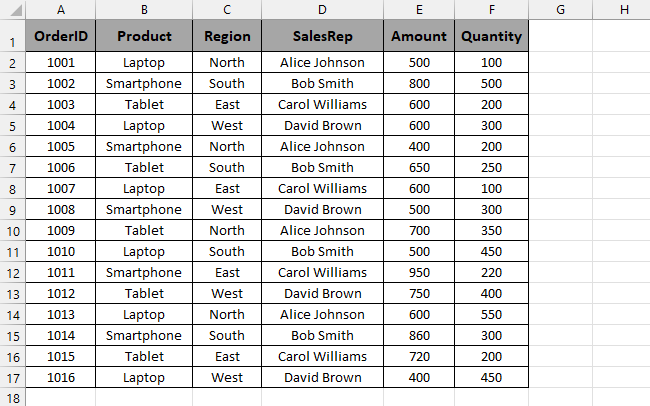
It must be organized properly and well structured and each column should contain a certain category and rows must contain unique attributes. Make sure there are no blank rows or columns in the dataset.
We will use the following sample data for our pivot chart. It contains the list of products sold to each region and the sales representative monitoring the sales.
To create its pivot chart,
Step 1) Select your entire dataset.
Step 2) Go to the Insert tab and click on PivotChart from the Charts section.

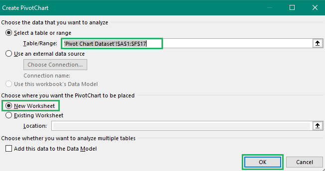
Step 3) The Create PivotChart dialogue box will appear on the screen.
Step 4) It will select the entire data and will prompt you to choose the location – the existing worksheet or the new worksheet. It is preferable to choose a new worksheet to avoid creating a mess.
Step 5) Once done, press OK.
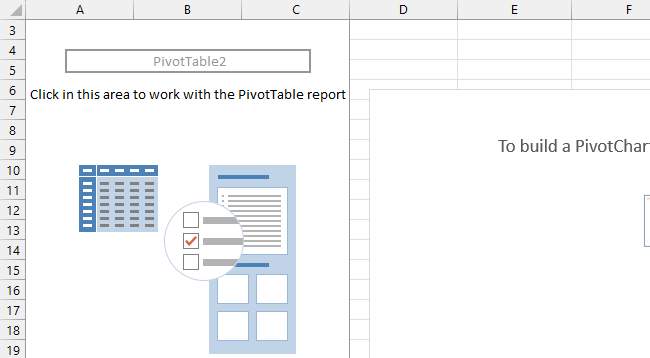
Adding a pivot chart will automatically create a pivot table as the pivot chart is a projection of the pivot table.
Step 6) An empty pivot chart and table will appear on a new sheet with the pivot pane on the right.
Step 7) From the pivot pane, tick the checkboxes of all the columns you want on your pivot chart.
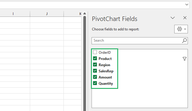
You can also drop them to the areas given below but checking the boxes is easier for beginners. The areas given are
Filters – Apply filters to each column to display or hide certain data
Legend (Series) – Indicates the series each bar represents
Axis (Categories) – Displays categories on the horizontal axis
Values – Numbers represented on the chart
Once you check all the desired checkboxes, the pivot table and pivot chart will have values in them. The pivot table will be something like:
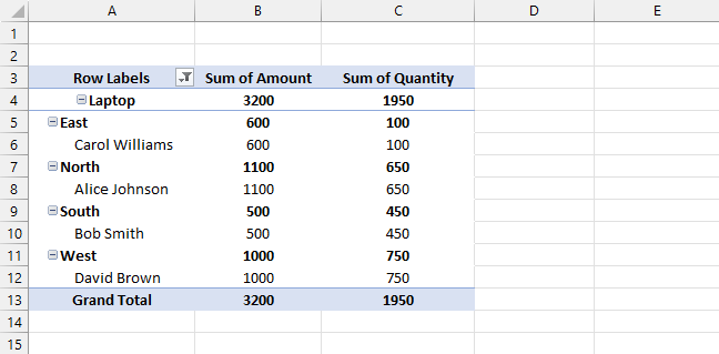
And this is what the pivot chart will look like:

You can now switch between the categories, modify your chart, and add or remove the format axis as you like to get the desired look.
Pretty cool, right?
How to create a pivot chart from a pivot table
Creating a pivot chart from an Excel pivot table is literally a two-step job – it takes no time and is easier than the above method as you don’t need to create a pivot table from the start.
We will use the same sample data and pivot table as above.
To create a pivot chart,
Step 1) Click on any cell in the pivot table.
Step 2) Go to the PivotTable Analyze tab on the ribbon and select PivotChart from the Tools section.

Step 3) Press Enter on the chart creation dialog box after selecting a location and your chart will appear.
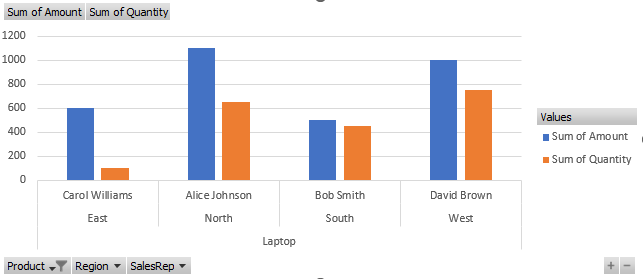
And it’s done! Your pivot chart will appear on your screen. You can modify it as you like 😃
How to filter a pivot chart in Excel
A pivot chart displays a filter at the bottom by default as you add columns to the Axis (Categories) area on the pivot pane. You can choose what categories to display on the chart using the filter.
There is another filter option that you can use in a pivot chart. To do that, you move the desired column to be filtered to the Filter area and the Filter of its categories appears at the top.
We will use the same dataset and pivot chart as earlier.
To filter a pivot chart,
Step 1) Click on the pivot chart to activate it.
Step 2) Select the column to be filtered from the column names and drag and drop to the Filters area.
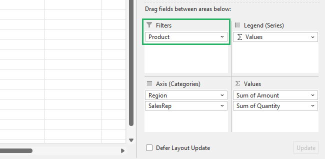
Step 3) The column name will appear at the top left corner of the chart with a dropdown arrow.
Step 4) Click on the column name to select the products you want to display.
Step 5) If you don’t want to display all the products, click on Select Multiple Items from the bottom.
Step 6) Press Ok.
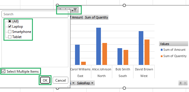
This will allow you to select only the desired products and not all of them.
Once filtered, the chart will adjust according to the items to be displayed and will look something like this:

Pretty cool, right?
How to change chart type in Excel
A pivot chart lets you change the type of the chart at any time – be it while creating the chart or after you’re done with it. The process is very easy.
To change the chart type of the above-created chart,
Step 1) Click on the pivot chart to activate it.
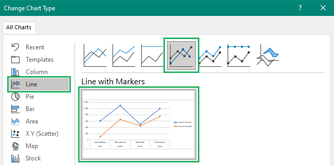
Step 2) Go to the Design tab and click on Change Chart Type from the Type section.

Step 3) The Change Chart Type dialog box will appear on the screen.
Step 4) From the chart type categories, select the type of chart you want to shift to.
Step 5) Select a sub-type of the chart.
Step 6) Press Ok.
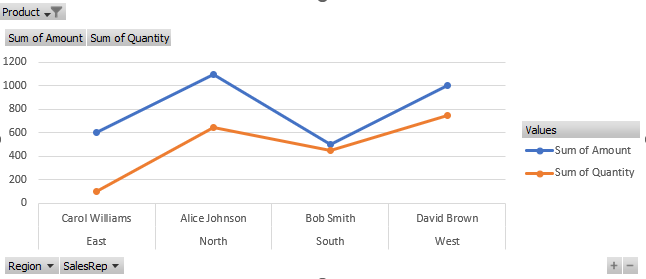
It’s done. The chart type has been changed to the new one.
How cool is that?
How to refresh a pivot chart in Excel
The best part of a pivot chart is that it is dynamic – it changes as your pivot table changes and reflects even the tiniest of changes.
But to reflect those changes, you need to refresh your pivot chart.
To do that,
Step 1) Click on the chart to activate it.
Step 2) Go to the PivotChart Analyze tab and click on the Refresh button from the Data section.

Step 3) You can also right-click the chart and click on the Refresh Data option from the dropdown.
Step 4) Or you could simply just press Alt + F5 to refresh the worksheet.
The pivot chart will appear after refreshing as:

That seems easy, right? Try it now!
How to change the data source in Excel
A pivot chart lets you change the source of the data. This means you can alter the previous data range to include or exclude a row or column or even change the entire data set.
We will use the same dataset as used in the above methods.
To change the data source,
Step 1) Click on the pivot chart to activate it.
Step 2) Once activated, go to the PivotChart Analyze tab and select Change Data Source from the Data section.

Step 3) The Change PivotTable Data Source dialog box will appear on the screen.
Step 4) It will take you to your original sheet containing the dataset.
Step 5) From there, select your new data range.
Step 6) Once done, press OK.

Excel will take you back to the sheet containing your pivot chart with the updated pivot table and chart as:

How easy is that? Give it a try now!
Conclusion
All in all, creating a pivot chart is not difficult. We saw how you can organize your data in your pivot table and represent it on your chart visually.
We saw how you can create a chart from a pivot table and from scratch. We also saw how to refresh a pivot table and change its data source.
To learn more about pivot tables and other types of charts in Microsoft Excel, give the following articles a read.
How to Create a Pivot Table in Excel: Step-by-Step (2024)
List of All Excel Charts & How to Use Them (2024 Tutorial)
How to Sort a Pivot Table in Excel: Step-by-Step (2024)
We hope you enjoyed reading these articles as much as we did crafting them 🤗
