How to Create a Waterfall Chart in Excel (Step-by-Step)
You have heard of charts like Pie charts, Area charts, Bar charts, etc.
But do you know what a Waterfall chart is?
Waterfall charts are unique analytical charts that draw a trend between an opening and a closing position in the most visualizable manner.
In Excel 2016 and subsequent versions, you get them in-built into Excel’s chart library. But for the older versions of Excel, you’d have to play a little smart to have these created.
In this tutorial, we will learn how to create waterfall charts in Excel in 2016 (and later versions) and older versions of Excel 🧓
This is going to be a very interesting tutorial. Grab your free practice workbook for this tutorial now and slide right in to learn all about how to create a waterfall chart in Excel.
What is a Waterfall chart?
A waterfall chart is an advanced type of column chart. It contains a series of columns where the first column represents the starting position of your data, and the last column represents the closing position of your data 🌊
The columns in between the first and last float to picture how data moves from the first to the last column. Data increases are shown by elevated bars, and decreases are shown by sunken bars.
That being said, the intermediate columns are color-coded. Specific-colored columns show an increase and specific-colored columns show a decrease.
Here’s what a Waterfall chart in Excel looks like.
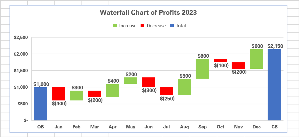
On the whole, it shows how the Profits have moved from $1,000 to $2,150 over 12 months.
The journey from $1,000 to $2,150 is pictured through multiple floating bars in between where green bars show profit increases and red bars show instances of Profit decrease.
As these floating bars bridge the first and the last column (Profit of $1,000 and $2,150), it is also called as a Bridge Chart.
Create a Waterfall chart in Excel 2016 and later versions
Excel 2016 and subsequent versions have the Waterfall chart included in the in-built chart library. This makes waterfall chart creation in Excel super easy 💦
Let’s try and see here.
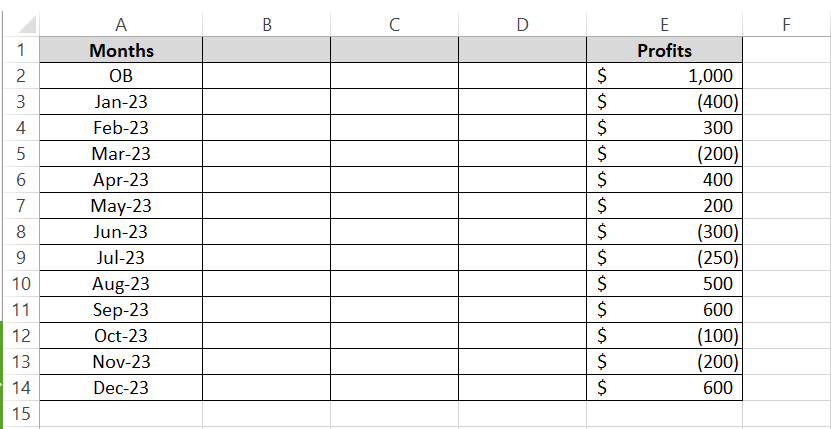
Below I have the data of a Company’s profits, starting from the opening balance at the beginning of the year, with the profits accruing each month up to the year-end.
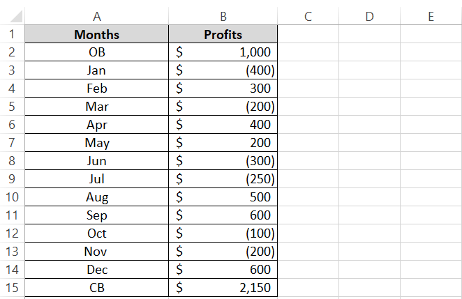
To create a waterfall chart out of it:
Step 1) Select the data to be populated (including the headers).
Step 2) Go to the Insert tab > Charts Group >Waterfall chart icon.

Step 3) From the type of charts, select the Waterfall chart.
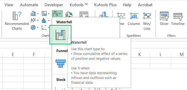
And a waterfall chart will be inserted in Excel made out of your data.
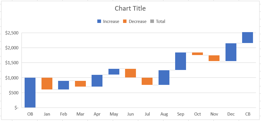
Looks cool! However, there are some necessary edits to be made to it for a better presentation ✂
Step 4) Select the last bar of the chart that represents the Closing Balance (CB).
Make sure to select the last bar only. If Excel selects more than one bar when you click on it, double-click on it again.
Step 5) In the Format Data Point window launched towards the right side of the sheet, check the option to “Set as total”.
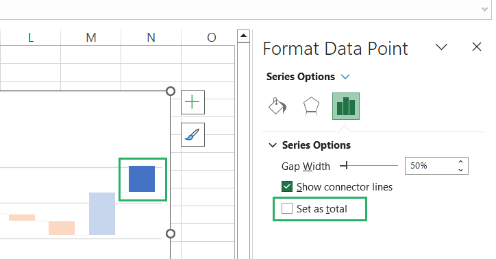
This will elongate the bar to meet the horizontal axis (giving it the true waterfall chart shape).
Step 6) Do the same for the first bar of the series (representing the Opening Balance). Although this bar already touches the horizontal axis but, it is in blue. Once you set it as total, both the total bars on the extremes of the waterfall chart will turn grey.
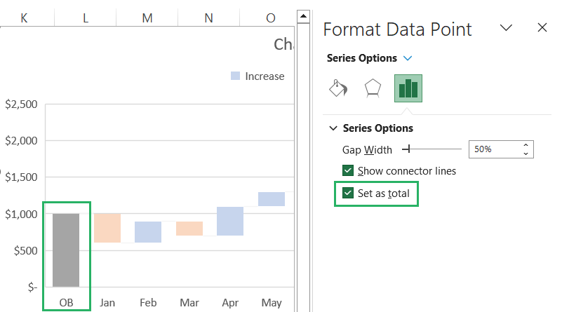
Here is how the chart looks now.
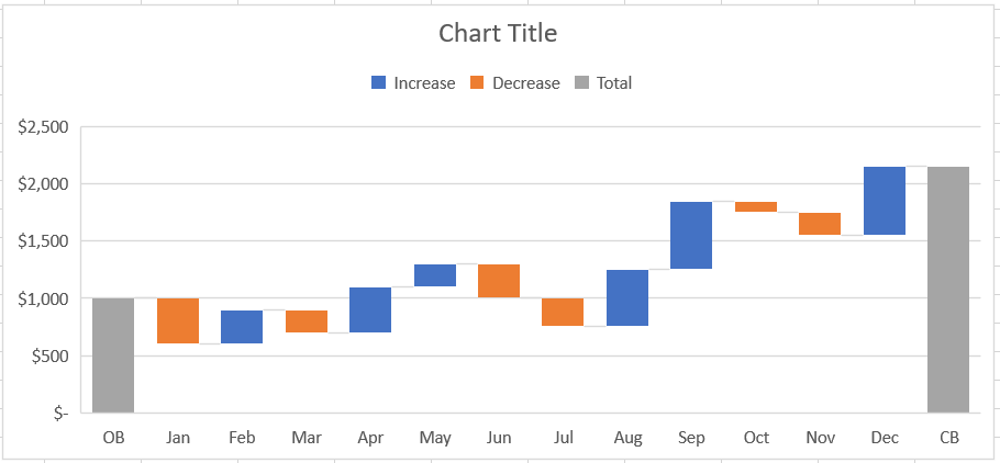
Both the grey bars at the beginning and end of the chart show the beginning and closing positions of the profit. Whereas, the bars in between show the increase (Blue bars) and decrease (Orange bars) in the profit each month 📊
Here onwards, the chart is up to your creativity. You can edit it in so many ways to bring it to your liking.
Talking about myself, here are some edits I’d make to it to make it more eye-catching and better in presentation.
Step 7) Select any bar in the chart (and all the bars will be selected).
Step 8) Right-click to launch the context menu and choose the option to Add Data Labels.
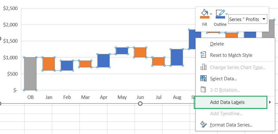
Data labels are small labels added to each bar showing what it represents.
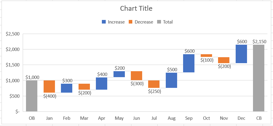
You can edit them for better in endless ways. Position them to be above or below the bars or in the center of them. Set them to a horizontal or vertical orientation, change their font and colors, and do much more 🎨
Step 9) Select the bars on the chart.
Step 10) From the Format Data Series pane on the left, uncheck the box to “Show connector lines”.
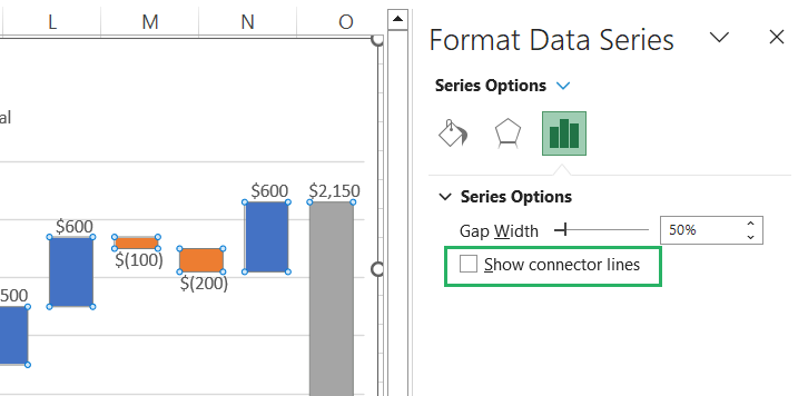
You see the small connector lines between bars (somewhere on top and in other places at the bottom) that show each bar is connected to the other will be removed.
Step 11) To make the chart look more coherent, you may reduce the Gap Width between bars.
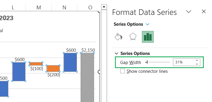
As the Gap Width is reduced, the bars become thicker. This makes the chart more readable and understandable.
The Orange, Blue, and Grey palette for charts is more like the default chart color palette of Excel that you don’t need to follow if it’s not something that pleases your eyes 👀
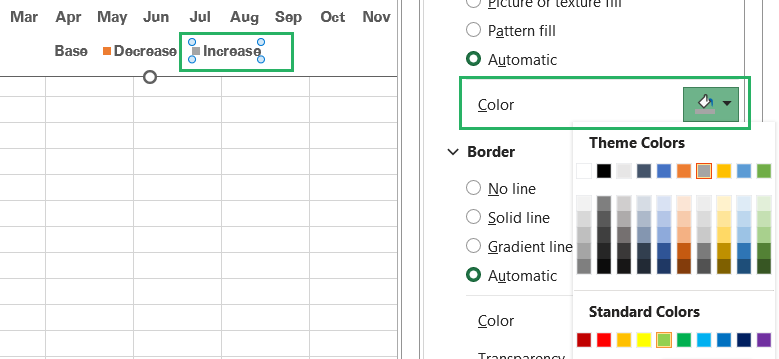
Step 12) To change the color of the bars that signify an increase, select the legend for Increase.
Step 13) In the Format Legend Entry pane launched towards the right of the sheet, select the relevant color for the increase bars (I am going with a bright forest green).
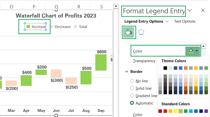
Here’s how it looks:
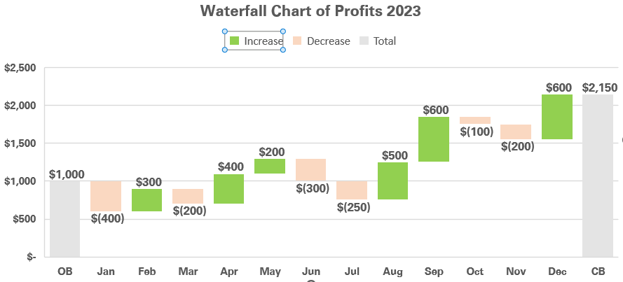
Choosing similar vibrant colors for the Decrease and Total bars, the Waterfall chart overall looks like below:

Much eye-catching than before.
This I believe does it for me 🎯
But remember that Excel offers a wide list of editing options for charts that you can leverage to make your Waterfall chart look better than ever. You can edit every aspect of your chart to make it look just how you want it to.
Create a Waterfall chart in older Excel versions
Creating a Waterfall chart from the built-in chart library of Excel is easy. We just made one above.
But what if you’re subscribed to an older version of Excel (older than Excel 2016)? In that case, while you scroll your charts library, you won’t find the option to create a Waterfall chart anywhere around 🚲
Does that mean old Excel users can not create a Waterfall chart in Excel?
Well, not. There’s always a hack to everything, and here’s the hack to creating Waterfall charts in older versions of Excel.
Firstly, you will need to make certain amends to the underlying data before you can create a chart out of it.
Here’s the data that we used to create a Waterfall chart in the above section 👇

Step 1) Add three columns to it between the Months and the profit numbers.
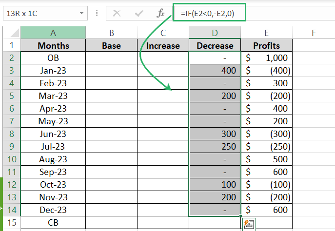
Step 2) In one of these columns, calculate the Decrease in profits by using the following IF function.
Step 3) Drag this formula down the whole list of profits.
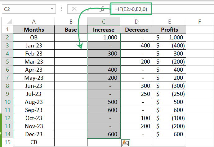
Step 4) Write a similar formula to extract the increases (positive values) out of the list of profits.
This IF function will check if the values in Column E are positive, it will return the positive values. And elsewise, zeros 0️⃣
Step 5) For the base values, write the following formula:
This calculates the balance of profit at each month.
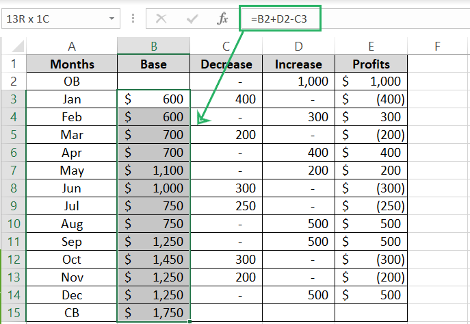
With this, our data is sorted.
Step 6) Select this data (excluding the list of Profits).
Step 7) Go to the Insert tab > Column Charts > Stacked column chart.

Excel will create a stacked column chart out of this data and insert it into the Excel sheet like here.
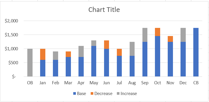
To convert this stacked column chart into a waterfall chart:
Step 8) Select the bars that represent the base values (blue ones in this case).
Step 9) From the Format Data Series Pane towards the right, select Fill > No Fill and Border > No line.
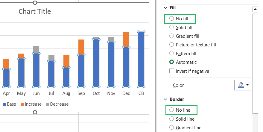
Doing this, the blue bars will be eliminated from this chart making it look like below 🕶
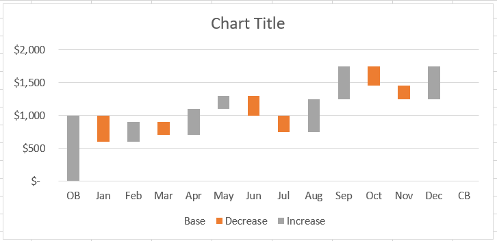
Now this chart adheres to a Waterfall chart to some extent.
Step 10) Double-click over the Closing Balance (CB) area of the horizontal axis. You can’t see anything there but, there exists a bar that’s just colored invisible.
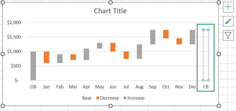
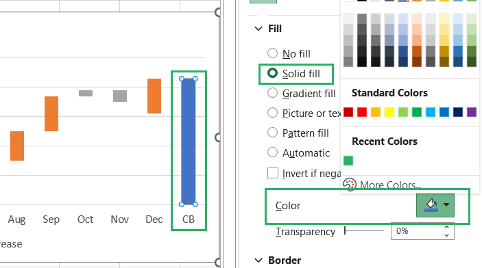
Step 11) Once selected, select the option Solid Fill under the Fill Options in the right pane. Choose the color you want for the Total bars.
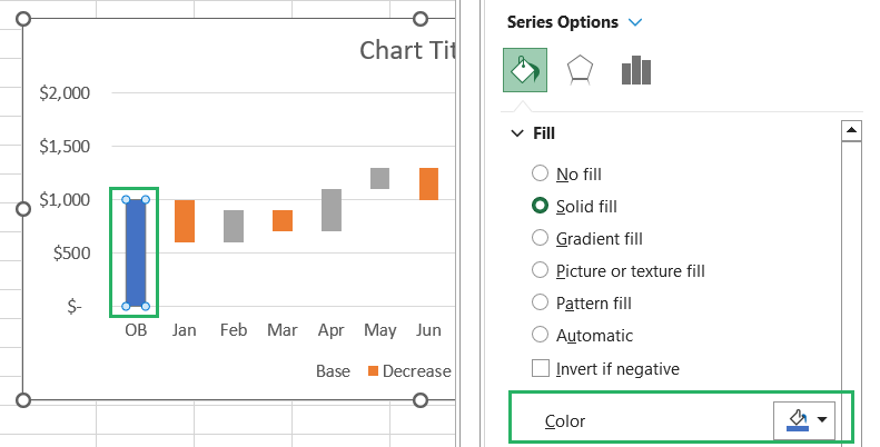
Step 12) Apply the same color to the first bar of the chart that presents the Opening Balance.
Here is how the Waterfall chart now looks:
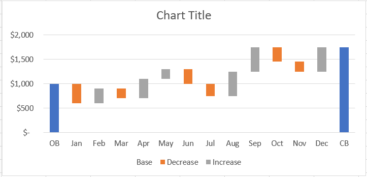
It is ready to be called a Waterfall chart 🌈
Here onwards, it’s you and your creativity with how you want the final look of the chart to come out.
Step 13) Select the bars on the chart to launch the Format Data Series pane.
Step 14) Reduce the Gap Width between bars to increase the thickness of bars.
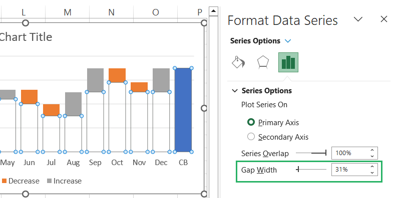
Step 15) To add more value to the chart, select the bars that represent an increase (orange bars).
Step 16) Click on the Chart Elements icon towards the right of the chart (the plus icon).
Step 17) Tick the Data Labels checkbox.
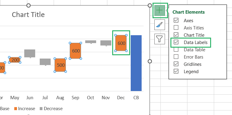
This will add Data Labels to the orange bars to show by what amount the profit has increased each month.
Step 18) Repeat the same for the grey bars to show the value of Decrease.
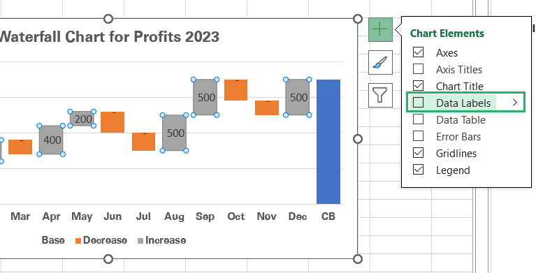
Be careful to individually select the increase bars to add Data Labels and then the Grey Bars to add the Data Labels. Selecting all bars at once to add Data Labels will also add them to the hidden bars for Base values making the chart look weird.
Step 19) Select the blue bars on both the chart extremes to add Data Labels to them.
Step 20) Format these labels as you like, change their font and color, bolden them, or rotate them as you like 🎡
Here’s how my Waterfall chart looks like Data Labels to it.
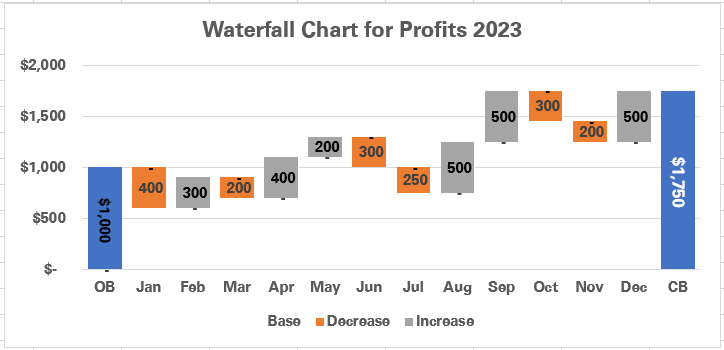
Step 21) Lastly, change the color of the bars to make them pop.
Step 22) Select the legend for each data type and change the colors for the relevant bars from the Legend Entry pane.
And with some final color changes, here’s how my stacked column chart (aka Waterfall chart) in Excel 2016 looks.
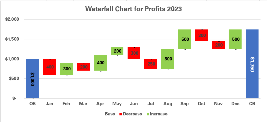
I hope this clarifies how you can not only create a Waterfall chart in Excel, but you can also edit it in several ways to clone an in-built Excel Waterfall chart. Fair chance you end up making an even better-looking chart 💡
Conclusion
Whether you’re an advanced Excel user subscribed to Microsoft Excel 2016 and newer versions or an old-is-gold person with older versions of Excel, this guide comprehensively covers how you can create a waterfall chart in Excel.
Hope you enjoyed the learning this Excel tutorial offers. We have a long list of other tutorials that explain making different types of charts in Excel. Hop on to them here to learn more.
