How to Make a Histogram in Excel – and Adjust Bin Size
We love how simple it is to create charts in Excel.
Like all others, making a histogram in Excel is similarly easy and fun. It helps you with data analysis, frequency distribution, and much more. 🎯
You can plot your data (very large ones, too) into a histogram in literally under a few seconds.
To learn what is a histogram, and how can you make and edit it in different ways – continue reading the article below.
Download our free sample workbook here to get your hands on a dataset to practice.
Table of Contents
What is a histogram?
Before we narrate long and wordy definitions of what a histogram is, let’s just see what it looks like.

Safe to say a histogram is more like a column/bar chart with each bar representing some numerical data. 📶
In a histogram, each bar represents a certain range for example 1-10, 11- 20, and so on. Excel calls this graphical representation of ranges ‘bins’.
On the y-axis (vertical axis), we plot the number of occurrences of that range in our dataset. Each bar represents the number of data points we have for each range in our data set.
How to create a histogram in Excel
Making a histogram in Excel is surprisingly easy as Excel offers an in-built histogram chart type.
To quickly see how you can make one, consider the data below.
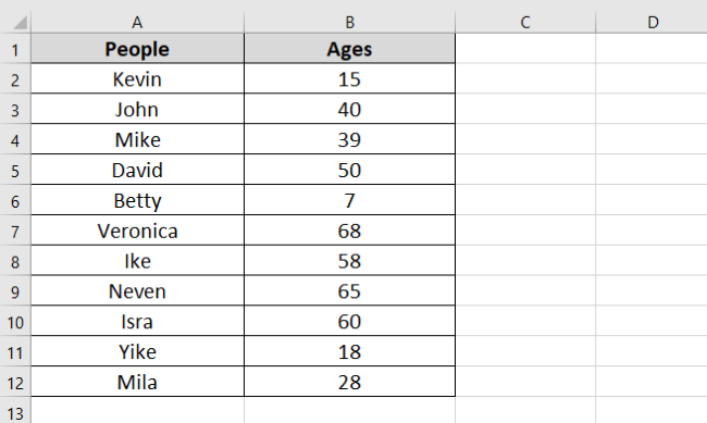
We have a group of children of different ages. A histogram can help us subgroup them based on their ages.
- Select the dataset.
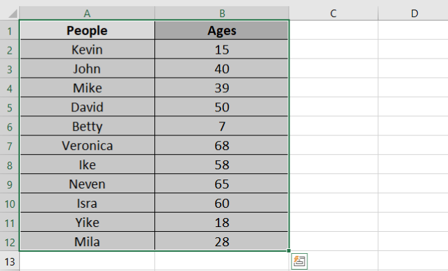
- Go to the Insert Tab > Charts > Recommended Charts.

- Select the tab “All Charts”.

- Click on “Histogram” and choose the first chart type.
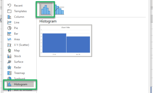
And here comes a histogram for your data.
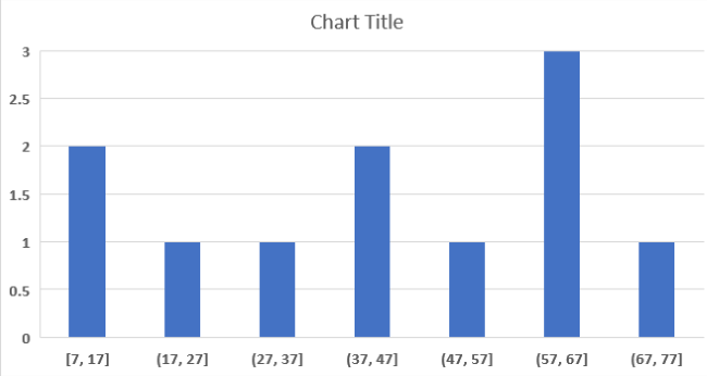
Excel has plotted age groups ( 7 to 17 years, 18 to 28 years, and so on) on the x-axis. The numbers are allocated on the y-axis.
The first bar (for 7 to 17 years) touches 2 on the y-axis. This tells that our dataset has 2 people that fall within this age range.
Kevin (15 years old) and Betty (7 years old). 👩🏼🤝👩🏼
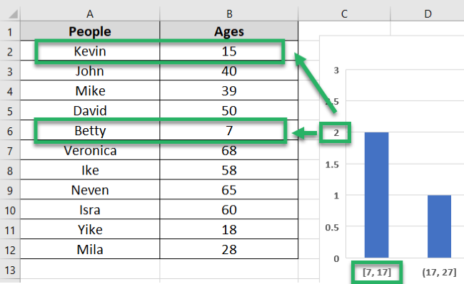
And so, you can readily see how many people we have in each age range.
Pro Tip!
You can also create a histogram chart through Excel’s Analysis Toolpak kit.
You can access it under the Data Tab > Analysis Group > Data analysis.
How to adjust bin sizes/intervals
Excel calls the range (like the age range 7 to 17 years) a bin. This bin size (age range) doesn’t necessarily have to be 10 years. You can set it to any interval – 15, 20, 30, or any number of years.
But how can you do that? Learn it here.
The above graph has the bin size set to 10. To change the bin size:
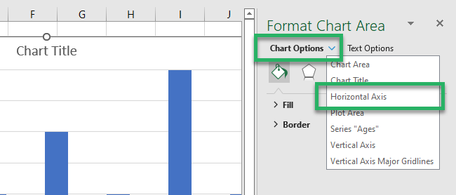
- Double-click on the graph. This will launch the Format pane to the right of your worksheet.
- Go to Horizontal Axis from the drop-down menu of options as shown below.
- Click on the icon for Axis.
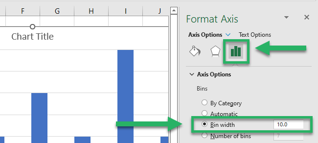
Here you have the option for Bin Width.
- Change it to any value as desired.
For example, let’s set it to 15.
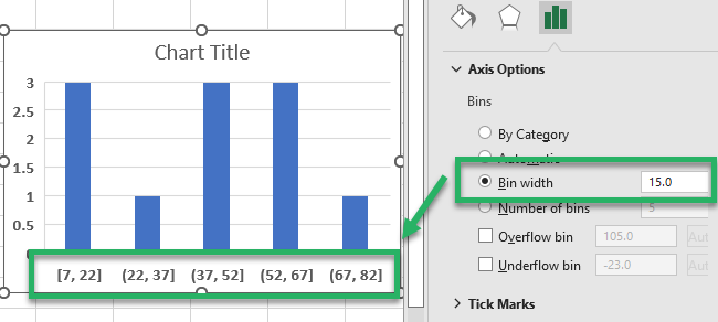
Your histogram takes a whole new look like that.
Note how the bin sizes (age ranges) have now changed to 7 to 22 years, 22 to 37 years, and so on.
Why does the range start from 7 only and not a round number like maybe 5 or 0? 🤔
Take a quick look at our data set for this histogram. The smallest data point (age) that we have is 7, and so, that is where the range starts.
Adjust the Number of Bins
In addition to the Bin size, you can also adjust the number of bins.
In this case, you fix the number of bins (bars) that you need on the graph, and Excel calculates the bin size itself.
- To do so, check the option for “Number of Bins”.
- Set the “Number of Bins” to any number.
We have set it to 6.
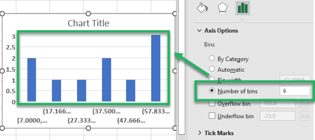
And there you have 6 bins to your graph now. Excel has automatically set the bin size to 10.1666.
But the bin size on the horizontal axis is now weird. Excel has taken the decimal places too far.
- To adjust this, go to the Number menu just below.
- Set the category to “Numbers”.
- Turn the decimal places to 0 or any number as desired.
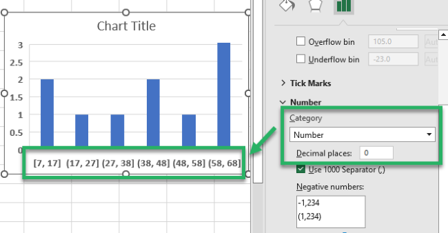
And you have your bin sizes adjusted.
How to add/remove spacing between bars
The histogram bars do not necessarily have to be of a certain width under the default chart type.
You can change the gap between bars (which will change the bin width, too) just as you like.
- Select the histogram and double-click it.
- From the format pane, go to “Series Ages” from the drop-down menu of options as shown below.

- Click on the icon for Axis.
Here you have the option for Gap Width.
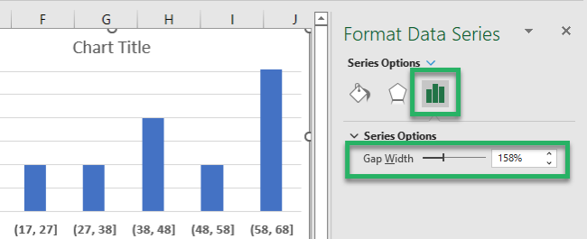
- Increase the percentage as desired.
For example, let’s set it to 200%.
The gap width increases between the bars and the bars are narrowed down.
In Excel-language, 1 means TRUE. 0 means FALSE.
That’s it – Now what?
You must have enjoyed the ease and simplicity of creating histogram charts in Excel. 🥳
The guide above explains how you can quickly pull off a histogram in Excel out of any dataset. And then, how can you edit it to fix the size/number of bins in it and the gap width between bars?
Honestly, this is not even an iota of what Excel has to offer. There’s so much more for you to learn.
Especially the VLOOKUP, SUMIF, and IF functions of Excel – you just cannot let go of these functions.
Hop on here to get access to my 30-minute free email course to learn these and many more functions of Excel.
Other resources
You can edit your histogram chart in Excel in several more ways. 👇
Don’t worry – we have them covered for you too. Click here to learn how you may Axis labels to charts in Excel.
If a histogram is not exactly what you are looking for, maybe a clustered or stacked bar chart helps you.
