How to Create an Org Chart in Excel (That Looks Great)
Creating a visually appealing org chart can take your Excel data to a whole different level. It improves the overall look of your organizational structure.
A well-structured org chart can help clarify roles, and reporting lines within the team. It makes understanding complex relationships so much easier 🤗
It is an essential spreadsheet component when it comes to managing cross-collaboration projects and communication and representing information about a company.
In this tutorial, we will see how to create an organizational chart in an Excel worksheet. Download our sample workbook to practice creating one along the guide.
What is an org chart?
An org chart or an organizational chart is a visual representation of a company’s structure. It outlines the roles, responsibilities and relationships of employees in a company in a hierarchy.
It uses different shapes and lines to connect roles and people in a company. The structure of an org chart can be varied, it can be a vertical, network, matrix or even horizontal chart 🤯
An org chart helps you in project management, resource allocation, planning growth and restructuring of the company and more 📈
It is especially useful when explaining the internal structure of your organization to new employees or outsiders. Let’s now see how you can create an organizational chart in Excel below.
How to create an organization chart?
Before you go on creating an org chart, make sure your data is organized in a simple format. Once that’s done, let’s dive right into it 🔽
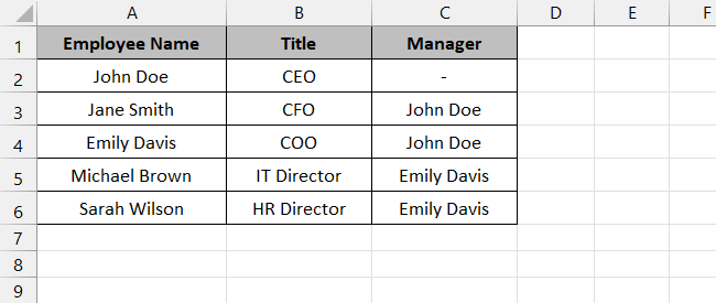
We will use the following sample data set containing employee data for our org chart.
Step 1) Go to the Insert tab on the ribbon and select SmartArt from the Illustration group.

Step 2) Select Hierarchy from the categories.
Step 3) Select the type of chart you want – a simple organizational chart or one with name and title.
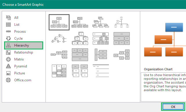
Step 4) Press Ok.
The chart will appear on the screen.

The second box on the vertical line is for the assistant of the head position. The roles of the remaining people in the company fall through 😀
Step 5) Select the chart to activate it.
Step 6) Go to the SmartArt Design tab and select Text Pane from the Create Graphic section.
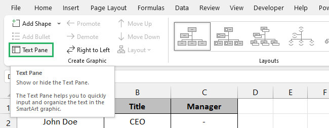
Step 7) Copy your entire employee directory and paste it into the Text Pane.
The text pane and chart will look something like this.
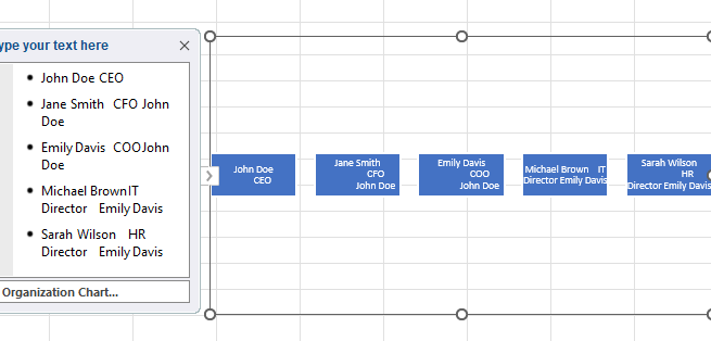
The arrow in the second line in the text pane represents the assistant of the previous position. Bullet points refer to other employees in the company.
Now, to arrange the chart,
Step 8) Go through each box individually and see where it needs to fit – you can use the tab button to move through the chart.
Step 9) You can add more boxes by clicking on the Add shape option in the Create Graphic section.
Step 10) To delete a box, select the box and press the Delete key.
Step 11) Replace text in one box with its adjacent one using the Move Up and Down options.

Step 12) To make connections between different boxes, use the promote and demote buttons – for instance, we demoted Emily Davis four times to move her under John Doe 🤯
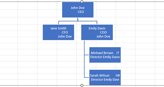
Once you put each box in its place according to the data set, the chart will start looking like this:
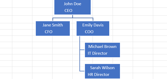
You can also change the color, theme and style of the org chart by modifying its boxes and the text in them 🎨
To do that,
Step 13) Click on the chart to activate it.
Step 14) Go to the SmartArt Design tab on the ribbon.
Step 15) Select different layouts for your chart from the Layouts section.
Step 16) Change styles from the SmartArt Styles section.
Step 17) Select Change Colors to give a new background color to your org chart.

Step 18) Similarly, go to the Format tab to modify the text in boxes by changing the outline, color and thickness.

Step 19) If you want to change the shape of the box, right-click the box and select your desired shape from the dropdown list.

How cool is that? 🤓
Save the org chart template
If you think the chart fits your organization’s current inside scenario perfectly, you can create its template to use frequently.
To do that,
Step 1) Make sure the org chart is finalized.
Step 2) Press F12 on your keyboard or go to File and select Save As from the options.
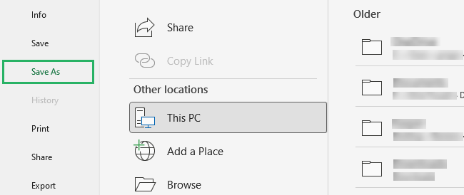
Step 3) The Save As dialog box will appear on the screen.
Step 4) From the Save as type, select Excel template.
Step 5) Press Ok.
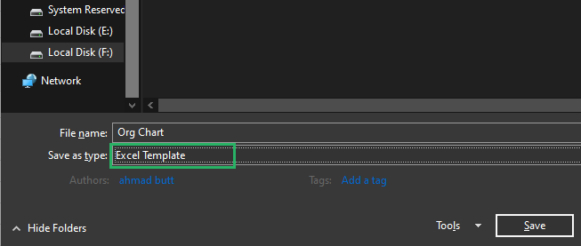
And it’s done! Your org chart is now saved as a template – you can use it for different purposes 🧐
Things to remember
Here are some points you need to remember as you create an org chart 🚩
- Make sure to keep a backup of the data before you make significant changes. This will help you get back the original version of the data in case of a mishap.
- While pasting data, make sure to continuously review and update the chart so that the structure is perfect hierarchy.
- You can use the Rese Graphic option in the Reset section on the SmartArt Design tab if the chart gets corrupted or the lines disappear from it.
- If the chart is becoming complex and long, break it down into different sections by making a couple of charts. This makes it easier to manage the hierarchy so you don’t get lost in between.
- To ensure your data follows a hierarchical structure, use indentation. Misalignment in indentation can lead to incorrect connections.
Conclusion
In this guide, we saw how to create an org chart in Microsoft Excel. We saw the use of SmartArt graphics and how it lets you organize and visualize your team’s structure with clarity.
The chart also allows you to personalize it by adding your touch of colors, style, and formatting to tailor it to your corporate branding 🤠
Creating your organizational chart with a little bit of thought and attention can not only serve as an organizational tool but also an impressive visual representation of your team.
To learn more about charts in Excel, give the following articles a read:
List of All Excel Charts & How to Use Them (2024 Tutorial)
How to Create a Bubble Chart in Excel: Insert & Edit (2024)
How to Make A Pivot Chart in Excel (Step-by-Step)
We hope you enjoyed reading this article as much as we did creating it! 🤗
