How to Create a Pivot Table in Excel: Step-by-Step
If you have a huge dataset that’s spread across your entire sheet, and now you want to create a summary out of it – you need a Pivot Table 💪
Pivot Tables make one of the most powerful and resourceful tools of Excel. Using them, you can create a summary out of any kind of data (no matter how voluminous it is).
You can sort your data, calculate sums, totals, and averages and even create summary tables out of it. If you are new to the concept of Pivot Tables, you’d be jaw-dropped by the end of this article.
So you’re ready? Let’s go.
Aa aah! Have you downloaded our free sample workbook for this guide? Get your hands on it right now to practice along with the guide below 🤟
Table of Contents
What is a pivot table?
An Excel pivot table is meant to sort and summarize large (very large sets of data).
Once summarized, you can analyze them, make interactive summary reports out of them and even manipulate them 📝
Let’s cut down on the talking and see what a pivot table looks like. Here’s the image of some data in Excel.
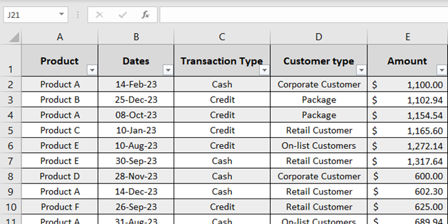
The data is about the sales of many products made throughout the year 📆
Yes, it’s super huge and it goes across many columns and rows. But it’s hard to understand the data this way. How about we create a summary of the same?
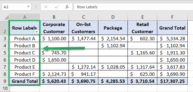
Wow! That’s what we call a Pivot Table.
It summarizes the sales for each product for each type of customer 💁♀️
You can change fields to summarize this data in any way you like. Like summarizing the sales for any particular product, period, type, etc.
Pro Tip!
Pivot Tables can help you do the following 👇
- Cleanly summarize huge datasets.
- Categorize your data into multiple categories and sub-categories.
- Extract a certain portion of your data (if need be) by selecting the relevant fields only.
- Get any part of your data as a row or as a column (called ‘pivoting’).
- Get totals, and subtotals, or drill down any of them to see their details.
How to create a pivot table in Excel
If the images above made you feel like it would be a science to create a Pivot Table in Excel – that’s just not true.
Pivot Tables are super easy to create. Let me show you how we created the one above 👀

So here’s the data for sales of different products made throughout the year.
Pro Tip!
Before we go on making a Pivot Table, here are some tips for you to follow to make your Pivot Table better 😎
- Turn your source data into an Excel table before making a Pivot Table out of it. This way, whenever you make any changes to the source data (adding or deleting rows or columns), your Pivot Table will reflect the same.
- Delete any empty rows or columns from the source data.
- Name each column as desired to have the same header as a field title in the Pivot Table.
- Ensure your source data doesn’t have any subtotals or totals.
Let’s concise them into a Pivot Table here.
- Go to the Insert tab > Pivot Tables.

You’ll see the Insert PivotTables dialog box on your screen as follows:
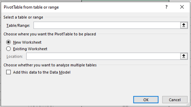
- Create a reference to the cells containing the relevant data.
We will navigate to the sheet ‘Data’ in our workbook and select the cells that contain data.
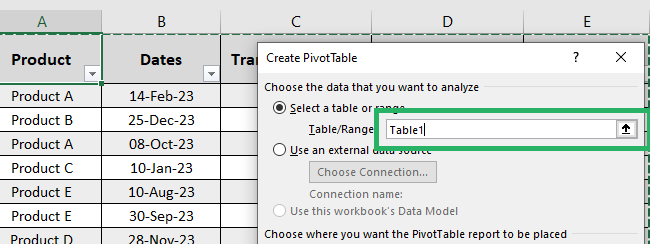
We have converted our data into an Excel table so Excel automatically recognizes it as Table1.
Do not forget to include the headers in the selection.
- Choose the option for New Worksheet or Existing Worksheet.
We will choose New Worksheet to have the Pivot table created on a new sheet.
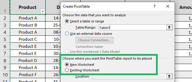
- Click Okay.
There comes the Pivot Table pane to the right of your sheet 💭
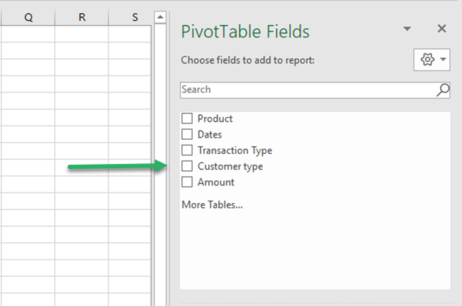
It has two parts. The first part (as above) has all the fields (columns) of your source data listed.
And here’s the second part.
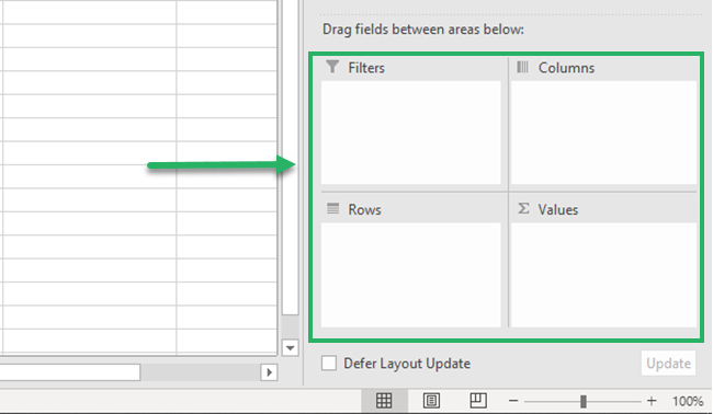
This part includes four boxes where you can specify how each field is to be shown in the Pivot Table. You can choose to have any field organized as a row or as a column, as a filter, or as a value 🎯
- Drag the filed Products from the list of fields to the box for Rows.
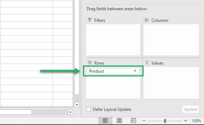
Here are the results.
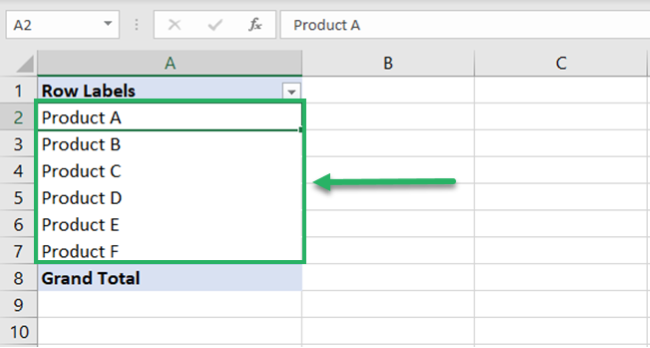
Excel organized all the products as rows.
- Drag the field Amount from the list of fields to the box for Values.
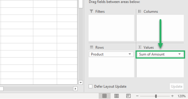
And this is what happens:
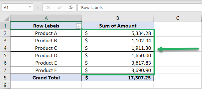
Excel adds a column for Values. The column Amount in our source data contained the sales amount of each transaction.
By adding it as values, Excel has summarized the sales of each product and listed them against each of the products 💰
But what if you don’t need the sum of sales of each product, but their count?
- Right-click on any number from the column Sum of Amounts.
- From the context menu, select Summarize Values By.
- Click on any operation that you want to be performed. For example, we want the Count of sales so we are selecting Count 🔢
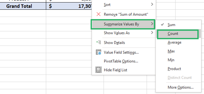
The results change as follows:
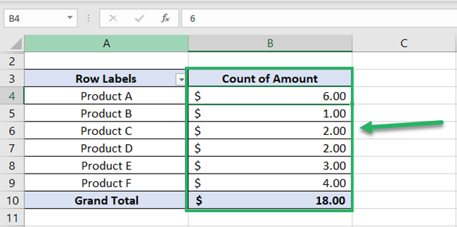
The column Sum of Amounts becomes Count of Amounts. For each product, we now have the Count of sales transactions.
No, it doesn’t stop here.
- Drag the field for Customer Type to the box for columns.
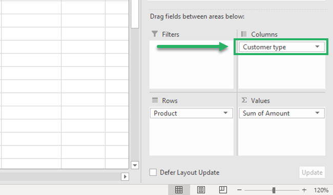
And this is what happens:
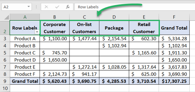
Excel adds columns for each Customer Type. And the sales of each product are now split into customer types 📊
Let’s add another field to see how you can further drill down into details using a Pivot Table.
- Drag and drop the field for Months to the box for Rows.
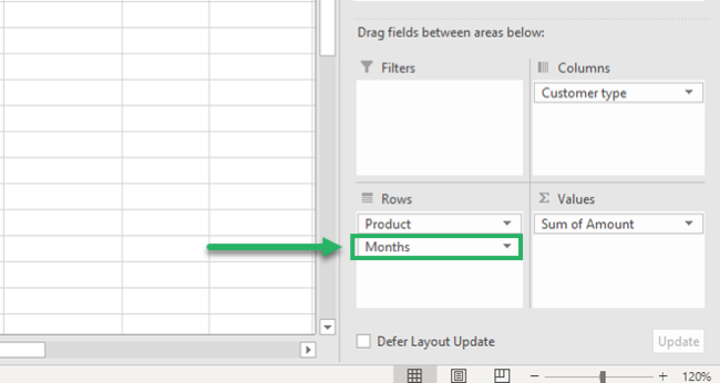
Excel adds a breakup of months under each product.
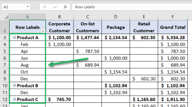
So now you can see a summary of sales of each product, for each month and by each customer type. Too convenient and clean ✔
You can make so many more variations to your Pivot Table by pivoting between rows and columns. No matter how vast your data is, Pivot Tables know how to knit it all together.
That’s it – Now what?
I am sure you loved the idea of Pivot Tables explained in the Pivot Table tutorial above. Excel Pivot Tables are a blessing for the people who get to deal with huge, messy data now and again.
But that’s just one tool of Excel. And Excel is a whole package of mind-boggling tools, features, and functions. We yet have so much more to explore 🚀
To begin exploring this giant spreadsheet software, I suggest you go with the VLOOKUP, SUMIF, and IF functions of Excel.
Want to learn them already? Enroll in my 30-minute free email course here that will teach you these (and many more) Excel functions in the most fun way.
Other resources
Using pivot tables, you can also create Excel Dashboards. It’s like combining multiple pivot tables in the form of interactive charts and graphs on one page.
Excel dashboards are just amazing – learn how to make them in Excel here.
Also, make sure to check out the 6 best dashboard templates I’ve found on the web!
