The Differences Between Reports & Dashboards in Power BI
In the Power BI environment, dashboards and reports play an important role in information visualization but both serve distinct purposes 😀
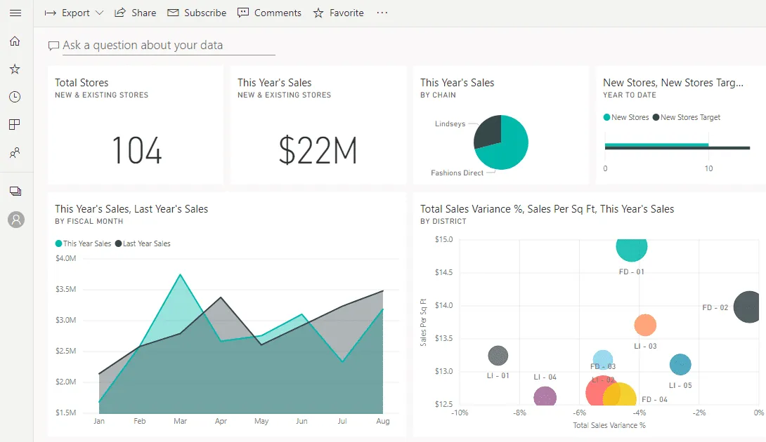
Dashboards offer insights and high-level key metrics on a single page They are designed for a quick view into all the data with different visualizations that make the data set easy to understand.
Reports, on the other hand, are a more detailed and comprehensive version of dashboards. It is a multi-page canvas with visualizations and advanced options to explore and analyze data.
Understanding the differences between the two is essential for effective data presentation. In this tutorial, we will get into the differences between the two and find the best option for you.
What is the main difference between a dashboard & a report?
The main difference between a dashboard and a report lies in the purpose 🧐
A dashboard is useful when you need a high-level overview of KPIs in a visually appealing manner. Whereas, a report is used for creating an in-depth analysis of a data set in a structured manner.
Think of the dashboard like an infographic – a single page with bits of information spread out everywhere. All information you need is on this image and you can zoom in and out to see better.

A report, on the other hand, is a document, with multiple pages and features. You can add different datasets on different pages, explore data and perform detailed analysis.
Reports are accessible everywhere in the Power BI environment – the desktop version and the online version. However, dashboards are only available online and can’t be accessed offline 🤔

Moreover, reports include rows and columns – similar to Excel sheets, which gives a sense of familiarity. Dashboards are a simple combination of multiple reports derived from various datasets.
Dashboards are the best choice for users who want to make decisions with a glance at the metrics and statistics. But if you want to get a detailed idea of the database, you need a report.
Power BI Reports
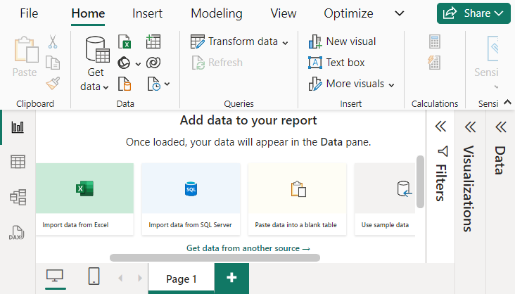
Power BI report is an essential tool of the Power BI Environment that lets you create detailed analysis and examination reports of a data set. A report usually spans multiple pages each covering a different aspect of a data set in-depth via a table, visualizations or elements ⬛⚪
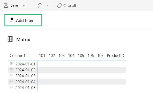
You can perform, ad-hoc analysis, filter, highlight, slice and drill through the data to get a comprehensive view and get deeper data insights.

In simple words, the report is the place where you do all the actual work – slicing, dicing, cleaning, connecting, and transforming the data to get it into the shape you want.
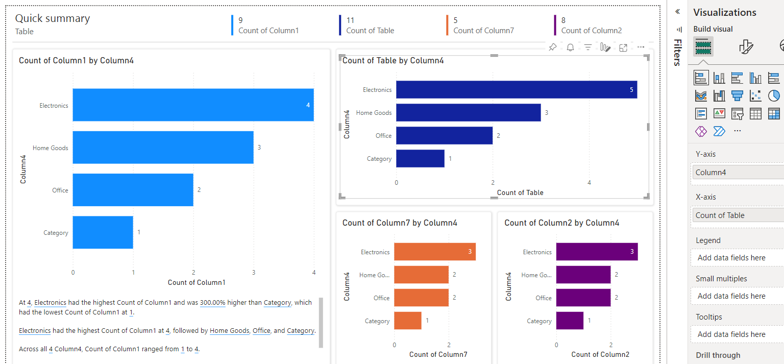
You can also add charts and graphs to your dataset to offer a more concise graphical representation. They make a good choice because reports are dynamic and are updated each time any change is made 🔃
Features
Data Sources: Reports can connect to different data sources like SQL servers, cloud services and spreadsheets to import data which are then used in elements and visualisations, etc.
Sharing: Power BI reports are connected to a Service that lets you share and collaborate with other people. Your team and you can open the report on various devices and make changes in real time.
Templates: You can use report templates to create reports – from creating an entirely new one or using an existing report. You can also add visual elements, data models and queries.
Interactivity: Reports allow you to explore and analyze the data in depth. Drill the data down, and check different visual elements on the screen to see the database behind it.
Slicers: One of the most important features of reports – slicer. You can use slicers to filter a whole report or a couple of elements only. It lets you choose what data is being displayed on the screen.
Export: You can extract data from a Power BI report in any way you want – from CSV to XML to XLXS, you can export the report in different formats.
Pages: You can add a variety of pages to a report where each page contains tables, and visuals describing different aspects of a dataset. You can locate all the pages under the navigation pane.
Power BI Dashboards
As the name suggests, Power BI Dashboard is a tool in the Power BI environment that gives you an overview of multiple reports on a single page. It is designed to give a consolidated view of all KPIs and track the performance of databases in one glance 👀
You get a huge variety of visualizations to choose from when working on a dashboard, but the most commonly used visualizations include tables, cards, charts and graphs. Its interactivity is kept minimal to make the process of using it easy.

Dashboards and reports are connected. The downside of a dashboard is that you can’t interact with the visuals as clicking them will take you to the report it’s sourced from.
They display data in real time and can connect to a variety of different sources. They contain pinned visualizations called tiles that show important chunks of information from each report.
Tile Customization: Power BI Dashboard offers easy tile customization – the process of adding, resizing or cropping is self-explanatory. But to edit the visual, you will have to edit the report.
Dynamic Data: You can set up dashboards to show data and updates made in real-time. This feature comes in handy when dealing with dynamic metrics.
Visualisations: Dashboard is a business intelligence tool that uses visualisations such as charts, graphs, etc that give insights into the trends and metrics.
Collaboration: Dashboards can be shared with your team, colleagues and anyone in the organization in real time to view and make changes. The dashboard can be viewed on any device.
Consolidated View: A dashboard shows a summary of data collected from different reports, databases and sources. It gives an eagle view of all reports which makes decision-making easy.
Alerts: You can set alerts in the dashboard to notify you of changes made by other people through email or in the dashboard.
Q&A: One of the most intelligent features of Power BI Dashboard. Ask questions about your data set in natural language and get results in the form of graphs and charts.
Power BI Dashboard vs Report
As we’ve already discussed, both the dashboard and report serve the purpose of storytelling but in rather distinct ways. Let’s see the key differences between the two below 🔽
- Reports typically consist of multiple pages and tabs each containing tables and different visuals conveying the sense of the data set. Dashboards are single-page canvases that contain key metrics and data points with visualisations understandable at a glance.
- Reports are used for detailed data analysis and interactive examination where the user can filter out and drill data whereas dashboards are concise and give a consolidated view of statistics and figures.
- Reports offer a highly interactive interface with lots of features. These include the query editor. Filtering, inserting images, linking and more. Dashboards, on the other hand, feature limited interactivity that helps understand the visualisations better.
- Reports offer a scheduled refresh feature. It creates analysis based on old company data sets and requires frequent updates to stay in the loop. Dashboards, however, focus more on real-time data updates making them more dynamic and reliable.
- Reports allow users to create, edit and customize data using query editor and insertion and deletion of images. But Dashboards don’t have this feature. You can resize the visualizations pinned on the dashboard but to edit them internally – you need to access the report.
- The dashboard offers natural Q&A and related insights features. The Q&A engine is like a subtle version of AI where you ask questions about your data model and get specific answers. The related insights feature gives insights on a specific tile by going through the data patterns and visualising them. Reports, unfortunately, don’t have any such feature yet.
Which is better?
The answer to this question depends on what you seek from the tool. As discussed earlier, both tools are part of the same environment but are used for different tasks and play different roles 😃
To clarify things further, let’s see the pros and cons of dashboards and reports.
Pros of Dashboards
- Easy customization
- Alerts setting
- Eagle-view of information
- Natural Q&A
- Related Insights
Cons of Dashboards
- Single page
- Lack of filtering option
- Not available on Power BI Desktop
Pros of Reports
- Available on both Power BI Service and Desktop
- High interactivity between visuals
- Slicers and filters throughout the report
- Deep analysis of data
- View underlying tables and data sets
Cons of Reports
- Single dataset per report
- No alerts feature
- High functionality interface can be confusing
Conclusion
In this guide, we saw the main differences between a dashboard and a report in Power BI. While both are powerful tools in Microsoft Power BI, both are well suited for different purposes 🤠
Reports offer detailed analysis that allows users to interact with each nook and croonie of the data set across multiple pages with a variety of features.
Dashboards summarize all the important information in a single page providing a quick high-level overview of everything 📃
You can leverage the best features of both tools to use them to their full potential by understanding their differences and aligning their strengths with your needs.
To read more about Power BI features and tools, give the following articles a read:
Power BI: Desktop vs. Online – Pros and Cons
Power BI Best Practices: 10 Guidelines to Always Follow
Power BI vs Excel: When to Use Excel and When Power BI Is Better
We hope you enjoyed reading this as much as we did crafting it! 🤗
