How to Make a Scatter Plot in Excel (and When to Use It)
A Scatter plot is one of the best tools for the visualization of data in Excel. It helps analyze trends and represent the relationship between two values more concisely.
But how can you use it to display your data? We will learn that and much more in the guide below 🧐
So without further ado, let’s get started.
Also, if you want to practice creating a scatter plot in real time, download our free sample workbook here.
Table of Contents
What is a scatter plot, and when to use it?
Also known as the scatter diagram or XY graph, the Scatter plot is a two-dimensional graph. It is used to show the relationship between two variables (axes), i.e., the X-axis and Y-axis.
The X-axis is referred to as the horizontal axis, and Y-axis makes for the vertical axis. It shows the relationship between two variables – how one variable is affected by a change in the other variable.
Enough with all the talk now 😅
It’s time we see what a scatter plot is and how is one created in Excel.
How to make a scatter plot
The most important part of making a scatter chart is not choosing the graph. Or changing the style and lines of the graph. It’s arranging the data properly.
Values of the independent variable or the X-axis should be in the left column. And the values of the dependent variable or the Y-axis should be in the right column. This makes it easy for Excel to plot the data points.
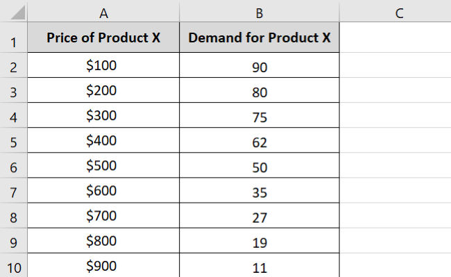
In the following data set, the Price of Product X is our independent variable. And Demand for Product X is the dependent variable.
Pro Tip!
What does this mean? You must have seen that as a product gets expensive (the price goes up), many people fail to afford it and shift to cheaper alternative products. The demand for the product hence falls ⤵
This shows an inverse relationship between both these variables. As the price increases, the demand decreases, and vice versa. This further tells that “Price” is an independent variable. And “Demand” is a dependent variable – it depends upon the price.
Now that we’re done with the arrangement of our data let’s make the scatter plot 🚴♀️
- Select all the data.
- Click on the Insert Tab.
- Click on the Insert Scatter (X, Y) or Bubble chart option from the Charts group.

You can see a variety of scatter plots available. Hover the cursor over each type to see its preview on the sheet.
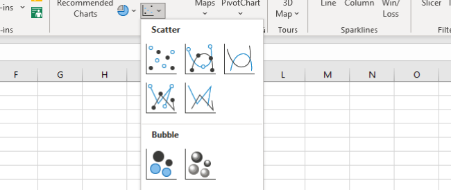
We are choosing a simple Scatter chart.

And the scatter chart appears 📊

Easy 👻
Right now, it might seem like a pack of scattered dots on a two-dimensional table. But pay close attention to note that each dot is formed at the intersection of Price & Demand.
For example, the first dot shows that the demand is 90 units when the price is $100 💰
If for some reason, you cannot change the positions of the column, you can change the axes on the scatter graph later. Here’s how:
- Right-click the chart and click Select Data.
- The Select Data Source dialog box will appear.
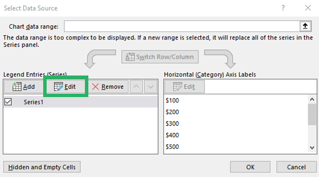
- Select the Edit option.
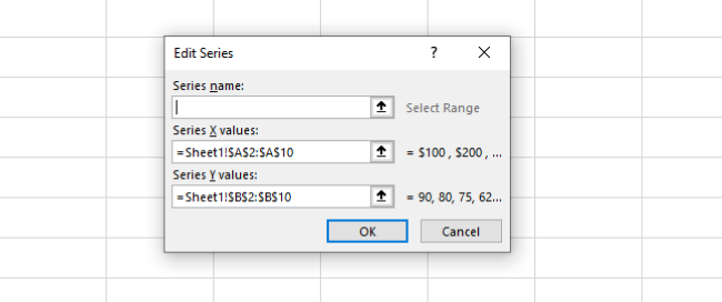
- Under the Edit Series dialog box, change the series reference for both the X and Y Series.
- Create a reference to the values for X-axis in the box against Series Y Values.
- Create a reference to the values for Y-axis in the box against Series X Values.
- Press “Okay” to see the value change axes as below:
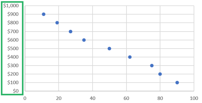
The major part of creating a chart is done. But doesn’t it seem too plain?
Let’s customize it by adding some chart elements to it 😀
How to add a line to a scatter plot in Excel
A scatter plot is certainly hard to decipher in its raw form. To better analyze trends, you can connect these dots into a line.
There are many ways you can add a line to a scatter plot in Excel. You can select different options from the scatter chart types even.
The Smooth Lines and Markers option will automatically add a line to your chart.
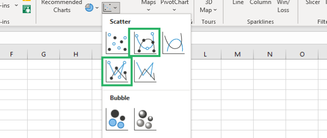
Similarly, the Straight Lines and Markers option will show lines along with the data points on the chart. And the results would be like this👀

Another option is to use the chart elements. For that:
- Select the chart.
- Click the + icon on the top left corner of the chart.

- Select Trendline from the list of options.

And a trendline will appear on your chart 📊
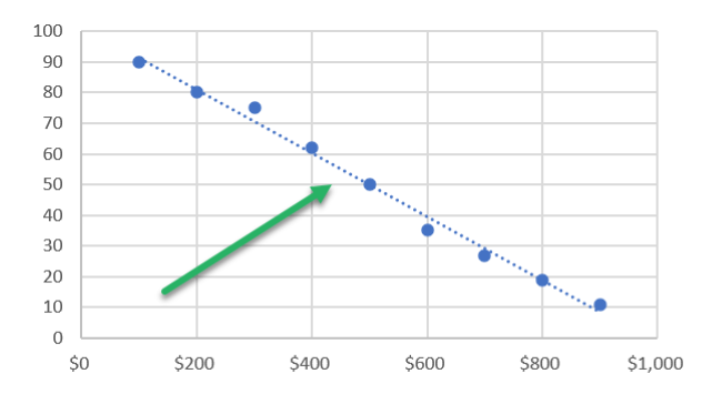
You can also add a line to the scatter plot from the Format Data Series.
- Right-click any data point on the chart.
- Select the Format Data Series option.

The Format Task Pane appears.
- Click the Fill & Line option (the paint can icon).
- Select Solid Line from the Line options.

A line connects all the dots on the scatter chart 🤩
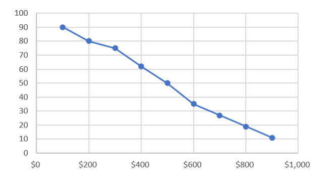
Scatter plot with multiple series
Often we need to add multiple series to our chart to add more meaning to it. Luckily, adding multiple series to a scatter plot is easy – it takes no more than 5 seconds ⌚
Let’s see how to do it below. For example, we have our scatter chart all ready and now we want to plot an additional dataset to it.
- Select and copy the entire additional data set.

- Select the scatter chart.
- Right-click the graph.
- Select the Paste Option from the drop-down menu.
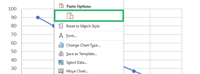
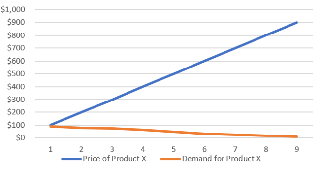
- Another Series appears on your chart (the orange line).

Similarly, if you have more columns in your data set, your chart will have more lines.
Scatter plot vs. line graph
Most Excel users find the Line graph and Scatter plot to be similar – but that’s exactly the case. And since both are used for the same purpose, choosing one can be really difficult.
To avoid this confusion, we will list the differences between both graphs. And we will also see the ideal scenario to use each of them 🔎
Scatter Plot
Here’s what a scatter plot looks like:

Line Graph
And here’s how a line graph looks like
Apart from the very apparent visual differences, here are the key differences between a scatter plot and a line graph in Excel 🥊
- A Scatter plot is mainly used to show the relation between two variables. And Line graph is used to show a pattern or trend over a period of time.
- Scatter plots work best for showing numeric values. Whereas the Line graph is better suited for periods, etc.
- A scatter plot, in essence, is a plot where each data point is represented by a dot on the plot. You may or may not choose to convert it into a line. The line graph, on the other hand, represents the data in the form of a line. You may or may not choose to add markers (dots) for each data point on your line graph.
- A Scatter chart works great for random data distribution of the horizontal axis. The line graph is preferred for the even distribution of data on the x-axis with long labels.
That’s it – Now what
This guide gives us a comprehensive insight into creating scatter plots in Excel. From learning what is a scatter plot to creating one. From adding lines to the graph to differentiating scatter plots from line graphs – we’ve explored a lot of options.
Excel, being a versatile spreadsheet software, has a huge variety of graphs and charts to offer. Even if it doesn’t have all the options, you can always use hacks and make tweaks to create the one you want 😁
And it doesn’t just stop there. Excel’s features and functions are a world of their own. You can master half of Excel if you master Excel functions only.
If you’re eager to start right away, we suggest you begin learning the VLOOKUP, IF, and SUMIF functions.
Enroll in my 30-minute free email course that teaches these functions and much more.
Other resources
Did you enjoy reading this article? If yes, we bet you’d love to read other related topics. Like How to Make a Line Graph in Excel, How to Make a Gantt Chart, How to Add Axis Labels, and more.
