How to Add a Trendline in Excel – Full Tutorial
On a graph, it can be hard to find the actual direction of a data series if there is no line on the graph to show the pattern of the data series.
But there’s a tool to help us out with that: the trendline📈
You can even use the trendline to get the expression of the data points, so you can do forecasts.
Grab the sample workbook here and let’s dive into adding a trendline to this dataset🤿
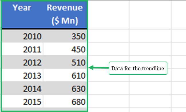
Table of Contents
How to add a trendline in Excel
To start the lesson, we will first convert our dataset to a chart.
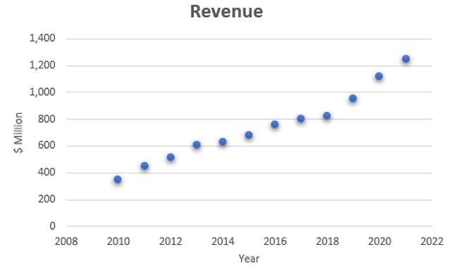
I am creating a scatter plot for the example data set.
You can add trend lines to any of the below chart types👍
- Column chart
- Line chart
- Bar chart
- Area chart
- Stock chart
- Bubble chart
- XY scatter charts
But, we can’t add a trendline to every chart type. The below chart types are not supporting the trendline👎
- Pie chart
- Surface chart
- Radar chart
- Stacked chart
- Sunburst chart
- Doughnut chart
Let’s add a trendline to the above chart.
- Select the chart.
Click on the chart to select the chart.
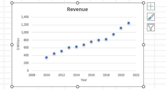
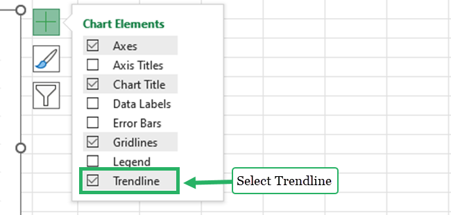
- Click the plus (+) button in the top right corner of the chart to expand the chart elements.
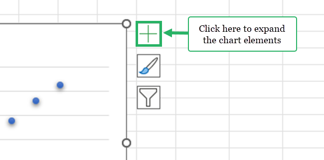
- Select trendline from chart elements.
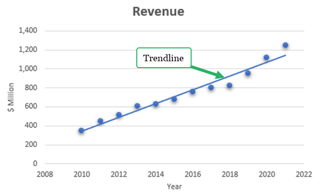
Our chart is quickly updated with a linear trendline.
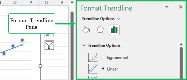
- Double-click on the trendline to open the format trendline pane.
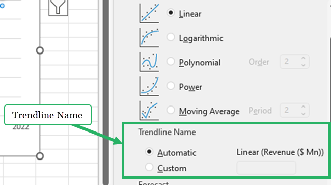
- Select one of the 6 trendline options.
-
- Exponential trendline
- The exponential trendline is a curved line and this trendline is helpful when data values increase or decrease at a constant rate.
- An exponential curve cannot be generated if the data set has negative values and zeros.
- Linear trendline
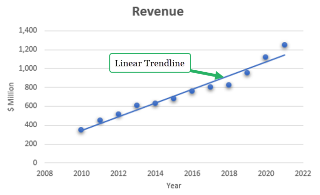
- A linear trend line is suitable when data points increase or decrease at a steady rate.
- Logarithmic trendline
- The following equation is used to compute the least squares fit of the data points.
- Exponential trendline

-
-
- A logarithmic trendline can have both negative and positive values.
- Polynomial trendline
- The following equation is the polynomial equation to calculate the least squares fit of the data points.
-

-
- Power trend line
- The power trendline is a curved line.
- It cannot be used in any of the data values that are negative or zero.
- Moving average trendline
- The moving average trendline clearly shows a trend in the data set by smoothing away variations in the data.
- We can change the number of periods to find the average values for the trendline.
- Power trend line
The name of the selected trendline option is displayed in the format trendline pane🔎
Linear trendline
Let’s apply a linear trendline to our data set.
Select “Linear” from the trendline options.
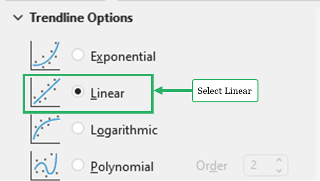
The equation below is used to determine the least squares fit for a line in a linear trendline:

Our linear trendline is ready.
Polynomial trendline
Let’s use the polynomial trendline for our data values.
Select “Polynomial” from the trendline options.
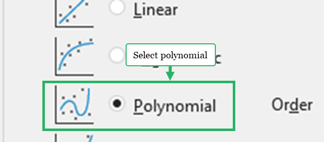
In the order box, we can enter a whole number between 2 and 6.

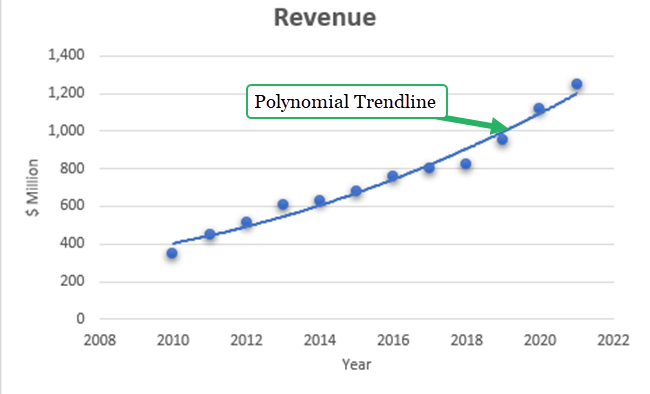
The number of bends (hills and valleys) in the curve can be used to estimate the polynomial’s order⛰️⛰️⛰️
Typically, there is only one hill or valley on an Order 2 polynomial trendline.
Order 3 contains one or two hills or valleys.
Order 4 typically has three or more.
Our chart with the polynomial trendline is ready.
Pro Tip!
You can add multiple trendlines on the same chart😍
How to add a trendline to each data series in the same chart?
Select one data series at a time and follow the steps of the above example.
How to add different types of trendlines for the same data series?
Repeat the steps of the above example and choose a different trendline each time.
Let’s add different trendlines to our example.
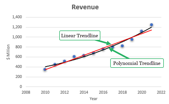
The red line is the linear trend line and the black line is the polynomial trend line.
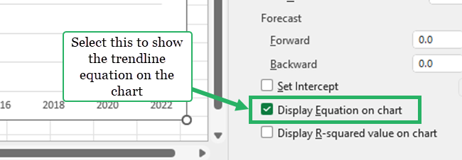
Show trendline equation
Select the checkbox of “Display equation on chart” to add trendline equations on the chart.
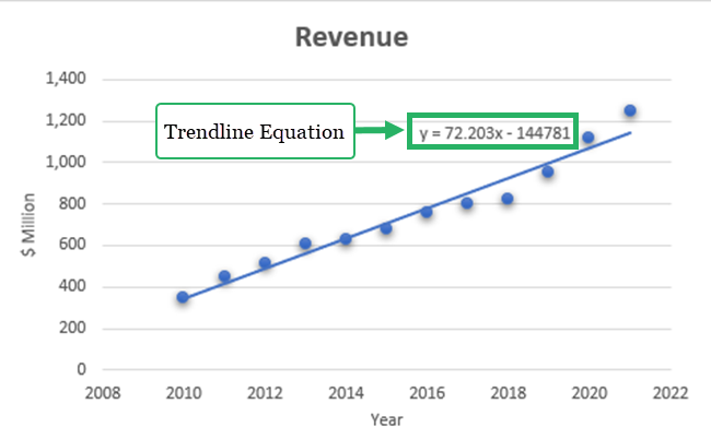
If this option is selected, Excel displays the R-squared value on the chart.

And you can see it here:
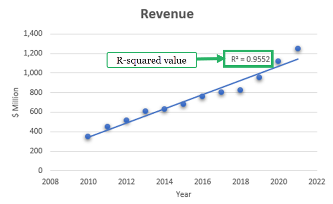
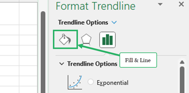
Go to the Fill & Line section of the format trendline pane to change the line color of the trendline.
What is a trendline?
A trendline can be a line or curve to show the direction of data values.
It helps to visualize the pattern of a data series more effectively and easily.
It helps to forecast future trends more accurately and very quickly.
The trendline is very useful to get a quick insight into our data👌
For example, an increasing slope of a trendline indicates a positive correlation between the two variables. If the slope decreases, it indicates there is a negative correlation between the two variables.
Trendline reliability is depending on the R-squared value of the data set.
It assesses how well the linear regression line fits the data.
R squared value is ranging between 0% and 100%.
If the R squared value is 100%, the line fits the data values 100%.
It means that the independent variable completely explains the dependent variable.
When the R-squared value is closer to 100% the trendline is more reliable.
A low R-Squared value indicates that the trendline is not reliable.
That’s it – Now what?
You now understand how simple it is to insert a trendline in an Excel chart.
Did you tag along in the sample workbook?
Well done💪🏼
So, you’re looking to add a trendline to a chart.
But what data does your chart display?
It better be something useful.
The best functions for getting useful numbers in Excel are: IF, SUMIF, and VLOOKUP.
If you’re not already an expert on those topics, you should sign up for my 30-minute free online course and learn them all, step-by-step.
Other resources
If you like to learn more about creating Excel charts, you can read our articles about how to create a scatter plot, a line graph, or a column chart.
Also, closely related to trendlines is forecasting in Excel. Read all about it here or dive into linear regression specifically.
