How to Make a Frequency Chart in Excel (Step-by-Step)
Have you ever felt lost in a huge database of numbers trying to make sense of where everything fits in? In today’s data-driven world, that’s a common struggle.
But what if I told you there is a tool that can help you visually see where all the numbers align? 🧐
Enter the frequency chart – one that makes complicated data easy to understand. There are three different ways of creating a frequency chart in Excel and we will be exploring both below.
You can download our free sample workbook here for hands-on practice with frequency charts. Let’s get right into the tutorial 🚀
How to Create Frequency Distribution Table Using Frequency Function
To create a frequency distribution table in Excel, you need to have data with different recurring values. Let’s assume we have the following sample data 📗

We can say that a variety of values appear in the data repeatedly. What the frequency chart will do is plot a graph that gives a visual representation of the values that appear and the number of times they appear.
But to do that, you need to have two essential data arrays or input ranges in your data set. These are the Bins and Frequency of Data itself.
Let’s see how to extract this range of values from your data set below.
To create Bins,
Step 1) Select your original data set.
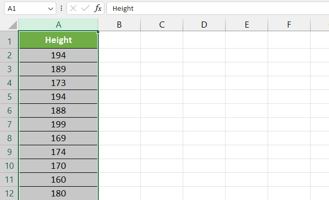
Step 2) Go to the Data tab on the ribbon.
Step 3) Under the Sort & Filter section, click Advanced.
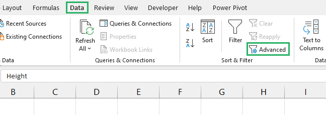
Step 4) The Advanced Filter dialogue box will appear on the screen.
Step 5) Under Action, it shows two options, select Copy to another location.
Step 6) In the Copy bar, you need to select the column where you want your unique values to appear.
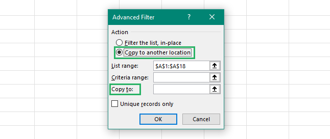
Step 7) Click on the arrowhead at the end of the Copy bar and select cell B2.
Step 8) Click on the arrowhead again to return to the dialogue box.
Step 9) Tick the Unique Records only box at the bottom left of the dialogue box
Step 10) Press Ok.
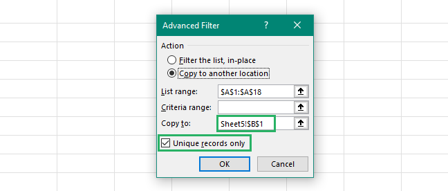
Step 11) The unique values from your data set will appear in column B.
Step 12) In the column header, change the name to Bins Range.
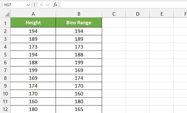
Hold on, we’re not done yet! There’s one last thing to do.
Step 13) Select your Bins Range column.
Step 14) Go to the Home tab and under the Editing section, click Sort & Filter.
Step 15) From the dropdown that appears, select Sort A to Z🔡
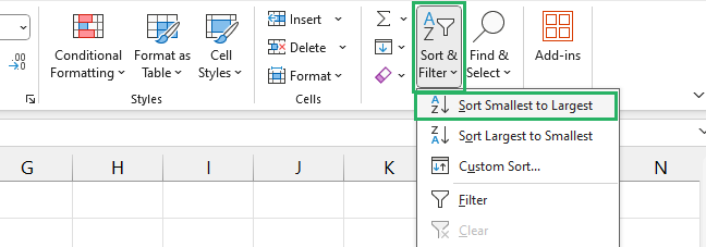
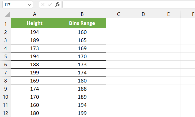
And it’s done. Your bin array is all sorted and ready to use.
Now, we need to calculate the frequency. To do that, we will use the frequency array formula:
where,
data_range refers to the actual data set with recurring values
bin_range refers to the unique values extracted from your data
Step 16) Select cell C1 and type in Frequency as a header.
Step 17) Insert the frequency formula in cell C2 as:
But don’t press Enter just yet!!
Step 18) Press CTRL+Shift+Enter on your keyboard ⌨
You will notice a pair of braces or curly brackets appear at the start and end of the frequency function as shown in the image below. This indicates that the current formula is an array formula.
Step 19) Double-click the Fill Handle or drag it down to cell D5 to calculate the frequency for the remaining cells.
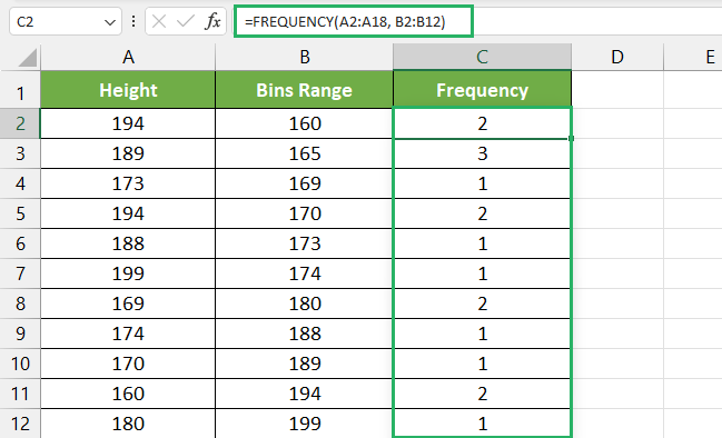
And your frequency distribution table is all ready!
How to Create a Frequency Chart Using Column Chart
Under this heading, we will see how to create a frequency chart in Excel in the easiest way possible.
To create a frequency chart in our Excel spreadsheet.
Step 1) Select your output range or Frequency column.
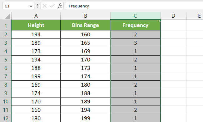
Step 2) Go to the Insert tab on the ribbon.
Step 3) Under the Charts section, click on Insert Column or Bar chart and select a 2D column chart

Step 4) In the chart output, you will see the frequency values on the y-axis and different bin values on the x-axis.
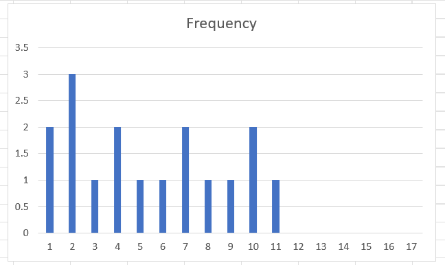
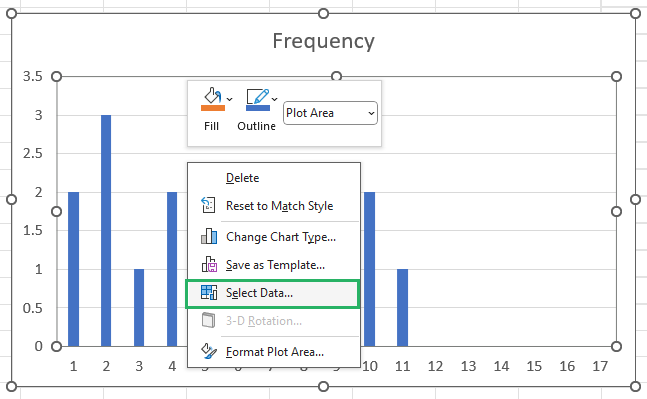
Step 5) To change the bin values, right-click the chart and click Select Data from the dropdown menu that appears.
Step 6) A Select Data Source dialog box will appear on the screen 💻
Step 7) Under the Horizontal Axis Labels, click Edit.
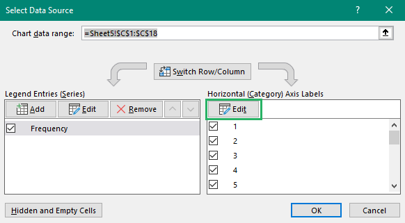
Step 8) A small Axis Label will pop up, select the bin range values in this range using the arrowhead.
Step 9) Press Ok.
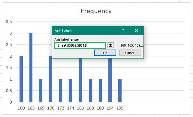
Step 10) Click on the plus icon (+) on the top right corner of the chart and check Axis Title.
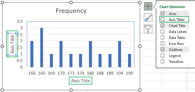
Step 11) You will see Axis Title boxes appear on the x and y-axis of the chart.
Step 12) Fill in Frequency on the left side and in Range on the right.
Step 13) You can also fill in the Chart Title given at the top centre of the chart or delete it.
Step 14) Once done, this is what your final frequency distribution chart will look like:
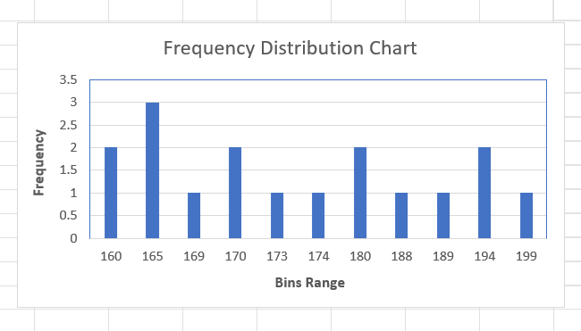
It took some time, but we got it all right 😉
How to Create Frequency Distribution Table Using Data Analysis
Using Data Analysis is the easiest way of creating a Frequency Distribution table and it takes less than two minutes to create one. Don’t believe us? See for yourself below.
Say, we have the following sample data.
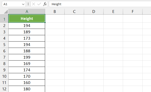
Now, to create the table using Data Analysis, you need to have the Add-in enabled. If you have it enabled, you will be able to find the Data Analysis option on the Data Tab under the Analysis section.

If you can’t find it on the Data tab, it might be because you have turned the Data Analysis ToolPak Add-in off. To turn it on,
Step 1) Go to File > More > Options.

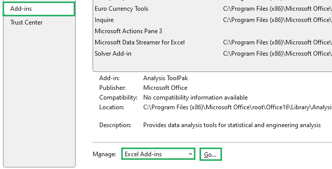
Step 2) Click Add-ins from the list of Categories. In the Manage bar, select Excel Add-ins and click Go.
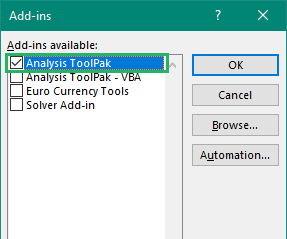
Step 3) From the Add-ins dialog box that appears, check the Analysis ToolPak option
Step 4) Press Ok.
The Data Analysis Add-in should now appear in your Data tab. You can learn more about it here.
Step 5) Click on the Data Analysis button.
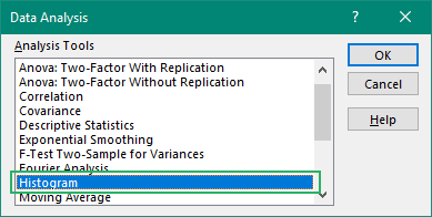
Step 6) A Data Analysis dialog box will appear.
Step 7) From the list, select Histogram and press OK.
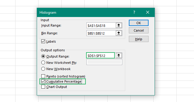
Step 8) The Histogram window pops up on the screen.
Step 9) In the Input range, select your raw data set.
Step 10) In Bin Range, select the column containing unique values from your data set.
Step 11) Check the Labels box.
Step 12) Under output options, you can choose to either create the table on the same worksheet in range or choose a New Worksheet 📝
Step 13) We chose Output Range.
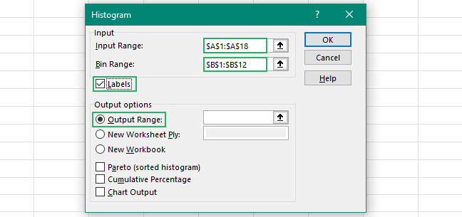
Step 14) Select the area on your sheet where you want the table to appear.
An extra feature that Histogram offers over other methods is the option to calculate Cumulative Frequency.
To add that to your table,
Step 15) Check the Cumulative Frequency box at the bottom of the dialogue box.
But don’t go on pressing Enter yet.
How to Create a Frequency Chart Using a Histogram Chart
Let’s now see how to create a Histogram chart in MS Excel 📗
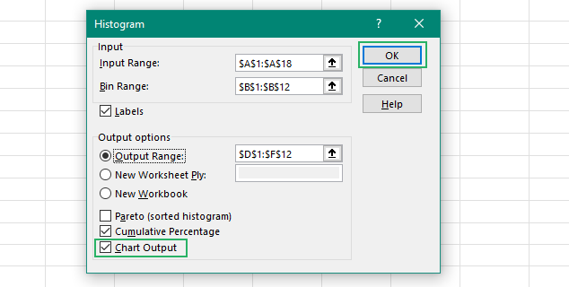
Start right from where we stopped – in the Histogram dialog box, check the Chart output box at the bottom and press Enter.
Here’s where all the magic happens.
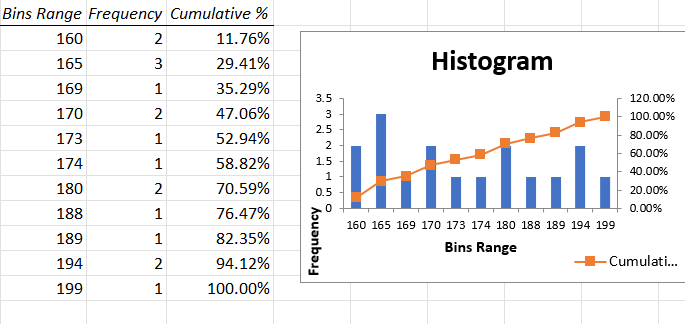
The Histogram will now appear with the Unique Values, Frequency, Cumulative Frequency columns and Frequency chart. This is what your worksheet must look like:
Pretty cool, right?
You can make little tweaks to the final output and charts if you like but the major part of our frequency distribution table and chart is done here 📊
How to Create Frequency Distribution Table Using Pivot Table
Another easy way of creating a Frequency Distribution Table is using the Pivot Table. Let’s see how to do that below.
To create a Pivot Table,
Step 1) Select your raw data set.
Step 2) Go to the Insert tab and under the Tables section, click on Pivot Table.

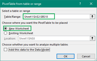
Step 3) A Pivot Table dialog box will appear on the screen.
Step 4) Select your raw data set and select New Worksheet from the options
Step 5) Press Ok.
Step 6) A blank Pivot Table will open up in a new worksheet.
Step 7) There will be a Pivot Table window pane on the right side.
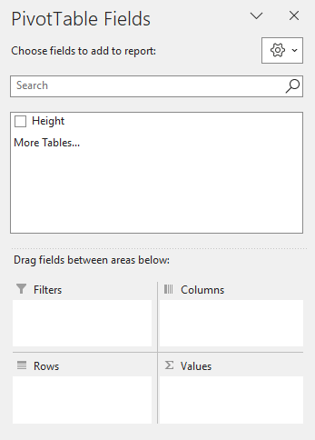
Step 8) Select the Height column and drag it to the Row field at the bottom of the pane.
Step 9) Drag the same column again and drop it in the Values field.
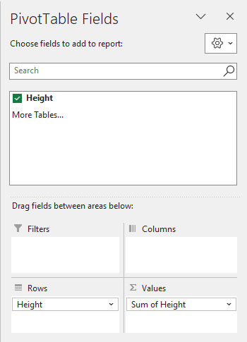
Step 10) Your Pivot Table will now look something like this:
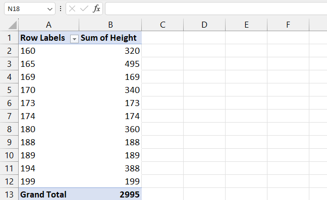
This means we’re on the right path.
Step 11) Right-click the Sum of Height column and select Value Field Settings from the menu.
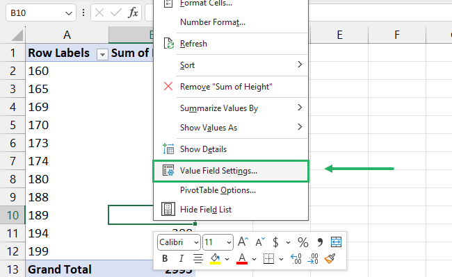
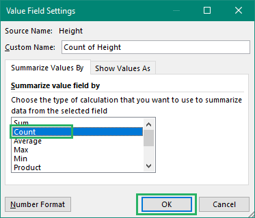
Step 12) A value Field Settings dialog box will appear.
Step 13) From under the Summarize value field by, select Count.
Step 14) Press Ok.
Let’s now group our Row Labels. Note that this step is optional and if you don’t want to group your data, skip to the Pivot Chart part.
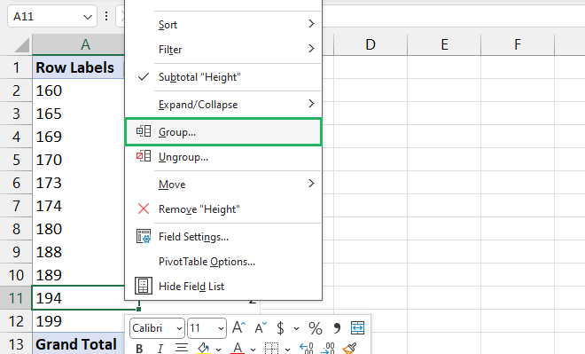
Step 15) Select any cell in the Row Labels column and right-click.
Step 16) Select Group from the dropdown menu that appears.
Step 17) A small Grouping dialog box will appear.
Step 18) Set the distribution of the values as you like – we set it by 3.
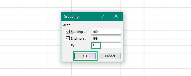
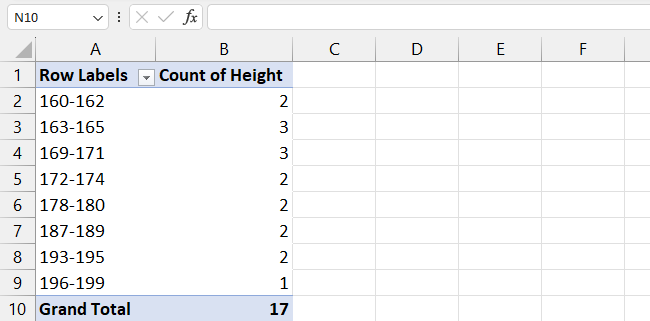
Grouping distributes your data set according to the values provided. That means if I set my By value as 5, my row label will contain values like 160-164 and so on. This helps us know how many values occur in a certain range.
Step 19) Press Ok.
And it’s done. Your Frequency Distribution Table has been created.
Your final Pivot Table will now look something like this:
Pretty cool, right? 😀
How to Create a Frequency Chart Using a Pivot Chart
Now that we have our pivot table with all the data points we need, let’s create our frequency chart using a pivot chart in Microsoft Excel.
To do that,
Step 1) Select any cell from the Pivot Table.
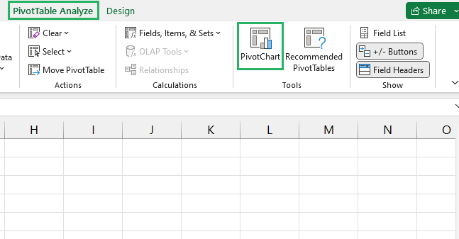
Step 2) On the ribbon, go to the PivotTable Analyze tab.
Step 3) Under the Tools section, click on Pivot Chart 📊
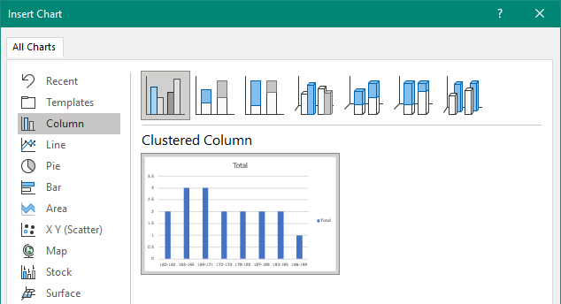
Step 4) From the Insert Chart dialog box, select the Clustered Column chart.
Step 5) Press Ok.
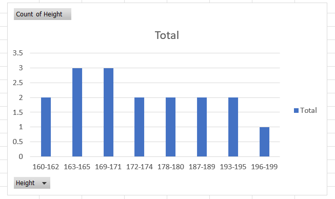
Step 6) The Pivot Chart will appear on the screen with the grouped Height and Frequency values plotted on the x and y-axis, respectively.
Let’s quickly make some formatting changes to the chart and it will be ready in no time.
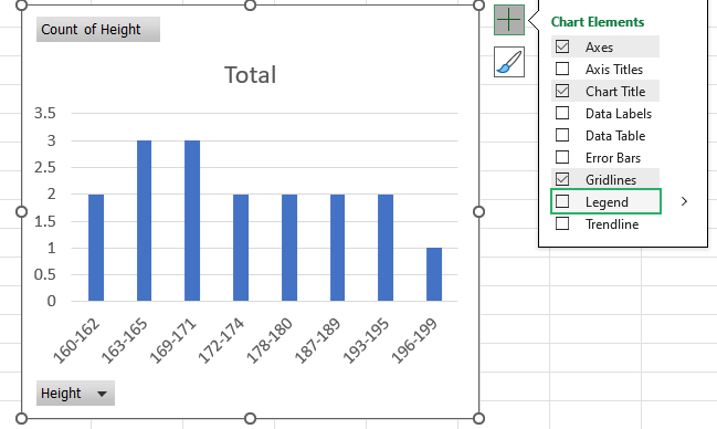
Step 7) Click on the plus icon (+) at the top right corner of the chart.
Step 8) Uncheck Legend – this will remove the unnecessary Total written on the chart.
Let’s now remove the annoying Field Buttons on the chart.
To do that,
Step 9) Right-click the Count of Height button at the top left of the chart.
Step 10) Select Hide All Field Buttons on the Chart.
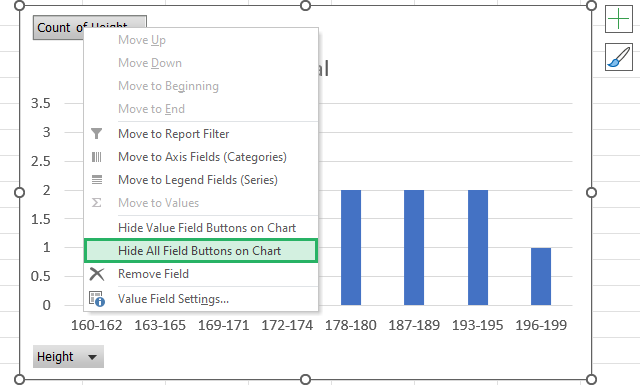
And the Field Buttons have been removed.
Step 11) Click on the plus icon (+) at the top right corner of the chart ➕
Step 12) Uncheck the Chart Title and check the Axis Titles.
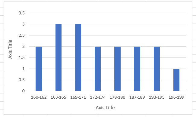
Step 13) In Axis Titles, type in Frequency on the left and Height at the bottom.
And it’s done. Your Frequency Distribution Chart for Grouped Values is ready.
The same for Ungrouped Values looks something like this:
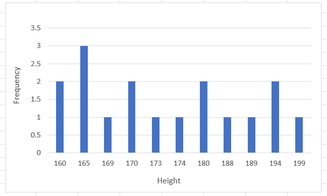
That was easy, no?
Conclusion
In this tutorial, we saw three different methods of creating a frequency distribution table and chart in Excel📗
The major difference between all these methods is that unlike in the frequency function methods, you don’t need to find Bin Ranges and Frequency explicitly.
Nevertheless, all methods offer a clear and concise way of representing data visually. For beginners, however, I would suggest the Data Analysis method as it is easier and quicker to use 😀
Read our other related articles below:
- How to Make a Histogram in Excel – and Adjust Bin Size (2024)
- How to Count Unique Values in Excel (and Distinct Values)
- How to Create a Pivot Table in Excel: Step-by-Step (2024)
We hope you enjoyed reading this article as much as we enjoyed creating it.
