How to Change Series Name in Excel (Step-by-Step)
If you frequently use Microsoft Excel to create charts and graphs, you’d know Excel is an excellent choice for data visualization through charts.
While Excel can quickly visualize a given data series in the shape of charts and graphs, it also automatically names the data series used in creating those charts.
These names are derived from the data itself (the data headers). However, sometimes these names might be too generic or just not something you want. Inappropriate naming of data series in Excel might make the chart difficult to understand defeating the entire purpose of data visualization 📊
But that’s not a problem – you can always change the series name in Excel. In this step-by-step guide, we will discuss the two possible methods of changing series names in Excel.
To follow it till the end, I suggest you download your free practice workbook for this guide to practice all the way along.
What is a Series Name?
Series’ names are the labels or keys assigned to different series of data used to create a chart.
These names help you identify how each data set is represented on the chart. They are particularly important when your data has multiple series all of which are collectively represented on the chart.
For example, the data below represents the quarterly profits for three different Companies.
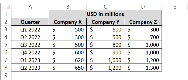
To visualize this data, let me quickly create a line chart out of it 📈
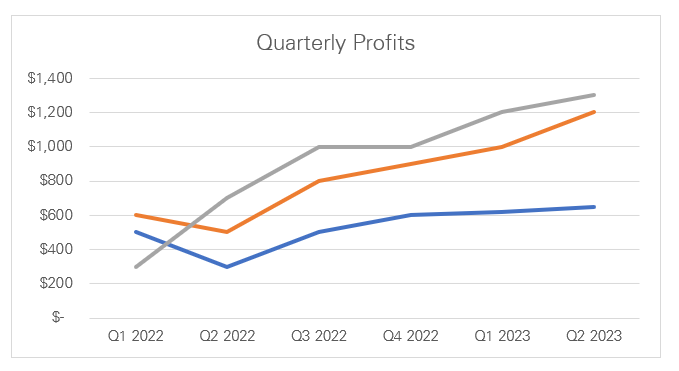
There are three different colored lines (probably each of which shows the trend of profits for each company over the quarters).
However, which line shows the progress of which Company? Which Company performed better than the rest?
Can’t say really because, without names for each data series, the chart makes little sense.
Once we add series names to this chart, it will look like below.
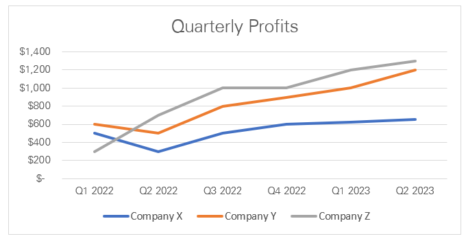
With the series name added to the chart, it is now evident that the blue trendline represents the performance of Company X 🏦
The orange line represents Company Y and the grey line represents Company Z. Although Company Z started from a pothole, it rose to the highest level of profits by the last quarter.
Hope we are now on the same page about what series’ names are and how they are useful. They are also called chart legends.
Change the Series Name in Excel by changing the data
Every time you create a chart that has multiple data series (like Company X, Y, and Z’s profits), Excel will name each series based on the headers in the source data.
Like here:
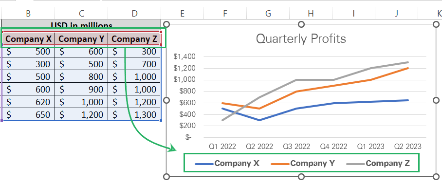
Now, if you want to change these names, the most common way is to change the source name from they are derived 📝
Step 1) Identify the data headers from where Excel has derived the series names.
Look around the data headers in the source data and you will find these names readily placed before you in the dataset.
Step 2) Edit the relevant headers to include whatever text you want as the Series name.
For example, I want the Series names of Company X, Company Y, and Company Z replaced by the actual company names of ABC Ltd., LMN Ltd., and XYZ Ltd., respectively.
Let’s edit the data headers to achieve this.
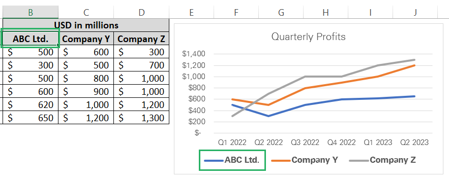
See that? As soon as I edited the data header for Company X to write it as ABC Ltd., the relevant Series name in the chart was changed.
Updating the data headers for the remaining companies as well changes the series names as follows.
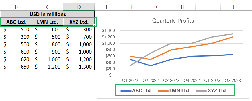
That’s how you change series names in Excel. Just update the source data and the chart will automatically update the series names 🤯
Change Series Name in Excel from the Select Data tab
The first method to change series names in Excel is straightforward.
However, if you do not want to disturb the source data to change the series names appearing in the chart, it won’t work for you 📚
To change the series names appearing in the chart in Excel without having to make any changes to the source data, follow the steps below.
Step 1) Select the chart by clicking anywhere on it.
Step 2) Go to the Chart Design tab on the Ribbon > Data group > Select Data.

This will launch the Select Data Source dialog box as below.
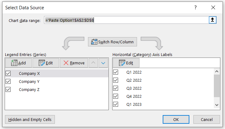
Step 3) Select the relevant legend (like I have selected Company X).
Step 4) Click on the Edit button under Legend Entries.
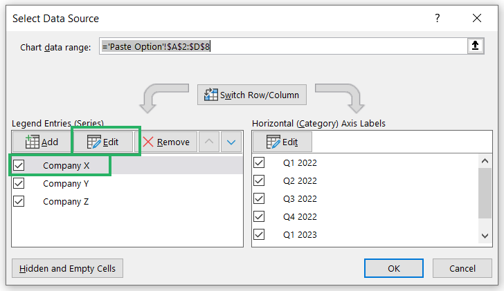
Step 5) Under the Edit Series dialog box > Series Name, define the text for that data series as desired.
For Company X’s data series, I am defining the new name as ABC Ltd.
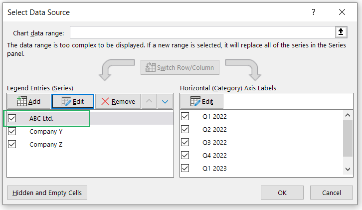
Step 6) Press okay under the Edit Series dialog box.
Repeat the steps above (from Step 3 onwards) for each of the remaining Companies (Company Y and Company Z) 🚀
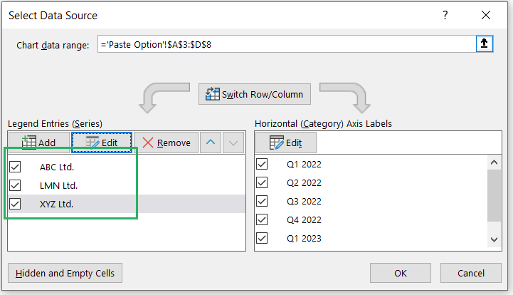
Step 7) Press okay for the Select Data Source dialog box.
And you’ll see the series’ names will be changed in the chart.
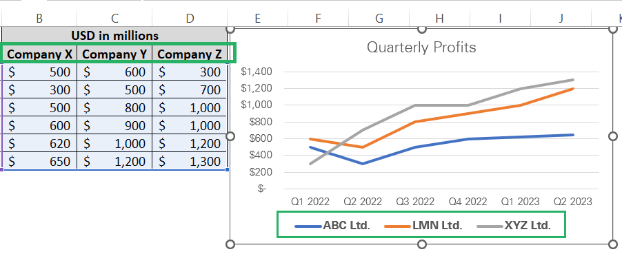
Although the data series are now named ABC Ltd., LMN Ltd., and XYZ Ltd., on the chart’s face, the original data source remains unchanged with the headers as Company X, Company Y, and Company Z.
Conclusion
Hope you enjoyed learning different ways how you can change the series names in Excel charts with and without making changes to the source data 🙈
And if you did, you would enjoy reading the following Spreadsheeto tutorials even more. Give them a read here.
