How to Forecast in Power BI (Using a Line Chart)
Forecasting is a tool businesses use to determine possible trends in the future. At the same time, it’s always a great way to cope with the future’s uncertainty 🤔
But remember that forecasting doesn’t exactly tell you the future — only the possibilities the future brings.
Also, forecasting relies heavily on past and current data points. Without them, there will be no basis for the possible trends 📈
Power BI is an excellent business intelligence and analytics solution. With it comes a basic forecasting tool that’s super easy to use. And we’ll see how to do it using the Power BI Desktop.
Download our sample workbook here to practice along the guide.
Import file to Power BI
To create forecasting, we need to create a report in Power BI with our previous and current data. The previous data will provide the basis for the forecasting as we will be mapping the trends and patterns on it.
We need to import our file containing the data to Power BI for this purpose. 📃
To start importing the workbook,
Step 1) Click the down arrow on the ‘Get Data’ icon found on the ribbon and select ‘Excel’:
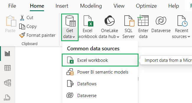
Step 2) Locate the file and open it.
Step 3) Select the sheet name that contains the dataset.
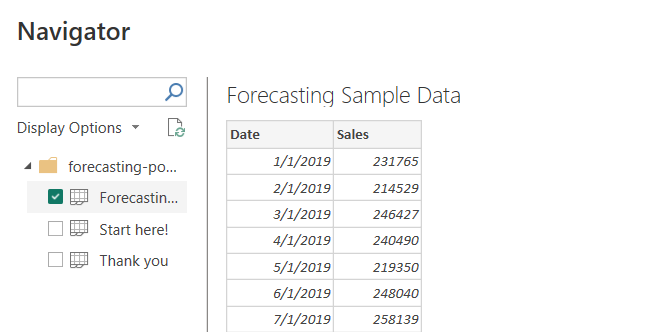
Step 4) If the formatting looks good, click Load. If not, click Transform.
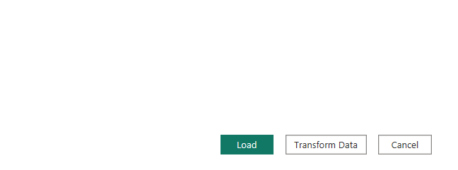
And your data set has been imported to the report.
Transform takes you straight to Power Query Editor where you can edit your dataset by deleting or inserting rows and columns. It provides a variety of features you can use to clean data like splitting text into columns, sorting & filtering, pivoting and unpivoting columns and more.
Table to Line chart
Let’s hit this off by creating a table out of the data we have 🤩
We will be creating a line chart to plot the forecasting but you can create any chart of your preference – bar chart, gantt chart, waterfall chart or even heat map.
Step 1) Click the table icon on the visualizations pane.
Step 2) Check both the ‘Date’ and ‘Sales’ fields on the fields pane.
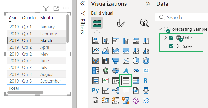
Note that the table shows the date hierarchy of the Data field in the created table – we don’t want that. We want simple dates in the table we can work on.
To do that,
Step 1) Go to the visualizations pane under the ‘Fields’ section.
Step 2) Click the down arrow beside the field name and change ‘Date Hierarchy’ to ‘Date’:
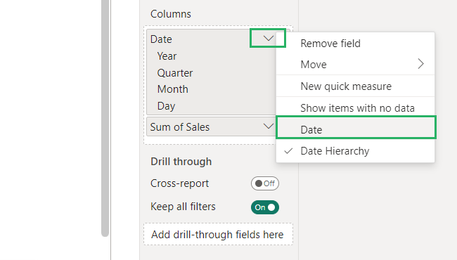
Then, simply convert the table to a line chart since the forecast feature is only available on the line chart visual.
Step 3) Click on its icon on the visualizations pane:
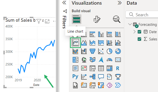
And you have your line chart ready 📊
That wasn’t difficult now, was it?
Creating a Forecast
Now that we’re done with importing the data and creating the line chart, let’s initiate forecasting.
To add a forecast,
Step 1) Select the chart and go to the ‘Analytics’ section on the visualizations pane – magnifier icon.
Step 2) Make sure that the line chart is currently selected.
Step 3) Scroll down until you see the ‘Forecast’ part. Expand it and toggle ‘On’.
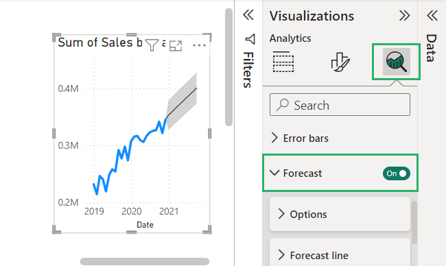
And it’s done! You have just created a forecast on the data from the imported file.
However, your work isn’t done yet. Although Power BI automatically sets the forecast settings for you, it’s still a bit clunky and would certainly need your input 🤔
This is what the current forecast looks like:
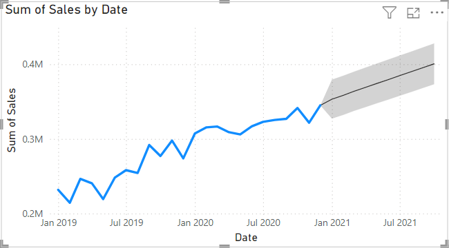
It’s a straight rather diagonal line. But here’s not where it ends.
The forecasting setting includes:
- Units
- Forecast length (by points, seconds, minutes, hours, days, etc.)
- Ignore last
- Seasonality
- Confidence interval
Units tell about the options available for time whether it’s years, months or quarters.
Forecast length tells the number of units you want to forecast. A forecast length of 20 suggests we will create a forecast for the next 20 years.
Ignore the last option is used when something in your dataset has the least importance. For instance, if your company is flourishing but was at a loss the prior two years, we will not include that time because we want to be optimistic about our forecast.
Seasonality checks for tendencies within the given period. It detects variations and uses that information to pick up patterns and make predictions.
Confidence interval is exactly what it sounds like – it tells how confident you are in your forecasted value. It gives a range of values and we consider this range with a margin of error.
Now, that we know what each setting does and how it works, let’s use them below.
Step 4) Insert the forecast values.
Since our data has two years of data, we will set the functionality and seasonality 12.
Step 5) Press Apply when you’re done.
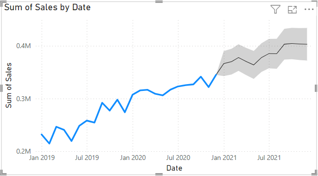
And we’re done! Your forecast is ready to predict the future values of your business 😃
Limitations
Forecasting is a powerful feature in Power BI and offers many advantages. However, it has its fair share of limitations too. Let’s see what these are below 🔽
- It has to have at least a 1-hour interval between the values
- Only works with line charts
- The chart should have fewer than 1000 lines
- The X-axis of your chart needs to be a uniformly increasing whole number
- The chart only needs to have a single line for forecasting to work
- You can’t set text or decimal values as the x-axis
Conclusion
In this guide, we saw how to create a forecast in Power BI Desktop. We saw the prerequisites of creating a forecast and the elements involved in it.
It is essential to create a line chart before you add the forecasting to the report to give the data analysis a basis to stick on 📗
Forecasting is a powerful business tool that helps predict the future and make informed decisions. Using Power BI’s robust features, you can make the most of your reports.
It has its limitations but forecasting’s benefits overpower its disadvantages. You can use it to map future trends, make working more insightful for data analysts and plot patterns.
To learn more about Power BI and forecasting, give the following articles a read.
Power BI Dashboard vs. Report: The Pros and Cons
How to Create Groups in Power BI: Get an Overview of Your Data
How to Do Table Visualization in Power BI (Step-By-Step)
We hope you enjoyed reading this article as much as we did crafting it! 🤗
