How to Visualize a Table in Power BI (Step-by-Step)
Power BI enables the creation of interactive reports and excellent dashboards by allowing connections to multiple data sources.
One of the winning features of Power BI is the vast library of data visualization options that it offers – the shapes, the charts, the tables, the graphs, and other visuals.
Out of these visuals, we have tables that you can create in Power BI. They allow you to display detailed data as structured rows and columns 👩💻
In this tutorial, I will walk you through the process of visualizing your data as tables in Power BI. Read with me till the end.
What is a Power BI table?
The Power BI table is a simple two-dimensional grid where data is logically organized as rows and columns.
Microsoft Excel users can relate to the ease of tabular representation of data. A Power BI table is the same, with headers and totals at the bottom 📑
A table visual is an excellent choice for quantitative comparisons. Or when you want a detailed representation of your data.
Here’s what a Power BI table looks like.
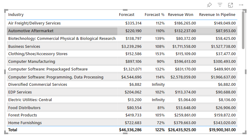
A Power BI table helps you create table visuals that you can use in your reports. You can cross-highlight the elements of your table with other visuals on your Power BI dashboard.
In short, it works the same as a spreadsheet does 📊
The table visual closely resonates to the matrix visual in Power BI. They both might look the same but are different in functionality. A matrix is far more versatile than a table in Power BI. It is more like a Pivot table as it allows aggregation and disaggregation of data.
Table is a simpler form of data representation and I know most of us go to Power BI for advanced visuals. Then why should you choose a table visual?
Here are some reasons why and when it’s better to opt for visualizing your data through a Power BI table:
- To represent numerical data categorically
- Do you prefer a tabular, two-dimensional format to display data
- To run an effective comparison of detailed data
- When visuals take the backseat, and actual data values are of more importance.
Thinking about how to create the Table Visual in Power BI? Let me take you through the process here.
How to create a Power BI Table
We are finally diving into the steps to create a Power BI Table.
We are using the Regional Sales Sample dataset for this section. You can get access to it by loading sample data model in Power BI. Tables can be created in Power BI Desktop and Power BI Service, both.
Now let’s assume I want to create a table with the following fields 👇
- Industry
- Forecast of Revenue
- Forecast Percentage
- Revenue won
- Revenue in the Pipeline
Step 1) Launch a blank page in your Power BI Report.
Step 2) Go to the Visualizations pane and click on the table icon.
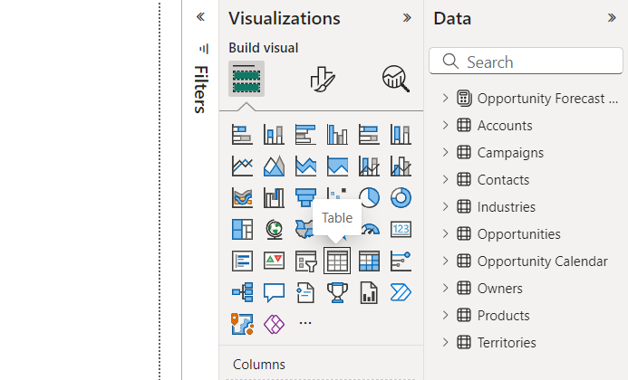
This will add a table visual to your canvas that looks blank and greyed.
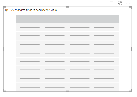
Step 3) Click on this visual to activate the relevant panes in the Visualizations pane.
Here onwards you have to drag the relevant fields from the data pane to the Columns section in the Visualizations pane to have what you want visualized through the table 🔍
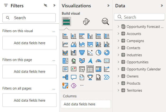
Step 4) Drag the data field for Industry to the Columns section.
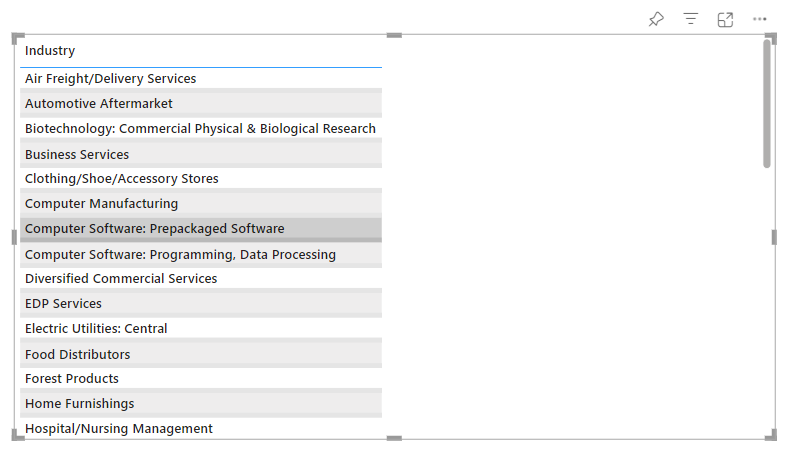
Step 5) Now add the other value fields that you want to be displayed in the table.
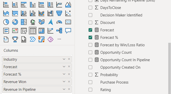
Power BI arranges all the next fields as successive columns with their totals presented at the bottom.
This is how the table now looks.

That’s how you create a basic table in Power BI 🤩
There’s much more than you can do about it and we are going to cover that just in the next section.
Formatting a Table Visual in Power BI
After you’ve created a table, don’t let it go that plain. After all, Power BI visuals are known for their brilliance.
You can format table visuals in Power BI in several ways and there are many formatting options that Power BI offers you for that 😎
Let me take you through some.
Font and Text Formatting
The basic and foremost formatting options that we know of are the Font and Text formatting.
To adjust it:
Step 1) Click on the table visual to select it.
Step 2) From the Visualizations pane, go to the “Format” pane (paint roller icon).
Step 3) Under the Visual tab, scroll down to find the “Values” section.
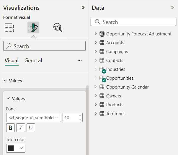
Step 4) There you can increase or decrease the font size and choose a custom font color as you like.
Step 5) Under the Column Header section, you can adjust the header fonts, color, and size for the Column Headers.
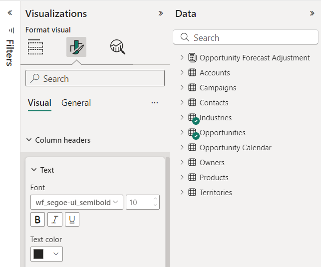
That’s something about the basic font and formatting of a Power BI table 🎨
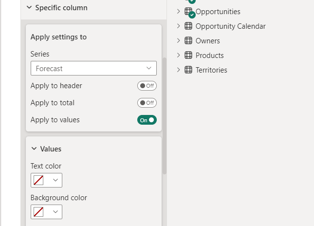
This way you can set up a particular formatting style for a specific column
Conditional Formatting (for Values)
The table visual also allows you to conditionally format the values within your table 🖌
To apply conditional formatting to your table:
Step 1) Go to the Visualizations pane.
Step 2) Right-click on the field based on which you want to apply conditional formatting.
I am applying conditional formatting to the Forecasted Revenue.
Step 3) From the drop-down menu, select Conditional Formatting > the type of formatting you want applied.
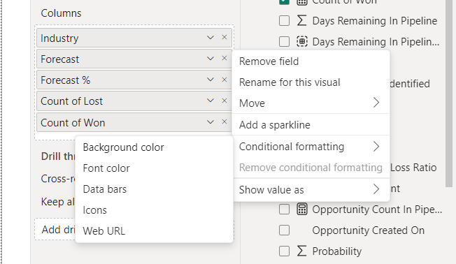
This will launch the Conditional Formatting dialog box as below.
Step 4) Set up the fields as you want the values (Forecast figures) to be conditionally formatted (e.g., higher values in green, lower values in red).
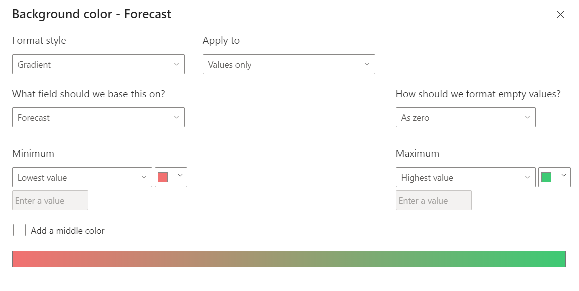
And there you go!
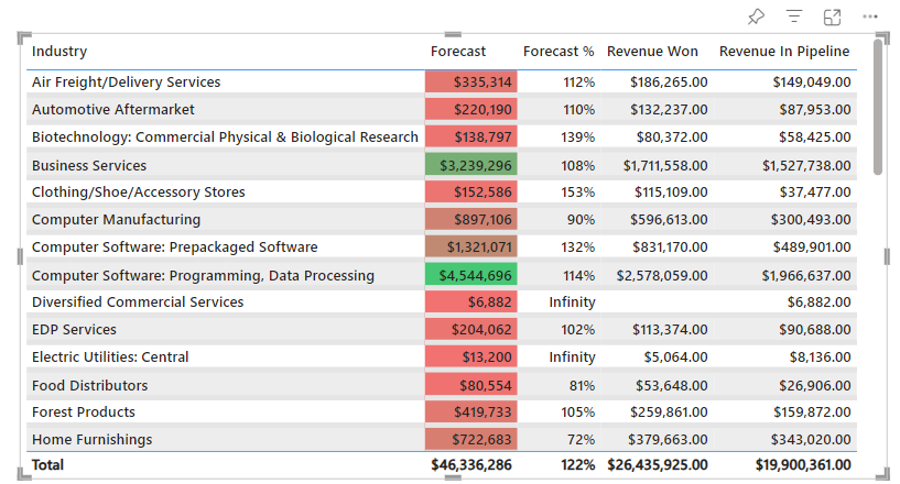
The Forecast values in the Power BI table are conditionally formatted per the rules defined by us (higher forecasts turn green and lower forecasts turn red) 📊
Column Totals:
Column totals are added to table visuals by default. But if you want to make changes to how they look, follow the steps below 👀
Step 1) Go to the Visualizations pane > Format Visual tab.
Step 2) Go to the Total Section and expand it.
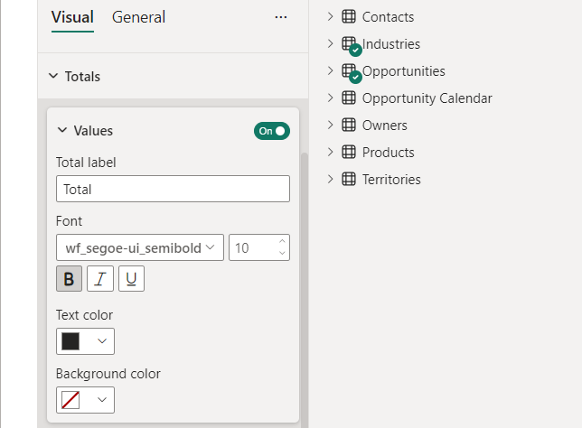
Step 3) Turn it on or off as you like (if you do not want the table to show column totals, you can turn it off).
Step 4) Rest you can set up the font style, size, color, and background color per your choice.
Other Formatting options
There are many other formatting options that you can explore too. Like 👩🏫
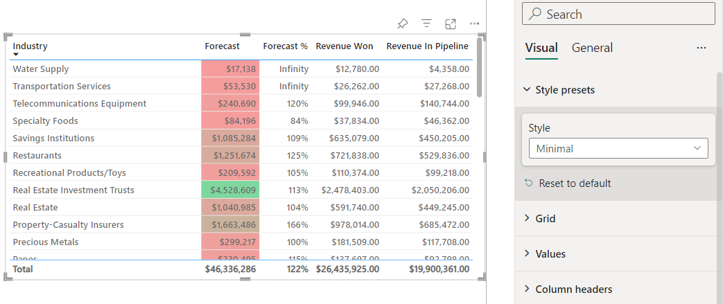
- Style Presets
Choose a particular style to be applied to the table.
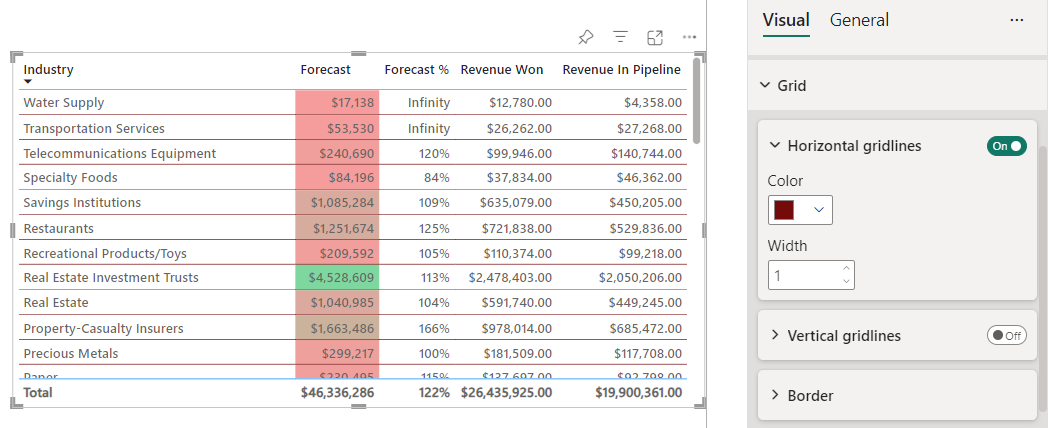
- Grid
You can set up the width and the color of the Gridlines.
And others too. Explore the formatting pane to see what else can you do about your table to add all the meaning to it.
Conclusion
Picturing your data in the form of a table in Microsoft Power BI makes it easy to read and organizes it better so no detail of your data goes missing.
In this guide, we’ve discussed how to create a table visual in Power BI. And on top of creation, we’ve also seen how you can format its appearance. It’s easy enough for even beginners to grasp it.
BI is versatile in terms of its table visuals. This helps simplify complex datasets and create comprehensive reports that capture everything about your dataset.
Just like a table, there are so many visuals that you can create out of your datasets in Power BI. Learn Power BI better through the following blogs by Spreadsheeto.
