How to Create a Gantt Chart in Power BI (for Free)
A Gantt chart in Power BI is a powerful visualization tool used for keeping track of project deadlines, the duration of different tasks and the progress of each member.
It provides a clear and structured way to track projects with all tasks displayed along with start and end dates. The duration of each task is shown in a visual which makes it easy to grasp 😃
Unfortunately, Power BI doesn’t have a native Gantt chart but it lets you import custom visuals and we will use that to create a highly customized Gantt chart of our choice.
Gantt chart in Power BI can help enhance project management and reporting oversight which helps track timelines and milestones effectively 😉
In this tutorial, we will see how to create a Gantt chart in Power BI, prepare the fields, map them to the visual and use the chart to its full potential. Download our sample workbook here.
What is a Gantt chart in Power BI?
Gantt chart is a type of visual that is popularly used for tracking and managing project schedules. It makes an excellent choice when it comes to graphically displaying project timelines.
It helps ensure that the entire team is on one page by showing information about the estimated time commitments and what’s supposed to happen in a certain period.
The strong suit of the Gantt chart lies in scheduling and assigning tasks and tracking them. It gives you complete details of a task – from team members involved to the progress made so far, and more.
The only tiny problem is that the Gantt chart isn’t native to Power BI and you need to get it separately to use it in your report.
But that’s not an issue. Below we will see the step-by-step process of creating a new Gantt chart.
How to make a Gantt chart in Power BI
To make a Gantt chart, your data set should be prepared. Creating a Gantt chart is easier on Power BI Desktop so you need to have it downloaded on your local computer.
Next, we’ll import the data from Excel, and Access or you can insert the data manually. Once the data is loaded, we will add the chart visual to the report and customize it.
Let’s see all this in detail below.
Import data into Power BI
We will be using the following dataset from an Excel workbook for this example. If you want to use the same, you can get it from the link given above.
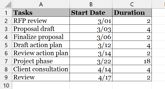
To import data into Power BI,
Step 1) Open the Power BI Desktop application.
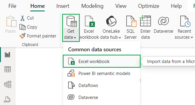
Step 2) On the Home tab, select the Get Data option from the Data section.
Step 3) From the dropdown that appears, select Excel 📗
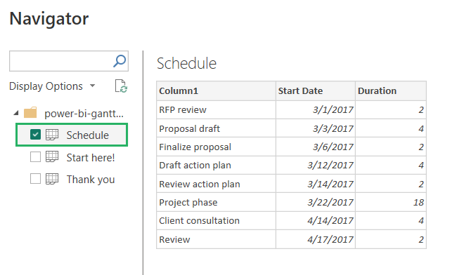
Step 4) The Navigator window will open up with the Excel sheet loaded.
Step 5) From the Display option on the left pane, select Schedule from under the file name.
Step 6) A preview of the table will load in the navigator.
Step 7) Press the Load button to import the data into the report.
If you want to make changes to the table like add or delete a row, press the Transform button next to Load. It will take you to Power Query Editor and you can make your desired changes there.
Step 8) Open the Table view by clicking on the Table icon on the left side of the screen.
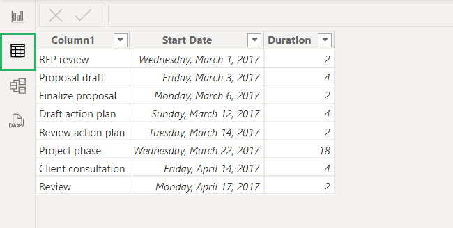
And your data is all ready to use! 🤩
Get the Gantt chart visual
Now that we have the data set, let’s get the Gantt chart visual.
To do that,
Step 1) Click on the Report view button on the left side of the screen 📊
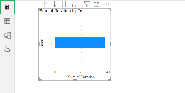
Step 2) Three different right panes will show up on the screen.
Step 3) Select the Visualizations pane.
Step 4) At the bottom of the elements given, click on the horizontal three dots.
Step 5) Select Get more visuals from the dropdown to add more visuals from Microsoft Appsource.
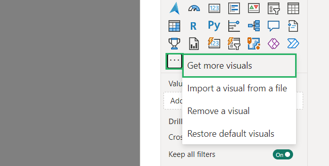
Power BI Visuals window will pop up with different visuals 🟩
Step 6) Type in Gantt in the search bar and select the first option that appears.
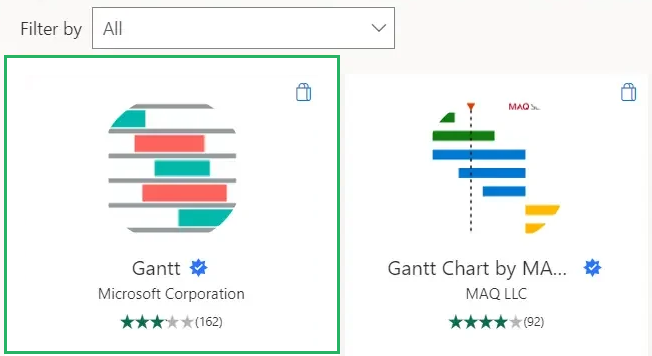
Once the chart is loaded, its icon will appear in the elements under the Visualizations pane.
If you can’t seem to import the chart from Power BI, you can get it directly from AppSource via your browser. Download the visual add-in from there and in Power BI, select Import from file from the three dots under Visualizations pane.
Insert your Gantt chart
Now that we have everything prepared, let’s create a Gantt chart.
To do that,
Step 1) Click on the Gantt chart icon under Visualizations.
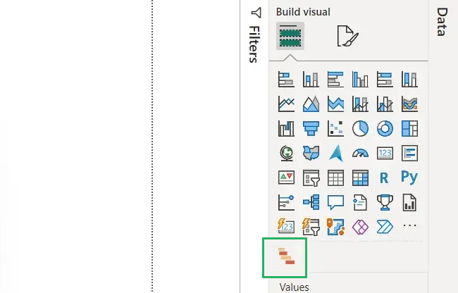
Step 2) An empty Gantt chart will appear on the screen.
On the Visualizations pane, there is a ton of information that you can add to the chart.
Let’s see what it’s all about 🧐
- Duration: expected working time on project, a week or a month
- Legend: shows the category of the project
- Resources: used in managing projects like programmer resources, employee resources, etc.
- Task: certain part of a project assigned to a team member to be completed in a specified time
- Milestones: shows the backlogs stored or improvements made in the project
- Start Date: gives the starting date of a project
- End Date: gives the ending date of a project
- % Completion: percentage of a task that has been completed
- Parent: gives a summary of the child’s tasks in your project
- Tooltips: gives information about a certain task upon hovering
You can explore each property in more detail later.
Add data to the visual
Similar to what we do with other charts, we drag and drop data into respective fields in the Gantt chart. The data set appears under the Data pane on the right.
To add data to the chart,
Step 1) Select each column for the table under the Data pane
Step 2) Drag and drop them in the buckets under Visualizations.
For example, in our data set,
Step 3) Column 1 contains all the tasks – move it to the Task bucket.
Step 4) Place Duration in Duration bucket.
Step 5) Start Date goes to the Start Date bucket.
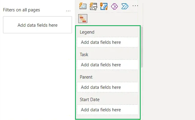
As you finish filling the buckets, your Gantt chart will be filled up.
All the information is shown in horizontal bars on the chart. Hovering on each bar will show details like the task, assignee, progress, start date, expected date of completion and more 📅
Customize the visual
Now that your chart is all created, you can customize it to your liking. Select each bar and change its colour, size, shape, amount, frequency and more.
You can apply styling changes to the chart as well – you change the theme, and colour, add more or less elements to it and more 🎨
Not only that, you can also change the axes of the chart, data label size, position, padding and other specifics of a chart.
Isn’t this fun? Try it now!
Benefits of a Gantt chart
Even if your work doesn’t strictly revolve around project management, you can still use Gantt chart. Its biggest advantage in Power BI is that even though it’s not initially available, you can get it from the Appsource in seconds. With that done, you simply need to put in the data and insert it in the Power BI Gantt chart. Some other benefits of Gantt chart include:
- Easy to understand for beginners and experts
- Compatible with a variety of other Microsoft products.
- Best choice for those switching from spreadsheet to Power BI.
- Team members and project managers can collaborate together.
Downsides of a Gantt chart
While the Gantt chart is an excellent choice for project management, it has its fair share of disadvantages too. Gantt chart is not essentially a task assignment and tracking graph – it is more of a data representation visual. This is why it doesn’t offer a lot of project management features. Let’s see what these are below 🤔
- To make any changes to your report like adding an extension to the deadline or changing the schedule, you need to create a new report with updated data and generate a new Gantt chart.
- Gantt chart is not dynamic, it only shows data once put into the chart and doesn’t allow new changes. It only visualizes data but doesn’t actively offer project management features.
- Doesn’t offer project cost tracking features, quick analysis of elements or individual task tracking.
Conclusion
Creating a Gantt chart is a simple process that can make project oversight an easy task. The best part is that Power BI lets you create a Gantt chart for free and you can build it as you like 😃
Once you have our data configured and organized, you can create the most stunning Gantt chart visual in Power BI in no time.
To learn more about charts and Power BI, give the following articles a read:
How to Do Table Visualization in Power BI (Step-By-Step)
How to Create a Histogram in Power BI [Step-by-Step Guide]
How to Create a Hierarchy in Power BI (Explained Simply)
We hope you enjoyed reading this article as much as we did crafting it! 🤗
