How to Create a Histogram in Power BI
A histogram is a useful data visualization tool that distributes the values in a data set by dividing it into intervals and bins 💪
It’s best used to analyze trends and patterns as it helps show the frequency of different values in a dataset.
Histogram provides a graphical representation of the frequency distribution of your data set.
In this tutorial, we will see how to create a histogram in Power BI, prepare the data and map them to the visual. Download our sample workbook here to practice along the guide.
What is a Histogram in Power BI?
A histogram is a visual in Power BI that gives the distribution and frequency of different ranges of values within the data set.
Unfortunately, Power BI does not provide native Histogram visual but you can always get it from Appsource in seconds and customize it 🎨
A histogram in Power BI can help depict the differences in your ranges clearly – this helps understand the data in one glance.
How to create a Histogram in Power BI
Creating a Histogram is easier on Power BI Desktop so you need to have it’s better to have it on your local computer 💻
Next, we’ll import the data – you can do it from Excel, Access or insert it manually. Once the data is loaded, we will add the visual to the report and customize it.
Let’s see all this in detail below.
Import data into Power BI
We will be using the following dataset from an Excel workbook for this example. If you want to use the same, you can get it from the link given above.
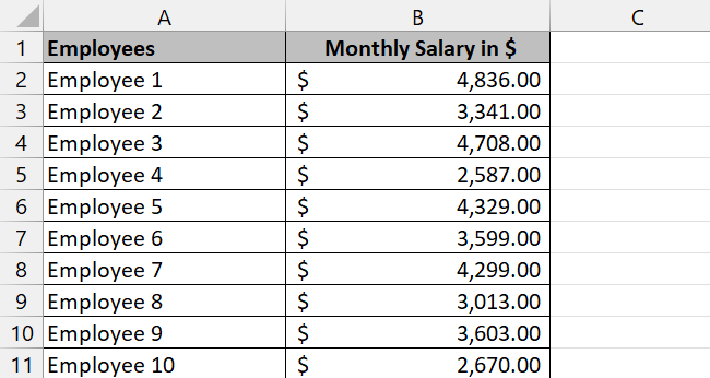
To import data into Power BI,
Step 1) Open the Power BI Desktop application.
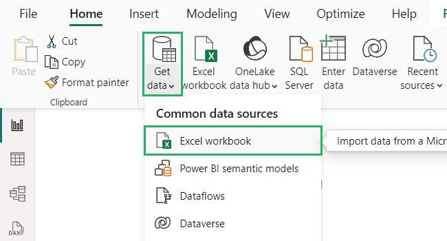
Step 2) On the Home tab, select the Get Data option from the Data section.
Step 3) From the dropdown that appears, select Excel 📗
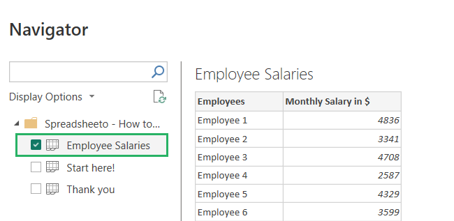
Step 4) The Navigator window will open up with the Excel sheet loaded.
Step 5) From the Display option on the left pane, select Schedule from under the file name.
Step 6) A preview of the table will load in the navigator.
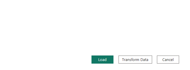
Step 7) Press the Load button to import the data into the report.
If you want to make changes to the table like add or delete a row, press the Transform button next to Load. It will take you to Power Query Editor and you can make your desired changes there.
Step 8) Open the Table view by clicking on the Table icon on the left side of the screen.
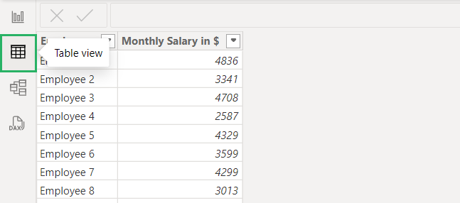
And your data is all ready to use! 🤩
Get the Histogram visual
Now that we have the data set, let’s get the Histogram visual.
To do that,
Step 1) Click on the Report view button on the left side of the screen 📊
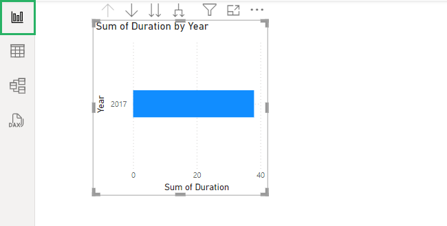
Step 1) Three different right panes will show up on the screen.
Step 2) Select the Visualizations pane.
Step 3) At the bottom of the elements given, click on the horizontal three dots.
Step 4) Select Get more visuals from the dropdown to add more visuals from Microsoft Appsource.
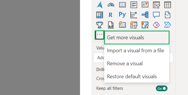
Power BI Visuals window will pop up with different visuals 🟩
Step 5) Type in Histogram in the search bar and select the first option that appears.
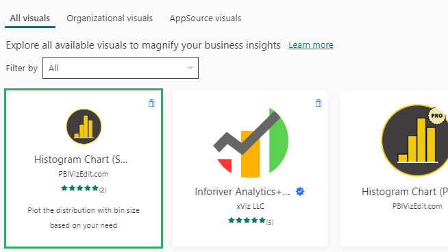
Once the chart is loaded, its icon will appear in the elements under the Visualizations pane.
If you can’t seem to import the visual from Power BI, you can get it directly from AppSource via your browser. Download the visual add-in from there and in Power BI, select Import from file from the three dots under Visualizations pane.
Insert the Histogram
Now that we have everything prepared, let’s create our Histogram.
To do that,
Step 1) Click on the Histogram icon under Visualizations.
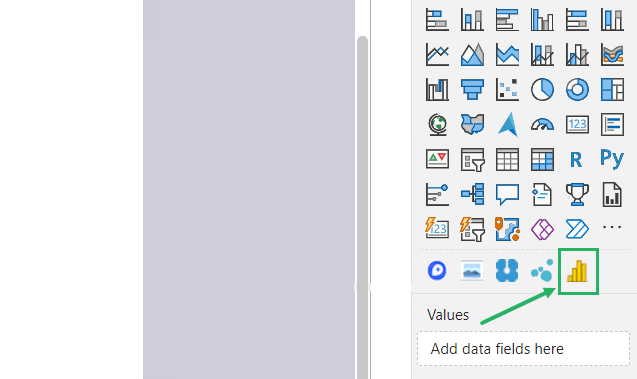
Step 2) An empty Histogram will appear on the screen.
Under the icons, two properties appear for the Histogram. Let’s see what they are about 2️⃣
- Values: move the range of your data set to this bucket
- Frequency: move the frequency data to this bucket
We will fill each property below.
Add data to the visual
Similar to what we do with other charts, we drag and drop data into respective fields in the Histogram. The data set appears under the Data pane on the right.
To add data to the Histogram,
Step 1) Select the range and frequency columns from the data set separately.
Step 2) Drop them in their respective bucket under the Visualizations pane.
For example, in our data set,
Step 3) The Monthly Salary column goes to the Value 1 bucket.
Step 4) The Employee column goes to the Value 1 Weight bucket.
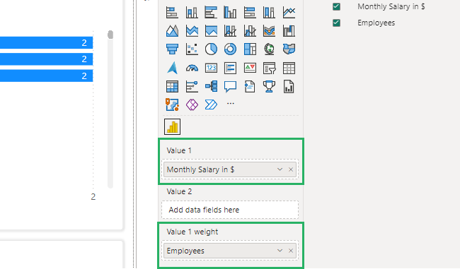
As you finish filling the buckets, your Histogram will be filled up 📊
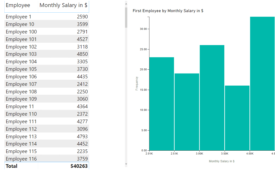
The difference in range in your data set will be displayed in vertical bars on the Histogram. Hovering over each bar will show details like employee name or variation in salary, etc.
Customize the visual
Histogram offers a variety of options to customize it- from changing the colour theme to adjusting the bin size, you can do it all. Let’s see how to do that below.
Colour theme
You can add different themes to your Histogram to make it more personalized 🎨
To do that,
Step 1) Select the Histogram.
Step 2) Go to the View tab.
Step 3) You will see different coloured themes there.
Step 4) Select any one you like and apply it to your Histogram,
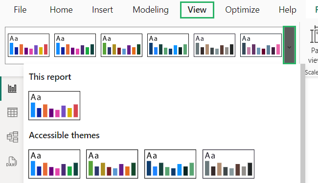
You can also create custom themes for your Histogram using the Theme gallery.
Data labels
One of the most useful parts of a Histogram is Data labels – it gives specific information about the frequency of each bin in the Histogram 🧐
To use them.
Step 1) Scroll down the bin customization option to open the Label placement option.
Step 2) Select the options you want to apply from the dropdown.
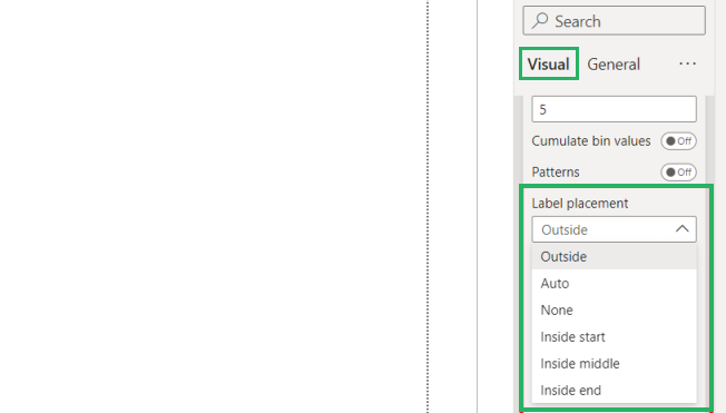
Ans it’s done!
Titles and annotations
You can add titles and annotations to your Histogram to make it easier to understand and read 👀
To add titles,
Step 3) Select the Histogram.
Step 4) Go to the Format pane and select General
Step 5) Turn on the Title option.
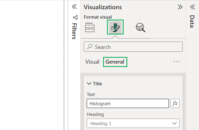
Step 6) Insert your text in the Histogram.
Once done, you can modify the title by changing font, size, colour, etc.
Annotations are used for directions and you can represent them with shapes like lines and arrows.
To add annotations,
Step 7) Go to the Format pane and select Shape.
Step 8) Choose the shape you want to represent annotation in.
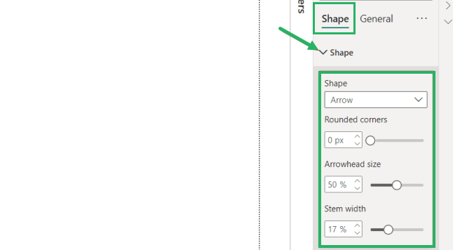
You can change its properties like size, colour, etc as you like.
Adjust Histogram bins
The bins in a histogram give the width of each interval on the x-axis. However, you can customize the size of each bin to display values 💻
You can increase the bin size to see an overview of the entire data set. Similarly, you can decrease it to see all the details in a data set.
To customize the size of your bin in a Histogram,
Step 1) Select Format Visual from the Visualizations pane.
Step 2) Click on the Determine bins by box on the pane.
Step 3) The dropdown will show three options – select size.
Step 4) Insert the bin width size.
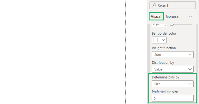
And it’s done! The bin size of the Histogram has been adjusted.
Benefits of Histogram
A histogram is an essential tool when it comes to seeing the difference in frequency in the ranges of your data set. Let’s see some benefits it has to offer 😃
- Clear Frequency Visualization: The Histogram clearly shows the frequency of ranges in different data sets that show the rate at which specific points occur.
- Identify Unusual Data Points: It helps in spotting points in the data set that deviate significantly from the general distribution.
- Data Distribution Analysis: It shows how the data is distributed across different intervals which helps to identify trends and patterns.
- Easy Statistical Histogram is an essential tool to identify the shape of the data that helps in statistical analyses like hypothesis testing.
Downsides of Histogram
Histogram is an amazing tool when it comes to performing data distribution but it has its fair share of disadvantages too. Let’s see what these are below 🤔
- Not Ideal Choice for Exact Comparison: Histograms are not the best choice for exact comparison because they aggregate data into ranges when displaying them.
- Loss of Individual Data Points: It hides individual data points and small details as it groups the data into bins, especially when the data set is huge.
- Limited Use for Small Datasets: Histograms don’t work as well for small datasets as the distribution might not show much of a difference killing the purpose of creating a Histogram.
- Sensitive to Bin Size: Histograms are highly sensitive to bin sizes – the smallest change in them can change the visual. A small number of bins make the Histogram seem overly simplified whereas a high number of bins make the visual noisy and complicated.
Conclusion
Creating a Histogram in Power BI is an excellent way to visualize the frequency of data ranges and gain insights into the underlying patterns ✔
Whether you use custom visuals or manually set up bins for your Histogram, Power BI has you covered.
To learn more about Power BI and Histograms, give the articles below a read.
How to Do Table Visualization in Power BI (Step-By-Step)
How to Create a Gantt Chart in Power BI (Fast and Easy)
How to Embed a Power BI Report in a Website (Fast and Easy)
We hope you enjoyed reading this as much as we did crafting it! 🤗
