How to Visualize Data in a Power BI Matrix
Power BI matrix is a powerful visual that displays data in a tabular form with multiple dimensions and aggregation.
You can set up your data in a hierarchical matrix so you can drill down into the details without cluttering the visual.
A matrix allows a broad margin to group rows and columns, create measures, and analyze data across multiple categories 💪
Excited to learn how to visualize data in a Power BI Matrix? Read this tutorial with me till the end to learn how.
What is a Power BI matrix
The Power BI matrix looks the same as a two-dimensional table.
A matrix makes the tabular presentation of data easier and simpler by displaying data meaningfully across multiple dimensions. It supports stepped layouts which means you can aggregate data as a single row and dig down deep into it by expanding it.
It looks like this 👀
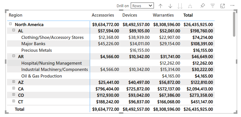
It is also called the Power BI’s version of the Excel Pivot table as it supports multiple dimensions, a stepped layout, drill-down functionality, and aggregation.
Excel users can relate it to a spreadsheet’s interface.
You can create matrix visuals in your Power BI report and then cross-highlight elements to each matrix to other visuals on that report page.
Individual and multiple cells can also be copied and pasted to other applications.
To create a matrix in Power BI, you have to decide which data fills the following three fields.
- Rows
- Columns
- Values
In the next section, I will take you through the step-by-step guide to creating a matrix visual in Power BI 🤿
How to create a Power BI Matrix
This is the juiciest section of this guide (and my favorite).
We are going to create a Power BI Matrix just now and see how it comes out.
We are using the Regional Sales Sample dataset for this section. You can get access to it by loading sample data model in Power BI. A matrix can be created in Power BI Desktop and Power BI Online, both.
I am creating a matrix to show:
- Regional > State or Province > Industry-wise sales
- for Product categories > Products
In easier words, I want my matrix to show regional sales for different product categories with the option to drill down to provincial and then industrial sales for each product
Here’s how we will do this:
Step 1) Begin with adding a new page to the report.
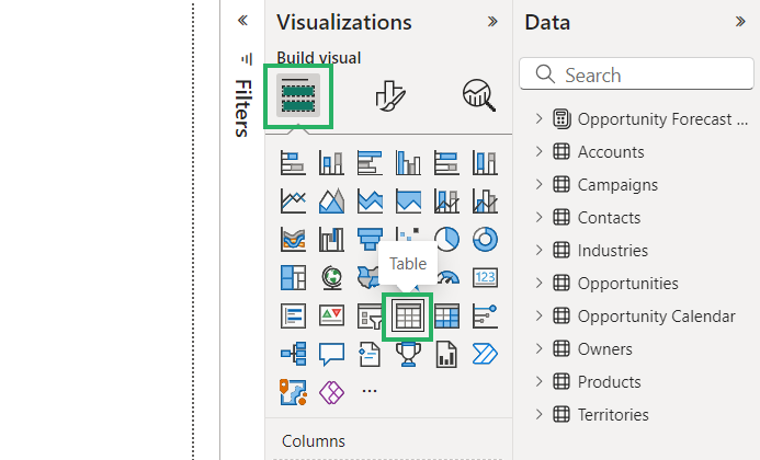
Step 2) Go to the Visualizations pane and click on the matrix icon.
This will add a matrix visual to your canvas that looks blank and greyed.
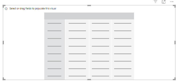
Step 3) Click on this visual to activate the relevant panes in the Visualizations pane.
Step 4) From the Territories table, drag the region to the rows section.
Step 5) After Region, add State or Province and then add Industry.
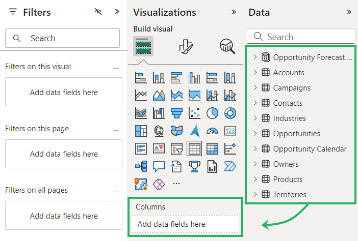
If you are adding multiple fields to any section (be it rows or columns), make sure to add them in the same sequential order as you’d want them disaggregated later. Like I want the industries within each state/province of a region to be displayed.
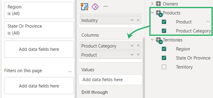
Step 6) From the Products table, add Product Category and Products to the Columns section.
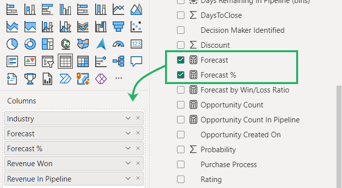
Step 7) As we want to see the Revenue made by each of these categories, drag the filed for Revenue Won from the Opportunities table to the Values Section.
This is how the matrix now looks.
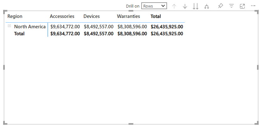
Too simple? It shows the region in a column and the revenue made by each product category in the rows next to it.
Step 8) Click on the small expand icon towards the left of the region i.e. North America to expand it to States and Provinces.
This will show you the disaggregated revenue at the provincial level.
Step 9) Click on the expand icon towards the left of each state/province like AL and AR to expand it to Industries within each province.
This will show you the disaggregated revenue at the industrial level
Want to take this a step ahead?
Step 10) Check out the drill-down options at the top of the matrix.
Step 11) Set the Drill Down option to ‘Columns’ and use the arrows next to it to Drill down (disaggregate the columns further) or Drill up (aggregate the columnar data back).

I am drilling the columns down to see the Revenue for each product separately.
Spectacular!
Formatting a Matrix Visual in Power BI
Power BI is known for its stunning data visualization options and obviously, the visuals game doesn’t just end here.
Once you have created a data matrix in Power BI, you can format it in endless ways to make it more appealing and insightful than ever.
Let me show you some formatting options here that you can explore in Power BI.
Font and Text Formatting
The basic and foremost formatting options that we know of are the Font and Text formatting.
To adjust it:
Step 1) Click on the matrix visual to select it.
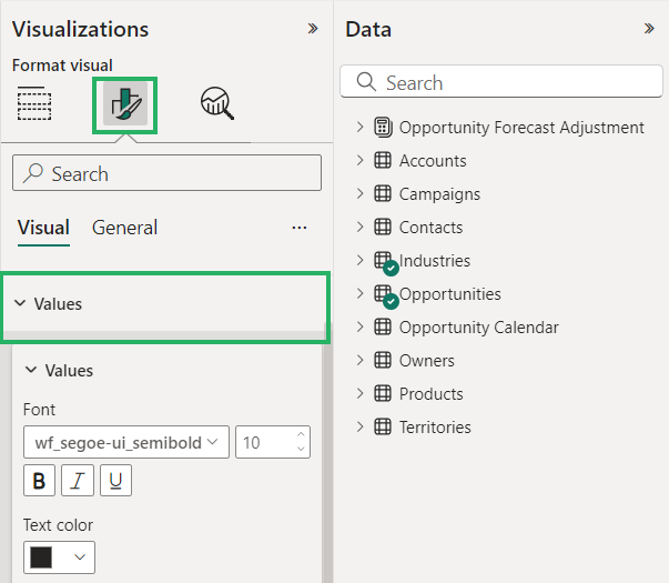
Step 2) From the Visualizations pane, go to the “Format” pane (paint roller icon).
Step 3) Under the Visual tab, scroll down to find the “Values” section.
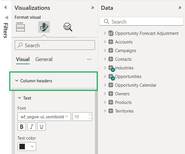
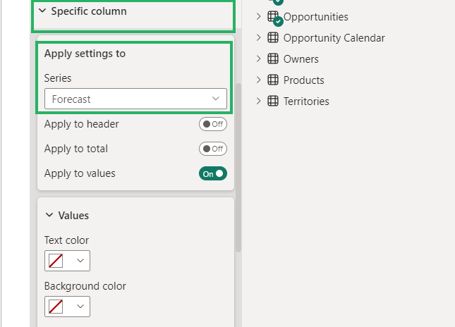
Step 4) There you can increase or decrease the font size and choose a custom font color as you like.
Step 5) Under the Row Header and Column Header sections, you can adjust the header fonts, color, and size.
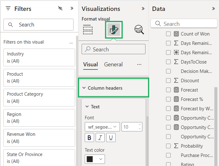
That’s about the basic font and formatting of your matrix visual.
Conditional Formatting (for Values)
The matrix visual also allows you to conditionally format the values within your matrix.
To apply conditional formatting to your matrix:
Step 1) Go to the Visualizations pane.
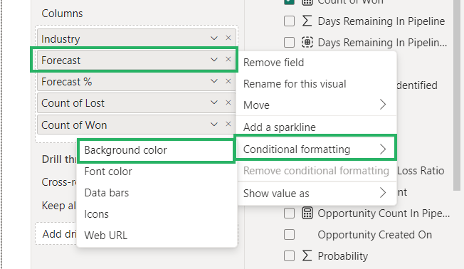
Step 2) Right-click on the field based on which you want to apply conditional formatting.
Step 3) From the drop-down menu, select Conditional Formatting > the type of formatting you want applied.
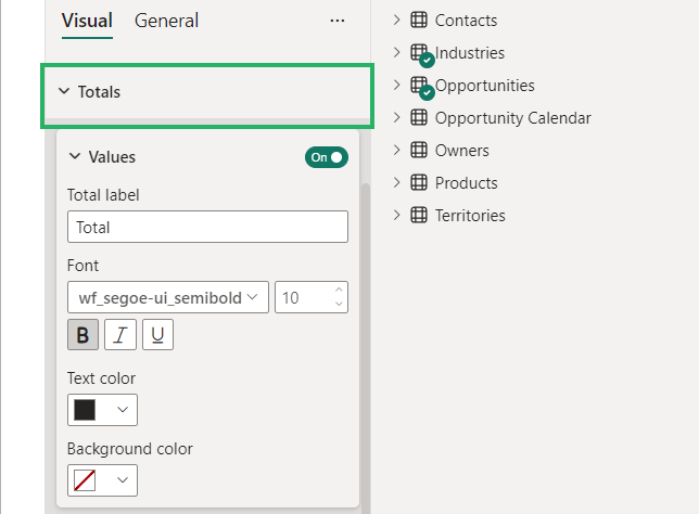
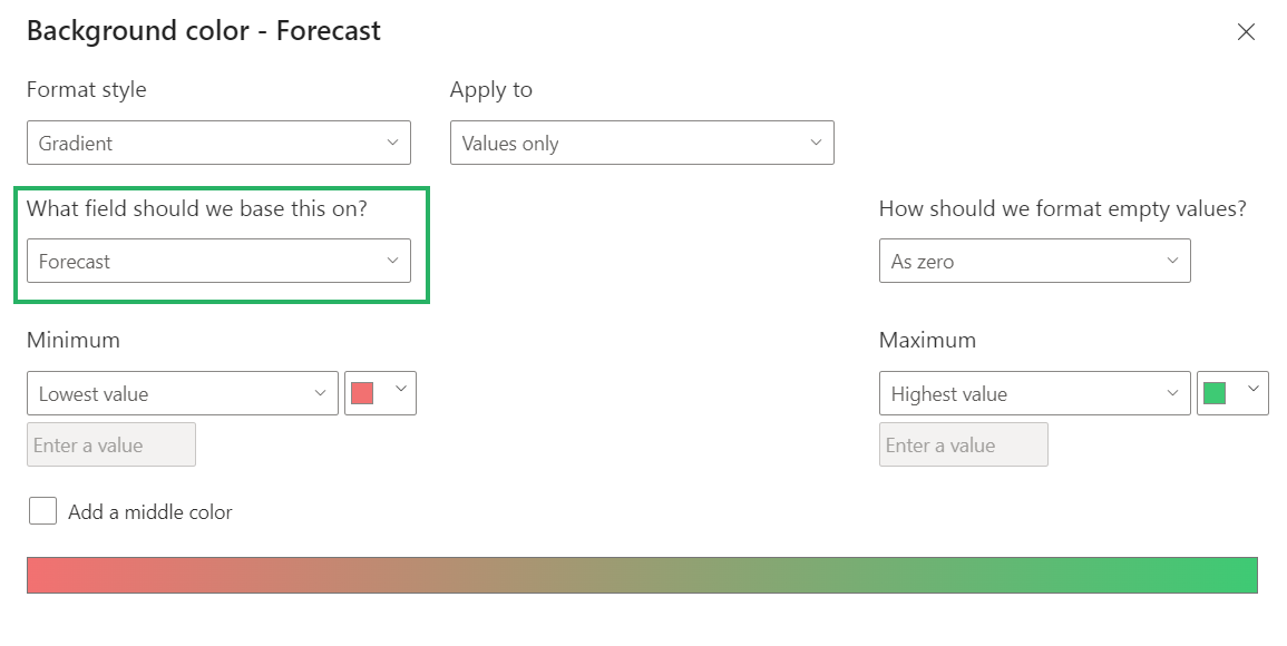
This will launch the Conditional Formatting dialog box as below.
Step 4) Set up the fields as you want the values (revenue figures) to be conditionally formatted (e.g., higher values in green, lower values in red).
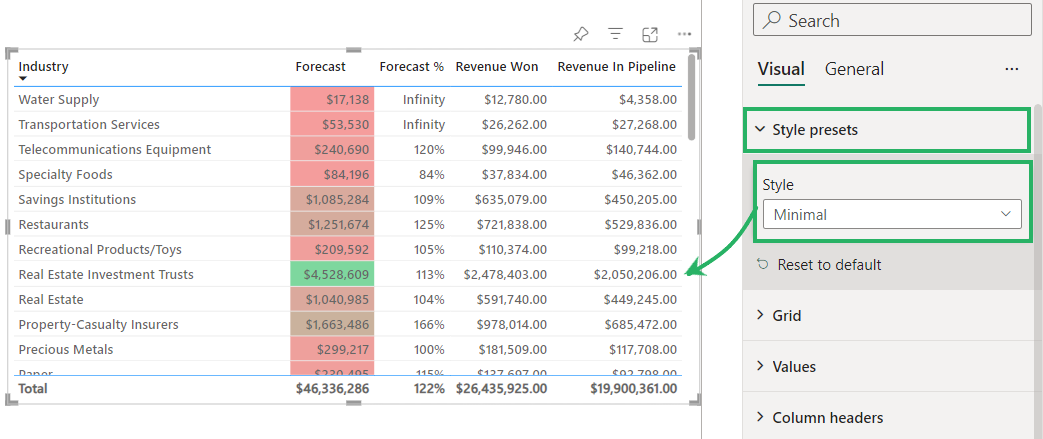
And there you go!
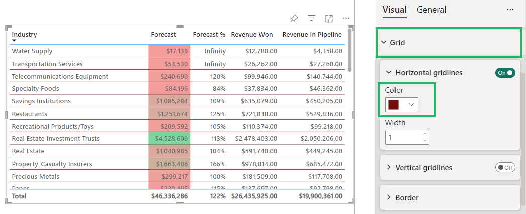
The values in the Power BI matrix will be conditionally formatted.
Row and Column Subtotals:
You can also add subtotals to the rows and columns while you expand and collapse the dataset.
For example, to apply row subtotals to see the subtotal revenue won for a state or province:
Step 1) Go to the Visualizations pane > Format Visual tab.
Step 2) Turn on the Row Subtotals.
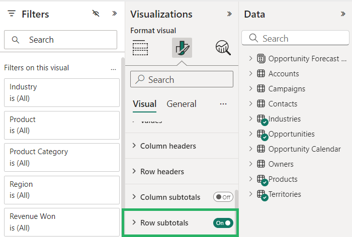
Step 3) Do the necessary settings like positioning the subtotals above or below the row and other necessary formatting.
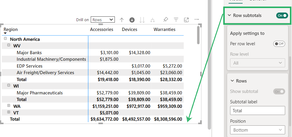
You can make other cosmetic changes to it like adjusting the font size color and so on.
Know that this is not it. There’s so much more about the formatting that you can do.
Explore the many headers in the Visualizations > Format the visual pane to see how you can make the best out of your Power BI matrix.
Conclusion
Let’s agree that a Power BI matrix is an intuitive and dynamic way of presenting complex data. It allows users to meaningfully interact with the information it contains.
By organizing data into rows and columns and values, a matrix helps you see those powerful insights, patterns, and trends that are otherwise hard to visualize.
And the best part is that you can leverage a matrix’s drill-down, aggregation, and customization capabilities to drive better decision-making.
In this guide, we have learned how to visualize data in Microsoft Power BI through a matrix. If this is something that added value to you and you look forward to learning more, check out the following Power BI tutorials by Spreadsheeto.
