How to Calculate Relative Frequency in Excel (Easy)
A frequency table shows the frequency of an event – in simple words: how many times did it occur.
We all practiced tons of them during our elementary education, and to bring you back some reminiscences from those times, here’s one 🧐
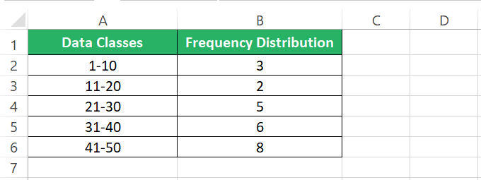
Have flashbacks from old-school times?
This is a simple frequency table. However the frequency distribution that we are going to explore in this tutorial goes a step ahead.
Once you have calculated the frequency distribution for a given set of events, the next step is to calculate their relative frequencies. As the name suggests, relative frequencies refer to how you can study frequencies in relation and comparison to each other.
It is a very powerful statistical analysis tool that helps you study huge datasets at a glance, and I strongly recommend you grab your practice workbook for this guide here and tag along with me to learn to create these in Microsoft Excel.
What is Relative Frequency
Before I explain what relative frequency is, you need to understand what a frequency distribution is.
Here I have a dataset of letters that are just random letters spread across multiple rows 🔡
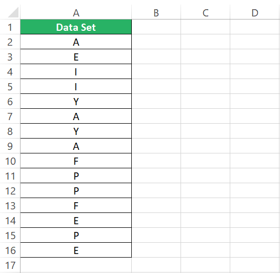
I can broadly see many letters starting from A to Y. However, merely knowing this fails to offer insights into this dataset. To study this data better, let’s make a frequency distribution out of it.
For that, I will use a Pivot table.
Step 1) Launch a new sheet in Excel.
Step 2) Go to the Insert tab > Tables > Pivot Table.

Step 3) Select the range of cells where the data sits in your sheet.
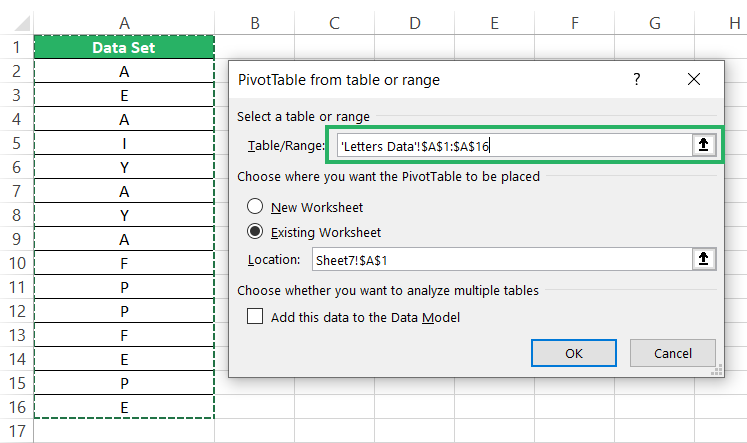
This inserts a pivot table for the selected data.
Step 4) From the fields pane on the right side, drag the dataset down to be included as rows.
Step 5) Drag it down to the values section as well and set the value field setting to Count of Dataset.
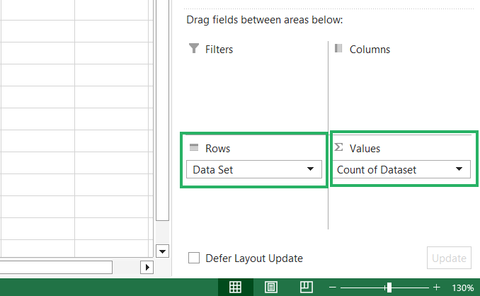
This will make a frequency table out of it as follows.
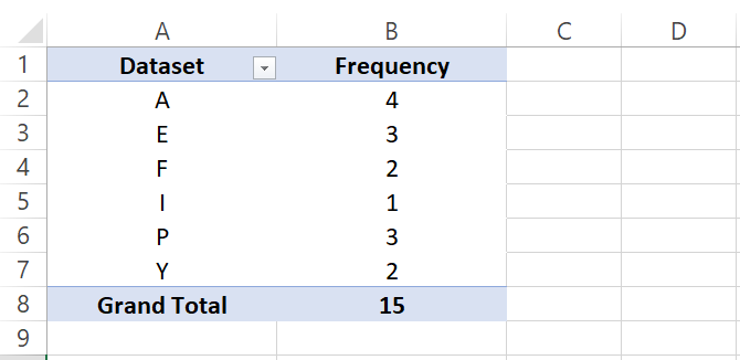
We have one occurrence of each alphabet now, and next to it, we know the number of times it appears in our dataset 🧾
Now it only takes a glance into a sorted and clean dataset for me to tell that E appears thrice in this dataset. This is how a frequency distribution helps us sort data.
There also other ways how you can create a frequency distribution in Excel like using the FREQUENCY function, and COUNTIFS function. Which is the best method to create it will however depend upon the nature of your data.
To take this data analysis a further step ahead, we calculate relative frequencies for each item of the alphabet. I know E occurs thrice but, how much is the frequency of E’s occurrence in relation to all other alphabets?
The relative frequency distribution tells the frequency of each alphabet’s occurrence as follows: 📚

From the relative frequencies, I know that E occurs in this dataset 20% of the time. Or 20% of the dataset constitutes E only.
This is how relative frequencies help us interpret data.
Relative frequency for each item within a dataset is calculated by dividing it’s frequency to the total frequency of all items in the dataset.
Curious to know how you calculate them in Excel? Jump to the next section.
Calculating Relative Frequency in Excel
This is going to be an interesting section.
After we learned how to make a frequency distribution using Excel using pivot tables, I copied and pasted the Pivot table as simple values for ease of calculation 🚩
So here we have our sorted data along with its frequency distribution. To calculate the relative frequency for it.
Step 1) Calculate the sum of the frequency distribution (if not already done).
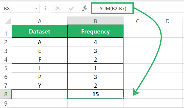
Step 2) Insert a second column next to the frequency distribution.
Step 3) Divide each alphabet frequency by the total frequency as below.
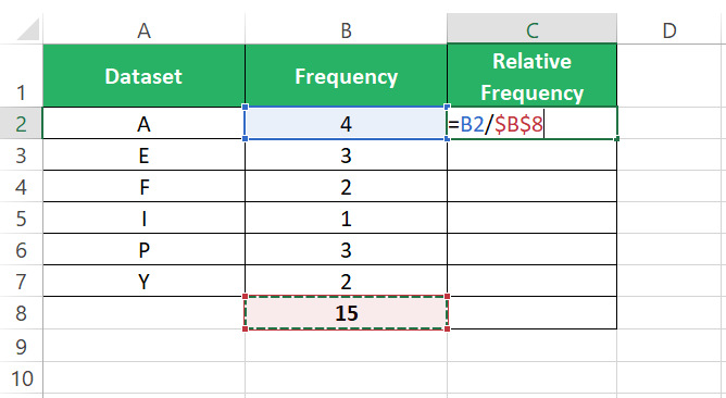
Make sure to use an absolute cell reference for the sum of frequencies so that the same can be dragged down the entire cell range of frequencies.
This will calculate the relative frequency of the letter A, which turns out as 0.2667.
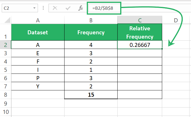
Step 4) Drag the same formula down the whole list to get the following results.
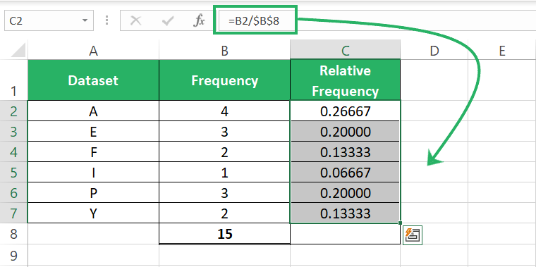
The results will be in decimals. To convert them to percentages:
Step 5) Go to the Home tab > Editing group > Percentage Icon.

The decimals will be converted to percentages as follows.
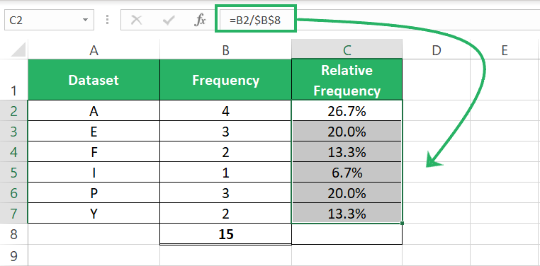
This gives you a proportion of each alphabet’s frequency in the subject dataset. From here, it takes me literally a split second to tell that the alphabet A makes the biggest part of this dataset with 26.7% relative frequency.
The data is so nicely deciphered with relative frequencies.
Step 6) To check if you have accurately worked out the relative frequencies, sum them up to see if they make a perfect 100%.

The whole concept of relative frequencies is to calculate the proportion of each frequency from the sum of frequencies; hence the total of relative frequencies will always be equal to 100%.
See, I said you’d find it easy 😎
Conclusion
Frequency tables allow us to classify data into different classes to observe the pattern of occurrence of events.
It not only offers valuable insights into the data but, also uncovers patterns that you might have missed otherwise and facilitates better analysis and informed decision-making 💡
In addition to frequency distribution and relative frequencies, my following Excel tutorials offer great insights into other statistical topics, too. Do give them a read here.
