How to Create a Pareto Chart in Excel Step-By-Step
Pareto Charts are based on the Pareto principle. These charts graphically represent the significance of different reasons for an event.
Making a Pareto Chart in Excel is quite simple as long as you have an in-built function to create a chart in Excel. 😀
However, if that’s not the case, you might need to create a simple chart and edit it till it functions as a Pareto Chart.
How to create a Pareto chart in Excel? Let’s learn this through the article below.
Download our free sample workbook here to practice the examples in the guide below.
Table of Contents
When to use a Pareto chart
The Pareto principle comes from the legendary Italian economist, Vilfredo Pareto. It is based on the fact that not everything in the world is based on equality.
Instead, the Pareto principle suggests that 80% of the events are caused by only 20% of the causes. For example, 80% of the sales of a business come from 20% of the customers.
That is why the Pareto principle is also commonly known as the 80/20 principle.
A Pareto chart is used to support decision-making. It graphically represents the significance of different causes of a situation.
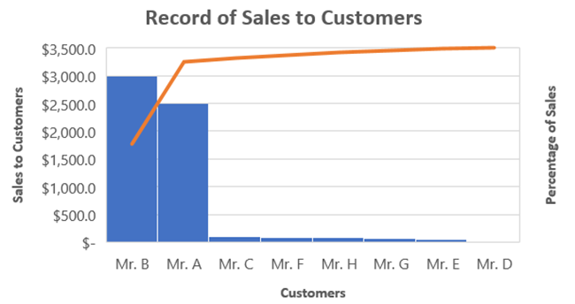
How to make a Pareto chart in Excel (2016 or newer)
Plotting a Pareto Chart in Excel 2016 (or newer versions) is relatively simpler. This is because Excel 2016 and above offer an in-built feature for creating Pareto charts.
Let’s create a Pareto Chart in Microsoft Excel using the data below.
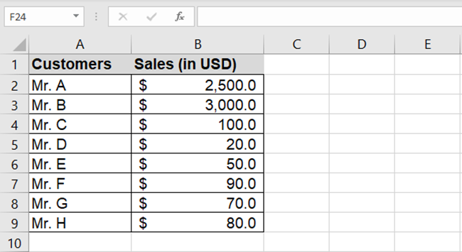
The image above shows different customers and the sales made to each of them.
Plotting this data on a Pareto chart will tell us which customers take the biggest share of sales.
1. Select the data (including headers).
Pro Tip!
Make sure your data is in the form of a table. If not, select the data, and go to Insert Tab > Tables > Table.
2. Go to Insert Tab > Charts group > Recommended Charts

3. From the Insert Chart dialog box, go to the tab ‘All Charts’.
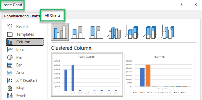
There appears a list of charts on the left side.
4. From this list, select the chart type ‘Histogram’.
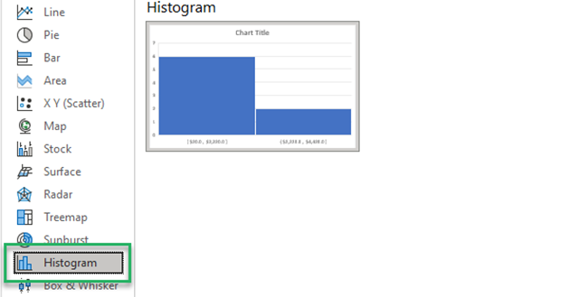
5. Under Histogram, there are further two options.
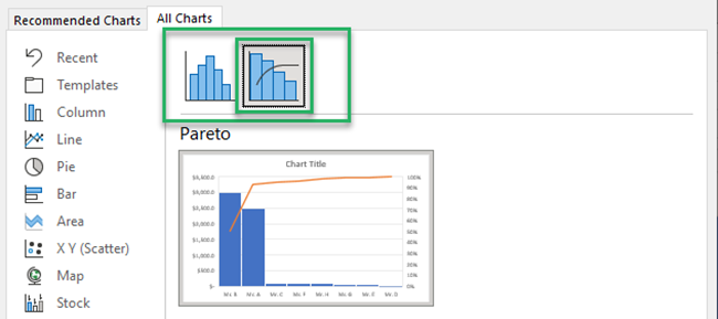
The first one has simple clustered column charts. The other one has an additional line chart to it (which draws the pattern of significance).
Just like the Pareto principle, a Pareto chart is used to explain the significance of different factors. And so, we will choose the chart with a line chart.
And that’s it! You have your Pareto Chart Ready. 🤩
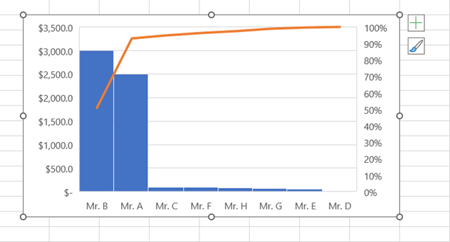
Formatting the Pareto Chart
Excel offers a wide variety of options to format the chart to your choice.
To launch the formatting options:
1. Click anywhere on the chart to see two icons on the right side of the chart.
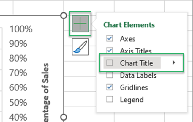
2. To add Axis Titles, click on the plus icon next to the chart.
3. Check the box for Axis Titles.
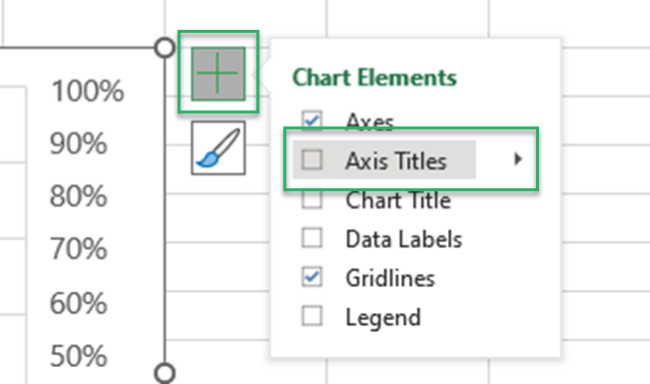
Write axis titles as needed.
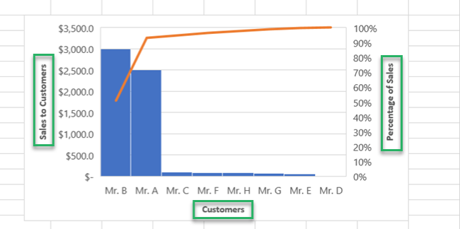
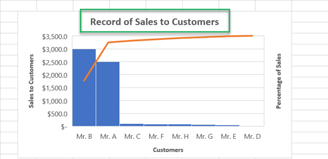
4. To add a title to the chart, click on the plus icon and check the box for the chart title.
5. Write a chart title as needed.
How to create a Pareto chart for Excel 2013 or older
Don’t you have Excel 2016 or newer versions? That’s alright.
You can still create a Pareto Chart with Excel 2013 or an older version with only a little extra effort.
This is because Excel 2013 and older versions do not offer an in-built function for creating a Pareto Chart. 🤫
We, therefore, use a hack to create one. Learn it below.
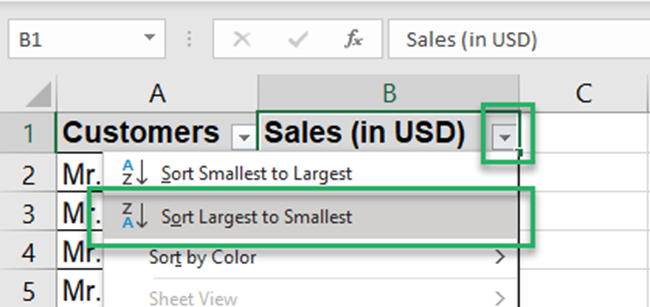
1. Sort the data used in the example above in descending order.
2. Click the downward-facing arrow on the header and choose ‘Sort Largest to Smallest.’
3. Once you have your data sorted, add another column to it for the cumulative percentages.
4. Write the formula in the first cell as follows:
= (SUM ($B$2:B2) / $B$10)
Pro Tip!
Cumulative percentages show what percentage of the data is covered at each level. In our case, what percentage of the total sales are taken by each successive customer?
Mr. A takes 42% of sales. Next in the list, Mr. A and Mr. together take 93% of the sales, and so on.
To double-check the accuracy of your cumulative percentages, you can see if the last percentage equates to 100% or not. If it does, you are good to go!
5. Drag and drop the first cell to get cumulative percentages ready for all customers.
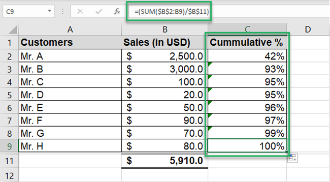
The data is all ready! It’s time we create the chart now.
6. Select the data (including headers).
7. Go to Insert Tab > Charts group > Recommended Charts

8. From the Insert Chart dialog box, go to the tab ‘All Charts’.

In Excel 2013, you do not see the option ‘Histogram’ on the left side. This is what makes the difference.
We will instead create a Combo chart (the closest to a Pareto chart).
9. From this list, select the chart type ‘Combo’.
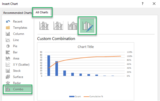
10. For the Sales column, select a Clustered Column Chart.
11. For the Cumulative Percentage Column, select a Line Chart. Check the secondary axis.
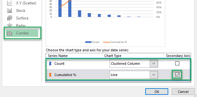
Excel creates a chart, as shown below.
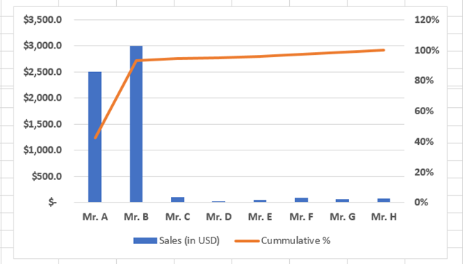
While it serves the purpose of a Pareto chart, you may edit it to bring it closer to a by-default Histogram chart.
We only need the cumulative percentage up to 100%.
1. Click on the axis > Format Axis pane > Axis options.
2. Adjust the maximum axis to 1.00 (100%).
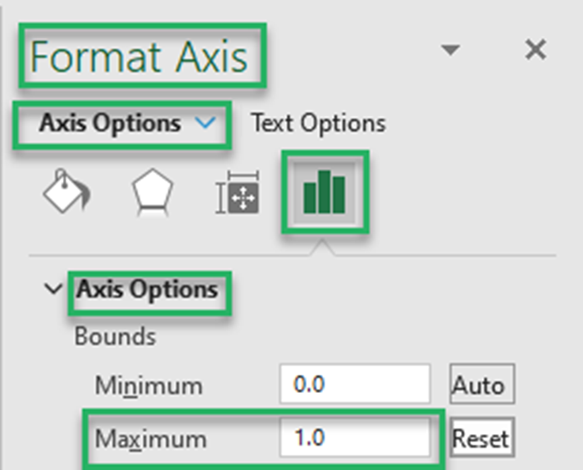
The chart changes as follows:
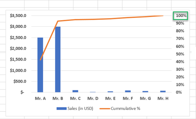
Something still seems missing.
Maybe it’s the thickness of the clustered columns. But that’s not a problem – you can set it as desired.
1. Select clustered column chart > Click Format Data Series pane > Series options
2. Adjust the gap width (the gap between each column) to a lesser percentage.
We have set it to 5%.
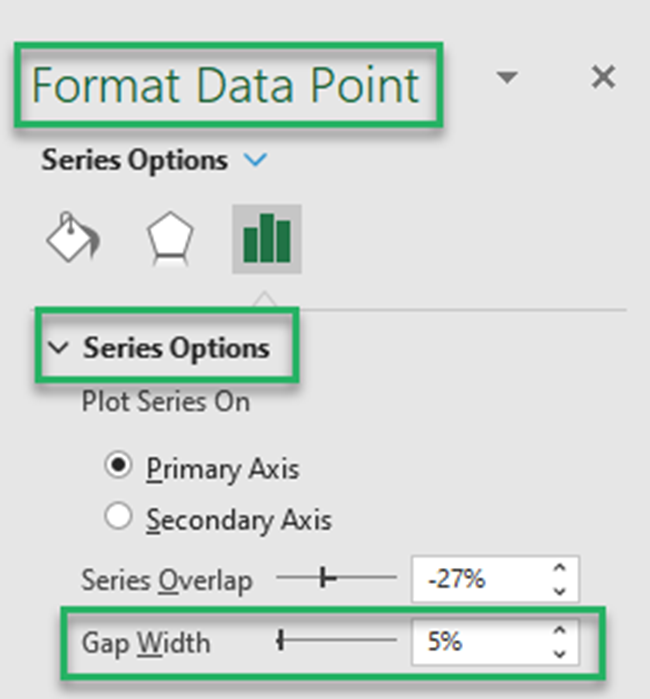
The chart now looks like this.
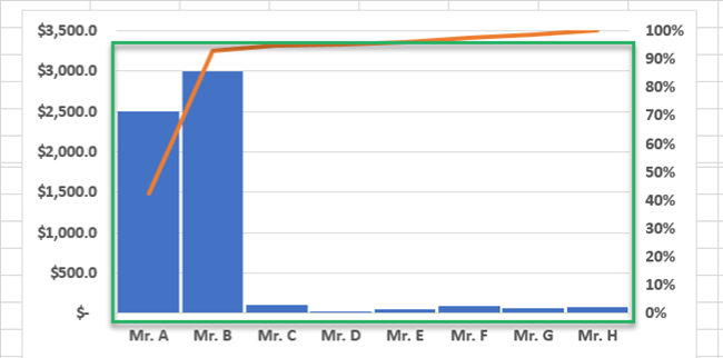
That’s how you can make a very good-looking Pareto chart in older versions of Excel too.
That’s it – Now what?
Making a Pareto Chart in Excel 2016 (and newer versions) is all about a few clicks in Excel. Going down the lane, it only gets more and more difficult as you try making it in older versions of Excel.
The above article should surely help you make Pareto Charts in all versions of Excel. But that’s not it.
To make the most out of this spreadsheet software, mastering functions like the VLOOKUP, SUMIF, and IF is essential.
My free 30-minute email course will help you learn them in no time. Register now!
Other resources
Found the above article interesting? Excel offers a wide variety of in-built charts that you can readily make.
Check out our other articles – Column Charts, Bar charts, and Sparklines in Excel. Also, try reading our article on adding and formatting Axis lines to Excel.
