How to Extend a Trendline in Excel: Step-by-Step
A trendline draws a general trend out of any given dataset. This helps with trend analysis and data analysis.
And why only the general trend of the dataset? Using trendline extensions, you can also forecast the behavior of a dataset in the future.
Extending trendlines helps you identify how a trendline will move in the future. Excel draws it based on the historical data pattern.
If that sounds a little complex to you, shrug that thought off. Making and extending trendlines in Excel is a piece of cake 🍰
Let’s go through the guide below to learn how you can (make and) extend a trendline in Excel. Download our free sample workbook here and jump right in.
How to extend a trendline in Excel
Here we have a dataset that tells how the prices increase as the demand increases.
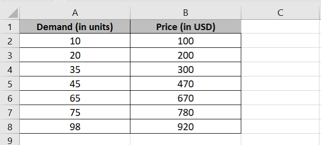
We want to see this data plotted as a trendline. To do that, let’s first make a scatter plot out of it 📈
- Select the dataset.
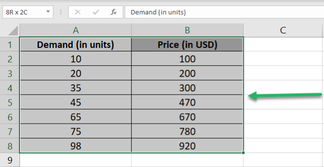
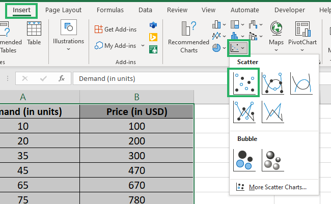
- Go to the Insert tab > Scatter Chart Icon > Simple Scatter chart.
And you’d have a scatter plot inserted in your sheet.
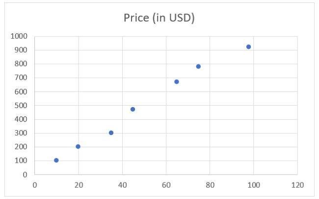
We see points plotted on the chart. Now we will make a trend line out of these dots to understand the trend (the relationship) between the demand and price of an item🚴♂️
To make a trendline on a scatter chart:
- Select the chart.
You’d see three icons to the right of the chart.
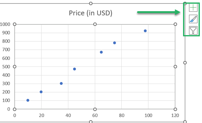
- Click on the Plus icon.
- From the drop-down menu, check the box for Trendline.
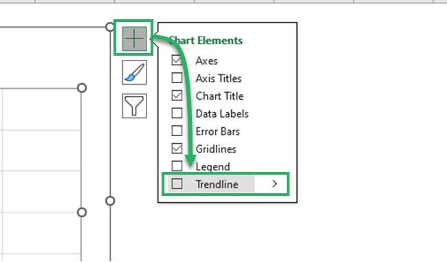
- This will add a trendline to your chart.
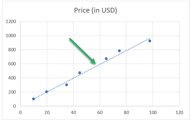
This trendline depicts the trend between the dataset provided to it. The trendline ends around 100 and 920 on the x-axis and y-axis, respectively.
A blue dotted trendline is the default trendline in Excel. You can always change it to your liking 🙈
For example, you can set it to a straight or curved line, a solid or dashed line, and in different colors. Sometimes. a scatter plot can also have multiple trendlines.
We want to extend this trendline to forecast future prices and demands. To do that:
- Double-click the trendline.
- This will launch the Format Pane to the right of your Excel sheet.
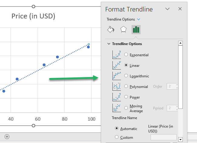
Look out for the Forecast Options in the Format pane under the Trendline Options.
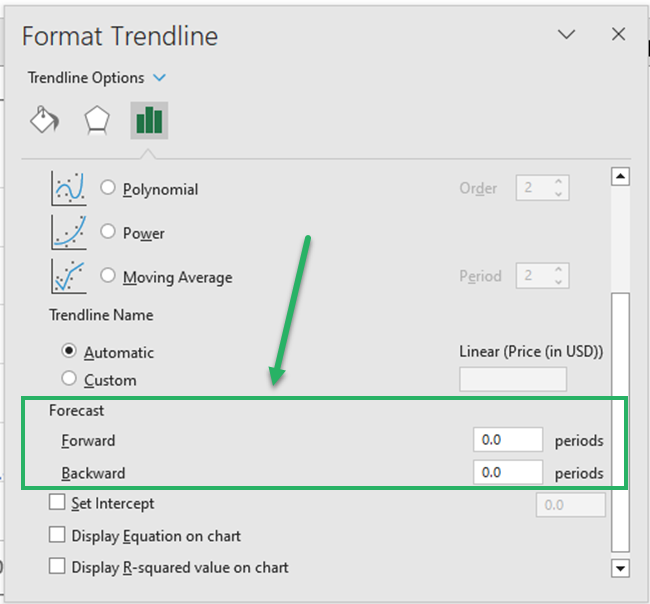
The Forward period tells how much you want the trendline to be forecasted for the forward periods 🔮
Let’s set it to 10.
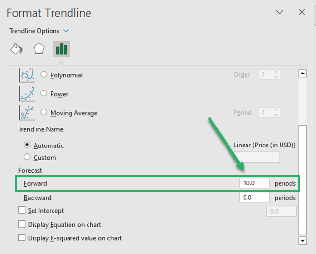
And here is how the trendline extends 10 periods beyond the last data point.
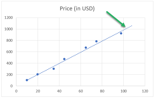
Note how the trendline is extended across 100 and 1000 now. This extension predicts how the trendline is expected to be in the future.
Similarly, the backward period extends the trendline towards the back. Let’s set it to 5 too 😎
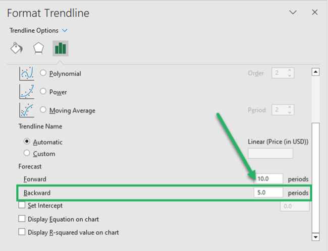
The trendline is slightly extended backward from the first data point.
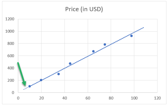
Extending the trendline forward and backward, you can forecast trends. Interesting and easy at the same time, isn’t it?
That’s it – Now what?
The guide above teaches you how to create and extend a trendline in Excel. And you must’ve found that super easy ✌
Hold on tight – because there’s so much more about Excel that we are yet to explore. Like a wide variety of tools, features, and functions.
Some of the top functions from Excel that’ll take your learning game to the next level include the VLOOKUP, SUMIF, and IF functions.
Want to start learning them already? Click here to enroll in my 30-minute free email course now. It will take you through these (and many more) Excel functions in a jiffy.
Other resources
There’s so much more to making scatter plots and trendlines in Excel.
Hop on here to learn how to make a scatter plot in Excel and how to create a trendline out of it.
