How to Make a Dashboard in Excel (Step-by-Step)
Excel dashboards are amazing!
They are such a great way to visualize data and get insights.
If you’re like me when I first saw an Excel dashboard, then you probably immediately wondered “How can I build my own?”
Well, in this article, we will show you exactly how!
We also prepared a practice workbook for you so you can follow along. Download the practice Excel file here.
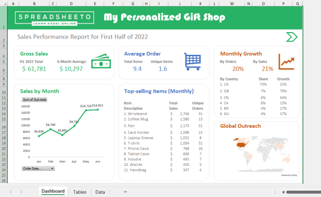
At the end of this tutorial, you will be able to create an Excel dashboard like this one:
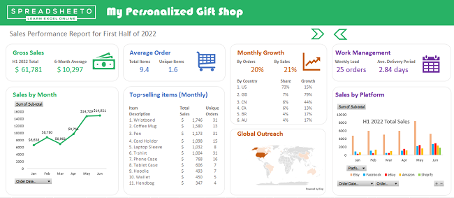
So, let’s jump right in!
Table of Contents
What is an Excel dashboard?
An Excel dashboard is a high-level summary of key metrics used in monitoring and decision-making.
It shows you most of what you need to know about a subject without going into specific detail. A dashboard often has visuals such as pie charts, line graphs, and simple tables.
Think of a car 🚗
A car’s dashboard displays speed, temperature, fuel level, etc.
But it doesn’t show everything that’s going on under the hood.
Similarly…
An Excel dashboard primarily shows key performance indicators and metrics.
The data and calculations are tucked “under the hood”. These are usually inside other sheets or in a separate workbook.
Getting started with Excel dashboards🏁
There are so many possibilities in creating Excel dashboards.
It’s easy to get lost in the process if you do not have a clear idea of what your Excel dashboard will look like.
So, it’s always a good idea to outline your dashboard structure. By doing so, you are setting yourself up for success with clear goals and methods.
Here are a few guide questions to help you set up an outline:
- What is your goal or purpose in creating an Excel dashboard?
Are you evaluating business performance? Understand customer trends? Or track your team’s workload? - What are the available data sets that can be used towards your goal?
Do you have sales data? Is your team tracked using a project management platform? How easily can you download and use these data sets? - Who are your Excel dashboard’s target audiences and which key metrics are important for them?
Do you intend to present it to investors? Or is it for yourself and your managers to improve work efficiency?
Let’s use the practice Excel workbook for example.
Example Excel dashboard outline
In the practice file, you have the raw sales data of an online store selling personalized gifts.
The data encompasses the entire first half of 2022. It includes orders from several E-commerce platforms.

Following the guide questions above:
- Your goal is to create a sales dashboard in Excel that can help analyze the store’s sales performance. Also, it should help improve work management across the different selling platforms.
- As for the data source, you only have the basic order information. This should be available for any online store and most stores have a sales/order workbook in hand.
- There are two target audiences:
- Investors – You are growing the business. There is no better way to showcase your store’s potential than with a well-designed dashboard in Excel.
To win over investors, you have to present sales figures and other key metrics. - Management (yourself and/or your team) – Excel dashboards are also a great way to visualize workload. You can study your team’s performance in terms of how many orders are being processed each week and how quickly the store delivers its products.
Try to bring all the items mentioned above into a neat outline like this:
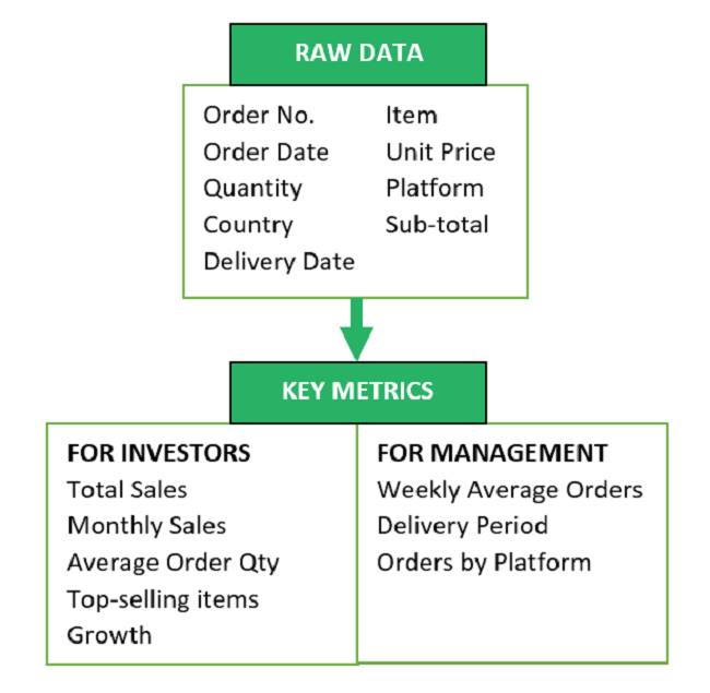
Now you have a clear outline for your dashboard structure.
Great start! 👍
This is the first step towards your superb Excel dashboard!
Pro-tip:
There are thousands of Excel dashboard templates available on the Internet.
Use your dashboard outline to identify and select suitable templates online.
Want to build better dashboards? Check out these ready-to-use Excel dashboard templates to get started.
Get raw data into Excel
Data sets most often come in the form of spreadsheets like Microsoft Excel or Google Sheets. Some may also come as CSV files (comma-separated values).
These can all be imported into Excel.
Check the Data tab in the Excel Ribbon.
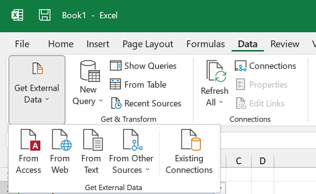
There are many ways to import your data. Whether it’s from an online platform or a local file, Excel offers plenty of options.
It is also possible to connect a data source. By doing so, changes in the data source are reflected in real-time in the Excel dashboard.
In the example workbook, the sales data is already available so there is no need to import any other raw data.
Set up data and file structure
Once the data is in, you need to set up a structure for your workbook.
The dashboard is the summary of key information from the data. So, it is best to place it at the beginning of the workbook.
Let’s try this in the practice workbook.
1. Insert a new worksheet at the beginning of the workbook and name this “Dashboard”.
2. For the raw data, you can change the worksheet name to “Data”.
Use an Excel table to store and show data
This next step is optional. But it greatly improves efficiency, especially if will insert several charts and graphs.
1. Select the raw data table and go to Home > Format as Table.
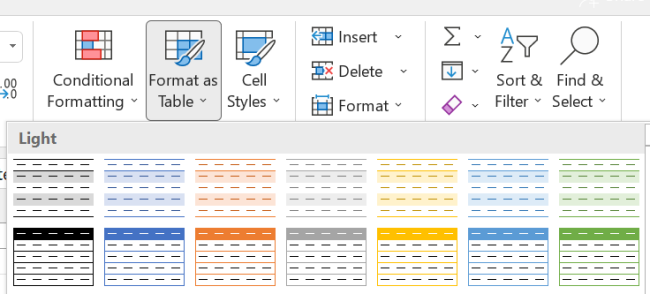
Excel automatically recognizes the entire table. You can then choose a table style to apply.
In the default Excel table styles, the header row is highlighted and succeeding rows are banded. This means their fill color will alternate between light and dark so that it is easier to read the data.
Filters are also added for each column, allowing you to find and sort specific data points.

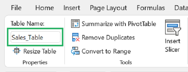
After formatting, you can also change the name of the table.
By doing so, you can reference the table directly using its name instead of highlighting its entire range repeatedly.
Also, you can apply data validation to Excel tables. This ensures the accuracy and structure of your data before analysis. Learn more about Data Validation here.
Try to change the table name of the example data set.
4. Format it as a table then change the table name to “Sales_Table“.
Analyze Data with Functions
Now you have your data table set up.
Let’s now add a few dashboard elements to the practice workbook.
Using formulas
You can reference a table’s elements in a formula using its name and an opening bracket “[“.
For example:
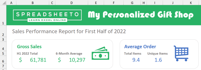
1. In the “Dashboard” worksheet, try this formula to get the monthly average sales.
=SUM(Sales_Table[Sub-total])/6

2. Then you can add a few more sets of formulas to get the other key metrics listed in the outline.
Experiment with colors, shapes, and icons to customize your Excel dashboard.
Using Pivot Tables
The most efficient and effective way to analyze and visualize data in Excel is using a Pivot Table.
Pivot tables are an extensive topic. It will be challenging to cover it in detail in this Excel dashboard tutorial alone. Instead, you can learn more about pivot tables here.
Or, you can also watch my short YouTube video on creating pivot tables.
Building a pivot table can be quite fidgety. Changing the fields in a pivot table can unintentionally alter column widths and cell formatting.
So, I suggest you create a new worksheet in the practice Excel workbook and name it “Tables”.
Here you can build a pivot table first before copying it to the “Dashboard” worksheet.
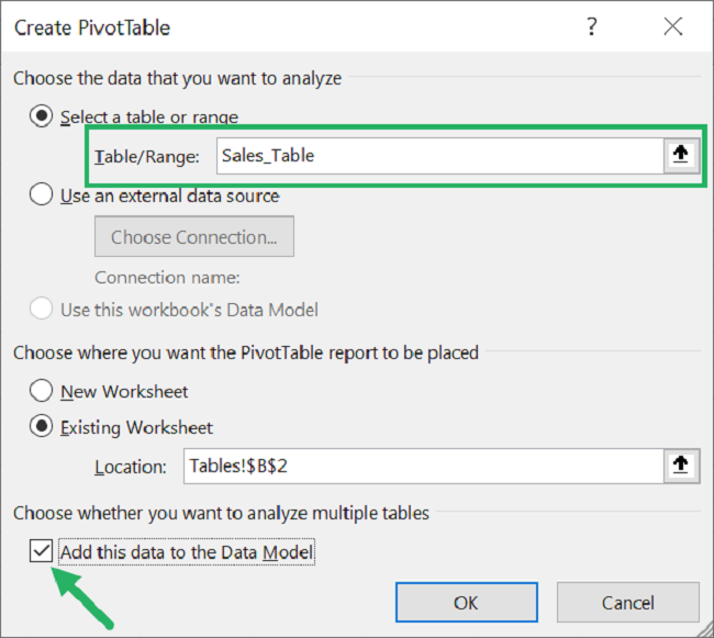
1. Try it out by inserting a pivot table from the Insert Tab.
2. For the source data, enter the name of the data table which in this case would be “Sales_Table”.
3. Then select any cell in the “Tables” worksheet and click OK.
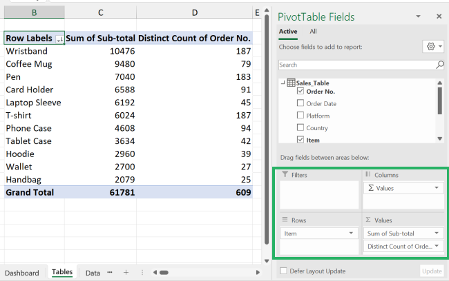
4. Drag and drop fields in the Field List window to get your desired pivot table.
For example:
You can set up the fields like below. This will display the top-performing products in the pivot table.
5. Then copy the table into the “Dashboard” worksheet.
Try using formulas to manipulate the values.
For example:
6. Divide the table values by 6 to get the monthly averages.
7. Apply formatting to make it look cleaner.
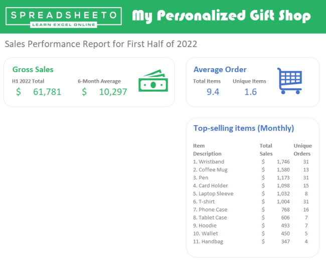
While building your Excel dashboard, always keep your outline in mind. Also, try to group related elements.
Visualize data and calculations with charts
Tables and functions are great for displaying lists and figures.
But if you want to show trends and/or patterns, charts and graphs are the go-to elements.
You can insert a Pivot Chart from the Insert Tab in the same way as with pivot tables.
1. Create a line chart for the total sales like this:
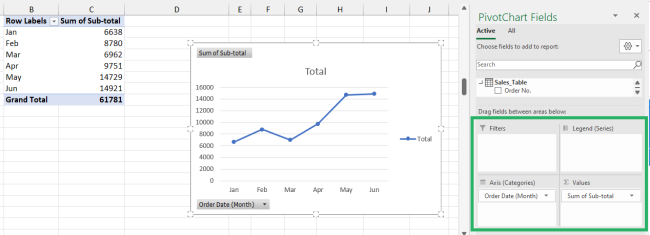
2. Then copy it over to the Dashboard tab and apply your desired formatting.
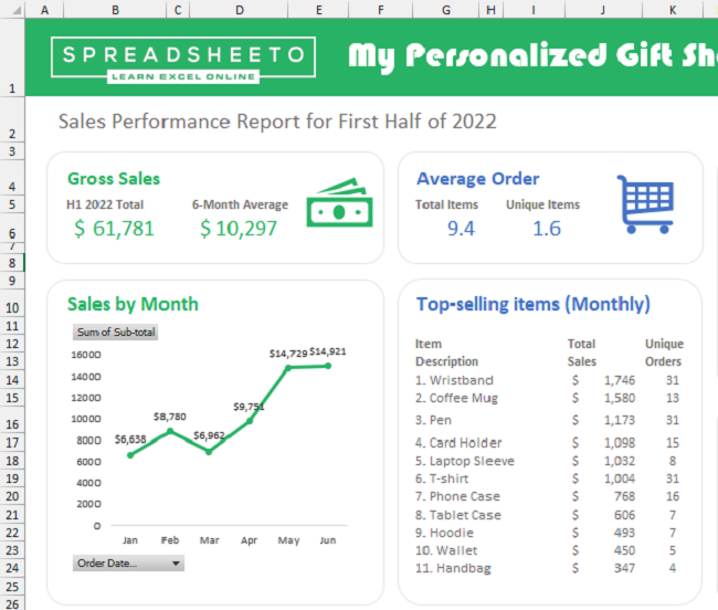
Explore the many different Excel tools! 🔧🔨
Don’t limit yourself to a simple line chart or graph. Excel offers so many different visual elements for use.
You can select from various charts such as pie charts, bar charts, or even a map!
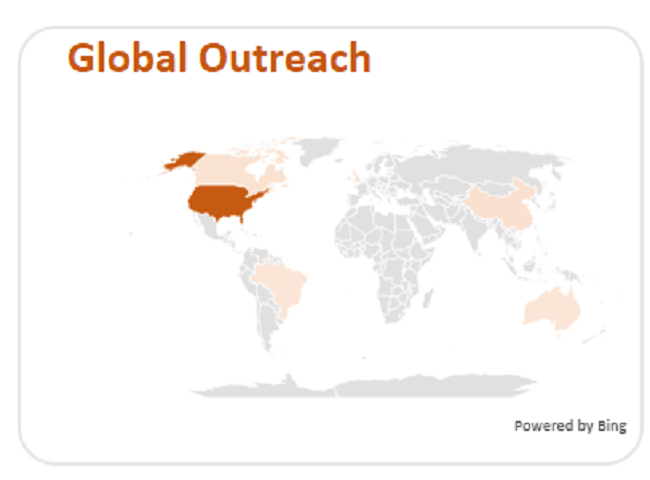
Select dynamic charts that work best with your data.
For example, instead of listing out the top-selling items, you can display this in a colorful pie chart.
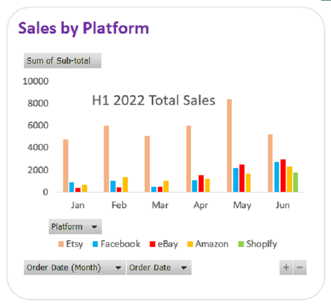
You can also create interactive charts like this clustered column chart. It allows you to filter data by category and date.
Once you have all your Excel dashboard elements in place, you can now move on to formatting and clean-up.
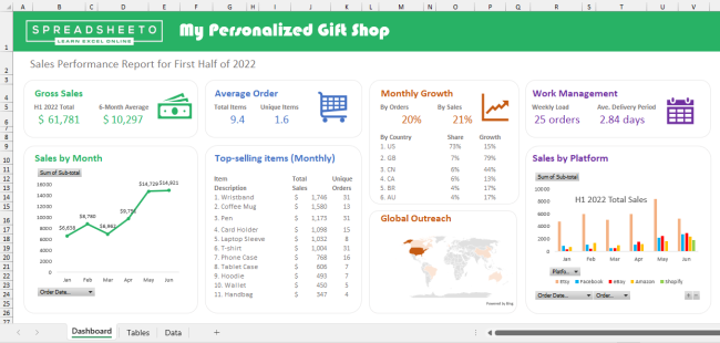
Nice work! 🤩
You now have a working Excel dashboard. This particular example is simple compared to other Excel dashboards.
Quite often, advanced Excel dashboards will have a lot of data and visuals. This can make navigating them difficult.
To overcome this, you can create an interactive Excel dashboard that allows users to change views. So that they can focus on specific data points and visuals.
Let’s see how you can do this.
Using Macros to create views
Revisit the example dashboard outline earlier. Based on it, you want the key metrics for both investors and management visible.
But you also want an option to hide the management-related metrics when needed to streamline your Excel dashboard.
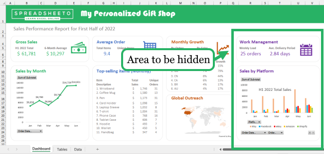
This is easy enough to do by Recording a Macro to hide the last few columns and assigning this macro to a button.
Recording macros is easier (and faster) than you think — here’s how to do it in Excel💨
Once, you have Show & Hide buttons like the ones above, users can now manage their view of your Excel dashboard.
Free dashboard templates
Believe it or not, Microsoft Excel and other spreadsheet programs have been around since the 1980s! 😲
And there is more than three decades’ worth of templates and examples of Excel dashboards. This goes for both simple and complex data.
Some common ones include financial dashboard, web analytics dashboard, product metrics dashboard, and many other interactive Excel dashboard templates.
That being said, you rarely have to create a new dashboard for your specific needs.
Most likely, someone has already created a similar Excel dashboard and the template is available online.
You just need to personalize it according to your needs using the skills you have learned today.
Check out this article for our hand-picked Excel dashboard templates that might be what you need!
General dashboard advice
Here are a few reminders to help you make the most out of your Excel dashboard.
- Keep your dashboard simple and easy to understand. Avoid cluttering your dashboard with too many tables and visuals.
- Group related items together so users can quickly find information.
- Experiment with different styles and color schemes to get the best presentation for your data.
- Use freeze panes and custom view buttons like those shown in the example. This ensures users can view and navigate your Excel dashboard as intended.
That’s it – Now what?
You are now equipped with the basics of creating an Excel dashboard.
Go ahead and build your own from scratch or customize one from a template.
Working with a dashboard in Excel is an intermediate-level topic.
If you had difficulty following along with this tutorial, you can sign up for my free online Excel training course here.
It will help you learn the basics and more!
Other resources
As you saw in the examples earlier, it’s so easy to manipulate data using Excel tables.
Check out our guide to Excel tables to learn how they can make sorting, filtering, and analyzing data much easier.
If you want to know more about inserting and customizing Excel charts, visit my YouTube channel for some quick tutorials. You can learn to use all the charts such as the pie chart, bar chart, and column chart.
Thank you for reading! 🙂
Catch you in the next article!
