How to Add a Slicer in Power BI (Step-by-Step)
Slicer is a powerful feature in Power BI that lets you filter your data in multiple ways and make the visuals in your report more interactive 😀
You can visually filter your data by category, date, range and more to bring certain areas of your data set to the spotlight and enable price data exploration.
If you’re familiar with slicers in Excel, using them in Power BI will be a piece of cake for you as the working of slicers is highly similar in both software.
In this tutorial, we will see how to add slicers in Power BI in a step-by-step process to filter your Power BI Report. Let’s get right into it.
What is a slicer?
Power BI slicers are visual filters that can placed directly on your report. They are used to filter and sort your data only to show information you’re interested in seeing 🧐
You can use it to remove all unnecessary or irrelevant information on the report. Slicers serve the purpose of a filter but their working is slightly different from that of a filter.
A slicer is represented as a visual on the report that shows only the data selected. For example, if you have the profit and loss budget report of a company, you can make a slicer of its products.
You can then see each product separately from the slicer whose sale value you want to analyze. It provides an intuitive way to explore and filter data directly on the canvas 🎨
Slicers are generally used to make reports more interactive and dynamic for users. The visuals on the report respond to each click you make and take you straight to the data behind that visual.
They make the report easy to read eliminating the need to move through huge and complex data. You can choose the type of data you want to show on the report and it will reflect immediately.
The best part is that slicers add a visual appeal to your report and you can customize that visual as you like by altering its size, colour, font, shape and other properties 🧰
When to use a slicer?
Usually, one would want to use a slicer to:
- Create visually appealing reports without large chunks of repeated data.
- Show important or frequent filters on the report
- Bring filtered information to the spotlight by placing it next to important data
- Remove unnecessary or unimportant data from the report temporarily
- Filter the report without the use of a dropdown list
What are the different types of slicers?
There is a variety of types of slicers that you can choose from depending on your requirements. To choose the best option for your task, you need to understand the workings of each slicer 🔪
List Slicer
List slicer is the default type of a slicer and the most commonly used by users. It displays the items of a field as a list of checkboxes and users can select specific values to filter the visual.
List slicer is the go-to choice of so many people because of its versatility and flexibility. You can use it with any type of data be it dates, numbers or text.
You can select one or multiple values with it in one go – like filtering the categories or departments in your company’s report. It’s perfect for quick and easy filtering of data.
Hierarchy Slicer
A hierarchical slicer is your best option if your data set is divided into hierarchies or sections like Year > Quarter > Month or different products in a categories section.
The slicers filter data by branches or levels and let you view each section separately. You can easily collapse or expand it to drill down into the data and analyze it closely.
Dropdown Slicer
As evident from the name, the dropdown slicer offers a single select option that opens as a dropdown and minimizes when the selection has been made.
This slicer is mostly used when you’re low on space and need to fit a visual within that limited space. For instance, filtering data from a long list of countries.
Timeline Slicer
Timeline slicer is used to filter data based on data ranges. It displays a timeline on the screen on the visual that users can interact with.
You can move and drag the timeline to select particular data points. This slicer works best if you want to filter your data on a deeper level and choose custom dates.
Numeric Range Slicer
A numeric range slicer comes in handy when you want to include data between a certain range in your report. It appears as a line on the visual with points on both ends.
You can drag the points towards and away from each other to specify a range you want to pick values from. The numeric slicer lets you focus on particular data without having to manually select it.
This works best when you’re working with data like years, age, and age and you want to specify a certain year or age group.
Relative Date Slicer
A relative data slicer allows filtering data by relative periods, i.e., week ago, month ago, etc. It is your best friend when working on dynamic reports that need to be updated frequently.
You can set different time ranges and use a relative slicer to compare performances across those ranges. The best part is its easy filtering like choosing to show data from the past 30 days.
Sync Slicer
As the name suggests, sync slicer sync slicers across different report pages. Using this slicer, you can apply the filter applied to one page to all other pages on your workspace.
For instance, you want to see the same products or countries filtered for the sales budget across all report tabs.
Creating a slicer in Power BI
Creating a slicer in Power BI is as simple as adding any visual to your report 🟩
We will use the following “Retail Sample Analysis” sample data.
This data set contains data about retail sales of items sold across different stores and districts. There’s data about this year’s performance, last year’s sales, units, gross margin, variance, and others.
Say, you made this year’s sale report with StoreNumberName.
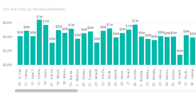
We want to add a slicer to filter the report based on Distrivt Managers in the data set.
To do that,
Step 1) Select the slicer visual from the Visualizations pane.
Step 2) A blank slicer visual will appear on the report.
Step 3) From the Data pane, select District > District Manager.
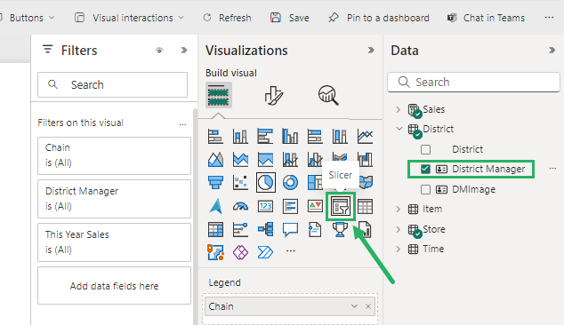
This will add the contents to the slicer that you want to filter.
The slicer will now show the filtered data as you select each manager:
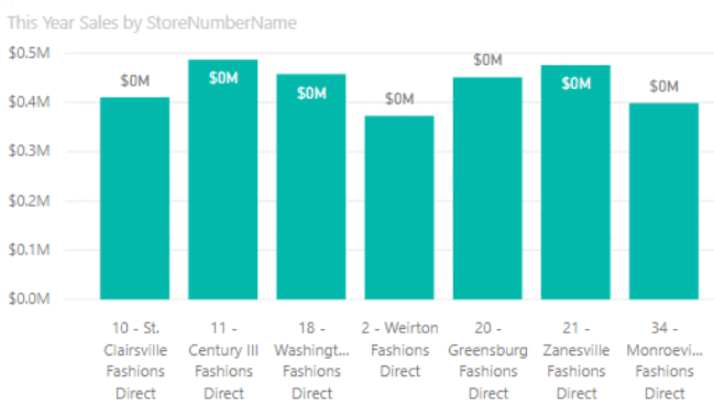
How cool is that? 🤠
Formatting the slicer in Power BI
Your slicer might be looking plain and boring right now but there are loads of options you can use to format it. Let’s see them below 🔽
To format the visual,
Step 1) Select Format on the Visualizations pane (the icon with roller).
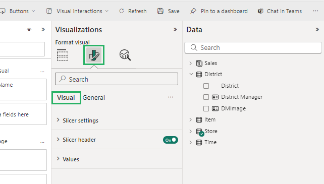
It will display a list of formatting options you can apply to your slicer. These include:
- General
- Selection Structure
- Border
- Title
- Slicer Header
- Background
- Border
- Items
Say, you want to make the header size bigger.
To do that,
Step 1) Turn on the Slicer Header from Selection Controls.
Step 2) Under Font, increase the number of points.
This will change the size of the slicer list.
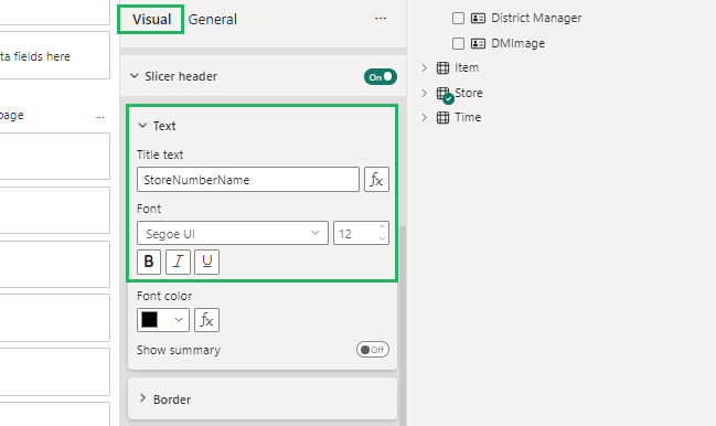
You can choose any other options from the Format dropdown to format your slicer 🎨
Changing the type of slicer in Power BI
You can change the type of slicer you are working on in Power BI depending on the fields you insert in the visual 😃
Say, you want a slider-type slicer.
To do that,
Step 1) Select the slicer visual.
Step 2) From the Fields pane, select Time > Date.
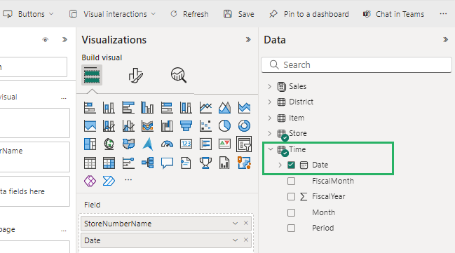
This will insert a slider bar in your visual that you can move across the line to select a date. It offers further options to select a Date range like:
- Dropdown
- Between
- List
- Before
- After
- Relative
To select these,
Step 1) Select the visual and go to the Format Visual option on the Visualizations pane.
Step 2) Under Visuals, select Slicer Settings.
Step 3) Under Options, select Style.
It will display a dropdown list showing all the above options.
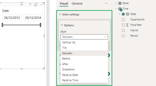
Isn’t that fun? Try it now! 🤩
Limitations of slicer in Power BI
A slicer allows you to add visual filters to your report but it has its fair share of limitations too. Let’s see these below.
- Slicers provide row-level values for numeric data instead of aggregated values.
- There’s no option to pin a slicer to a dashboard.
- Visual-level filters are inaccessible in slicers.
- You can only use the numeric range slicer in Power BI desktop not in Service.
- You cannot drill down in a slicer in a report.
- Data models in slicers don’t give time zone data when importing.
Conclusion
In this guide, we saw how to add slicers in a Power BI report and understood how they worked. We also saw how you can format a slicer in Power BI 😉
Slicer can make a long, complicated report very easy to understand and interactive. It lets you focus on particular insights from a huge set of data in just two clicks.
Not only does this improve the report’s functionality but also provides the user more control over the displayed data making the analysis more efficient.
To learn more about Power BI and slicers, give the following articles a read:
How to Do Table Visualization in Power BI (Step-By-Step)
Power BI Dashboard vs. Report: The Pros and Cons
How to Use Filters in Power BI (Step-By-Step Tutorial)
Happy Slicing! 🤗
