How to Use Themes in Power BI (+My Favorites)
Themes in Power BI offer a powerful way to customize the look and feel of your reports by creating a visually appealing experience for your audience 🤩
Power BI lets you change the background colour, font style, layout and more in just a few seconds to align with your brand and make the data more interactive.
Adding themes makes it easy to understand complex data at a glance. Whether you’re creating a professional report or a simple prototype, Power BI has something for you 📃
In this tutorial, we will see how to use themes in Power BI and where you can get additional themes from. Without further ado, let’s get right into it!
Power BI Themes
A theme in Power BI is a set of colours, styles, icon sets, layout and more that you can apply to your report and dashboard.
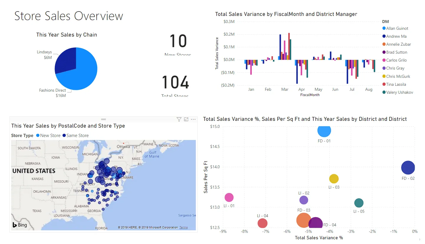
A sample Power BI dashboard with the default theme looks something like this:
Applying a new theme Innovate makes the dashboard look like this:
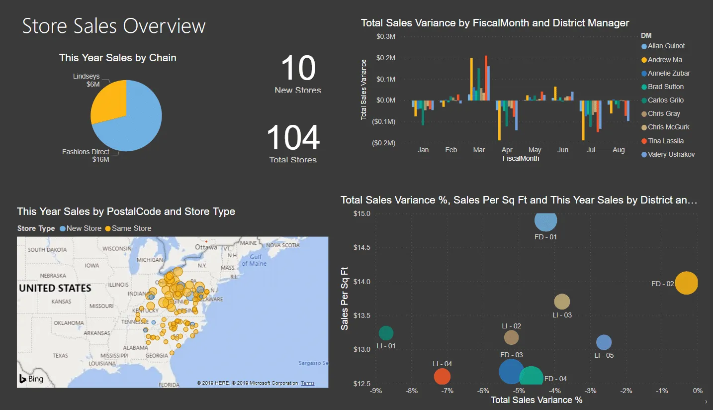
The changes you see here are made in 2 clicks only and less than 2 seconds 2️⃣
Note that you can only apply themes in Power BI Desktop and not Power BI Service. This is one of the key differences between the two.
At its core, changing a theme requires changing the attributes of RGB in a JSON (JavaScript Object Notation) file. But we will be doing it the easy way in this guide.
How to change the theme
Changing a theme in Power BI is as easy as a walk in the park. We will make changes to the default Power BI theme set on the report seen above.
To do that,
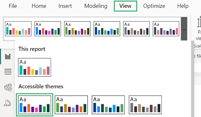
Step 1) Go to the View tab on the ribbon to the themes section at the top left corner.
Step 2) Select any theme you want to apply to your report.
Step 3) To explore more built-in options, click the down arrow on the Themes section and select the theme you want.
The theme on the report will be changed to the selected theme:
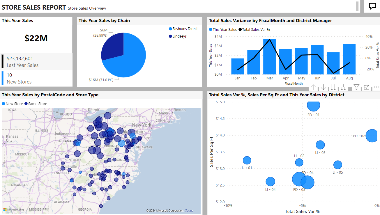
How cool is that? 😎
You can customize the current theme too from the same menu. Select different colours and choose other options to give it a new look.
Additional Power BI themes
Power BI offers a variety of built-in themes you can choose from. But what if you don’t like the available themes and want to try something new?
Fortunately, Power BI Desktop allows you to download themes from the Microsoft Power BI Community and use them for yourself.
You can get to the Themes gallery via:
- Link: Microsoft Power BI Community Themes Gallery
- Power BI Desktop
To get it via Desktop,
Step 1) Go to the View tab on the ribbon.
Step 2) Click the down arrow on the Themes section and select Theme Gallery.
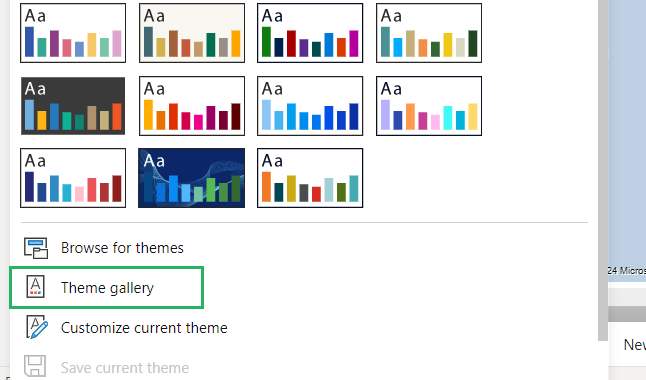
It will redirect you to the Microsoft Theme Gallery 🔃
Step 3) Click the theme you want to apply from the site to view it.
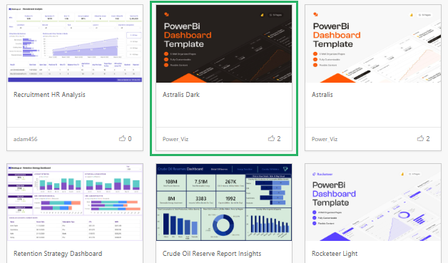
Step 4) Scroll down to see a description of it.
Step 5) Click the download button next to the name of the theme you want to download.
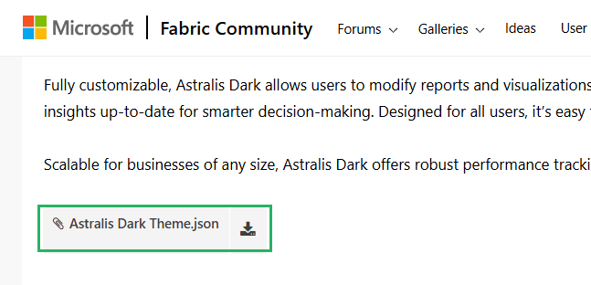
This will download the .json file on your desktop and store it in the Downloads folder.
And you have the chosen theme installed. Now you need to import it 📁
How to import a Power BI theme
Once you download a new theme file, you need to import it to Power BI to use it.
To import the theme,
Step 1) Go to the View tab on the ribbon.
Step 2) Click the down arrow on the Themes section and select Browse for themes.
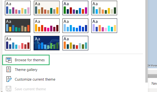
Power BI will prompt the Open dialog box.
Step 3) Locate the file from the Downloads folder and double-click it.
The theme of the report will be updated in an instant to show the new one.
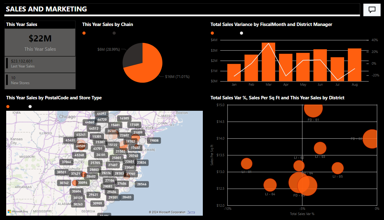
How cool does it look? Try it now! 😃
Modify an imported theme
Sometimes, because of the visualizations used and the theme applied, the imported theme doesn’t look the same on your report as it did in the gallery 🖼
In such cases, you might need to make some tweaks here and there for it to meet your taste. All you need to do is select visualizations and edit their formatting.
For instance, the theme we selected was to change the entire report colour contrast to black, white and orange but it didn’t change the map colour 🌎

We will have to make a little modification here by changing the background color.
To do that,
Step 1) Select the Map visual.
Step 2) On the Visualizations pane, select Format Visual (Paintbrush icon).
Step 3) Go to Map settings.
Step 4) From the Style dropdown, select Dark.
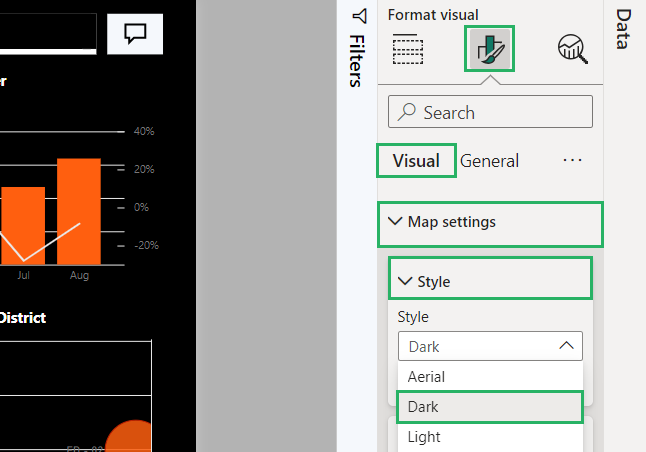
Step 5) Go to Bubbles.
Step 6) Select colours and choose Orange.
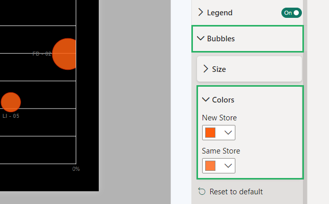
Your visual will be updated to match the chosen colours:
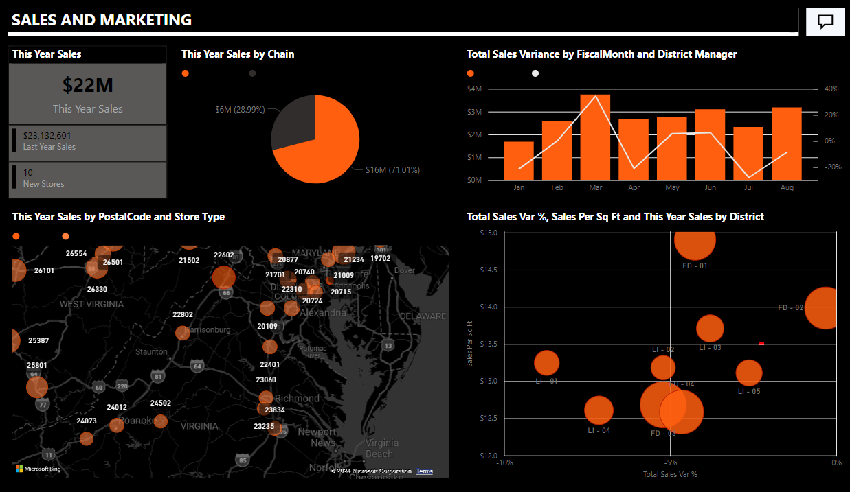
How cool is that? 😀
Top Power BI themes
Now that you know how to select, import and modify a theme, let’s see some of our best picks from the Microsoft Power BI Community Theme Gallery.
These themes are our personal favourites and do not reflect what the community thinks is best. Let’s get on with it 😀
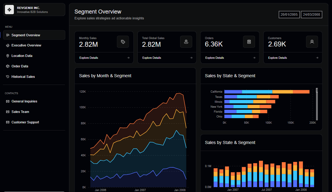
RevGenix Dark
The theme brings a bold, high-contrast look to your reports, combining whites, teals and deep red with shades of grey and blacks. Ideal for cases where visibility and clarity are key, this theme is perfect for tracking trends and displaying metrics.
Link: RevGenix Dark
Loomy Lime
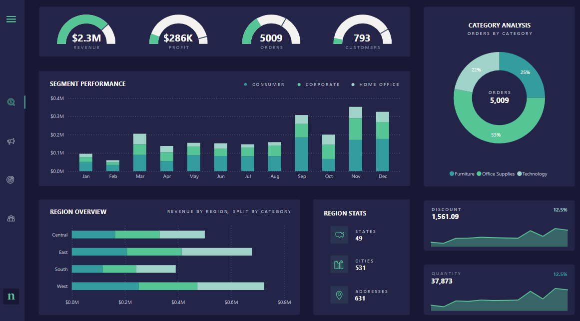
Loomy Lime adds a fresh and vibrant touch to your Power BI reports with shades of lime green, charcoal grey and soft white. The accent offers an uplifting eye-catching element that makes key points in the report pop.
Link: Loomy Lime
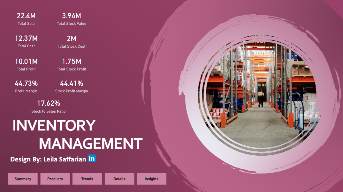
Pink Template
Feels girly working on this template but the hues of pink purple and white make the theme very cosy and likeable. Designed as an inventory management system, the theme is viewed and used by over 10,000 Power BI users.
Link: Pink Template
Nowalls Analytics
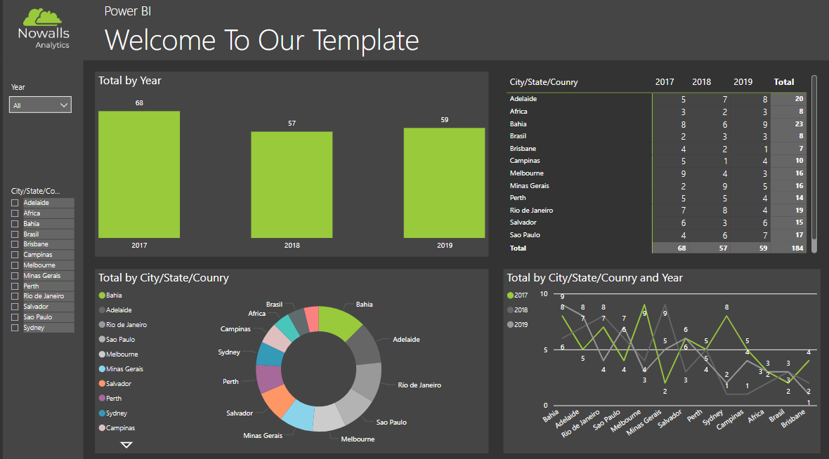
There’s a good reason why this theme belongs to the top 5. The mixture of neon and black makes this theme unique from the rest. Though used by the designer as a plug for their company, this theme has been viewed and downloaded by many Power BI users.
Link: Nowalls Analytics
Blue Moon
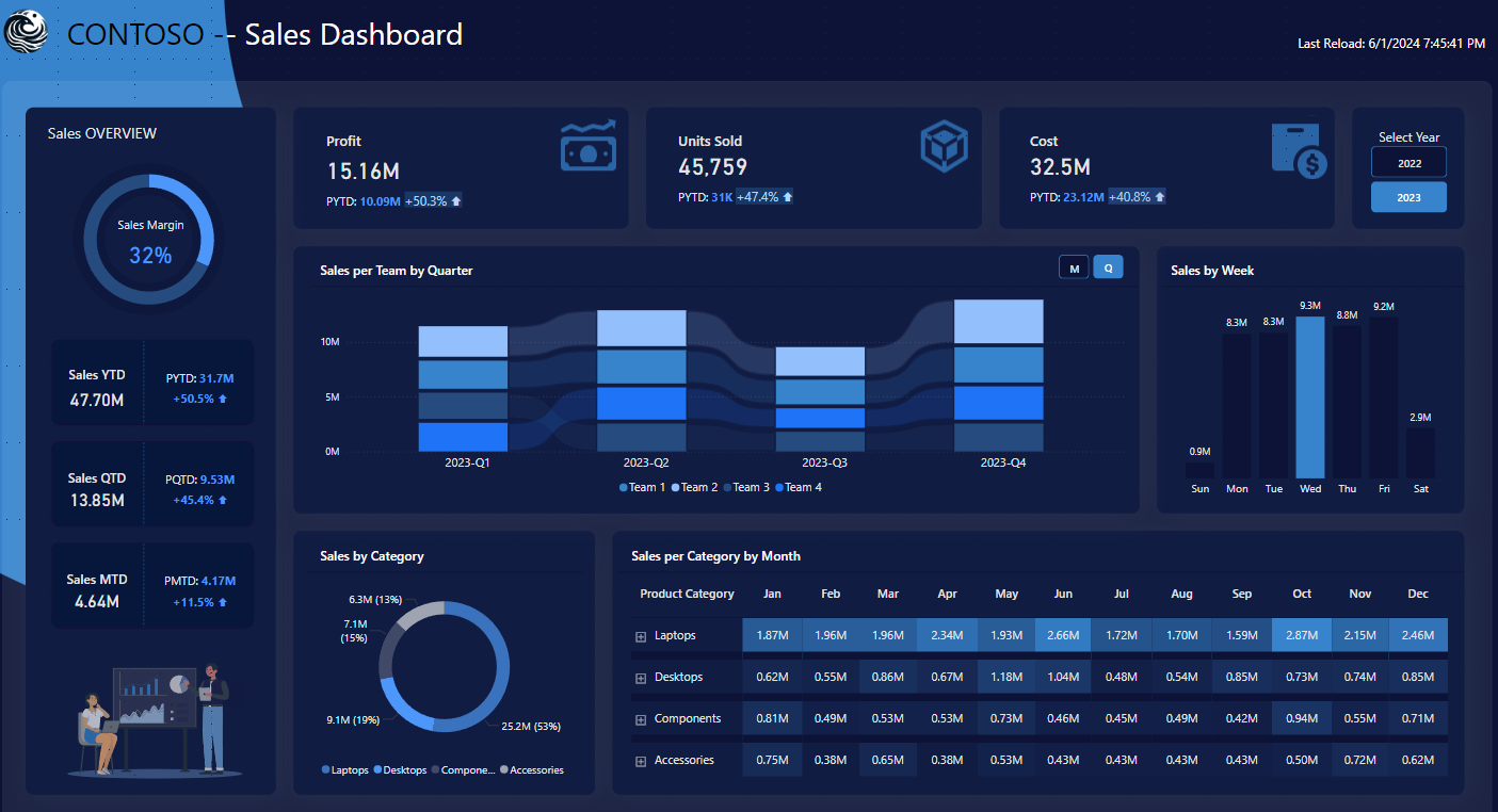
The theme uses a mix of light and dark blue hues, accented by complementary shared that highlight key insights. The Blue Moon theme brings a calming and refreshing palette that complements cool, professional and cohesive reports.
Link: Blue Moon
Tumble Road Multicolor Theme
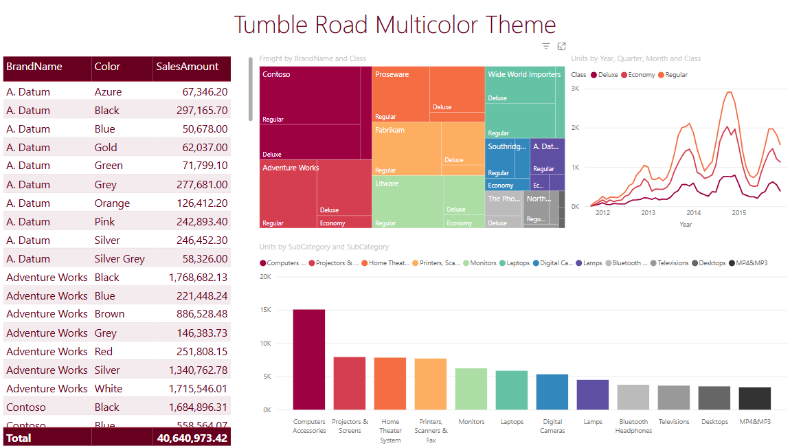
This theme is based on internal colour palettes that the designer developed. At first glance, it feels like the red colours are taking over. But on closer inspection, it just seems reddish due to a lot of red-related colours being used.
Seppirus Dark Mode Theme
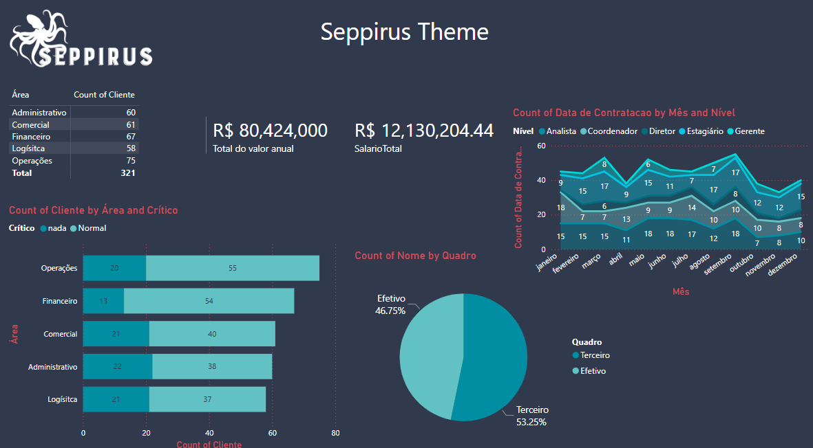
The Seppirus theme brings a modern and classy look to your report. Perfect for low-brightness environments or for users who prefer sticking to their dark interface. It has deep shades with vibrant accent colours that create a stunning contrast.
Link: Seppirus Dark Mode Theme
Spring Day (Expose’ Data)
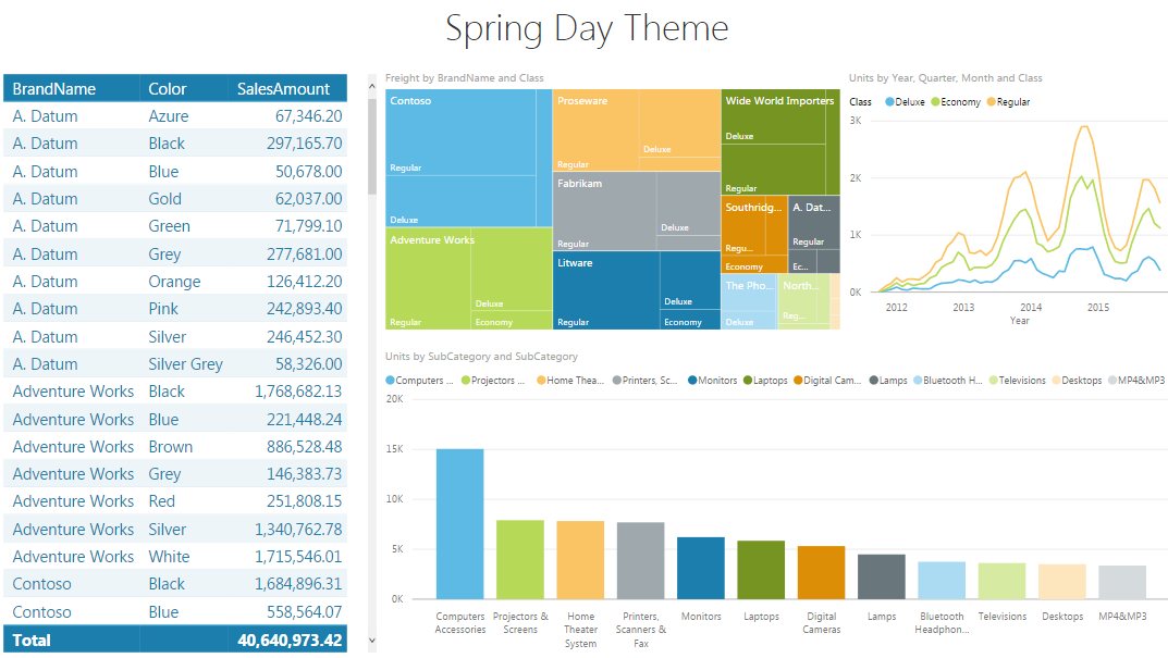
Currently, this theme has the most likes and views on the themes gallery. It’s not too hard to know why. The theme brings with it the soft colours of spring. Like the Pastel Color Theme, this theme is easy for the eyes.
Link: Spring Day
Vintage Theme (Expose’ Data)
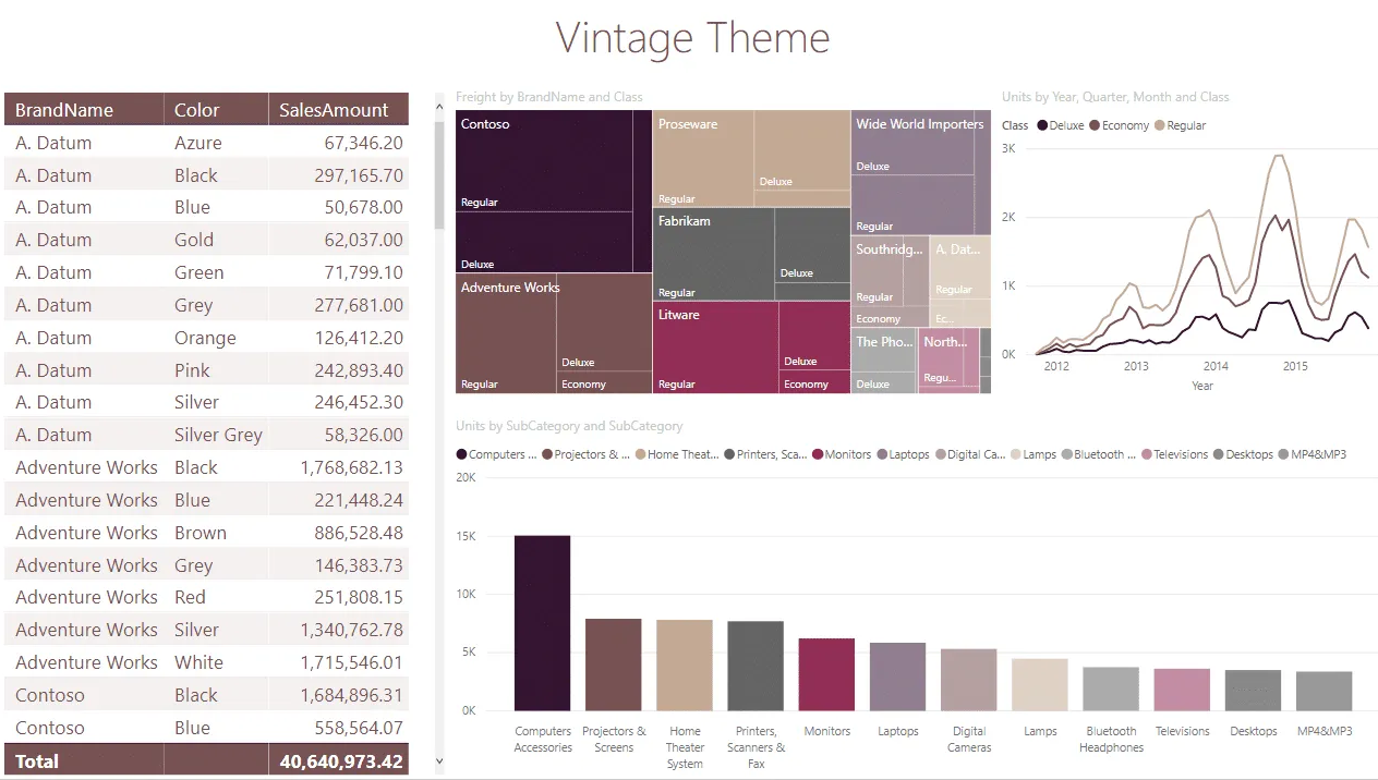
This theme, designed by Aexley, is inspired by red wine vintage colours. It has a healthy mix of light and dark colours layered with a light-vintage filter. Don’t you find the colours soothing to the eyes?
Link: Vintage Theme
Sales Dashboard Theme
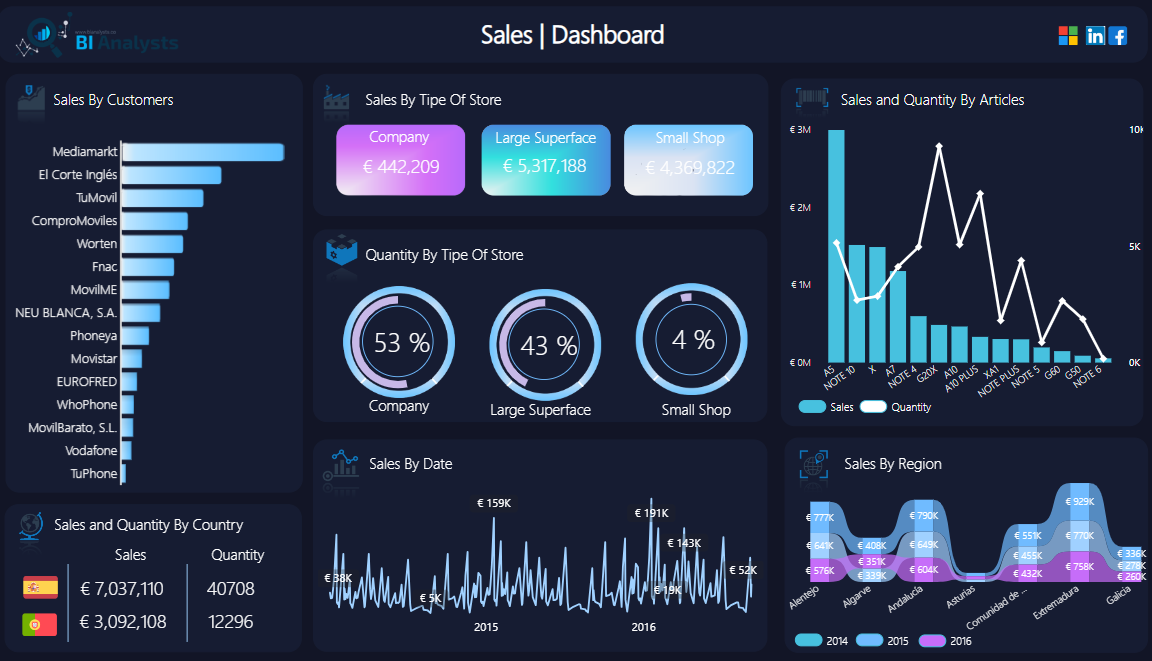
The theme uses a sophisticated palette of dark and light blues, white and purples, creating a modern and visually appealing look. It is tailored for sales reports and KPIs. It is ideal for presenting sales data that helps focus on critical insights instantly.
Link: Sales Dashboard Theme
Conclusion
In this guide, we saw how to add themes to Power BI, change them, import new themes and more. Themes allow you to enhance the functionality and aesthetics of your report 📃
They help align your report with your brand, unify all your ideas and direct attention to critical insights not to mention that can make your report visually appealing.
Experimenting with different themes in your report will tell you which looks best and feels the most intuitive to you and your audience.
To learn more about Power BI and its themes, give the following articles a read:
Power BI Workspace: What it is and how it works!
How to Visualize a Table in Power BI (Step-by-Step)
How to Visualize Data in a Power BI Matrix
We hope you enjoyed reading it as much as we did crafting it! 🤗
