Quick Analysis Tool in Excel: Full Tutorial
Are you tired of spending hours analyzing your data in Excel? Do you wish there was a faster way to make sense of all those numbers and charts?
Well, look no further than the Quick Analysis tool in Excel!
This powerful tool allows you to quickly analyze your data. Create charts and graphs, and perform complex calculations, all in just a few clicks.
In this guide, we’ll take you through everything you need to know to become a Quick Analysis pro and save yourself valuable time and energy.
Get ready to revolutionize the way you work with data in Excel! 💪
You can also download the sample workbook here to practice analyzing data in real-time.
Table of Contents
What is the quick analysis tool?
The Excel Quick Analysis tool allows users to format and visualize data in seconds. It is available in Excel 2013 and later Excel versions.
It provides a set of options that can be used to quickly create charts, insert tables, sparklines, and more. You can use the Quick Analysis tool to create a chart by selecting the Chart option in the menu.
You can then choose the type of chart you want to create, such as a column, line, or pie chart. Excel will automatically create the chart based on the selected data.
Similarly, you can use it to apply formatting to highlight certain values in the data. For example, you can use the Color Scales option to apply a color gradient to the data based on its values 😀
Overall, Quick Analysis is a valuable feature for quickly analyzing data in Excel. It can help you save time and improve productivity when working with large datasets.
In Excel-language, 1 means TRUE. 0 means FALSE.
Add totals from quick analysis tool
Adding totals from the Quick Analysis tool is a breeze. You can SUM, AVERAGE, and COUNT values in your table in the blink of an eye.
Want to see how? Read on! 🧐
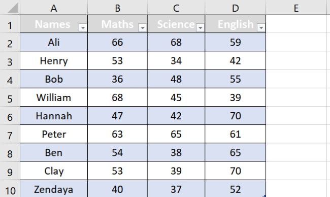
Say, we have the following sample data.
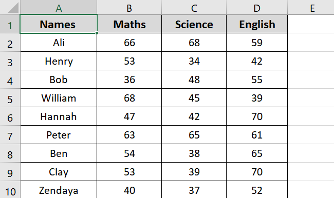
It gives information about the subject marks of some students.
We want to find the SUM of values from A1:D10, and we will do that using the Excel Quick Analysis tool.
- Select the data from cell A1: D10.
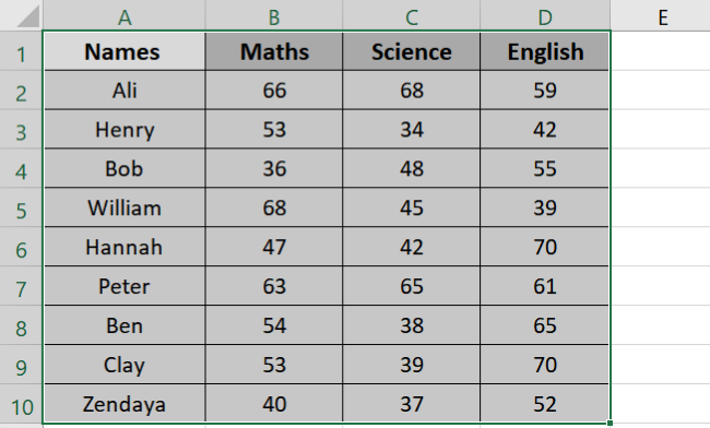
- Click the small Quick Analysis tool icon at the bottom right or press CTRL + Q.
- Select Totals from the categories.
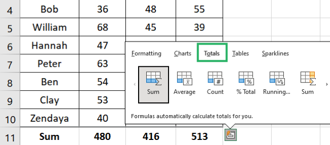
- Hover over any function, and the tool will show you its preview.
Pro tip:
If you only select the textual data, Quick Analysis will only show the COUNT option as:
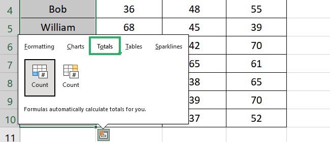
Make sure to select the entire data to analyze your data properly.
- Select the SUM function.
The final result appears as follows:
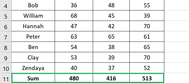
Similarly, you can try the other functions under the Total category.
PRO TIP!
Note that there are two SUM functions under the Totals category.
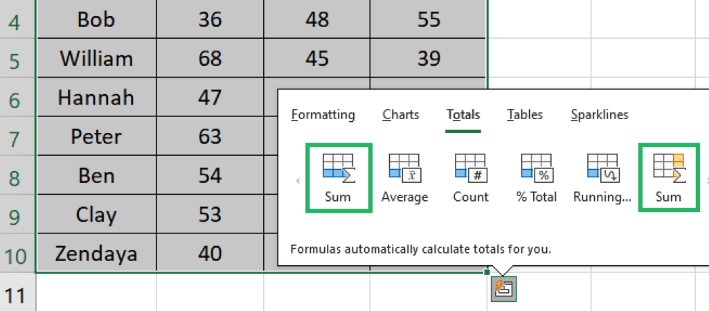
The SUM in blue at the left will give the result in rows. The SUM at the right in orange is for the column.
If you use the rightmost SUM function (orange colored) to total your data, this is how it will look:
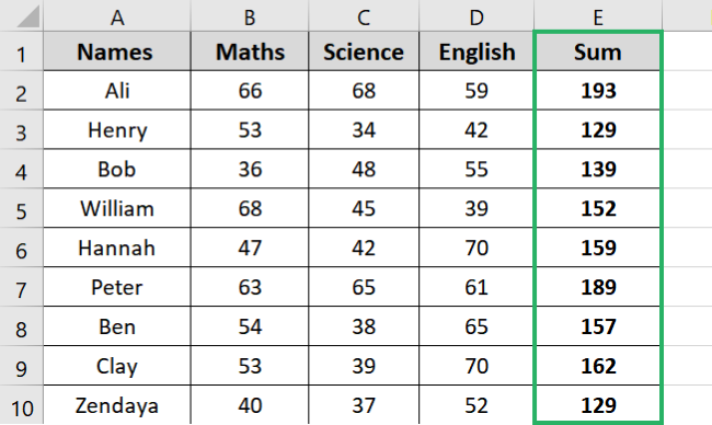
While the blue SUM will return as seen above.
And that’s it. We have successfully added the total row to our data 🥇
You can try it yourself using the sample workbook provided.
Add tables and pivot tables from quick analysis tool
You can also instantly create tables and pivot tables using the Quick Analysis tool.
Let’s see how to do it below.
We will use the previous data set for this example.

We want to create a table of the given data. To do that,
- Select the data.

- Click the Quick Analysis button at the bottom right. Select Tables.
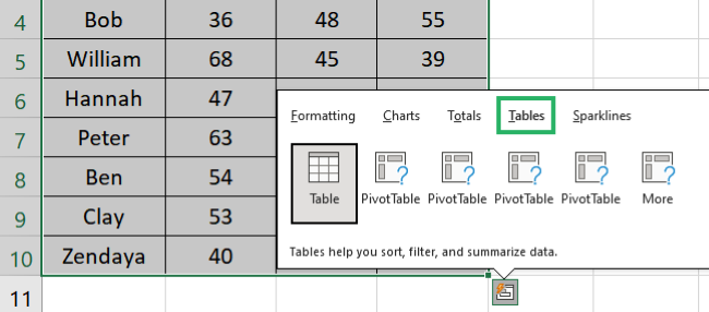
- Hovering over each option will give you a preview of the table.
- Select Table.
- It will convert the data set into a table as:
You can also choose a pivot table by hovering over the options. Click on the More option to explore a variety of pivot tables in one place.
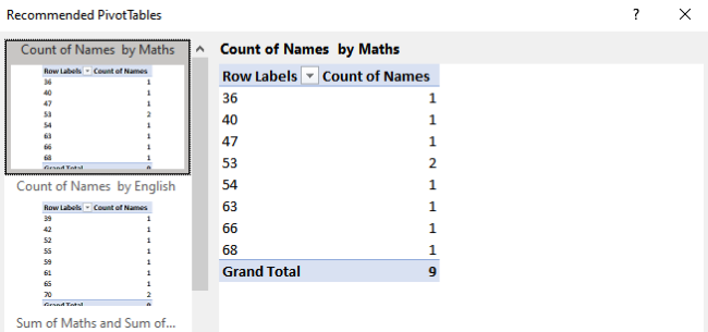
This is a really easy way to add pivot tables – one of the most powerful features of Excel – instantly 🚀
Add (conditional) formatting with quick analysis tool
You can also apply conditional formatting to your data using Quick Analysis.
It will add data bars, colors, icon sets, and more to your data in seconds. Let’s see how to do it below.
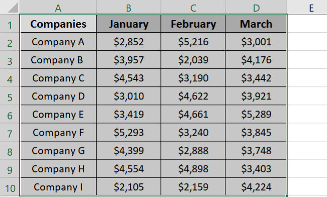
We have the following sample data.

It contains information about the monthly sales of some companies. We want to highlight all values greater than 3,000 in red.
To do that,
- Select the data set.
- Click the Quick Analysis icon at the bottom right.
- Conditional Formatting is selected by default.
- Select Greater than from the conditional formatting options.
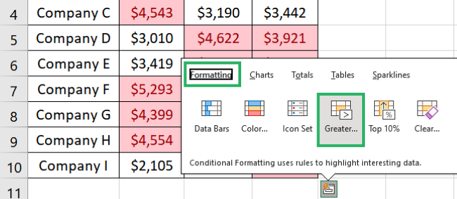
- It will show a Greater Than dialog box.
- Enter the minimum value – in our case, it’s 3,000.
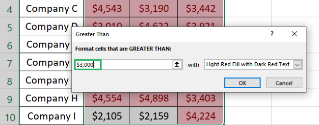
- The red color is chosen by default, but you can select any color.
- Press Ok.
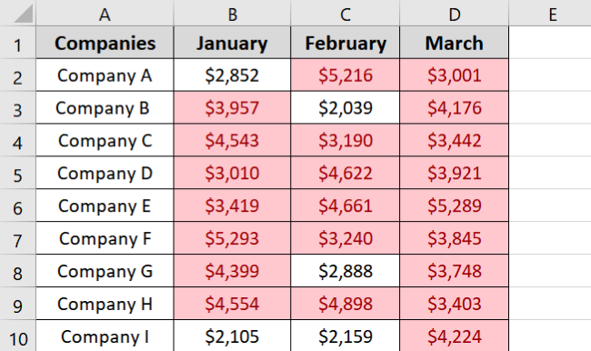
All cells greater than 3,00 have been colored red.
Pretty quick, no? 🤩
Add charts with quick analysis tool
Just like other options, you can quickly access charts using the Quick Analysis tool. Let’s see how to add charts using Quick Analysis below.
We will use the previous data set for this example.
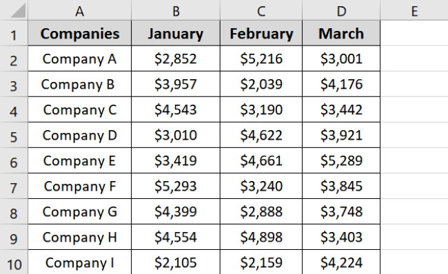
We want to create a stacked bar chart of the sample data above.
- Select the data range.

- Click the quick analysis tool excel.
- Go to Chart types.
- Hovering over the charts will show you a preview of the chart.
- Select Stacked bar chart.
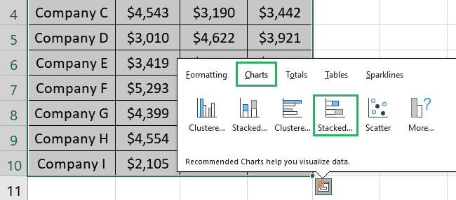
Your stacked bar chart with selected data appears as follows:
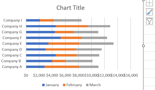
If you can’t find the chart you want, click the More option. You will find a huge variety of charts there 📊
Add sparklines with quick analysis tool
Sparklines are mini charts that can fit in a single cell. Their purpose is the same as regular charts – to visualize data. The only difference is that the sparklines visualize the data in a row.
Let’s see how to add sparklines to your data set using the Quick Analysis tool below.
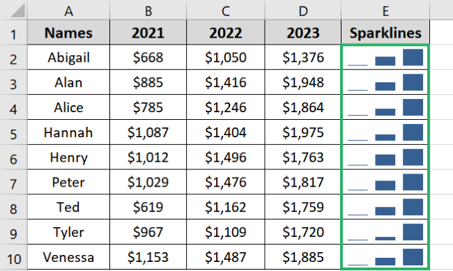
Say, we have the following data.
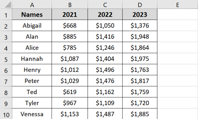
It contains information about the increments in salaries of employees of a company. We want to create sparklines showing the increment in each employee’s salary 💰
To do that,
- Select the data range.
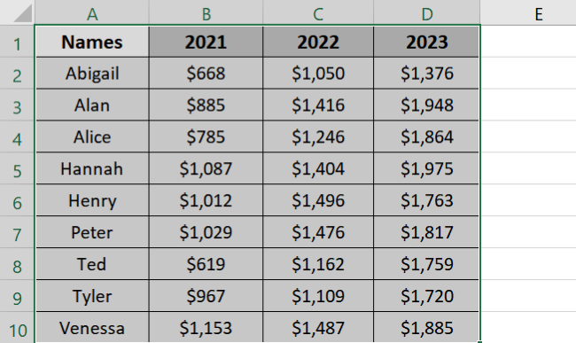
- Click the Quick Analysis icon.
- Go to Sparklines – the last category in data analysis options.
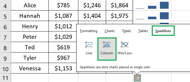
- Select any sparklines type – we will go with Column.
- The sparklines appear in the column next to your data set as:
How easy is that?
Try it yourself using the sample workbook now and become a Quick Analysis expert 😉
That’s it – Now What?
In this article, we saw how to use Quick Analysis tool. We also saw how to instantly create charts, tables, sparklines and even total our calculations.
The Quick analysis tool can be a great help especially if you are a newbie. It combines some of the most powerful features of Excel in one place 😀
Similar to Quick Analysis, Excel has many other fantastic features. The best of these are its functions. Some of the most commonly used functions in Excel include SUM, AVERAGE, and COUNT.
You can learn them for free in my 30-minute free email course only at the cost of your email address. So join now!
Other Resources
Did you enjoy reading this article? If yes, then you’d love to learn more such topics.
Read here: Common Functions in Excel, Create a Dashboard in Excel (free templates here), Cell References and more.
