Create a Sankey Diagram in Excel: Step-by-Step
A Sankey diagram, also known as a Sankey chart, is a lovely flow diagram 😊
It shows the overview of the flow characteristics of complex processes visually.
Fun fact: 💡 This was introduced by an Irish engineer named Matthew Sankey to illustrate the energy efficiency of a steam engine.
Most commonly, Sankey diagrams are created using the Google sheets add-on, and Excel ChartExpo add-in. But they can be made in an Excel spreadsheet too.
In this lesson, you’ll learn how to make chart templates for Sankey charts 😀
To start, download and practice with the sample data in this attached Excel example file.
Table of Contents
Prepare data for a Sankey diagram
There is no built-in chart option for the Sankey diagram in excel ☹️
Therefore, first, you have to prepare your data set for the Excel chart.
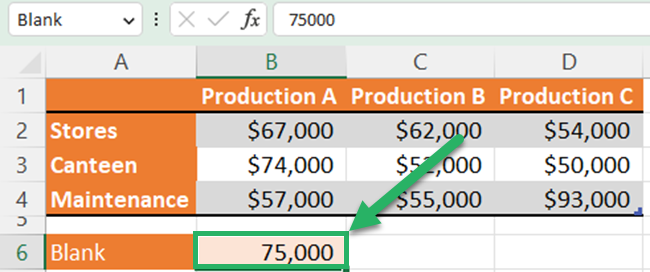
The below Excel data table shows the allocation of the cost of three service units of a factory to three production units 🏭
So, there are two categories in this two-dimensional table.

You can use a Sankey diagram in Excel to show the above data story.
It is easy to practice the lesson if you convert a regular data table to an Excel table. You can rename your data table using the table design tab.
First, create a named range called “Blank” under the above table and give a suitable value. This value will be the width of the blank space inside the Sankey Chart.
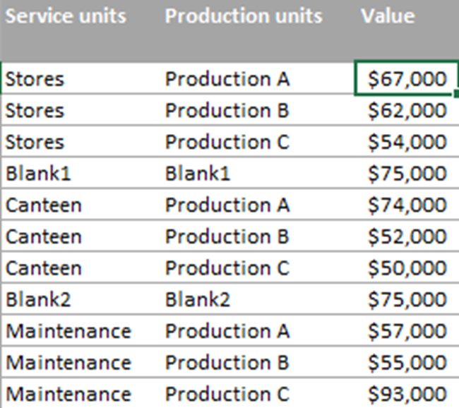
Next, you have to create the Sankey lines table.
In this Sankey lines table, you have to insert all possible combinations of rows and columns wise. After each row category, you have to insert the “Blank” named range.
You can use the following formula to get values to your new table.
=IFERROR(XLOOKUP([@[Service units]],Table13[[ ]],XLOOKUP([@[Production units]],Table13[[#Headers],[Production A]:[Production C]],Table13[[Production A]:[Production C]])),Blank)
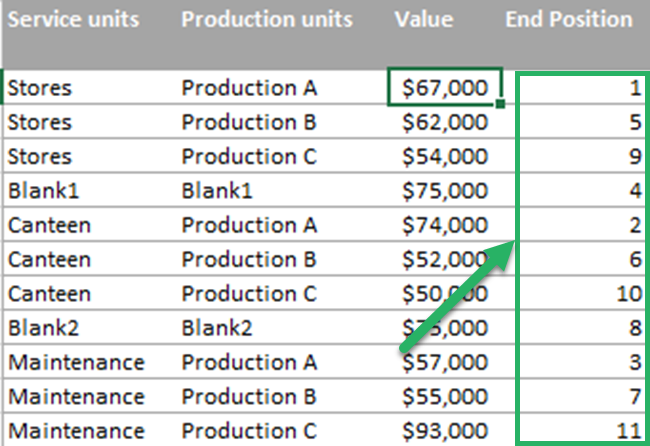
Then, insert an End position column to the above table. This is the order of the lines at the end of the diagram.
So, you enter 1 for the 1st “Production A”. Then Enter 2 for the second “Production A” and so on.
After you finish entering the end positions of one production unit, the next position goes to the first blank with no position from the top.
So, your table will be;
Then, you have to do 3 sets of calculations in the above table to create a 100% stacked area chart.
Those 3 sets are;
- The space above the Sankey line
- The width of the Sankey line
- The space below the Sankey line
Each of the 3 sets has 4 sub-calculations.

You can use the below formulas to do the calculation of each column.
The below 4 formulas help to calculate the space above the Sankey lines.
Above Start column
=SUM(Table3[[#Headers],[Value]]:[@Value])-[@Value]
Above Mid 1 COLUMN
=[@[Above Start]]
Above Mid 2 column
=[@[Above End]]
Above END Column
=SUM([Value])-SUMIFS([Value],[End Position],”>=”&[@[End Position]])
The below 4 formulas help to calculate the width of the Sankey lines. All 4 columns should be equal to the value column.
value Start column
=[@Value]
value Mid 1 COLUMN
=[@Value]
value Mid 2 column
=[@Value]
value END Column
=[@Value]
The below 4 formulas help to calculate the space below the Sankey lines.
Below Start column
=SUM([Value])-[@[Above Start]]-[@[Value Start]]
Below Mid 1 COLUMN
=SUM([Value])-[@[Above Mid 1]]-[@[Value Mid 1]]
Below Mid 2 column
=SUM([Value])-[@[Above Mid 2]]-[@[Value Mid 2]]
Below END Column
=SUM([Value])-[@[Above End]]-[@[Value End]]
As you are working with an Excel table, you have to paste the above formulas only in the first row 🤩
Excel will automatically apply the same formula to the below cells.
Then, your Sankey Lines table should be like this.

After you complete the above table, you have to create relevant data tables for Sankey pillars.
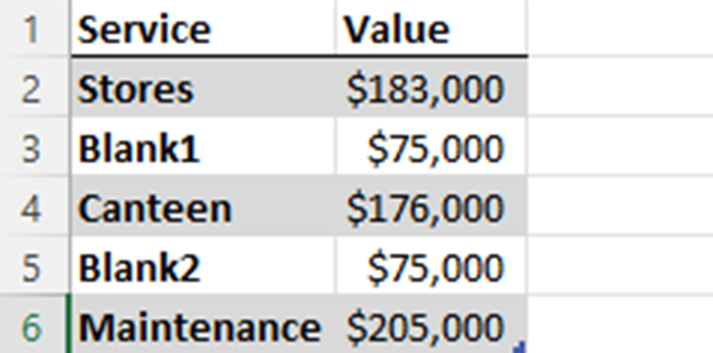
To create the Sankey source pillars, you have to enter sums of all row categories. Remember to insert the “Blank” item between each row category.
You can use the below formula to get values for the source pillars.
=IF(ISNUMBER(SEARCH(“Blank*”,[@Service])),Blank,SUMIF(Table3[Service units],[@Service],Table3[Value]))
To create the Sankey destination pillars, you have to enter sums of all column categories and insert the “Blank” item between each column category.
Enter the below formula to get values for the destination pillars.
=IF(ISNUMBER(SEARCH(“Blank*”,[@Production])),Blank,SUMIF(Table3[Production units],[@Production],Table3[Value]))
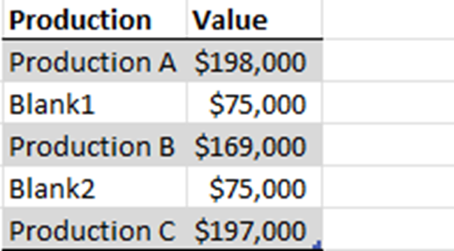
Then, you have to create a named range for spacing. This will be the horizontal axis for all 100% stacked area charts.
This data table represents categories and it determines the start and end position of the slopes of Sankey lines.

Now, you have prepared your data to create a Sankey diagram in Excel 👍🏻
How to build a Sankey diagram step-by-step
You can follow the below steps to create a Sankey chart.
- Create a 100% stacked area chart for each row category.
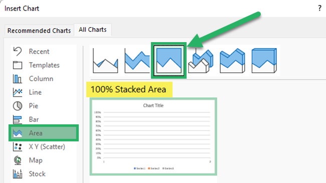
The y-axis will have 3 data series for 3 calculation sets. You have to select a spacing range for the x-axis (Horizontal axis).
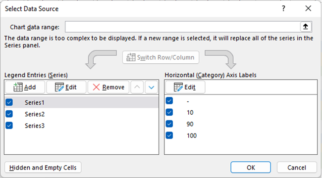

You will get a 100% stacked area chart like below.
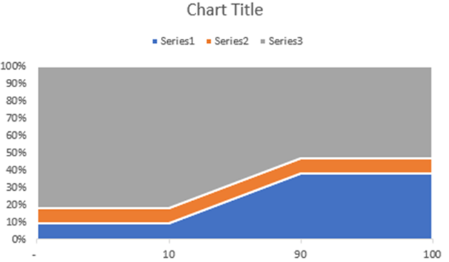
- Now, do the following formatting to the above chart.
-
- Go to the format axis pane and change the vertical value axis to reverse order.
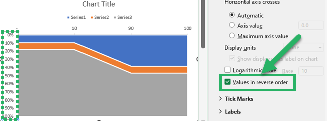
-
- Change the colors and transparency of each series.
- Series 1 – Solid fill and 100% transparency
- Series 2 – Select a desired color for the row category and 50 % transparency
- Series 3 – Solid fill and 100% transparency
- Change the colors and transparency of each series.
You can double-click on the relevant area to open the format plot area.
-
- Uncheck all boxes in the chart elements.
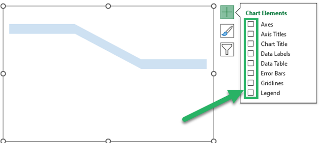
-
- Select the chart and open the format chart area. Change the fill color to no fill. Change the border to no line.
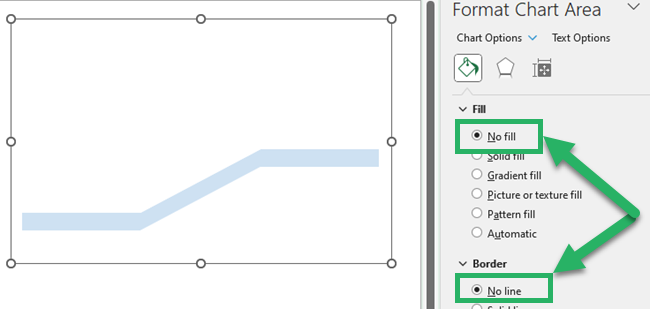
Now you have created a Sankey line. You have to create a chart for each row except blanks.
- Next, you have to assemble all the sanky lines that you have created. To do that, select all the charts while holding the control key. Then, go to the “Shape Format” tab and click align center and align middle.
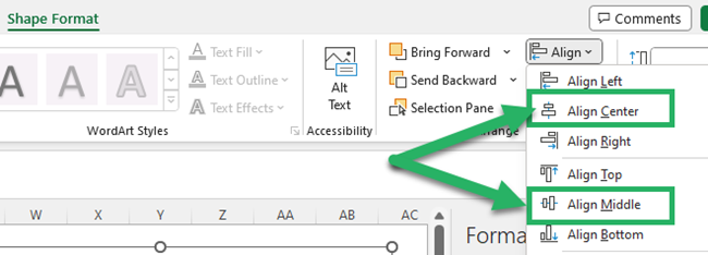
Then, all Sanky lines will be arranged like the below.

- Create two 100% stacked column charts for source pillars and destination pillars.
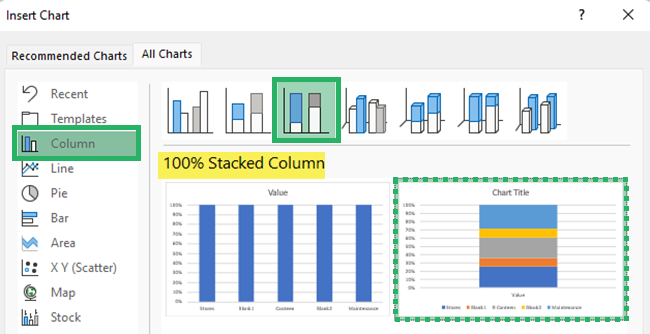
- You have to do the following formatting to above 100% stacked column charts.
-
- Go to the format axis pane and change the vertical value axis to reverse order.
- Insert the data labels as Series Name.
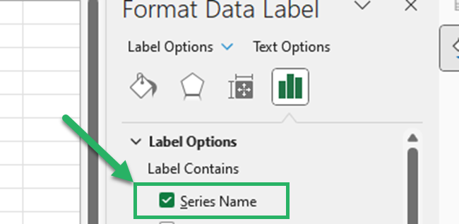
-
- Change the “blank” fields fill color to no fill and delete the labels of blank fields.
- Except for “Data Labels”, uncheck all boxes of the chart elements.
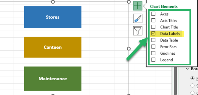
- Finally, move both pillars to fit the assembled Sankey lines.
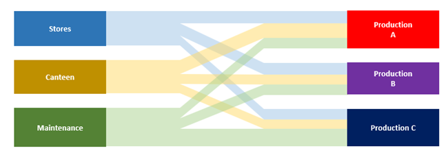
Your Sankey diagram in Excel is ready!
The width of each Sankey line is proportional to the flow rate.
This is the best visualization of flows from one set to another set.
That’s it – Now what?
Well done! You have successfully created a Sankey diagram in Excel 👏
Creating Sankey diagrams like what you did above involves a lot of building and writing Excel functions and formulas.
So, it’s really important to have a good foundation in Excel functions 😉
My best recommendation is that if you want to learn more about Excel functions, then learning the VLOOKUP, SUMIF, and IF functions is a good start.
Learn all these (and many more) in the most practical and easiest way when you enroll in my 30-minute free online course 💻
Other resources
We have used many functions such as XLOOKUP, SUMIF, IF, SEARCH, and ISNUMBER while creating this Sankey diagram.
You can refer to our articles about these functions for a better understanding 🧐
Our articles about Excel charts and How to Add Axis Labels in Excel Charts will definitely help you when creating Sankey diagrams in Excel.
Don’t forget to read the How to Name a Range in Excel article as well 👍
